 |
|
Title Treatment for “Wreck-It Ralph”. —— Client: Walt Disney Animation Studios
June 4, 2012 on 9:02 pm | By Michael | In News | 27 Comments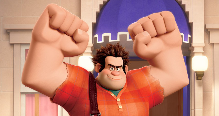 It’s been a while since I’d been called to do a title treatment for a major motion picture, so it was with great pleasure that I went in to see Disney Executive VP John Sabel to discuss working with them on developing a logo for a new animated feature slated for release this November 2nd. Wreck-It Ralph tells the story of Ralph, an arcade video game “bad guy” (John C. Reilly)—a one-man wrecking crew who is determined to prove he can be a good guy. Starting out as a classic arcade 8-bit character, Ralph travels through several arcade worlds, ending up in fully articulated 24-bit form. Here’s the final logo we ended up with:
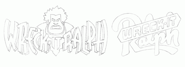
 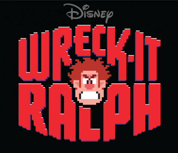 The process of developing this title treatment extended over several months. It’d be impossible to detail here all the stages we went through, but I’d like to just show here first some of my development pencil sketches:
 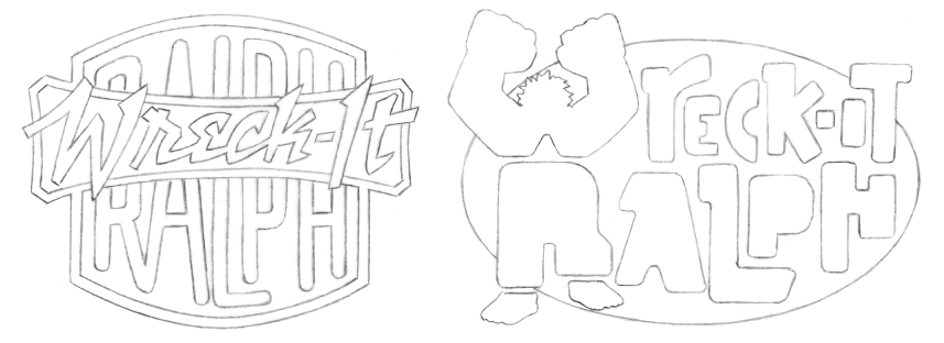 Some of the letterforms I used were reminiscent of the shapes in the character.
 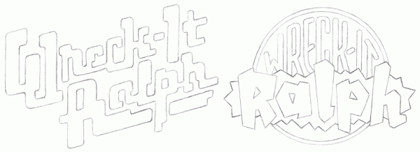 I tried to provide as many attitudes and alternatives as I felt worked for the subject matter.
  It was felt that a suggestion of the main character and his 8-bit nature might be a good way to go.
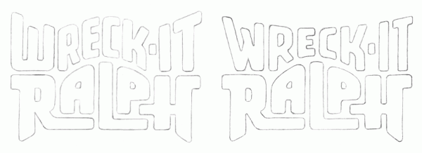
 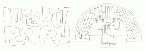 In all cases I wanted the treatment to be playful and reminiscent of some of the classic arcade logos of the ‘70s.
  When I came up with the idea of an 8-bit logo surrounding an 8-bit face, I knew we had hit paydirt.
 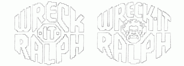 So from that point on I took that approach and developed the logo in digital form. It went through many, many different stages, culminating in the title treatment you see at the top of this post. It was decided that the face I came up with for Ralph was a little too “angry” looking . . . so I took it down a notch. Also the “Disney” logo needed to somehow be incorporated. We tried it both inside and and outside and above the treatment. I tried creating a border, making a self contained “badge” treatment with the Disney logo inside:
 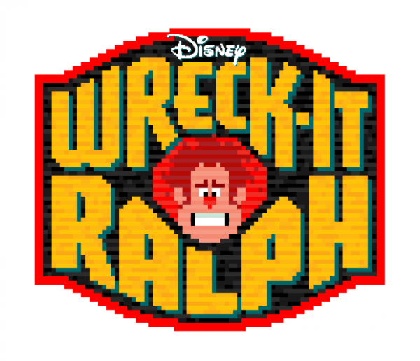 We then simplified the “badge” a bit:
 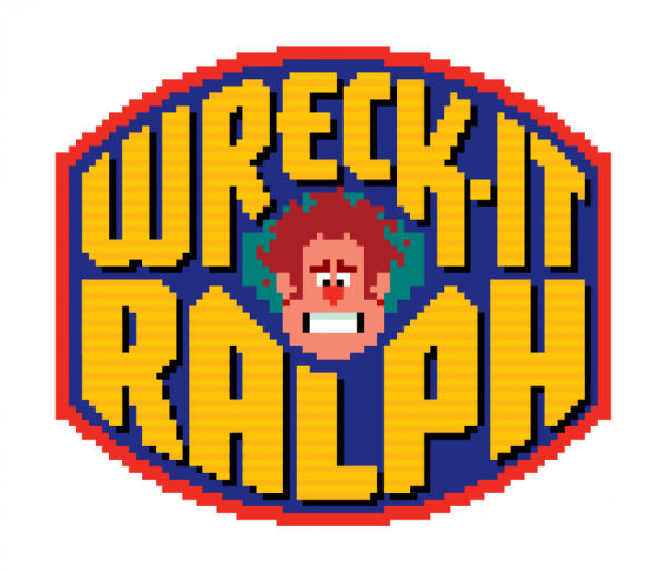 We eliminated the “badge” completely, again opting for more simplicity:
 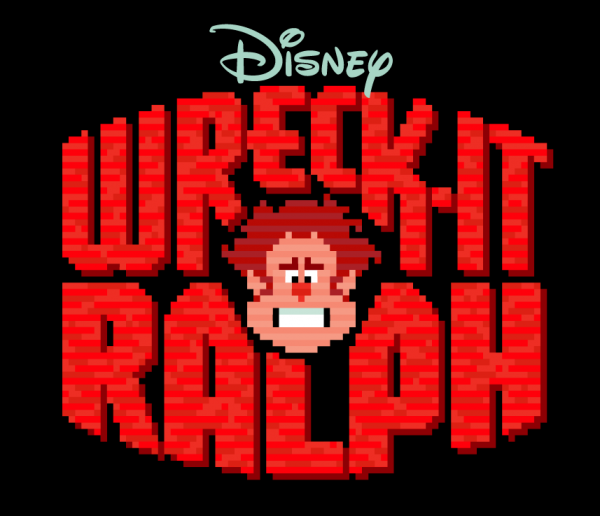 We changed Ralph’s face again, making him a little bit meaner looking, and edited the shapes of the letterforms.
 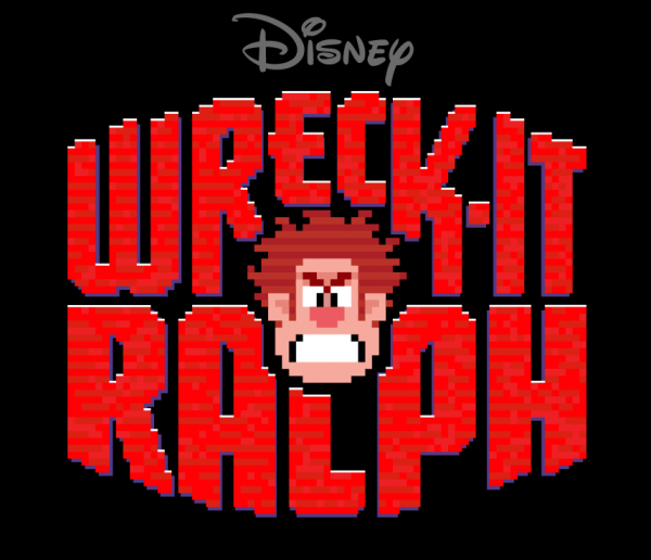 In the end we eliminated the “brick” texture that filled the letterforms, opting again for a simpler look. Here’s that final title treatment again:
27 Comments
RSS feed for comments on this post. TrackBack URI
Leave a comment
Powered by WordPress and Nifty Cube with Recetas theme design by Pablo Carnaghi.
Entries and comments feeds.
Valid XHTML and CSS.
Hi! Do you know about the process of another Disney animated film logo? They did an excellent job making logos for their classics 90’s films. I like how they not only design a logo but also create a container for it and a whole complete image with elements under the same graphic concept. I’m searching for articles or reviews about this, I hope you have some information.
Comment by Juan Pablo Linares — July 31, 2014 #
[…] isn’t new, but we came across this very interesting article about how designer Michael Doret created the title treatment (basically a logo) for last year’s Disney movie, Wre…. If you’ve ever wondered how an artist goes from concept to final designs, this is a good […]
Pingback by Logo Design News This Week 3.16 - Logomaker Blog — April 19, 2013 #
[…] Michael Doret’s work for Wreck-It Ralph. It’s always fascinating to see early concept sketches and the progression to the final piece. […]
Pingback by Designing the “Wreck-It Ralph” title logo | Rapid Notes — April 11, 2013 #
Chaitanyak: The slight color difference you may have noticed is probably just a function of some “bad” printing. The gradient thing was probably added by some overzealous designer at Disney. It’s difficult to maintain control over a design with such a large organization. In the end you have to finally “let go”. I’m OK with it. Thanks for your question!
Comment by Michael — April 11, 2013 #
great job! thanks for sharing your process and so many of those amazing sketches 🙂
the text appears to be more orange.. and seems to have a different gradient on the billboard thing.. was that done my you? or is that some marketing team designer’s last minute modification?
Comment by chaitanyak — April 11, 2013 #
[…] Nestlé’s Nesquik has taken a cue from my Wreck-It Ralph logo design and is now running a branded cross-promotion with Disney’s upcoming animated feature […]
Pingback by Alphabet Soup Blog » Blog Archive » I Should Have Seen This One Coming! — September 26, 2012 #
[…] Michael Doret documents the design of the title treatment for Wreck-It Ralph. […]
Pingback by Type News: Double Helix | Uber Patrol — July 12, 2012 #
[…] on Michael’s blog, you can see the progression of designs leading up to the final. A very interesting peek at an […]
Pingback by Michael Doret designs the title treatment for “Wreck-It Ralph”.Font Bros | Font Bros — July 6, 2012 #
[…] Some friends of mine were good enough to send along a few photos of the Wreck-It Ralph title treatment lording it over the attendees recently at Los Angeles” E3EXPO. These were sent by Steve Silvas and taken by Mike Moreno. Thanks guys! I̵ […]
Pingback by Alphabet Soup Blog » Blog Archive » Wreck-It Ralph Title Treatment Seen at E3 Conference — June 19, 2012 #
[…] designed (just below) at the end of the trailer. For more on my design process for this logo see my previous Wreck-It Ralph […]
Pingback by Alphabet Soup Blog » Blog Archive » Wreck-It Ralph Trailer Debuts on Web — June 18, 2012 #
[…] To be released in November, Wreck-It-Ralph is a Disney animated motion picture focusing on Ralph, who plays the wrecking bad guy in an 8-bit arcade game but grows tired of his role and escapes the game to become a good guy. Michael Doret created the title logo, a wonderful homage to 8-bit graphics. Michael shares his process and sketches at the “more” link. And you can see how it animates at the end of the trailer at the movie’s website. [More] […]
Pingback by Friday Likes 06 | Uber Patrol — June 15, 2012 #
Hi Bailey: Good question! Ralph’s head went through many iterations, the folks at Disney having had the last word and making some refinements (after all I’m not a character designer). But all the stages except the final were entirely mine. All I had for reference to create the head were some character drawings and renderings—but they weren’t of the 8-bit version, so I had to kind of imagine what that would be. I can’t show what I worked from because of an NDA I signed. For the final stage the folks at Disney made some small modifications to the head I had created in Illustrator, but in the end brought it back to the “angrier” head I had initially visualized. Also Ralph’s face that is being used on the teaser posters is a redraw by Disney and is different from the head in this logo.
Comment by Michael — June 12, 2012 #
Did you come up with the drawing of Ralph’s head also?
Comment by Bailey — June 12, 2012 #
It’s great to see a logo really champion the character and spirit of a whole movie. You nailed it.
It’s pretty daring. I’ve never seen something like this for a movie.
P.S. I’m glad the angry face was picked. Way better.
Comment by Nathaniel Sidwell — June 10, 2012 #
More simple than my likes but still a great project! It’s Disney!
Comment by José Cruz — June 9, 2012 #
[…] To be released in November, Wreck-It-Ralph is a Disney animated motion picture focusing on Ralph, who plays the wrecking bad guy in an 8-bit arcade game but grows tired of his role and escapes the game to become a good guy. Michael Doret created the title logo, a wonderful homage to 8-bit graphics. Michael shares his process and sketches at the “more” link. And you can see how it animates at the end of the trailer at the movie’s website. [More] […]
Pingback by Friday Likes 06 — June 8, 2012 #
Michael,
Have been a fan for years.
You’re one of the reasons I’m in the business.
Grew up in the 80’s, and you nailed it all — 8-bit, Disney, tonality, form, everything.
Fantastic job!
Comment by Mike — June 8, 2012 #
[…] To be released in November, Wreck-It-Ralph is a Disney animated motion picture focusing on Ralph, who plays the wrecking bad guy in an 8-bit arcade game but grows tired of his role and escapes the game to become a good guy. Michael Doret created the title logo, a wonderful homage to 8-bit graphics. Michael shares his process and sketches at the “more” link. And you can see how it animates at the end of the trailer at the movie’s website. [More] […]
Pingback by Friday Likes 06 | DailyClicker — June 8, 2012 #
Looks like an incredible movie with a logo to match! Beautiful work, Michael.
Comment by Michael — June 8, 2012 #
Thanks, Andy – sorry I was busy when you were out here, but sounded like you had a blast anyway!
Dave, you ARE reaching! But maybe I’ll tell people that . . . makes a good story!
Michael
Comment by Michael — June 7, 2012 #
I knew it! When I first saw it, I thought it looked good, especially how the A and the P worked around the chin/jaw. But when I noticed the crossbar go through the E on top and the shape of the K I remember thinking “I wonder if Michael Doret did that..”
Is the outer shape of the letters anything specific? It looks kind of like a fist (without a thumb) if it was coming right at you, but I could be reaching, there.
Nice work, sir! After seeing the trailer, I can’t wait to see this.
I’m gonna wreck it!
Dave
Comment by Dave Hollenbeck — June 7, 2012 #
Love it! Great job.
Comment by Andy Heckathorne — June 7, 2012 #
Getting comments like these makes all the hard work worthwhile . . . made my day!
Comment by Michael — June 7, 2012 #
So awesome seeing this developed from pencil sketches to finished logo. Perfect; great work 🙂
Comment by Alyssa — June 7, 2012 #
I just saw the trailer for this earlier today. I thought the logo looked perfect. Now I know why. Congrats!
Comment by Mark S. — June 6, 2012 #
[…] treatment I designed at the end of the trailer. For more on my design process for this logo see my previous Wreck-It Ralph […]
Pingback by Alphabet Soup Blog » Blog Archive » Wreck-It Ralph Trailer Debuts on Web — June 6, 2012 #
[…] (taken from Doret’s site; http://alphabetsoupblog.com/?p=1716) Tweet Posted in ANIMATED, ARTICLES BY AUTHOR, MAJOR MOTION PICS, MOVIES, MOVIES, […]
Pingback by Take a Look at Evolution of Disney’s WRECK IT RALPH Title Treatment | BEYOND THE MARQUEE — June 5, 2012 #