 |
|
“Sweet!”/A Logo Project–Part 2 of 5: Peace of Candy + AS IF
October 8, 2012 on 11:53 pm | By Michael | In Gigs, News | 5 CommentsPlease read Part 1 of this series before proceeding!
According to Sweet!’s founder, Gary Shafner, all the world’s countries have their differences—they either love or hate each other—but truth be told, we all have one thing in common: everyone loves candy. Gary wants to share that sentiment by finding some of the wackiest, and some of the best confections from around the globe and making them available in his “Peace of Candy” shop. World Peace through sugar rush!
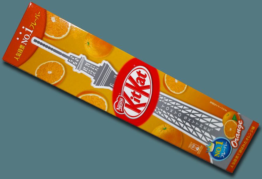
Take Japan for example. In the US Kit Kat is licensed by Hershey, but it was originally created by Rowntree’s in England, and is now a Nestlé product there and in most of the rest of the world. But the Japanese have turned Kit Kat into something that is both uniquely their own and immensely popular. Over the years they have developed over 200 flavors of Kit Kat. The all-time favorite Japanese Kit Kat flavor is Orange. Gary says that among the many, many other candies from around the globe you will find in Peace of Candy of course there will be those Orange Kit Kats, packaged in a special “Tokyo Tower” commemorative box:
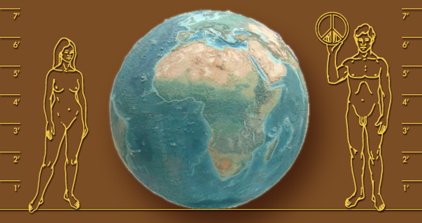
How will you find Peace of Candy when you’re in Sweet! you might ask? Just look towards the center of the store where you will find a giant relief globe (below)—7 feet in diameter—originally salvaged from Chicago’s Historic Rand McNally Building. There’ll be Peace signs placed over each and every country.
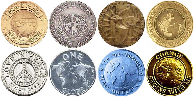
Inspiration for creating a logo for Peace of Candy was not hard to come by. Medallions extolling the virtues of Peace and Goodwill may easily be found. So it was not much of a stretch to take our design cues from some of these many and varied metallic coins.
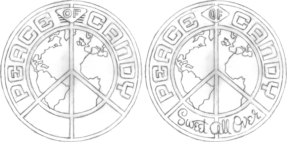
The first pencil sketch pretty much summed up the direction I wanted to go…but then it was decided that we needed to add the tagline “Sweet All Over”:
Once the direction was approved I needed to start fleshing out the look of the medallion, giving it depth and life. At the beginning, everything was pretty flat. Then I added dimension and texture—all done in Adobe Illustrator:
We tried different iterations of how to treat the “Sweet All Over” tagline panel:
And the final selected version:
I’m told that they’re actually going to make chocolate medallions with this design in relief!
AS IF – Shop for Spoiled Girls
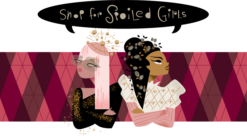
Because at least one of the shops (Yucky—coming up in Part 4) is mainly directed at boys, Gary didn’t want girls to feel left out, so he created a shop just for them: “AS IF – Shop for Spoiled Girls”. The theme of this shop revolves around two characters: Amanda Sugar (initials AS) and Isabella Fairchild (initials IF). These are two pampered, coddled, rotten and snobbish little girls. The back story is that both have a boarding school background, but have different (but indeterminate) ethnicities. Amanda is more into the club scene, while Isabella is more into period design. But over time they both realized that they had more in common than not—fashion being their common denominator—and begrudgingly became friends.
Gary, having become familiar with the illustration work my wife Laura Smith had been doing, decided she would be the right person to create a graphic of these two characters for this very girly boutique. So having been briefed by Gary on what these two were about, Laura set out to bring them to life.
The first thought was to have Amanda and Isabella back-to-back, kind of like bookends—as are these two Mudflap Twins:
But Amanda and Isabella really aren’t refusing to acknowledge each other, as this type of arrangement might suggest. But Laura decided to keep something of this back to back, belligerent attitude, only a bit less contentious.
To capture a bit of the attitude and indeterminate ethnicity of these two brats Laura looked at many, many fashion shots of female models—only these were a bit older than her subjects were supposed to be. She looks at reference like this not for any specific details, but to get a better feel for her subject matter, possibly combining many separate features into an interesting composite.
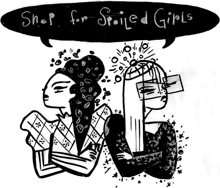
Here’s Laura’s concept sketch of these two characters. Can you guess which character is which?
First she roughed this out in pencil and went over that with pen. She usually go through more stages, but felt good about this direction:
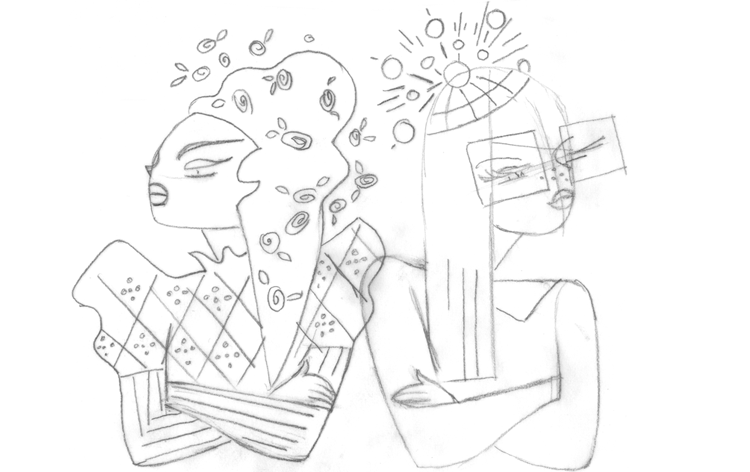
Here’s a tighter pencil drawing, where Laura starts working out some of the details:
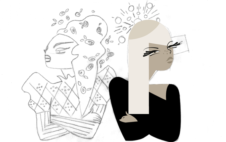
Once it was clear that Laura wanted to contrast the darkness of one girls hair and oppose that with the a lighter or blond color on her counterpart the piece was easier to visualize and I was able to flesh the rest out on computer. For Laura, it’s an organic process. Value or color against color, making sure that eveything reads properly:
Finessing the eyes of Amanda Sugar (on the right) was a little trickier. Laura had to play with that a little until she was satisfied. Laura wanted Amanda’s eyes to have a slightly more “Asian” look to them:
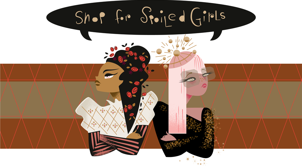
Color and background needed tweeking in a way that made them both equally important and not overwhelmed by the background pattern. And Laura decided that the two girls should be in “AS IF” order: Amanda Sugar on the left, and Isabella Fairchild on the right:
So here they are, visualized in their perpetual love/hate relationship—unwilling to see eye-to-eye, yet unable to live without each other.
Tomorrow our global trek comes full circle—back to the US and ending up in Part 3 on “Route 66 – Candy Americana”.
5 Comments
RSS feed for comments on this post. TrackBack URI
Leave a comment
Powered by WordPress and Nifty Cube with Recetas theme design by Pablo Carnaghi.
Entries and comments feeds.
Valid XHTML and CSS.







[…] read Parts 1, 2, 3, and 4 of this series before […]
Pingback by Alphabet Soup Blog » Blog Archive » “Sweet!”/A Logo Project–Part 5 of 5: TINSELTOWN — October 11, 2012 #
[…] read Parts 1, 2, and 3 of this series before […]
Pingback by Alphabet Soup Blog » Blog Archive » “Sweet!”/A Logo Project–Part 4 of 5: YUCKY — October 11, 2012 #
[…] read Parts 1 and 2 of this series before […]
Pingback by Alphabet Soup Blog » Blog Archive » “Sweet!”/A Logo Project–Part 3 of 5: Route 66 / Candy Americana — October 10, 2012 #
This is a really fun post, Michael. I love to see Laura’s process work, as well as yours. What a great team you two make! Can’t wait for this place to open so we can all check it out!
Comment by Steve — October 9, 2012 #
[…] check back here tomorrow, and I’ll post two more designs for Sweet!: “Peace of Candy” and “AS IF – Store for Spoiled […]
Pingback by Alphabet Soup Blog » Blog Archive » “Sweet!”: 6 Logos for a New Candy Store Opening in Hollywood/Part 1 of 6 — October 8, 2012 #