 |
|
Le Train Bleu @ Bloomingdale’s
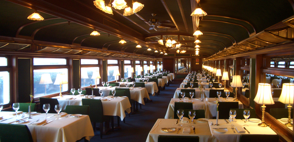
July 30, 2010 on 12:59 pm | By Michael | In Gigs, Wayback Machine | 8 CommentsWhile in New York City to give a talk at the Type Directors Club Laura and I stopped in at Bloomingdale’s. I hadn’t been back to Bloomingdale’s for many years, so while there I thought I’d check to see if some signage I had designed for their “Le Train Bleu” restaurant might still be in use. To my utter amazement, my work was there—still in use after 30 years. The restaurant itself is a stunning recreation of a vintage dining car, and has been virtually unchanged inside since the day my work first adorned its entrance.
The Original “Le Train Bleu” was a luxury French night express train which carried wealthy and famous passengers between Calais and the French Riviera from 1922 until 1938.
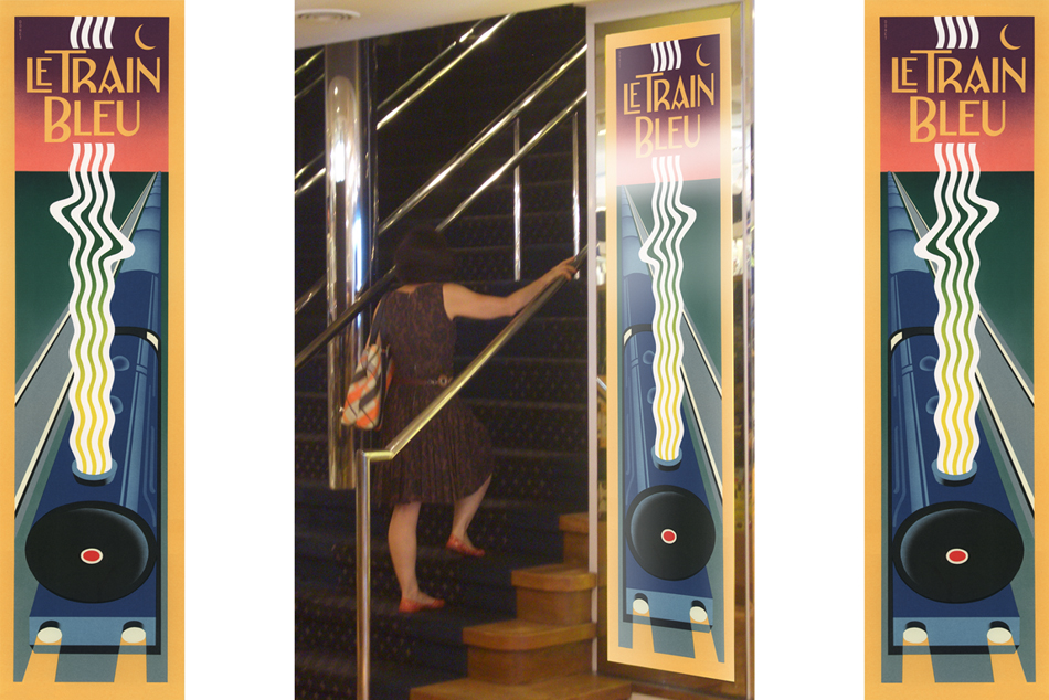
Back in 1980 I had designed and painted art for two panels that were to bookend the stairway leading up to the restaurant. The challenge, as outlined to me by then Bloomingdale’s Creative Director John Jay, was to design a poster reminiscent of the great transport posters of the ’20s, ’30s and ’40s,—but in an extremely thin vertical format: almost a 4 to 1 height to width ratio. Also the design had to be able to mirror itself so that it could appear on either side of the entrance. Designing the piece so that one had almost a bird’s-eye view of the train which was letting out a very art-moderne steam stream seemed like a natural for the format.
This was not a typical project for me at the time because I had never executed a painting like this before. In addition the typography played a much smaller role in the design, and in the end was much more toned down than in most of my other work.
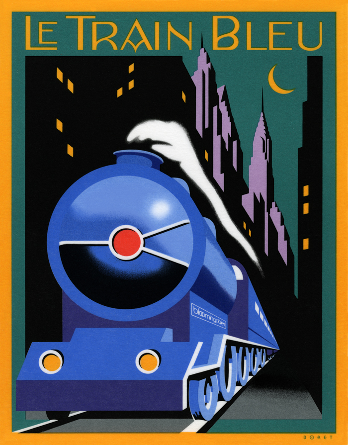
Above is the menu cover I designed as a companion to the stairway panels. It depicts the same train as in the panels from the more traditional “heroic” viewpoint seen in many transport posters of the time. I redid the lettering, but kept it in the same moderne style—only in a lighter weight. And unlike the panels the art for which I had painted in gouache, I did the menu cover as pre-separated mechanical art—much more akin to my current work which is usually done in Adobe Illustrator.
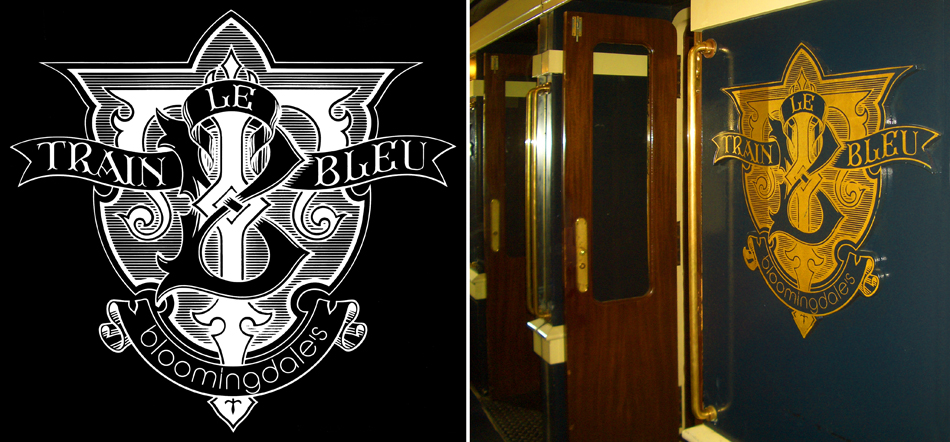
Additionally I had designed the “Le Train Bleu” seal or monogram that appears in relief outside the restaurant and on printed materials. This was much more akin to the type and letterform-centric work that I’ve become known for, and was designed to be very heraldic in nature. To my surprise this large monogram in relief was also still there, looking as fresh as the day it was first mounted in the vestibule of the restaurant at the top of the stairs.
For those who are interested there are prints of the Le Train Bleu vertical format artwork available on my ILLOZ site. These prints are finely produced, hand-crafted 12 color fine art lithographs that are virtually identical to the original painting.
Please also see my more recent supplemental posting on Le Train Bleu at Bloomingdale’s.
8 Comments
RSS feed for comments on this post. TrackBack URI
Leave a comment
Powered by WordPress and Nifty Cube with Recetas theme design by Pablo Carnaghi.
Entries and comments feeds.
Valid XHTML and CSS.


The restaurant is wonderful and your signage is magnificent.
I’m a big fan of yours as well as John Jay. I love both the panels and the menu cover. Everything about dining at this restaurant is a treat; I thank you for adding to the ambience and special flavor of Le Train Bleu.
Sylvia Laniado
Comment by Sylvia Laniado — April 18, 2015 #
A copy of one of their original menus with your art is housed in the LAPL Menu Collection (http://www.lapl.org/collections-resources/visual-collections/menu-collection) and I’ll be adding a reference in our notes for art design and this blog post. Thank you for helping make my research easier!
http://dbase1.lapl.org/images/menus/fullsize/c/25406-01.jpg
Comment by Stacy McKenna — January 29, 2015 #
[…] through Manhattan, in a great poster created for Bloomingdale’s by typographer/designer Michael Doret. You can read about the process here (and purchase a lithograph […]
Pingback by The Secret Train Car in Bloomindale’s « Scouting NY — September 9, 2012 #
[…] Two years ago I visited Bloomingdale’s in NYC, and specifically their Le Train Bleu restaurant for which “back in the day” I had originally designed many of the original elements. In my visit to NY last month I revisited the restaur […]
Pingback by Alphabet Soup Blog » Blog Archive » Le Train Bleu #2 — June 20, 2012 #
What MacTranslator can do for one!
Catch-vous plus tard!
Comment by José Cruz — August 8, 2010 #
Sacrebleu, mon cher José!
Comment by Michael Doret — August 4, 2010 #
Pardon my French…
Vous êtes tellement magnifique! Fabuleux monogramme!
Comment by José Cruz — August 4, 2010 #
Thanks for the nice walk down memory lane, that interior is quite the romantic spot. Love the monogram, and all the work.
Comment by Glenn — August 2, 2010 #