 |
|
Steinweiss Script – Just Released!
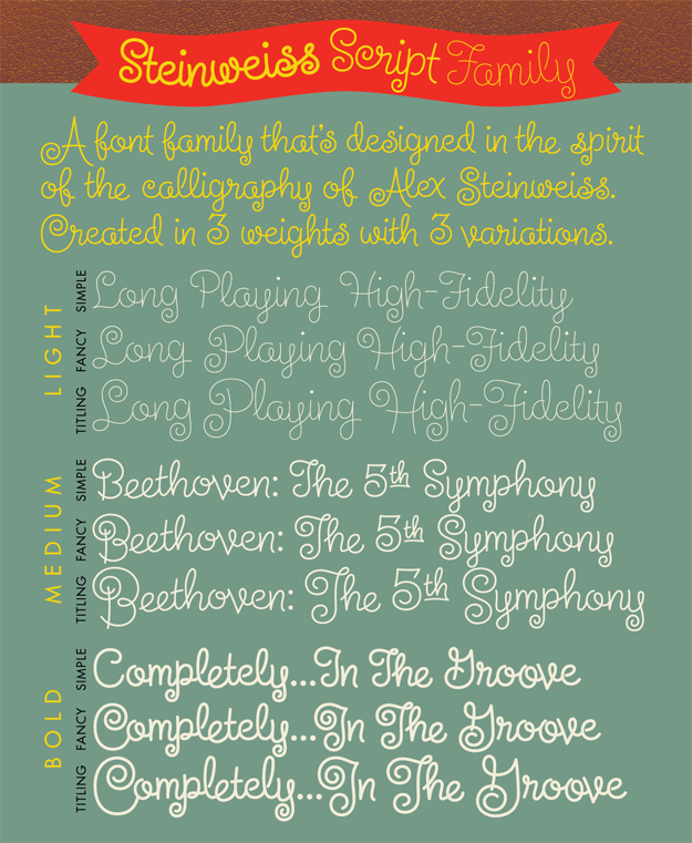
November 8, 2010 on 11:16 pm | By Michael | In Gigs, News | 5 CommentsWe’re very proud to be able to finally announce the release of The Steinweiss Script Family. We’ve described these fonts briefly in the last two postings (scroll down) but, to reiterate, this family is made up of three weights—a Light, a Mediuim and a Bold. Within each of the three weights, through advanced OpenType features, a user has the ability to access three distinct variations: Simple, Fancy, and Titling. Rather than trying to describe them again, I’ve provided an image that demonstrates what they are:
I began designing this font with just the larger caps and taller ascenders/descenders, but in the end felt that giving user’s these options would add usefulness to the font. These variations make Steinweiss Script accessible not just for headlines, but for applications where vertical space might be an issue, and also for longer passages of text.
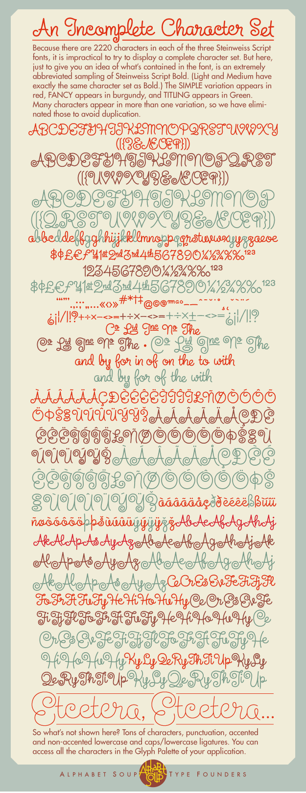
To help users understand how to be able to access these features (and also to show off the font) I created “The Steinweiss Script User’s Guide” in PDF form (1.2 MB download). I’ve also created an “Incomplete” character showing to give somewhat of an idea of what’s in the font:
Steinweiss Script is available from Alphabet Soup Type Founders either as a family of all three weights, or each of the weights can be licensed individually.
As always, we’d love to hear your comments about this font!
Steinweiss Script – Design and Art: Michael Doret – after Alex Steinweiss
Steinweiss Script – OpenType Programming: Patrick Griffin/Canada Type
5 Comments
RSS feed for comments on this post. TrackBack URI
Leave a comment
Powered by WordPress and Nifty Cube with Recetas theme design by Pablo Carnaghi.
Entries and comments feeds.
Valid XHTML and CSS.


[…] been seen before . . . but that’s not that easy to do. Most of my fonts (with the exception of Steinweiss Script and DeLuxe Gothic) are completely new […]
Pingback by Alphabet Soup Blog » Blog Archive » In the Works—New Blackletter/Hybrid Font — April 30, 2013 #
[…] My friend and frequent collaborator Michael Doret recently designed an awesome typeface called Steinweiss Script. It’s based on the “Steinweiss scrawl”, the calligraphy developed by the inventor […]
Pingback by The Jed Davis Song Foundry » Coverage — January 11, 2011 #
Really lovely! Terrific inspiration, to render Steinweiss’ script lettering into a font, and by all appearances, very nicely done.
Comment by Mike Diehl — December 6, 2010 #
Wow! Beautiful! Color me green with envy and very impressed with this font. Michael’s old world craftman’s skill shines in every character.
Comment by Glenn — November 12, 2010 #
[…] This post was mentioned on Twitter by Paula Gould, Michael Davis. Michael Davis said: RT @Pago: @MichaelDoret officially releases new #font family Steinweiss Script #typography #webdesign http://www.alphabetsoupblog.com/?p=998 […]
Pingback by Tweets that mention officially releases new #font family Steinweiss Script #typography #webdesign -- Topsy.com — November 10, 2010 #