 |
|
Author Archive
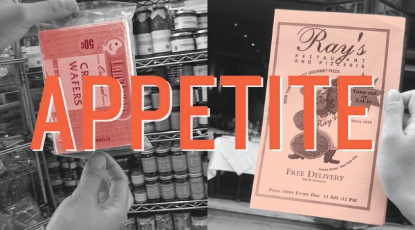
“Appetite” Opens at Cooper’s Lubalin Center
September 15, 2010 on 1:30 pm | By Michael | In News, Notes, Wayback Machine | 1 Comment“Appetite – A reciprocal relationship between Food & Design” opened last night at my alma mater The Cooper Union, hosted by the Herb Lubalin Study Center. The exhibition explores how design influences our day to day relationship with food, and covers everything from restaurant signs and menus to supermarket price labels and takeout packaging.
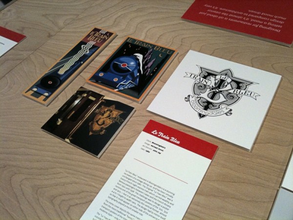
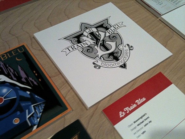
I was fortunate enough to have some of my work included in this show—my “Le Train Bleu” project that I had recently highlighted in this blog. Although I couldn’t make it to the opening, my good friend Louise Fili was kind enough to send me some snaps of my work displayed in the exhibition:
Hungry for more? The exhibition is at 41 Cooper Square (3rd Avenue between 6th and 7th Streets), NYC. The show runs through October 9th. The gallery hours are Monday through Friday: 12–7; Saturday: 12–5. The exhibition was curated by Alexander Tochilovsky. Read an interview with Alexander about this exhibition at Eye Blog, and read more about it and see more photos of the exhibition from the opening at Design:Related.
Introducing DeLuxe Gothic — 50% Off Special!
September 9, 2010 on 2:23 pm | By Michael | In News | 1 CommentDue to a threatened lawsuit by the folks at FontHaus (who somehow believe they are the only ones entitled to use the name “Bank Gothic”) I have changed the name of my font “Bank Gothic AS” to “DeLuxe Gothic“. I have great respect for the original designer of Bank Gothic, Mr. Morris Fuller Benton, and chose the name DeLuxe Gothic because it was the name that The Intertype Corporation used for their version of this classic font during the early years of the 20th Century.
My particular take on this design was that I always felt it could use a set of lowercase letters, and that is what sets my font apart from the rest. You can get a better look at it if you download the DeLuxe Gothic Brochure.
Fonts In Use: Grafika in Madrid
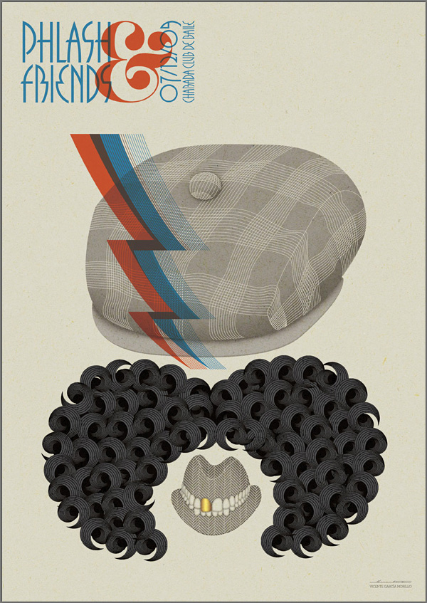
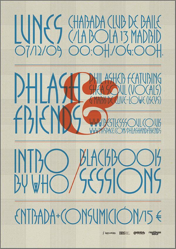
August 31, 2010 on 1:04 pm | By Michael | In News | 1 CommentMy good friend Mark Simonson recently alerted me to a very interesting use of my most recently released font Grafika. He found it Behance’s online portfolio for Spanish designer Vicente García Morillo. It was used to produce a flyer for Phil Asher, a UK DJ/Producer performing in Madrid under the guise of “Phlash”.
What piqued my interest about this particular usage was the fact that Mr. Morillo used Grafika in ALL CAPS—something I had never anticipated. I usually recommend that this font be set in upper and lowercase. But I have to admit that seeing this flyer has changed my mind.
Powered by WordPress and Nifty Cube with Recetas theme design by Pablo Carnaghi.
Entries and comments feeds.
Valid XHTML and CSS.
