 |
|
Archive for January, 2009
Barack Obama & JFK
January 20, 2009 on 5:06 pm | By Michael | In News, Notes | 7 CommentsToday is history. I cannot remember ever feeling this thrilled or so hopeful about a new president. The closest thing I can associate with this was the tenor of the nation during the years before the Kennedy assasination. The country was unified behind him and he was beloved by almost everyone. When he was shot I was in school, and I remember students were either stunned or openly weeping. My daughter Wenonah reminded me this morning that once many years ago I spoke to her about the Kennedy years, about how he was loved, how everyone was so positive about—and supportive of—our government. She had told me that she just couldn’t imagine ever feeling that way, or even relate to that experience. After the inauguration this morning she told me that now she understood what I meant.
After November 22nd, 1963, our country entered a long dark era, from which only now it may be emerging. I never thought a day like this would be possible in my lifetime. After all the US has been through I never imagined that we could again elect a person of such intellect and potential as Barack Obama. I believe he is capable of being one of the greatest leaders this nation has ever had. We will all need to re-evaluate what is truly important in our lives, and he and his administration will need the support of all of us to tackle the monumental challenges that lie ahead.
MyFonts Names Metroscript “Brush Script Font of the Year”
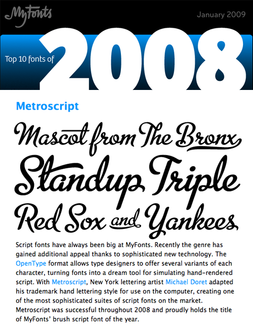
January 14, 2009 on 1:48 pm | By Michael | In News | 6 CommentsThe lead item in the January ’09 issue of MyFonts News is reproduced below. I have been thrilled that this font has been accepted so readily by the design community (and beyond), and would like to thank Stuart Sandler of Font Bros and Mr Retro for his assistance in helping me realize this design.

Set the Wayback Machine: “Viva” Astrology
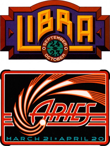
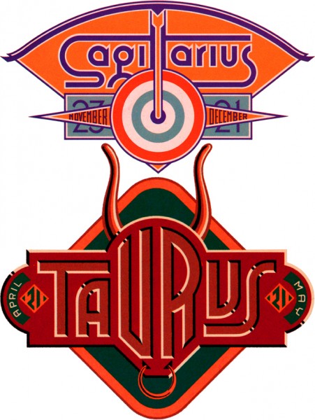
January 5, 2009 on 12:57 am | By Michael | In Gigs, Notes | 4 CommentsI thought it would apropos and an interesting idea to start the New Year off by initiating a series of posts that looks back at some of my work from times gone by. Much of this work will be pre-digital—done the old fashioned “analog” way, with pen and ink. Most was done as pre-separated art: I inked my art on multiple cells of frosted mylar using a Rapid-O-Graph technical pen. Basically the areas of black ink on each cell could be designated to print either with CMYK callouts or with Pantone numbers. It was a very laborious process that was easily duplicated after the first few versions of Adobe Illustrator had come out.
 |
 |
Four Astrology Sign “Logos” for VIVA Magazine
So right now let’s set the Wayback Machine for the mid ’70s and VIVA magazine published by Penthouse (a kind of Playboy for women). The Art Director—the late Rowan Johnson—asked me to design logos for their monthly astrology column which would change with each issue. Even though at the time I was paid quite a paltry sum for my efforts, this was a great ongoing project for me. Much like my recent “Jewish Zodiac” project, I saw this assignment as an opportunity to create a portfolio of distinct yet related logos. I think they really highlight the possibilities of using letterform design not as an end in itself, but as part of a total design concept where letters are treated as one of several related illustrative elements, and integrated into an expressive whole.
Powered by WordPress and Nifty Cube with Recetas theme design by Pablo Carnaghi.
Entries and comments feeds.
Valid XHTML and CSS.