 |
|
Archive for March, 2010
American Trademarks: A Compendium
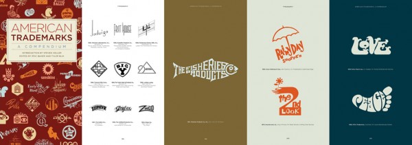
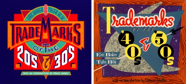
March 24, 2010 on 12:46 am | By Michael | In News | 1 CommentWhile they were in print, the three volumes of Eric Baker and Tyler Blik’s classic Trademarks series (which together sold 60,000 copies) were the authoritative books of logo design by decade. I had the distinct privilege of designing the covers for the first two. Many is the time that people have mentioned to me that they have those books, and had no idea that I had done the covers!
This definitive collection is now available from Chronicle Books in an expanded single volume with essays and samples of the work of 17 contemporary graphic designers (including myself), and with an introduction by Steven Heller. Over 1,000 iconic trademarks are packed into this extra-chunky paperback. While the original books have long enjoyed cult status, this attractive, updated edition will win legions of new fans among today’s ever-increasingly design-savvy public. So run don’t walk to your nearest purveyor of fine books, and snatch a copy before they’re all gone.
Art Imitates Life…Imitates Art (Canter’s Truck #2 of 3)
March 21, 2010 on 9:05 pm | By Michael | In Gigs, News | 3 CommentsAlthough most of the food trucks are similar in appearance, many contain details that slightly alter some of their proportions. So it became necessary for me to visit the Road Stoves truck depot and to take pictures of the truck that would be closest to the one that Bonnie would be getting, and to use those photos as templates for my design—I’d also have to Photoshop out the existing graphics, making the truck as clean as I could to act as a blank canvas for my new design:
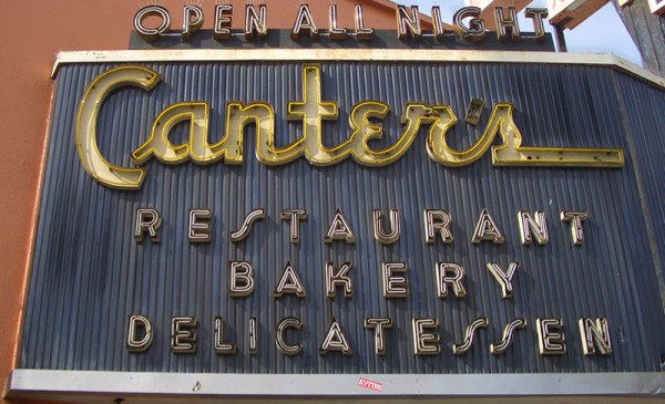
I set about to create the elements for the truck wrap, basing the graphics on the look of the Canter’s neon sign and my font Deliscript. I felt I needed to modify Deliscript a bit to make this a strong graphic statement—kind of like a logo for the truck. So I began by creating a large, circular initial “C” in Canter’s—and that became the basis for the look:
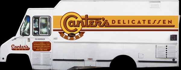
I also settled on a palette of colors that I felt would be attractive and reflect what I thought of as a Deli aesthetic. The unique double “SS” in “DELICATESSEN” was borrowed from the neon sign—one of many small details that I felt would help keep continuity between the restaurant and the truck. I added some other elements such as “Since 1931” that Bonnie wanted. In my first iteration for the truck my feeling was that I’d try it as a white truck—a good clean look— and adjust the graphics accordingly.
I might’ve had the Good Humor truck from my youth in Brooklyn in mind:
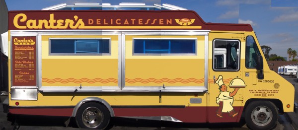
Nevertheless, a white truck wasn’t exactly what Bonnie had planned on. I have to admit that I’m glad she pushed me to do a more colorful truck. Even though the truck was to be treated as a “vehicle wrap” by SignQuest, a process that is being more and more widely used, I decided to treat the truck as if I was designing a paint job in order to give it a look that was more in keeping with its mid-century heritage. Keeping the color palette that I had first come up with I created some mock ups that I thought would work even better for Canter’s than my all white version:
We also decided that it would be a good idea to have a slogan and, after much deliberation, settled on “…home of the Kibitz Room”. The Kibitz Room is the dive bar/cocktail lounge that’s off in a corner of Canter’s Deli. Like Canter’s, it’s an LA institution that just seems to keep going and going.
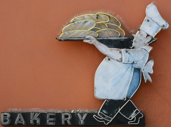
I had envisioned that we would somehow use my very graphic take on the neon baker sign on the service side of the truck. So I put him on the door and let the steam from his platter trail back along the length of the truck towards the menu. Along the top of the truck yet another version of the Deliscript/Canter’s logo:
In “Art Imitates Life…Imitates Art #3″ I’ll post photos of the actual truck wrapping, and also of the finished truck.
Art Imitates Life…Imitates Art (Canter’s Truck #1 of 3)
March 18, 2010 on 6:38 pm | By Michael | In Gigs, News | 2 CommentsRecently I had a strange (and kind of wonderful) confluence of circumstance—combined with a smattering of coincidence and random luck. It all started right here in this blog over a year ago when I started sharing my thoughts about creating my new font Deliscript. In the posting I mentioned how the design was “loosely inspired by one of the signs at Canter’s Deli,” a Los Angeles staple for almost 80 years:
At any rate my good fortune with Deliscript began about two months ago when I learned that it been selected by the Type Directors Club in NYC for inclusion in their annual show. About a month later I got a call from Bonnie Bloomgarden, the great-granddaughter of Ben Canter—one of the original Canter Bros. She and her sister Dena were trying to do a few things to gently update the Deli, while still respecting its heritage. One of their ideas was to create a “Canter’s Truck” and take advantage of the recent mobile gourmet food trucks craze. A lot of the newer trucks have been completely “wrapped” with colorful graphics using fairly new printing technology.
She told me that they had started looking for fonts to design the wrap for the truck themselves, but then realized it might be a little difficult for them without having a lot of graphic design experience. Then fortune smiled on Bonnie and Dena when they did a web search Googling “Deli” and “Font” and ran smack into Deliscript (probably because of the Canter’s mention in this blog) and then in turn found, and contacted me.
It has been a real pleasure working with Bonnie, a young person with good entrepreneurial instincts that are combined with a keen sense of what is worth keeping in the Canter’s visual vocabulary, and what perhaps should be let go. We both concurred that the truck identity should be based on that neon sign, and that I should use Deliscript as the starting point. I also suggested that we somehow should try to incorporate into the truck design their famous neon chef, who for years has been carrying that platter of freshly baked bread:
At first I tried to graphically recreate him pretty much as he was for the side of the truck. I soon realized that my rendition seemed far too literal for the look I was going for. Then, in an old matchbook catalog, I found a cut of a little round chef carrying a platter of turkey, and decided to use that as the basis for creating my updated baker (a little slimmed down) for the door of the truck:
In “Art Imitates Life…Imitates Art #2” I’ll discuss how we created the design for the truck.
Powered by WordPress and Nifty Cube with Recetas theme design by Pablo Carnaghi.
Entries and comments feeds.
Valid XHTML and CSS.
