|
|
|
Archive for January, 2014
Oh Canada! Logo Project for Iron Oxide Design – Part 2 of 2
January 17, 2014 on 1:30 pm | By Michael | In Gigs, News | 4 Comments
In Part 1 of this post I outlined this project from inception until completion of the finished art. But the part that was the most fun for me was when that artwork was finally placed in the client’s hands—a client who himself is a master signmaker, and who had ideas about how to take the design to the next level. I had never worked with someone like that, and was anxious to see how my art would be interpreted by such a craftsman. Because I was unable to be up there in Canada to see the fabrication first-hand, I asked Blaine Casson to photographically document the different stages of his project. In the end the final photos of the finished signs were taken by Blaine’s good friend, photographer Bryn Gladding. Following are Blaine’s notes on how he translated my 2D art into 3D signage.
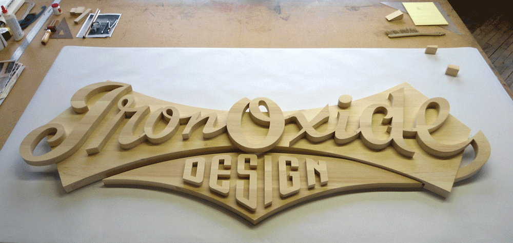
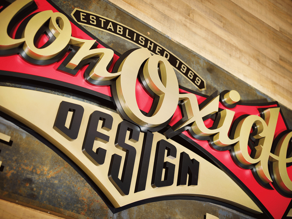
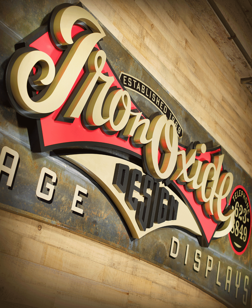
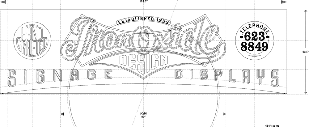
The Making of the IRON OXIDE DESIGN Sign. Three-Dimensional. 40 1/2″ high x 138″ wide x 5 1/2″ thick
“With no available drawings of the 105 year old building I began by photographing the destined sign location below one section of my third floor windows. I then scaled that photograph up, made a full size card pattern and checked it in the installation area to prove out the dimensions and arch shape.
“It was decided that the full version of the logo would not work well in this space so I made a scale model of the sign blank for Michael. I sent him vector art of the sign blank shape and dictated the background of the sign would be oxidized metal sheets and that his Iron Oxide script was already committed to be 80″ wide. Michael took over the design from there and I began to plot out full size paper patterns of the script and it’s background shield.
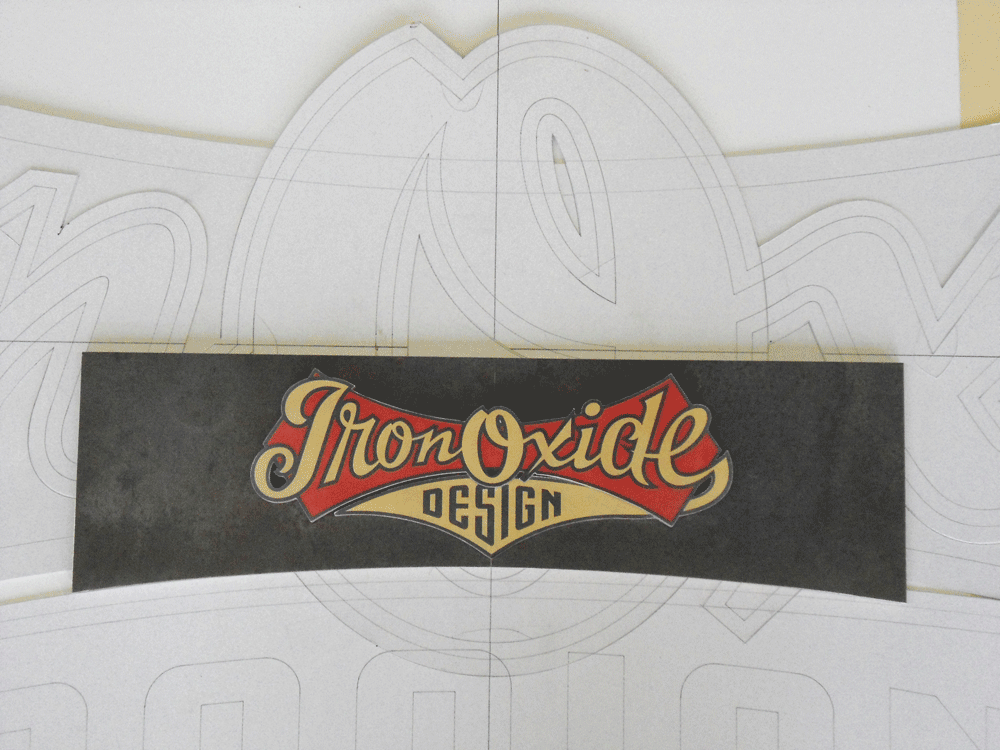
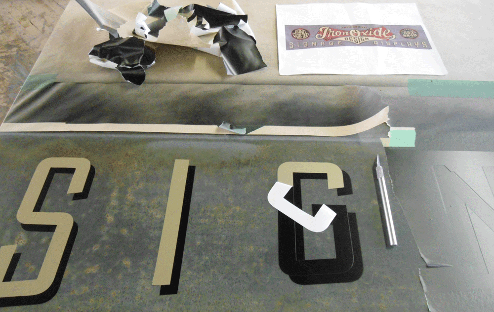
“I milled rough cut select Pine, glued and clamped it up into oversize blanks for the different layers that I had decided to use in the multi-layered three-dimensional logo script. As my sign was on a third floor in height and to be viewed from about 150 feet away I thought that to really convey the three-dimensional effect I was after I would have to be aggressive and chose to over compensate in layers and thickness. I assigned the first layer to the metal clad sign blank then broke Michael’s vector art up into the red shield and the gold tail of the “e”. These were on the same plane but of different thicknesses. Next layer would yield the black outline of the Iron Oxide script and finally the actual cut out script characters. The pending design copy from Michael would be painted directly onto the oxidized metal background.

“Patterns now generated, I transfered them to my Pine blanks and cut out all the individual letters and logo elements using either my 50 year old Oliver pattern makers scroll saw or my slightly more modern Hegner scroll saw. Vector art was flawless, so it was just a matter of splitting that pencil line as I cut.
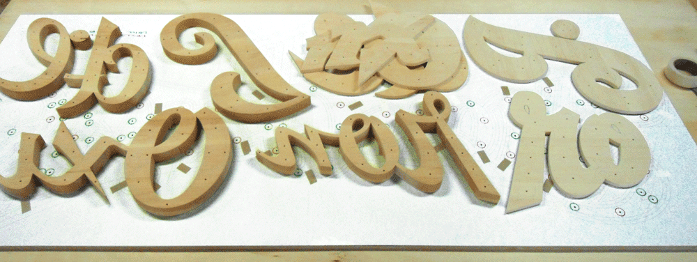
“Translating Michael’s logo design into the three-dimensional realm was simple enough but proved a little time consuming at the stage where I had to descend the tail of the “e” by 2″ from the script layer to the metal sign blank layer. As well, it had to pass under and through the red shield. I built up wood on the end of the “e” and between the band saw, chisels and plenty of hand sanding I was able to fashion the profile. I routed a path in the underside of the red shield to accommodate the tail.
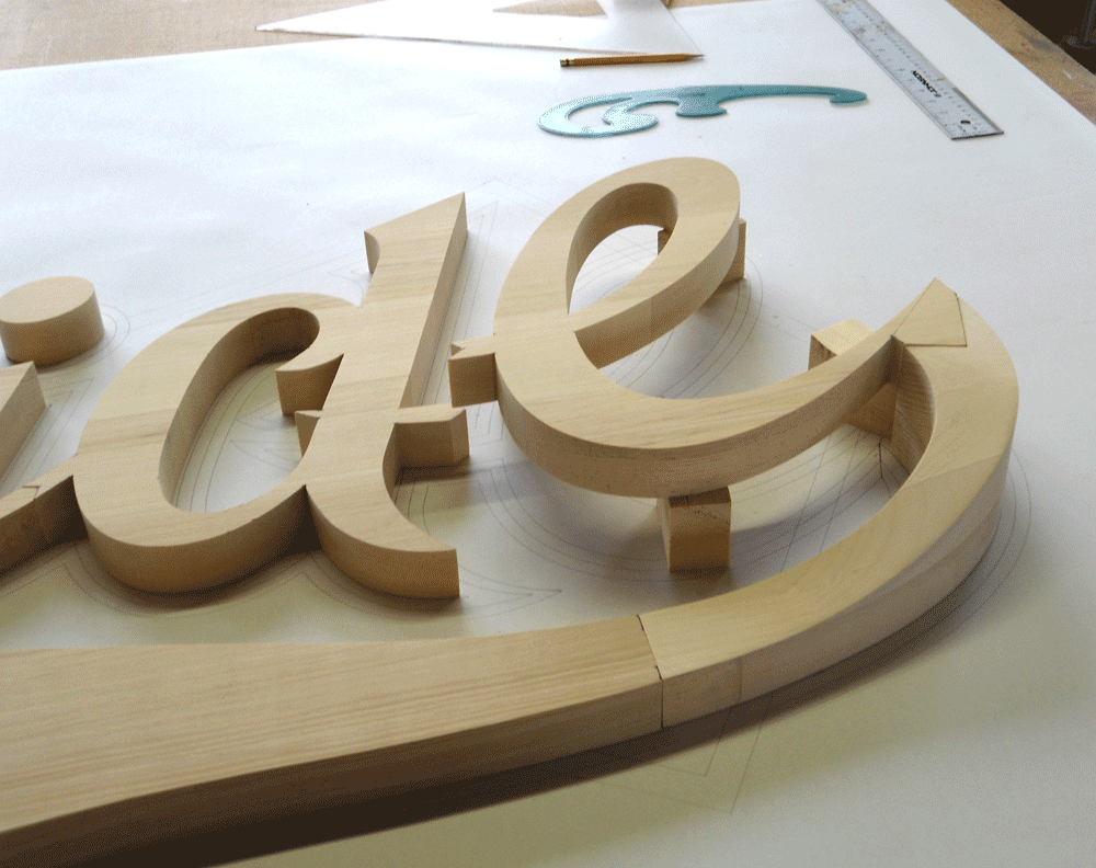
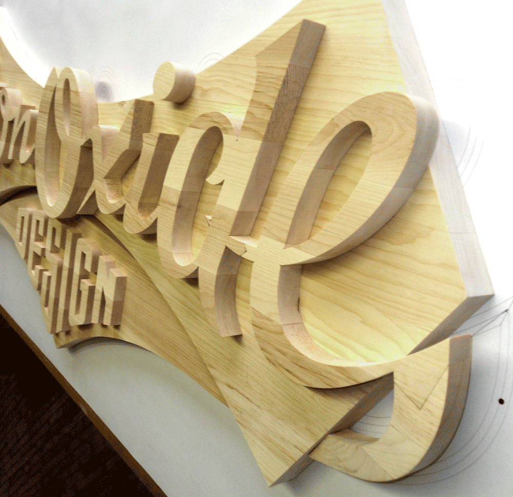
“All wood characters were then primed and sanded three times and sprayed with two coats of exterior paint.”
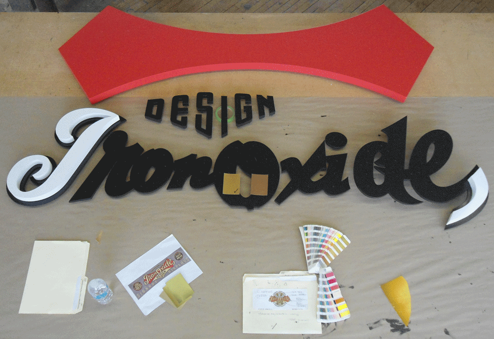

Et voila! The finished sign finally emerges. The following photos were taken indoors by Bryn Gladding, prior to exterior installation.

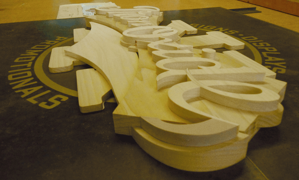
The making of the IRON OXIDE DESIGN interior door sign. Three-dimensional. 28″ wide x 40 1/2″ high x 3″ thick.
The interior sign was scaled down considerably from the exterior one, and utilized the full logo as designed. Blaine Casson writes about its fabrication:
“Working in Poplar wood this time, the production of my interior door sign was basically a downsizing of the exterior fascia sign project.

“I changed things a little bit given that this time I was reproducing the full “as designed” version of my logo. I eliminated the separate cut out layer for the script’s black outline and made it integral with the cut out shield layer, differentiated by painting the outline profile. I also painted “DESIGN” rather than individually cutting out the characters as I had on the fascia sign.

“I routed out the back of the shield to accommodate the “X” element as in the logo design it peeks through the area between the shield and the underlying tail from the “e”. This guaranteed alignment over the other option of cutting up the “X” and butt jointing the sections against the shield.”
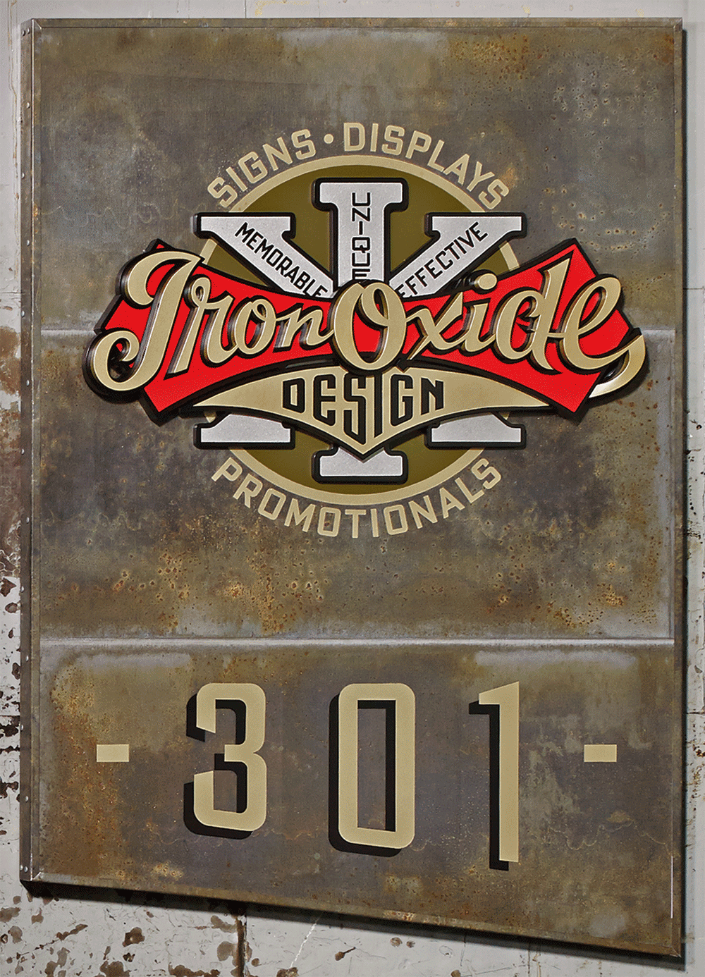
Finally, below is the full version of the logo as used for interior signage in Blaine’s loft building.
Client, Signage Fabrication, Progress Photography: Blaine Casson – Iron Oxide Design
Photography–Finished Signage: Bryn Gladding
Oh Canada! Logo Project for Iron Oxide Design Part 1 of 2
January 8, 2014 on 11:01 am | By Michael | In Gigs, News | No Comments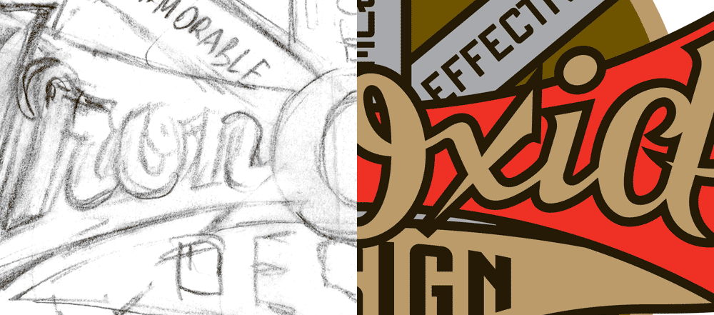
When I was first contacted for a logo design project by Blaine Casson, who runs a one man shop up in Cambridge, Ontario (near Toronto)—that handcrafts three dimensional wood signs, custom promotional pieces, and presentation cases—I was absolutely blown away by the quality of the work he was producing. Blaine specializes in raised letter wooden signs—something one doesn’t see that often in this “Age of Vinyl”. I have not seen his extremely high level of craftsmanship and attention to detail in such a looong time! He wanted me to design a logo for him, and saw in me a “kindred spirit”. We both gravitate towards a lot of the same types of vintage graphics and ephemera for certain types of inspiration. So I felt absolutely certain that whatever I did for him would be manifest perfectly in three dimensions, down to the smallest detail. I also knew that certain problems which I could never forsee in the fabrication of dimensional signage would be handled with sensitivity and with an extremely high level of problem-solving. Blaine wanted to move the design in a direction that I totally concurred with—using vintage motorcycle decals as a source of inspiration:

Blaine writes about these graphics:
“Beautiful cast metal logos affixed to the radiators of the automobiles of the day. Fantastic, colorful and complex water slide transfer decals on the gasoline tanks of the many hundreds of brands of motorcycles. I am mesmerized by the logos on antique motorcycles and have actually once added a motorcycle to my collection based on the decals over the mechanical attributes of the machine. A most interesting fact to me is that in the first year of some motorcycle companies existence, when they only produced a single or two or three machines, they would send the gasoline tank over to the local sign writer to get the company name hand lettered onto it. Sometimes the sign writer’s style and skill on this lettering became the genesis of the companies logo. As production increased in later years the sign writer was replaced by transfer decals but the hand lettered look often remained and was carried on.”
I saw working on this project as an opportunity to tap into this rich history—an area into which I had not delved in quite a while. There is so much in this tradition to sink one’s teeth into. I love the limited color palettes, predominently using gold and silver, the thick, heavy, black outlines, the swashes (you know I love those!), and the way type and lettering are organized within banners and shapes.
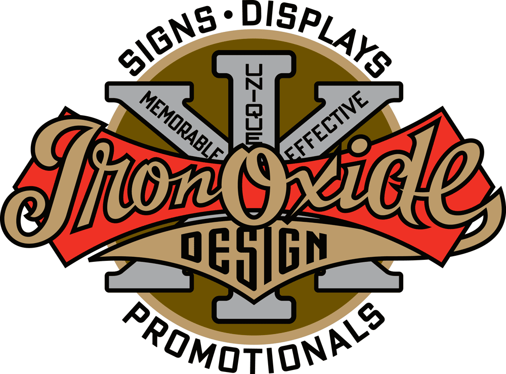
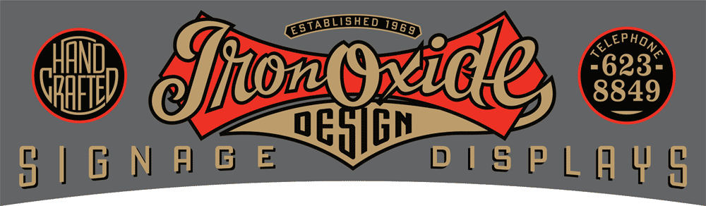
Blaine had quite a bit of information he wanted to be included in this design, because it was not only going to serve him as a logo, but as signage outside and inside his business—an old brick factory building in Cambridge. Words like “Signs • Displays • Promotionals”, and “Memorable • Effective • Unique” suggested advertising slogans from a bygone era. Never one to shy away from a challenge, I started putting my pencil to paper.
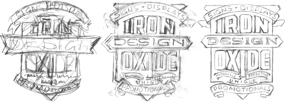
It’s important for me to try different configurations, to see how organizing the words in different sequences and relationships might either hide or illuminate what we’re trying to communicate.
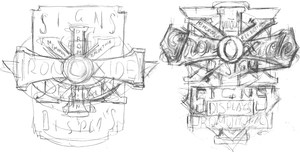
When I came up with the layouts above, I was directly referencing the Excelsior decal seen at the top of this page. I could easily justify turning the “cross” into an “I”, and using the “X” as a motif definitely seemed to fit in with the word “Oxide”.
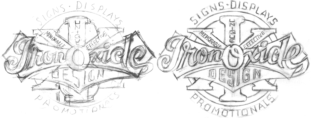
But the layouts seemed to be overly busy and a bit confusing, so I took the elements from the center of the design and re-worked them, playing down the secondary slogans quite a bit. I was quite happy with how the design was shaping up, and Blaine concurred.
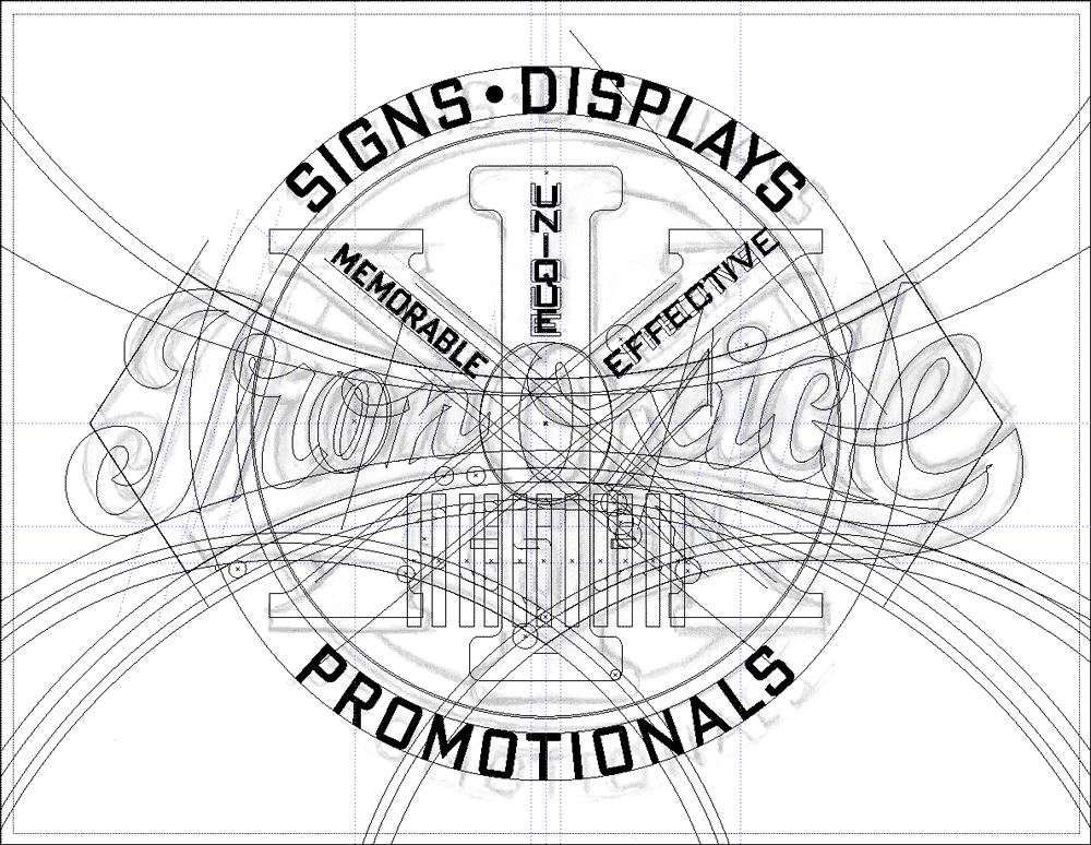
Then, placing my rough drawing on a Template layer in Illustrator I proceeded to flesh out this artwork. I used my font DeLuxe Gothic Condensed for the slogan words, and set up various arcs and curves that I would follow closely. Before I worked digitally I would have done a much tighter pencil drawing, working out all the fine details before inking, but now I do that in this Illustrator stage, using a rougher pencil drawing.

I hadn’t figured out color at this point in the process, so in Illustrator I just randomly assign different black, white, and grays to the different elements so that they separate and can clearly be seen one against the other. Also at this point I hadn’t yet decided what would get an outline, and what would be solid, but it’s still important in this phase to work out shapes and relationships to make sure everything is going to work.
When I completed the artwork Blaine wrote:
“You nailed the feel, the era and the complexity that I was after. The outlined gold script, the swoop of the tail on the lower case ‘e’, the big ‘X’ element and especially the slightly cramped and varied kerning and stacking of the lettering within the ‘X’ and the ‘I’.”
For the very large sign that was to be installed outside the third story windows, we needed to make some major alterations to the design. It needed to be fit into a long narrow space between the two floors, and have a very long arc along it’s bottom edge. Blaine sent me these sketches (above and below) as a suggestion for how he thought it could work.
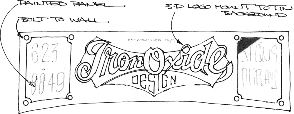
I then came up with this rough sketch on wording and placement—some of it could be typeset, other parts needed to be hand-lettered:

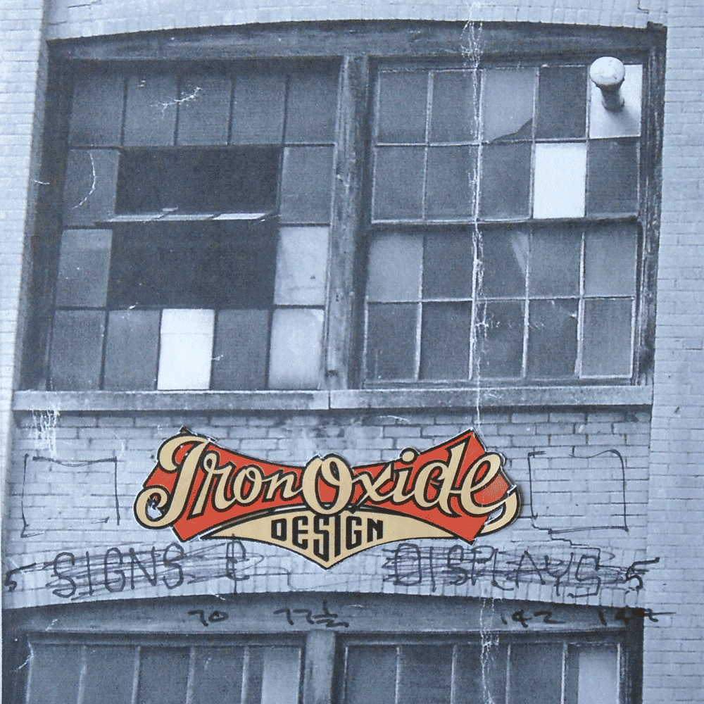
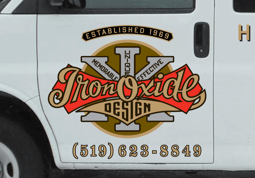
With the designs for the main logo and the horizontal exterior logo completed, the one other adaptation that needed to be addressed was for the Iron Oxide delivery van. We opted for a simpler solution, reverting to the original design, but adding a few elements.

The tendency these days is to “wrap” a vehicle, covering it completely with graphics, but we decided in this case that simpler was better, opting for a cleaner look, having the white background of the truck set off the logo.
But the most exciting part of this project was yet to come. For me that was the actual fabrication of the signs by Blaine in three dimensions, cut out of wood and metal, and painted. Exciting for me because this was going to be an interpretation—not a literal translation. I would get to see how someone else chose to solve certain design problems that were inherent in translating something from two dimensions into a truly dimensional piece of art. So stay tuned for Part 2 of this story . . . where I document how a master signmaker exercises his craft . . . coming soon!

Powered by WordPress and Nifty Cube with Recetas theme design by Pablo Carnaghi.
Entries and comments feeds.
Valid XHTML and CSS.