 |
|
Archive for October, 2009
Podcast Interview on PodKISSt
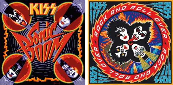
October 30, 2009 on 5:54 pm | By Michael | In Gigs, News, Wayback Machine | 2 CommentsAfter doing my first live radio interview for WXRX I did another, slightly longer interview for the KISS fansite “PodKISSt“. In this interview I discuss influences on my work, how the two covers for KISS came to be, the limited edition prints of those covers, international problems with the KISS logo, crazy fans, and some advice for budding young artists out there.
Fonts In Use – Major League (In a Minor Way)
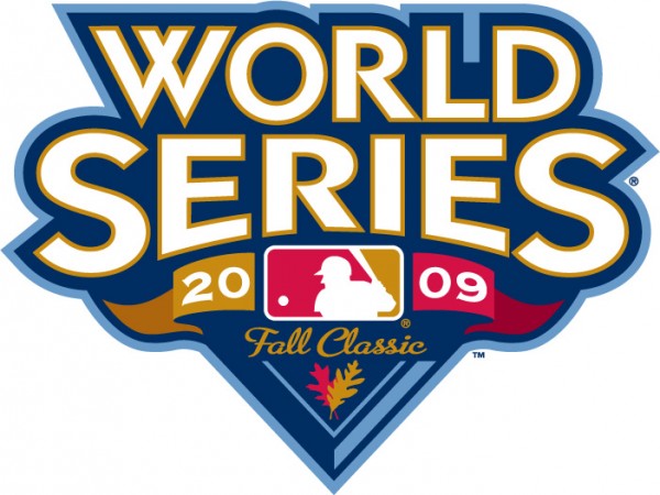
October 24, 2009 on 2:32 pm | By Michael | In News, Wayback Machine | 1 CommentRecently Andy Heckathorne brought to my attention that Major League Baseball had used Metroscript in their logo for this years World Series logo. Admittedly it’s not a major part of the design, but as Andy pointed out “It’s the WORLD Series!”.
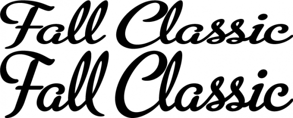
In the Metroscript Manual I wrote that “You can change the proportion of the set type by scaling it either horizontally or vertically.” The designer here has really pushed the reproportioning by scaling the type vertically at 72%. Below the sample is the un-reproportioned type. I don’t know who the designer is who worked on this logo, but if anyone out there knows and wants to send me that info I’d like to properly credit him or her.
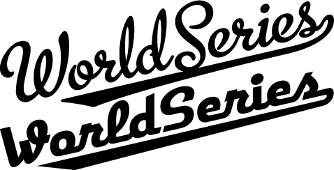
Actually I’m no stranger to the World Series logo, having actually designed it once some years back. I wasn’t terribly thrilled with this design (below) so I tweaked it a bit a few years later, and that newer version is the one I now show on my website.
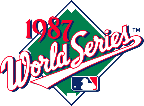
It was interesting for me to notice that the letterforms I used in this logo were in some ways precursors to the forms in both Metroscript and Deliscript.
I’d been using script letters similar to these in my assignment work for years before creating those fonts.
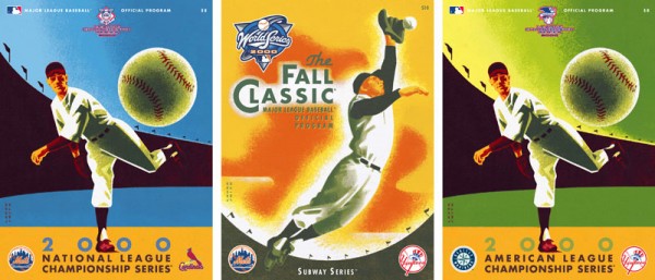
While I’m on the subject of the World Series, as a side note I thought that it might be worth mentioning that my wife, illustrator/designer extraordinaire Laura Smith, did a series of illustrated scorebook covers for Major League Baseball for what became known as the “Subway Series” in 2000.
Alphabet Soup Fonts In Use
October 2, 2009 on 3:24 pm | By Michael | In News, Notes | 4 CommentsFrom time to time people send me (or I find on my own) examples of how other designers have used my fonts. Sometimes these samples are really wonderful. So when I come across examples that I feel are unusual, different or extremely well-done, I’d like to post them here. Recently I posted an example of how Metroscript was used in the movie “The Hulk“. I would welcome submissions from anyone who would like to email them to me.
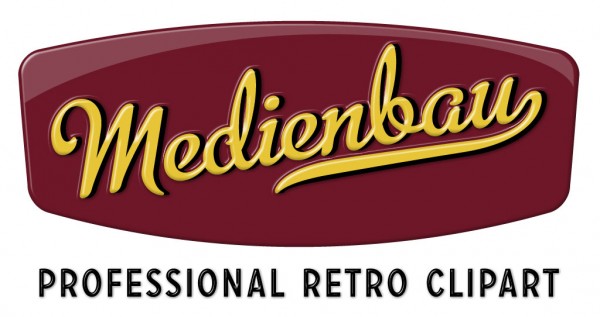
My first posting in this series comes from Switzerland and was sent to me by its designer. The font is again Metroscript. Usually I’m not a big fan of extruding type dimensionally—I’m kind of a type “purist”. But I thought that this one was done really well, keeping it simple and avoiding the temptation to just keep going and going. I love its simple colors and clean lines. Somehow the designer has taken what I feel is a very “American” font and imbued the design with a very European flavor.
It was sent to me by Bernhard Huber who asked that the credit read as follows— Design: Medienbau, Agentur für Konzept und Design, Switzerland
Powered by WordPress and Nifty Cube with Recetas theme design by Pablo Carnaghi.
Entries and comments feeds.
Valid XHTML and CSS.
