 |
|
Archive for October, 2010
“Steinweiss Script”…Soon to be Released
October 31, 2010 on 9:37 pm | By Michael | In Gigs, News | 6 CommentsBack in the summer of 2009 I was contacted by Josh Baker at Taschen Publishing about doing some work on the huge commemorative edition they were putting together on the work of Alex Steinweiss. For those of you who are not familiar with that name, Mr. Steinweiss is considered to be the inventor of the album cover as we have come to know it—as a kind of mini-poster with graphics relating to the musical content of the album. He produced hundreds of covers for 78 RPM albums between the late 1930s and the late 1940s. Of course I was thrilled to have anything to do with this project.
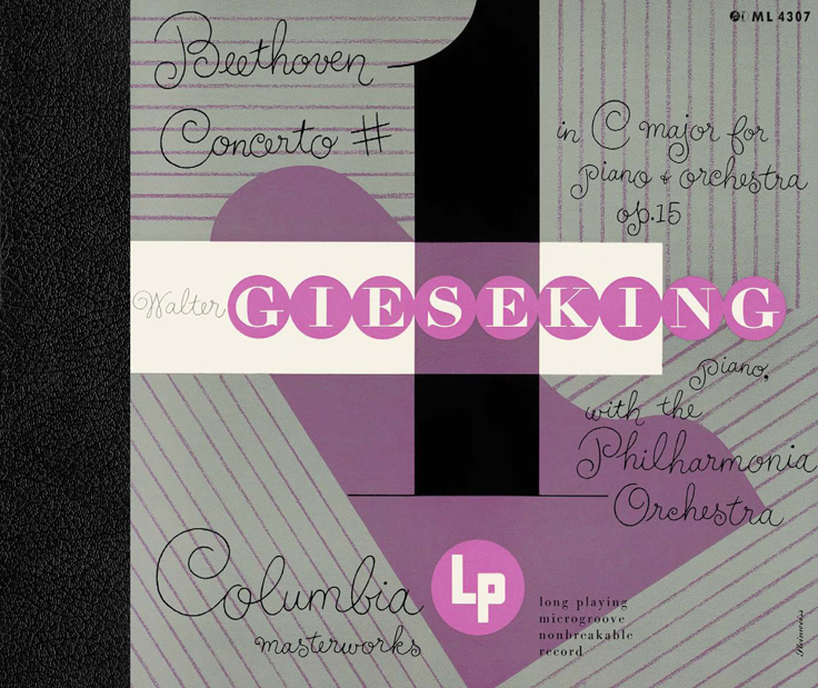
My assignment was to do some lettering for the cover and title page that was in the spirit of Mr. Steinweiss’ very graphic calligraphy, which had become known as “The Steinweiss Scrawl”. This “scrawl” had become ubiquitous and inextricably associated with his work. Here’s an example of one of his album covers:
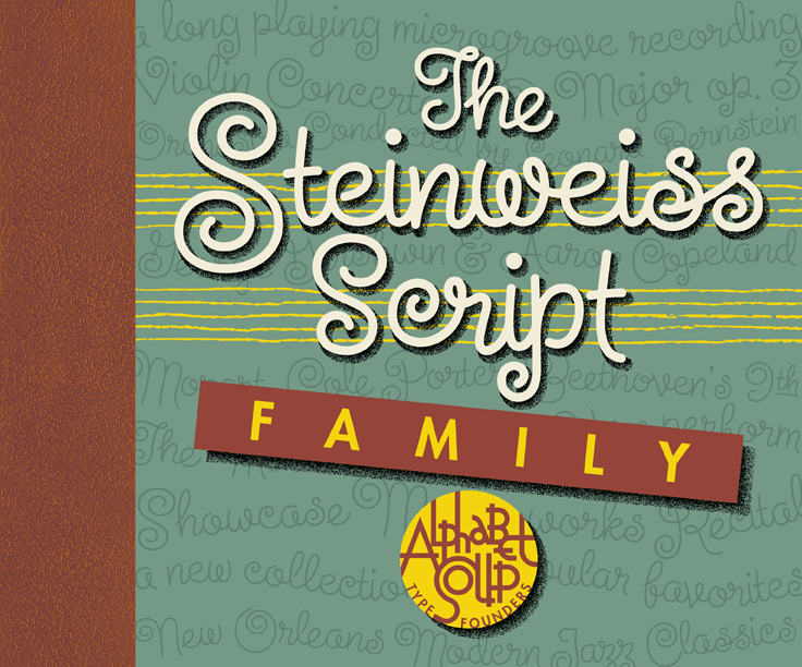
Steinweiss’ calligraphic work was very spontaneous and kinetic, while the work of lettering artists tends to be more carefully studied and worked out. So it was a bit of a challenge to try to capture that spontaneity in my piece of digital art for Taschen’s cover—as seen below:
While I was working on this, Josh and I had discussed the possibility of doing similar lettering for all the different chapter headings and headlines throughout the book (about 16 of them), but decided that it wasn’t practical for budgetary reasons. The subject of creating a “scrawl” font was also discussed, but was nixed for the same reason—in addition there wouldn’t have been enough time to do it: creating a font from scratch can be a very time-consuming process.
Around 1951 Alex Steinweiss had actually created a font called “Steinweiss Scrawl” for Photo-Lettering. (Coincidentally my first job after graduating Cooper Union was as Ed Benguiat’s assistant at Photo-Lettering!). But this font was extremely limited in it’s capabilities, and although it had a certain bouncy charm and naïveté, in my opinion, it didn’t really capture the fluidity of Steinweiss’ calligraphy: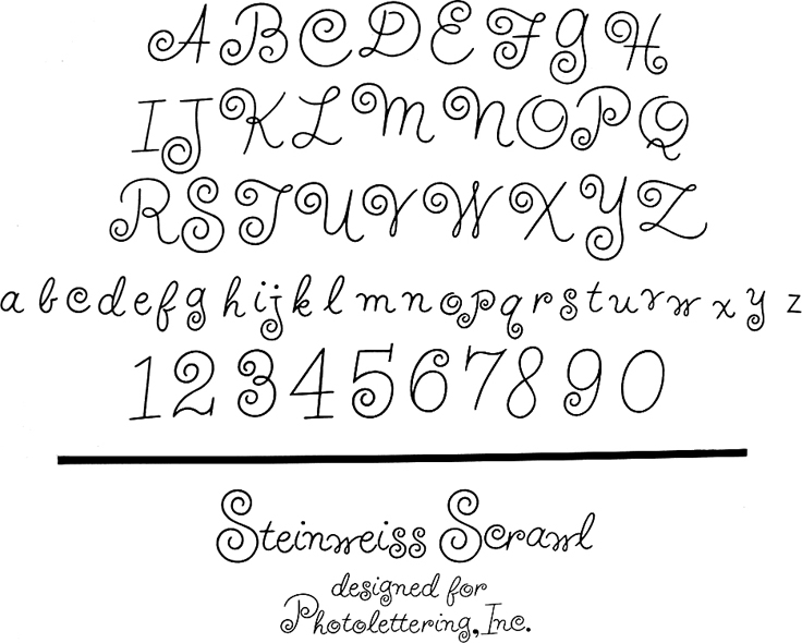 At any rate, shortly after completing the Steinweiss project for Taschen, I decided to pursue on my own the design of a font in the spirit of his calligraphy. The challenge was enormous—to create a typeface that retained the sense of hand-letting and fluidity within the context of a digital font. Where Steinweiss’ scrawls were all slightly different from each other, shifting and changing according to the needs of a particular cover design, a font designer has to commit to specific forms that need to be set in stone, so to speak. In this particular font, the “managed” nature of the design had to appear to be “unmanaged”!
Part of my solution was to create the typeface with a ton of alternates, lowercase ligatures, and caps/lowerase ligatures. Creating this as an OpenType font would be the only way to wrangle these thousands of pieces together into a coherent typeface design. Luckily I was able to count on the expert programming help of Patrick Griffin of Canada Type. Also, I was fortunate enough to be able to contact the Steinweiss family through Taschen, and get the official Steinweiss approval for this font design.
At this point until the fonts are released (very soon!), for those interested in seeing more, you may download “The Steinweiss Script User’s Guide” that I’ve just completed (about 1.2 MB).
In a nutshell, here’s how the fonts are organized: “Steinweiss Script” is a family of fonts in three weights: “Steinweiss Script Light”, “Steinweiss Script Medium”, and “Steinweiss Script Bold”. Additionally, within each weight there are three variations: Simple, Fancy, and Titling. These relate to the size/ratio of the caps to the lowercase, the complexity of those caps, and the size of the ascenders/descenders on the lowercase characters. The reason for all this is to add usefulness to the font, making it accessible not just for headlines, but for longer passages of text as well.
I am going to try to release these fonts within the next week or so. Please stay tuned for more information! I will announce here as soon as they go live.
Graphic Artists Guild Talk – October 23rd
October 12, 2010 on 4:36 pm | By Michael | In News | 3 CommentsIf you missed my talk at TypeCon in July, you’re in luck! I’ll be giving another dog and pony show to the local Graphic Artists Guild chapter in downtown LA on the evening of October 23rd. I’ll be talking about what inspires me by discussing the creation of the Guild’s logo, the design of the new Canter’s Deli Food Truck, and Alphabet Soup Type Founders. All are welcome—Guild and Non-Guild members alike!
Check out the particulars on the Graphic Artists Guild /LA website.
PEGs Cover Released w/Laura Smith Artwork
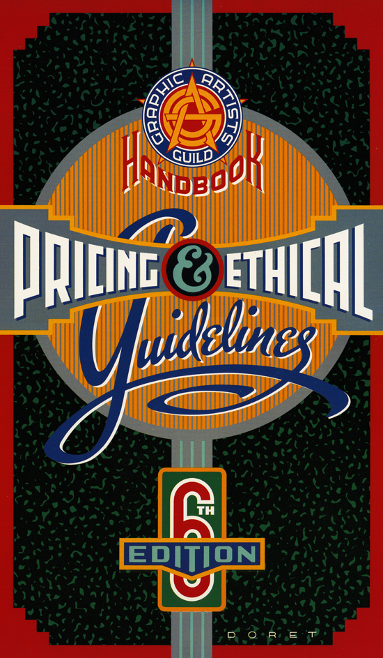
October 1, 2010 on 1:29 pm | By Michael | In Gigs, News | 3 CommentsYears ago I designed the cover for the 6th Edition of the “Graphic Artists Guild Handbook–Pricing & Ethical Guidelines”. I’d like to believe that my cover helped start a tradition of having excellent covers for the Guild’s main publication. Among the previous cover artists have been such luminaries as Lou Brooks, Noah Woods, John Hersey, and Richard McGuire—each with a decidedly different point of view and aesthetic. Now my wife, illustrator Laura Smith has joined that grand tradition.
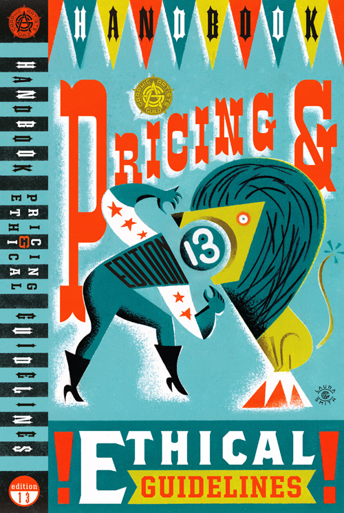
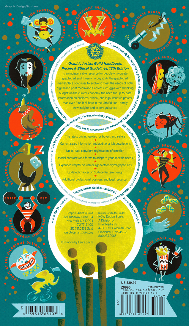
The Graphic Artists Guild has just released the 13th Edition with Laura’s beautiful work gracing the front back and spine:
The cover artists chosen by the Guild for the this project have always been given free reign to come up with a theme that would be carried through the book. Laura chose a circus theme since two things she loves are storybook illustration and circus imagery. This is especially evident on the back cover of this book where she’s created and written copy for an elaborate series of spots highlighting in circus/storybook style various aspects of the business of design and illustration:
Laura has always been one of the few illustrators who understands how to completely integrate typography into her illustrations, and this cover really demonstrates that fact. The Guild has chosen to highlight Laura and tell more of this story in their Member Spotlight. But also please check out the rest of the Graphic Artists Guild website—it’s the only organization that’s totally devoted to promoting and protecting the social, economic and professional interests of all graphic artists.
I will be headlining an event that the LA Chapter of the Guild will be holding later this month in downtown Los Angeles . . . but more about that later.
+++++++++++++++++++++++++++++++++++++++++++++++++++++
I wasn’t going to post the PEGs cover I designed back in the day, but since Ms. Blake asked, here it is. Side note: the beginnings of the style that eventually became my Metroscript font can be seen in the word “Guidelines”.
Powered by WordPress and Nifty Cube with Recetas theme design by Pablo Carnaghi.
Entries and comments feeds.
Valid XHTML and CSS.
