|
|
|
Archive for May, 2008
What I Do (#2 of 3)
May 29, 2008 on 1:46 pm | By Michael | In Notes, Wayback Machine | No CommentsI created a teeny-tiny niche for myself when I started doing “letterforms” art—this was back in the ‘70s. For me that time was a low point for typography. There wasn’t that much going on design-wise that held my interest. I felt at the time that illustration and typography/lettering were seen and treated as two seemingly unrelated disciplines. To my mind typography had become uninteresting and was hardly ever fully integrated with images—whether they were photographic or illustrative. At the time the very popular modernist movement (as typified by such designers as Rudolf de Harak and Chermayeff & Geismar) represented a way of approaching design that for me held very little interest. When I looked back a few decades at the rich history of ephemera in this country it seemed that we were in visually lean times.

Early work by Rick Griffin (l.) and Victor Moscoso (r.)
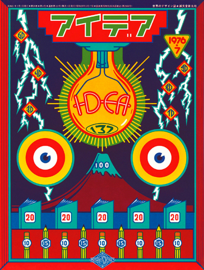
While a student at the Cooper Union I was very taken with the “psychedelic” posters that had appeared on both coasts. The work of such artists as Victor Moscoso, Kelly & Mouse and Rick Griffin had a huge impact on me with their unusual use of color and integration of letterforms and striking images. Of course I don’t think I could have verbalized any of this at the time, I just knew what I liked—and wanted to see more of those sorts of things. So I started to create custom letterform solutions, working and collaborating with illustrators—specifically Charles White III and Doug Johnson. I soon realized that I myself could also be a maker of images and so, after gaining a little self-confidence, started to take on projects where the image and the typography associated with it became more integrated with each other—at times becoming one and the same. I guess this was to become my “thing”—the integration of letter and image. Soon, other young designers began imitating what I did. At the time I kind of resented it as “plagiarism”, but I soon realized that imitation was the most sincere form of flattery. Over the years my “imitators” branched out and found their own voices. So it’s gratifying to see that in some small way I may have influenced a generation of designers.
What I Do (#1 of 3)
May 27, 2008 on 4:40 pm | By Michael | In Notes, Wayback Machine | 3 CommentsPeople are always asking me how I ended up doing what I do. They also want to know if what I do has a “name”. My intention was never to set out to be a “lettering artist”, but somehow I always gravitated towards solving communication problems with letterforms. I guess in some ways I’m a designer who works like an illustrator. I have done work of all kinds in all sizes—from billboards to postage stamps, from logo design to labels, from CD covers to signage—and then of course there’s font design.
I don’t feel it’s ever a good idea to try to fit one’s work into categories or niches: what I do overlaps several categories: illustration, graphic design, lettering, typography and font design. What I usually tell people is that I’m a “letterforms” artist—a definition vague enough not to be too confining, but at the same time giving a little more emphasis to the “lettering” part. How I ended up “inventing” this genre (I hope that doesn’t sound too immodest) is a whole other matter. I don’t want to give myself more credit than I actually deserve by focusing on this, but people are always asking how I got here . . . so, if you’re interested, stay tuned for my next post for more of the backstory.

Fame Has It’s Drawbacks…(sigh)
May 13, 2008 on 8:08 am | By Michael | In Notes | 2 CommentsSomething I hear quite frequently runs something like this:
“You’d have been perfect for our project, and I’d have hired you in a minute, but you know, we probably wouldn’t have been able to afford you.”
Well, many of the instances that clients believed this to be the case would actually have worked out just fine. If I had to depend only on the big-budget projects for my livelihood I’d probably go broke. The truth is I work for all kinds of clients, big, small and in-between. Many times the most interesting projects are the ones that don’t have the huge budgets. There sometimes seems to be a direct inverse correlation between budget size and creative freedom. Often we can find a way to work something out.

Just as an example, a recent project of mine was to do logos for a pair of Los Angeles restaurants—one in Beverly Hills, the other in the Los Feliz/Silverlake area—Dominick’s and Little Dom’s, two recent additions by restauranteur Warner Ebbink.
The budget wasn’t gargantuan, but we were also able to work out a situation where I was able to take advantage of his hospitality in exchange for my design expertise—it was win-win all around.
Powered by WordPress and Nifty Cube with Recetas theme design by Pablo Carnaghi.
Entries and comments feeds.
Valid XHTML and CSS.