|
|
|
Archive for the 'Wayback Machine' Category
John Waters’ “Cry-Baby” from Film to Broadway: Title Treatment Development
August 29, 2016 on 8:49 pm | By Michael | In Gigs, News, Wayback Machine | 1 Comment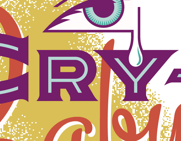
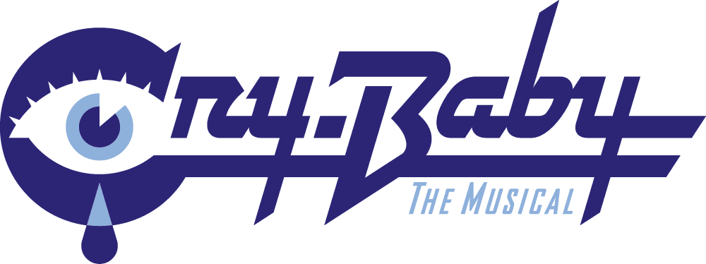
A few years ago I was asked to design a title treatment for the upcoming musical adaptaion to the Broadway stage of the 1990 John Waters cult classic film “Cry-Baby” which had originally featured Johnny Depp, Iggy Pop, Polly Bergen, Traci Lords, Ricki Lake, and Troy Donohue.
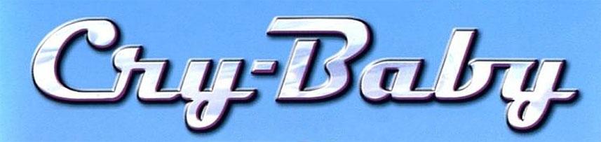
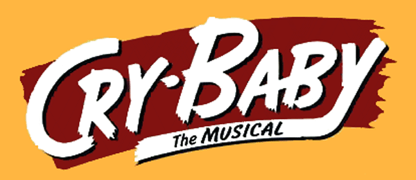
Below is the title treatment that was created for the film by others—which was simply the font “Magneto” with some added chrome effects:
“Cry-Baby–The Musical” was scheduled to open on Broadway in the Spring of 2008. The deadline on this job was unusually tight. I began work on November 15th. I had to deliver finishes by November 26th—eleven days later.
The first stage of any project is usually information gathering. In addition to a synopsis of the play, the info I received from the agency consisted of the following:
• Time Period: Early 1950’s (1950-1954/55)
• Style: Like all of your work, we need to respect the time-period but have a contemporary flair…in other words we took a 50’s logo and updated it for the 21st Century.
• We have 3 categories/styles that our Art Directors are focusing on: Pulp Fiction Book Jackets, Mad Magazine style, Early 1950s movie posters. I have attached some examples that I found on the internet when doing research for the project.
Here are two of the examples I was sent.
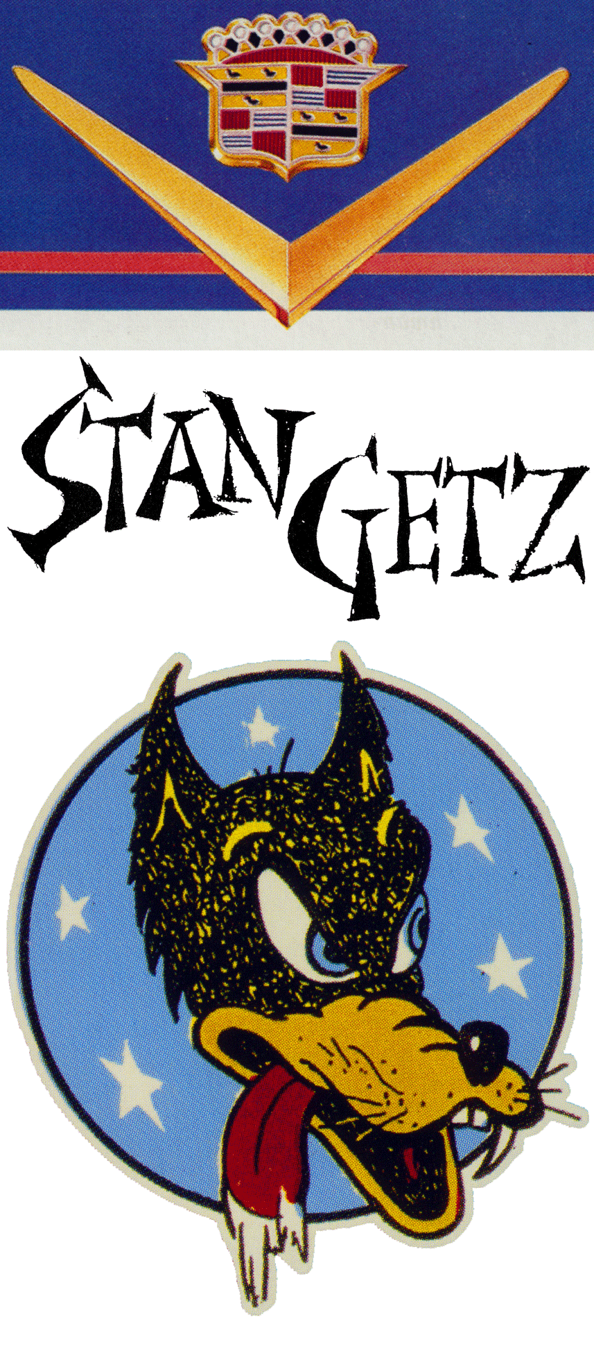
These examples were fine as far as type treatments on posters go, but a solution for “Cry-Baby” would probably have to go a bit farther in order to be able to stand on it’s own. I started doing my own research into the various genres that would be appropriate for this title treatment. In addition to the “Pulp”, “Mad Magazine” and “’50s Movie Poster” genres I felt that “Hot Rods” would also fit in nicely. I did my own research, coming up with many images such as the ones below:
I don’t use reference to “copy” from, but more to help me understand a mood, or set a theme, or push me toward a certain style. I might pull out 10 or more of my reference books—or sometimes none at all. It really depends on the project, and if my “creative juices” need a little jump-start.
Next I pick up a pencil and sketch pad and just start noodling and doodling. I might do many pages of these before I’m satisfied that I’ve got the germs of a few good ideas.
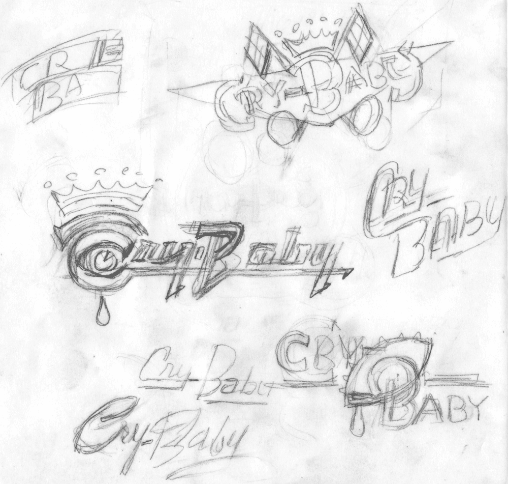
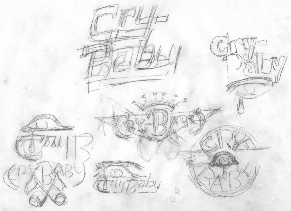
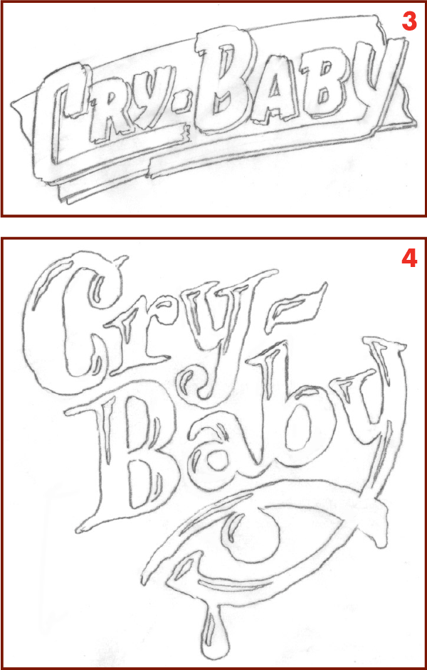
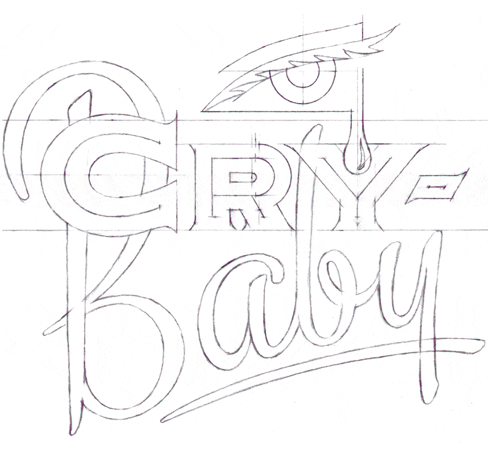
I‘ll go through all the pages of sketches, noting those that show some promise. In the case of this project, I picked out seven that I thought had potential and expanded them into rough pencil sketches that would be tight enough to present to the agency.
I try to provide graphic ideas that appear as different from one another as I can make them. Yet all of them should in some way fit within the parameters that were set out by the agency at the beginning of the project. Here is a little bit of the thinking behind the sketches:
The crowns in sketches 1 and 2 were suggested by one of the songs (“King Cry-Baby”) that appeared in the movie.
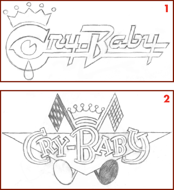
The letterforms in sketches 1 and 5 are references to “brightworks”– classic chrome car logos and ornaments of the ‘50s.
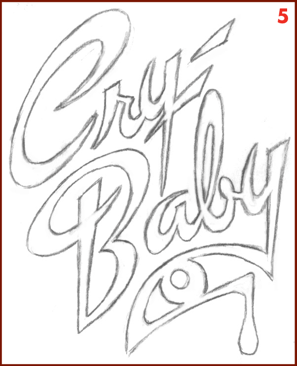
The letterforms in sketches 3 and 4 were an allusion to pulp novel covers and film noir and horror movie titles of the period.
Sketch 6 is a direct reference to hot rod decals. Sketch 7 is also a reference to hot rod decals and also to Matchbook covers.
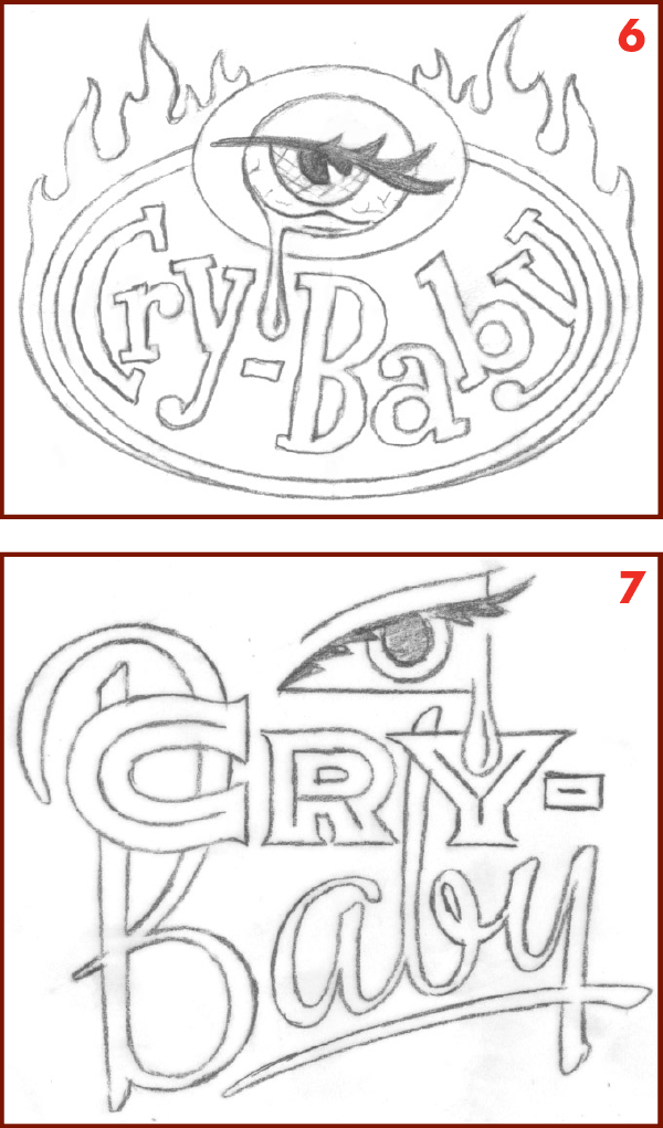
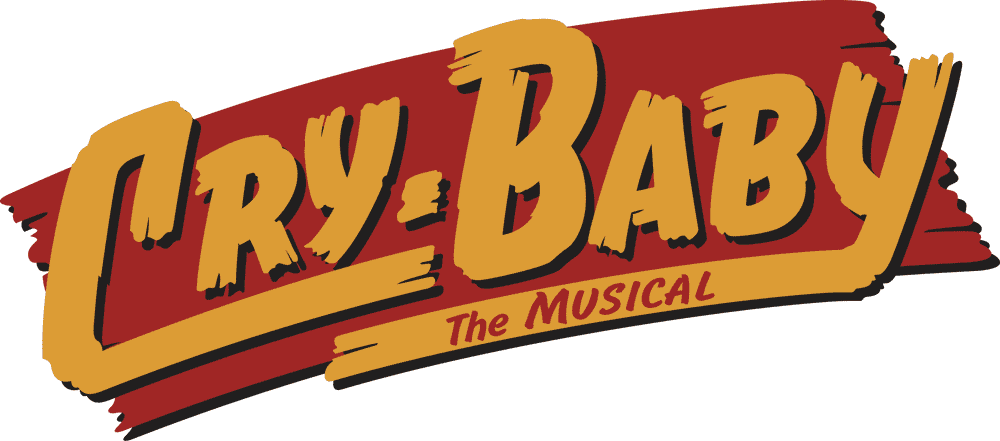
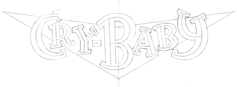
The agency asked me to bring three of the sketches to a level of finish where the producers would be able to easily visualize the treatments, and where the agency could insert them into their layouts. The agency felt that sketches 3, and 7 were fine as is. So I was to move ahead and take these three sketches to finishes in Adobe Illustrator. Typically the way I do this is to take a rough sketch and redraw it, making refinements and changes as required. Then I take the refined pencil and place it in a layer in Illustrator as a Template. Because of the impending deadline, there was no time to do redraws on most the designs, so I mostly had to make-do with the rough sketches as they were . . .
. . . except for #7 which needed a bit more detail and exactitude in the drawing before I could proceed to finish.
On sketch 2, the agency asked me to remove the racing flags/musical note motif. They also asked me to remove the crown motif, as the song “King Cry-Baby” would no longer be in the show. We discussed that it might be a good idea to change the triangular background to a V-8 “V” shape to reinforce the automotive connection.
Additionally, they asked me if I had the time before the deadline, if I could develop sketch 1—that would be great. As it turned out I was able to
squeeze in a finish on this one as well before the deadline. I also needed to edit out the crown on this design for the same reason as in sketch 2.
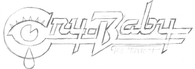
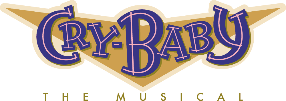
The one other thing I needed to add to these semi finished designs were the words “THE MUSICAL”. Of course I felt I should add those words in a way that would feel organic to the designs, and not “added-on”. I did a total of seven design solutions including the four you see above as finishes. The producers of the show selected design #3—the “pulp novel” style treatment. Unfortunately, and for reasons still unclear to me, this design (#3) was adapted and changed by others:
Sadly the show closed after only 45 previews and 68 performances.
#

A Stellar Poster for Simon & Garfunkel
March 23, 2015 on 8:13 pm | By Michael | In Gigs, News, Wayback Machine | 2 Comments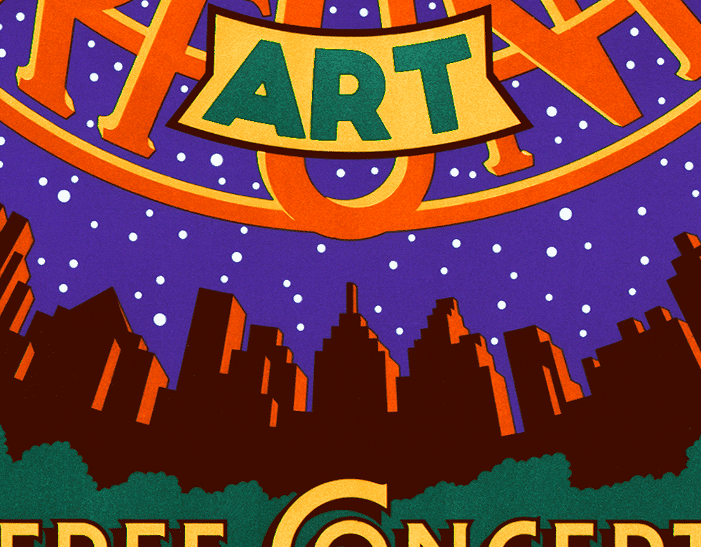
IF YOU’D LIKE TO PURCHASE A SIGNED COPY OF THIS POSTER, PLEASE
⬇︎ SCROLL TO THE BOTTOM OF THIS POST FOR INSTRUCTIONS ⬇︎
Back when I was doing fairly regular work for Time Magazine, one of their ADs—Irene Ramp—asked me if I wanted to do a poster for a reunion benefit concert for Paul Simon & Art Garfunkel that was to be held in Central Park. Irene was a friend of Paul Simon, and so putting Mr. Simon and myself together was fairly easy. Because of the many intervening years, I don’t anymore have my preliminary drawings or sketches for this piece, so here I would like to talk about my inspiration and how my ideas for the poster came to be.
Even as a young boy growing up in Brooklyn one of my passions was star-gazing. I remember saving up my meager allowance for months until I had enough saved ($42.15) to buy my own telescope. With my trusty “Jupiter” telescope (Made in Japan) I charted sunspots, gazed upon the craters and mountains of the moon, and saw the rings of Saturn. To help me find and recognize the constellations in the night sky I used a wheel chart I bought at the Planetarium called the “Star Explorer”. Apparently I was a young nerd in the making!
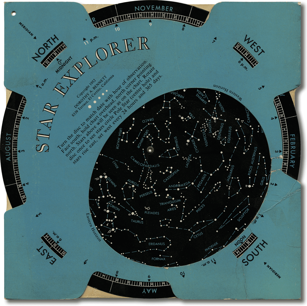
In addition to its usefulness I was fascinated by the graphics and the design—the representaion of the various star magnitudes by differently sized circles, and the seeming randomness of the star map in contrast with the beautiful geometry and design of the mechanism that made it all work. This strange beauty, born of utility, would stay with me for many years.
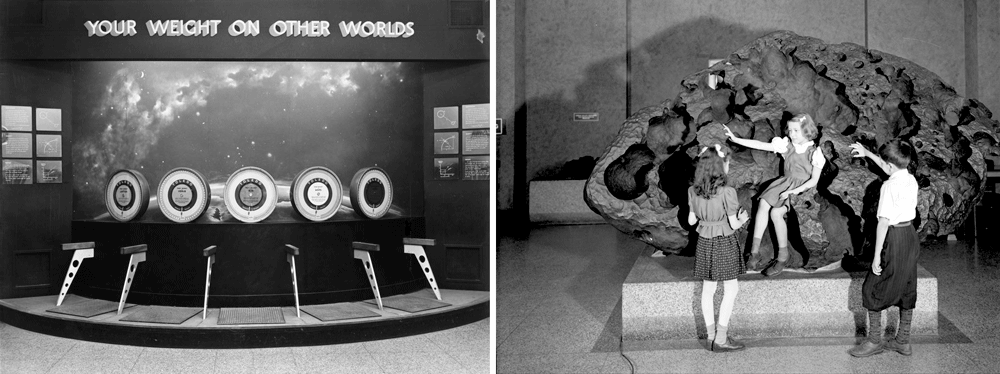
I had purchased the Star Explorer during one of my visits to the Hayden Planetarium. At my insistence, my parents took me there many times. The Planetarium was attached to Manhattan’s American Museum of Natural History (dinosaurs!), and I just couldn’t get enough of it. Whether it was seeing how much I weighed on Jupiter, or being able to touch an actual meteorite—or even just admiring the wonderful black light murals—I loved it all! But the best part (of course) was the sky show under the Planetarium dome.
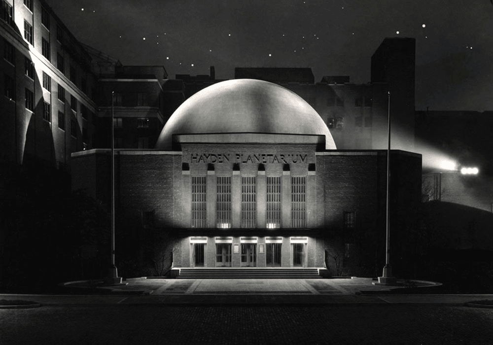
Since 2000 the Hayden Planetarium has been housed inside the new Rose Center for Earth and Space, and has been completely revamped and brought up to date.
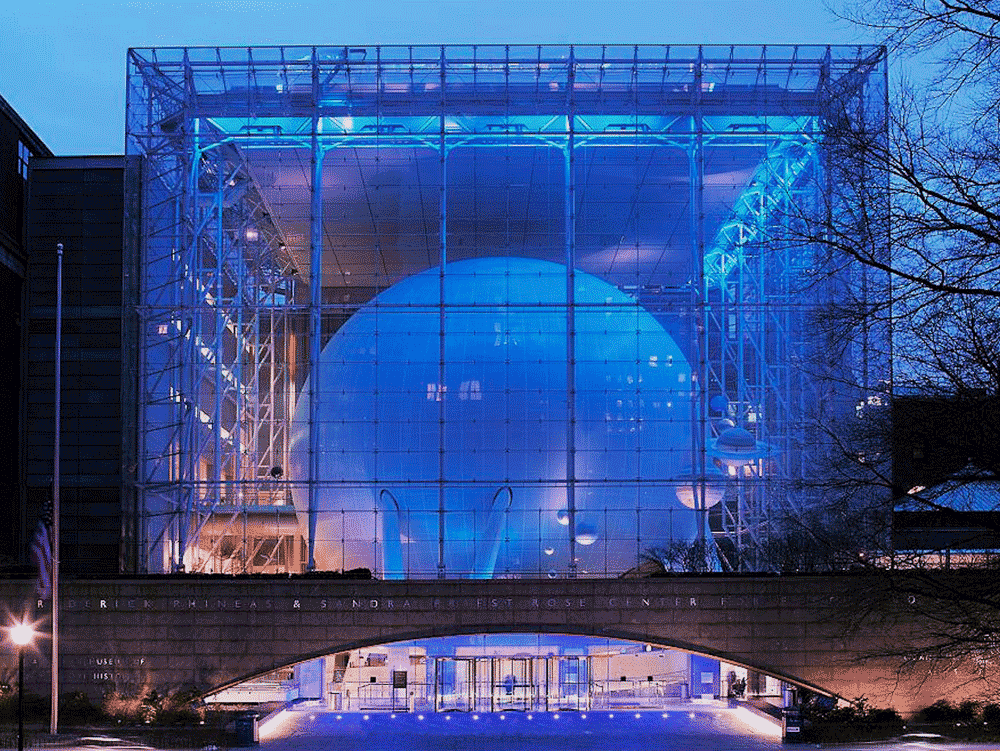
While the changes were needed, reflecting all the new technology and discoveries made since I was a kid, much has been lost, and I greatly miss all those things that had initially attracted and charmed me.
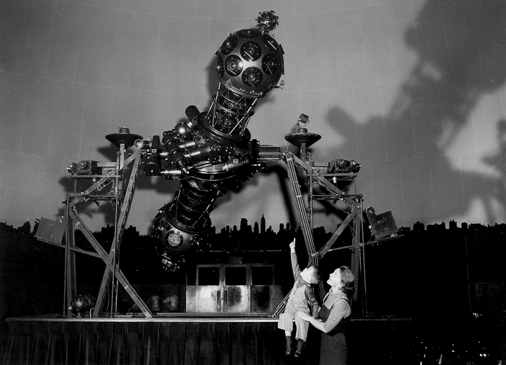
One of those things was the incredible look of the Zeiss Mark II projector. To me it looked like an alien spaceship or some sort of insect/monster. The new projector is a bit more high-tech and to my mind a little more visually nondescript. The other is that the projection dome is lacking one feature which I thought was great—and that is the wonderful silhouetted NYC skyline that surrounced you as the lights went down, simulating dusk.
I’m not the only one who thought the interior and projector were beautiful—it was the subject of a Fortune Magazine cover by John Cook.
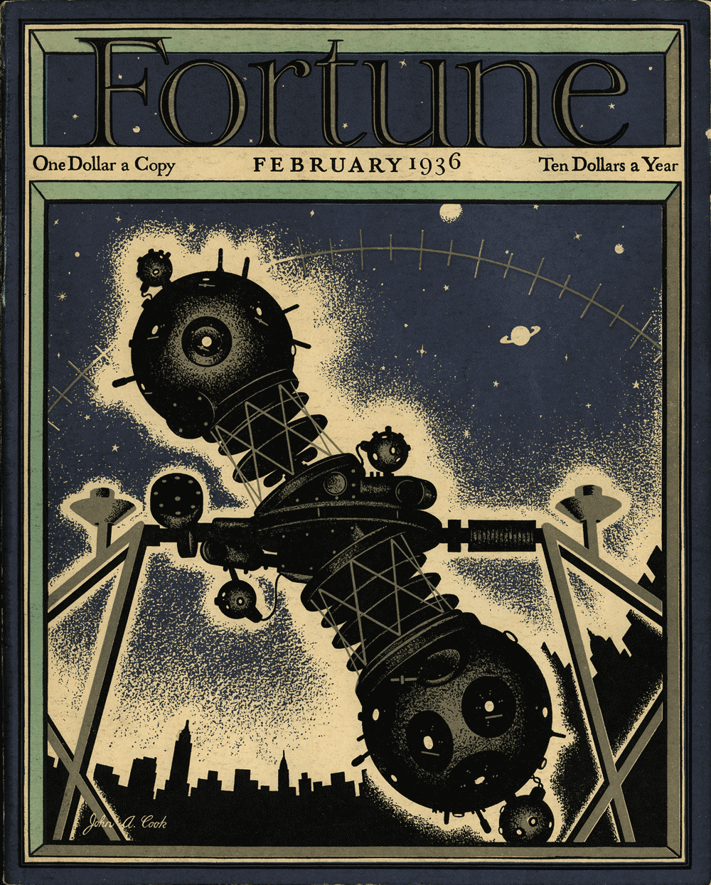
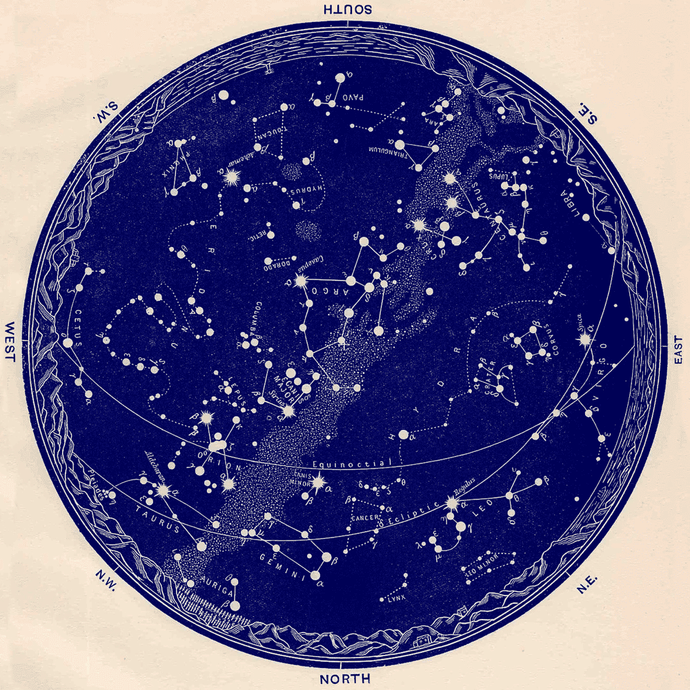
Note the prominent role played by that skyline silhouette in his art. When you settled into your seat for the sky show, having that skyline surround you really made you feel connected to both the sky and to the city—it was as if you were laying down in the middle of Central Park (which is right across the street) at night, and were gazing up at the stars surrounded by the city. For me that was really magical. Actually adding the local environment to star charts and such was nothing new as is clearly shown in vintage charts such as this:
All these things were in the back of my mind when I met with Paul Simon to discuss the direction the poster would take. Just the fact that the concert would take place in Central Park on a warm Fall evening led me to start thinking about what it might be like to be at the concert, listening to music under the stars. That led me to thinking about how much I loved the Planetarium (just minutes away from the concert site) and how it felt to be there, about my telescope, about star charts, but most of all about that magical NYC skyline. I knew that I had to incorporate them all into my poster. Luckily all parties agreed! The concert was a great success, attended by half a million, but the best thing was that despite the fact that it had rained all that day, the clouds parted and the stars came out.
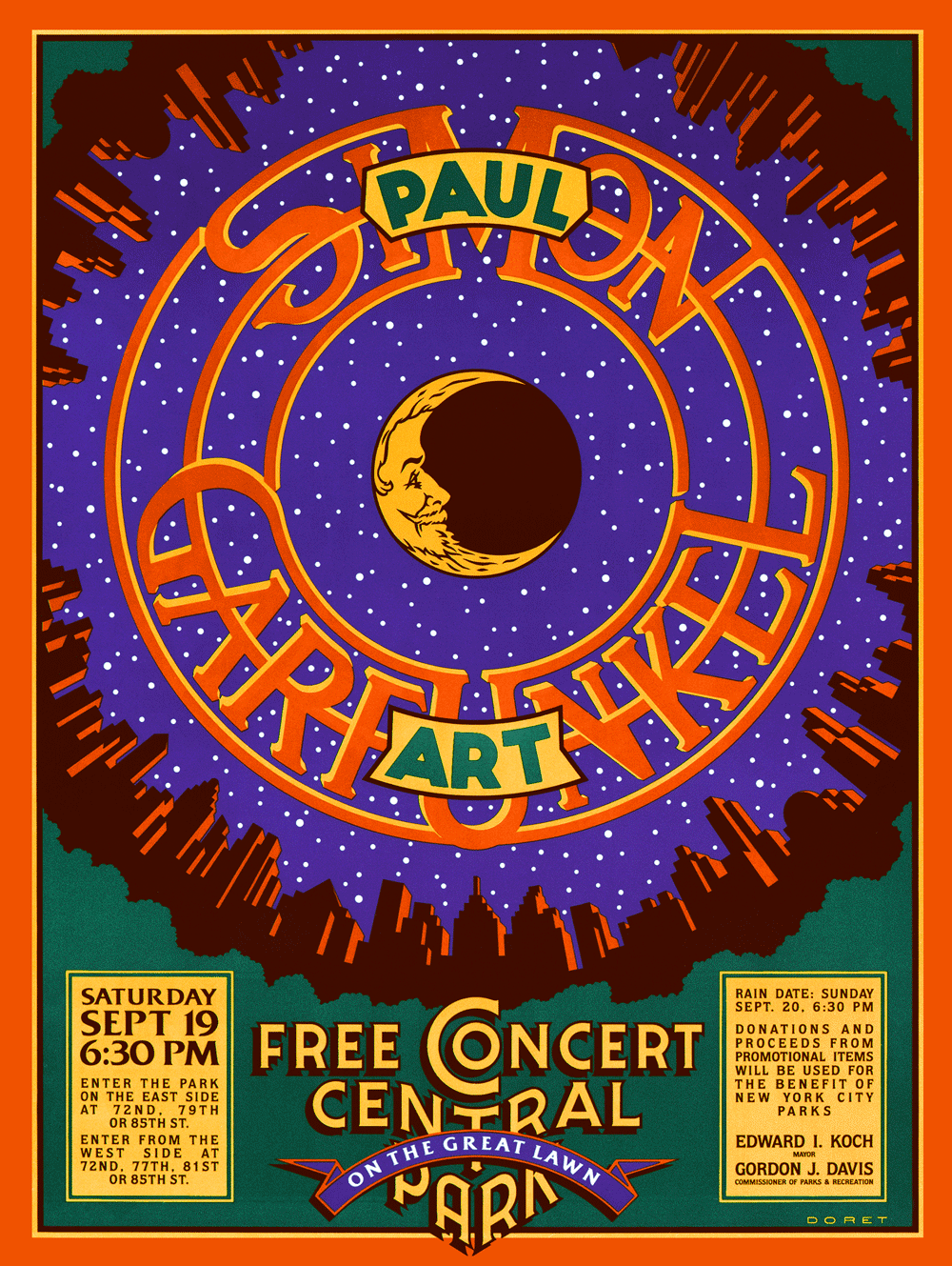
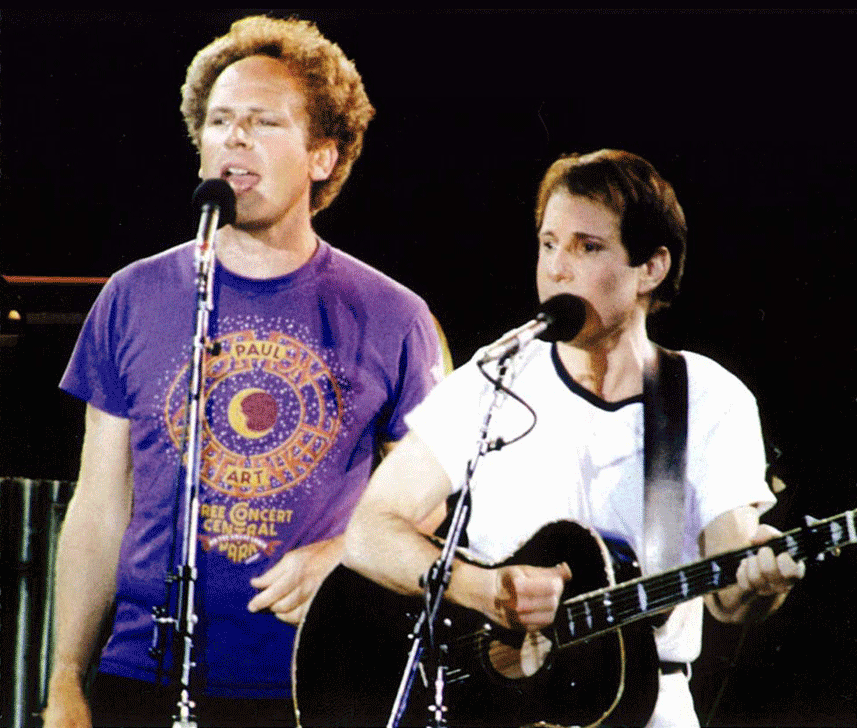
The posters had been sniped up all over NYC before the concert. If you were lucky, you were able to snatch one off a wall without destroying it. Despite the fact that T-shirts were produced and were for sale at the concert, there actually were never any officially sanctioned posters for sale anywhere. Over the years I’ve had many, many people write to me wondering where they could find a poster. I never had that many myself, having given away to friends and acquaintences what few I had. But luckily I kept one. Now I am very happy to be able to say that I am producing a limited edition of the poster myself, which I am making available through my Illogator site.
These posters will be 18” x 24”—the original size the poster was produced at, and will be signed by yours truly. I scanned the original poster myself, and spent days retouching the scan until it was absolutely perfect. These digital prints (or giclées) actually look better than the original. The original printing was done on fairly inexpensive paper, but the edition I produced is on a much better stock—which allows much more depth of color. If you’d like to find out more about the edition, just email me HERE, and I can fill you in.
“And in the naked light I saw ten thousand people maybe more”

Kiss Kulture Klash
April 17, 2013 on 5:19 pm | By Michael | In Gigs, Notes, Wayback Machine | 1 Comment
When I was asked to design and do the art for KISS’ 4th studio album Rock and Roll Over, I was fairly ignorant of the culture that was forming around the group. I was unencumbered by any preconceived ideas as to what the group and their music was about. Many are surprised to hear that Gene, Paul, Ace and Peter had to explain their different personas to me before I started working on the design.
I’d love to be able to show my working pencil sketches, but over the years they’d gotten lost or destroyed, and the only record left was the original colored pencil comp that I used to explain my concept to the group. A few months earlier I had done a cover for IDEA, a Japanese art magazine that had done an article about my work, and for whom I had created a cover. I really loved how that cover had turned out, so my thought was to try to emulate the look I had come up with on this new cover for KISS. My cover for IDEA had certain gamelike, and very graphic elements that I thought would work well telling the story of what KISS were about.

Since their makeup reminded me of classic Japanese Kabuki players, I thought the look would be appropriate. So I created a little story around each character and put them all together in a sort of “mandala” motif surrounded by a sawtooth blade with lettering. I kept the colors simple and bold as I had done with my IDEA cover. Here (yellowed and a bit worn with age) is the original colored pencil sketch I created for the group’s approval:

The meeting went particularly well, since I was expecting outright rejection of my idea—which at the time was pretty unorthodox for an LP cover. The changes gthey asked for, I felt, were fairly minor—adjustments to the faces (with the exception of Peter Criss), and rotating the lettering 90°.

The KISS logo already existed, but I felt it needed some help to work better with my design (Paul told me he had drawn it on his dining room table). So I redrew it, making the design more consistent, and adding the lightning strokes to help give movement to the sawtooth blade.

After the cover was done, I didn’t think about it very much. It was only years later that I came to understand that this cover had taken on a life of its own and become sort of a cultural icon. I started to realize that when I discoved all the incredibly blatant and poorly done rip-offs of my design. Rather than upsetting me, seeing all that was quite amusing . . . after all, isn’t imitation “the sincerest form of flattery”?

Another indicator to me of how pervasive this design had become in the culture was that people were having it permanently etched onto their bodies. This both horrified, and delighted me at the same time! Personally I would never have anything tattooed on my body—especially one of my own graphics: I’d get bored with the design way too quickly, and then it would be too late to do anything about it. Here are some shots of the process of one lucky soul having the complete Rock and Roll Over art permanently engraved on his right flank. The tattoo artist did a pretty good job, if you ask me!

And below, for your viewing pleasure, a few more of my favorite RaRO tattoo shots. I especially like the one of the guy getting his back autographed by Paul Stanley. Now that’s what I call Kiss Kommitment!

Speaking of Paul, he contacted me again recently. It seems that KISS were about to record their 19th studio album. They hadn’t done one of those for eleven years, and he told me they wanted to recapture some of the magic that the Rock and Roll Over design had provided for them when they were starting out. So, in a way they kind of wanted Rock and Roll Over All Over Again—the same . . . but different.
Attempting to recreate the success of an iconic image is a thankless task. You can’t realistically have that as a goal. The most you can do is to give it your all and try to do the best piece of art you’re capable of doing. Here are a series of rough sketches that led up to the finished design

The hardest part of this process was figuring out what to do with the four faces. This time Paul wanted them to be photographic instead of just plain old graphic—as they were the first time around. And I couldn’t get new photography—it had to be taken from existing files. The approach I decided on was to take the best photos I could find with the most contrast and shadows, and translate them into flat graphics that I could make work with the rest of the art. I’ve simplified the steps a bit, but here’s an example of what I did with the faces, using a photo I found of Gene’s face:


Everybody’s got an opinion as to whether the art for Sonic Boom is better or worse than that for Rock and Roll Over. Being so close to both designs it’s difficult for me to say. As far as Sonic Boom is concerned, I did the best I could within strict limitations provided by Paul. I think it solved the problem, and I’m quite happy with the results.

I’ll leave it to time, to posterity, and to others to decide if Sonic Boom becomes as much a cultural touchstone as Rock and Roll Over did. If it does, we may soon start seeing . . .

Purchase an original “Rock and Roll Over” press proof HERE
Powered by WordPress and Nifty Cube with Recetas theme design by Pablo Carnaghi.
Entries and comments feeds.
Valid XHTML and CSS.