 |
|
Japanese Time Machine
October 25, 2012 on 10:34 am | By Michael | In Gigs, Wayback Machine | 6 CommentsMy friend José Cruz recently posted this LINK on my Facebook page, reminding me about one of my earliest, favorite projects—one which set the tone for much of my work that followed. In the page that was linked the reproduction my cover was so tiny that I figured it might be time to unearth the real thing and tell its story.
I had only been freelancing for a couple of years when the Japanese magazine “Idea” contacted me, wanting to do an article about my work. I proposed doing a cover for that issue, and they agreed. Rather than designing a standard 4 color process cover, I prepared the art for 5 flat Pantone colors. Overlapping the transparent inks would create even more colors, and I hoped to achieve a richness and depth of color that approached the look of a silkscreen. It all worked out really well.
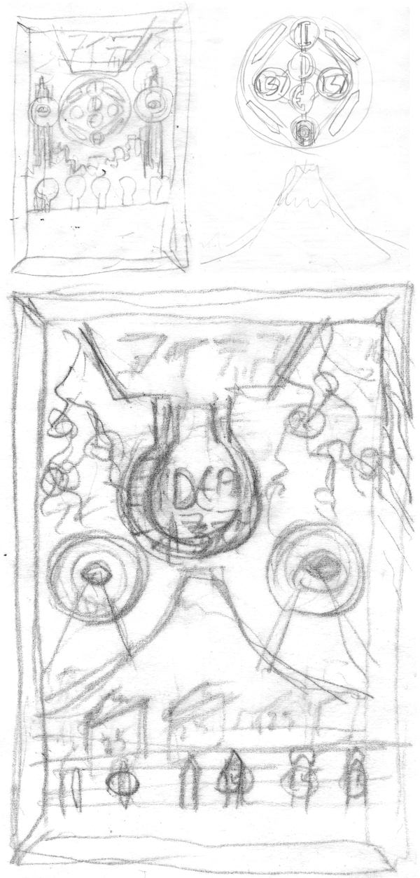
Starting with a few thumbnail pencils, I developed the look for the cover, which was based on an arcade/shooting gallery/metal target game look:
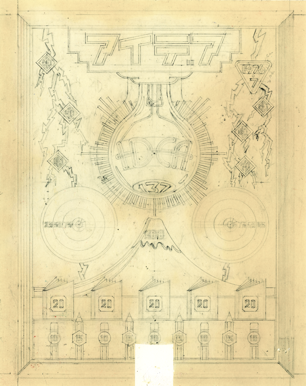
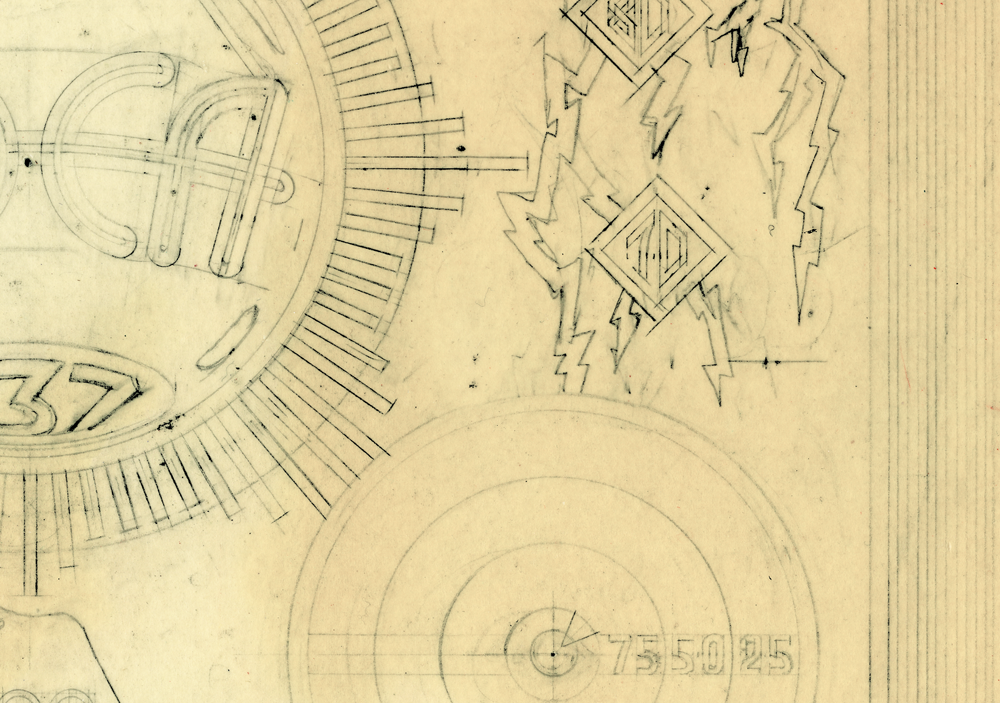
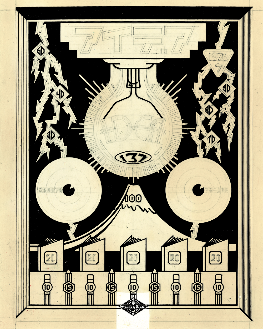
I’m sure there were a couple of pencil drawings between the ones above and the next one, but it’s been many years, and things tend to disappear. This next drawing demonstrates how I used to work pre-computer. I needed to work out the drawing in the finest detail, because once I inked the linework on prepared acetate, there was no such thing as ⌘-Z: making changes was difficult. You’ll notice in the detail, the great care I used when drawing—this was extremely painstaking work (the yellowing of the vellum is mostly due to the aging of the rubber cement used to glue it to a board:
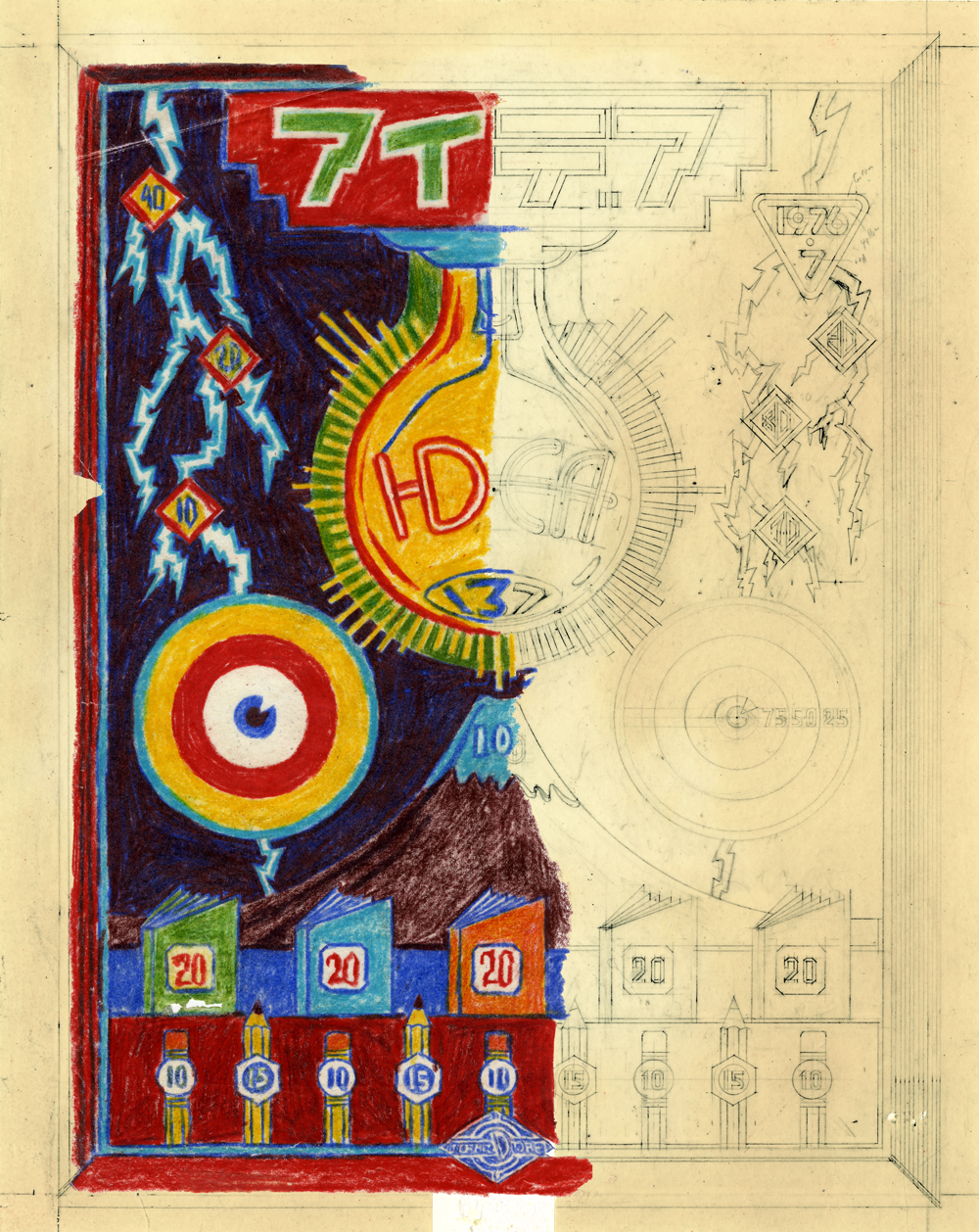
Next I worked out rough color with Prismacolor pencils on a piece of tracing paper over the tight drawing. I was tryng to approximate how transparent Pantone colors would react when laying one over the other. For example laying the blue/violet over the burgundy would get me a very dark—almost black-ish color. There were probably other color studies, but this is all I have left:
After working out the color, all that remained was to create the finished pre-separated art, inked in black with technical drawing pens (Koh-I-Noor Rapidograph). In this case the art consisted of seven inked, prepared acetate overlays, plus the base art that was inked on vellum and glued to an illustration board. Below is a representation of just one of the overlays in position over the tight tracing—where it was when it was inked—this represented the dark blue ink:
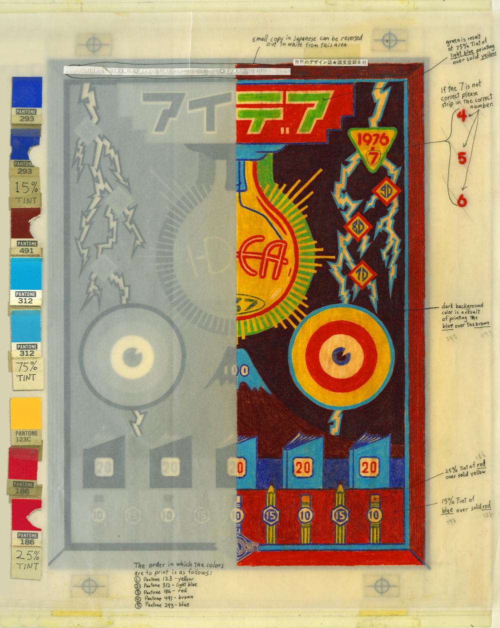
When all the inking was done, all the overlays were registered to each other (note the register marks), and the whole was prepared for the printer in Japan with detailed instructions written on a vellum overlay with a more accurate representation of what the finished piece would look like (rendered in colored pencil). Pantone color chips were taped alongside for color matching. It’s a hell of a lot easier to render art like this today using Adobe Illustrator!
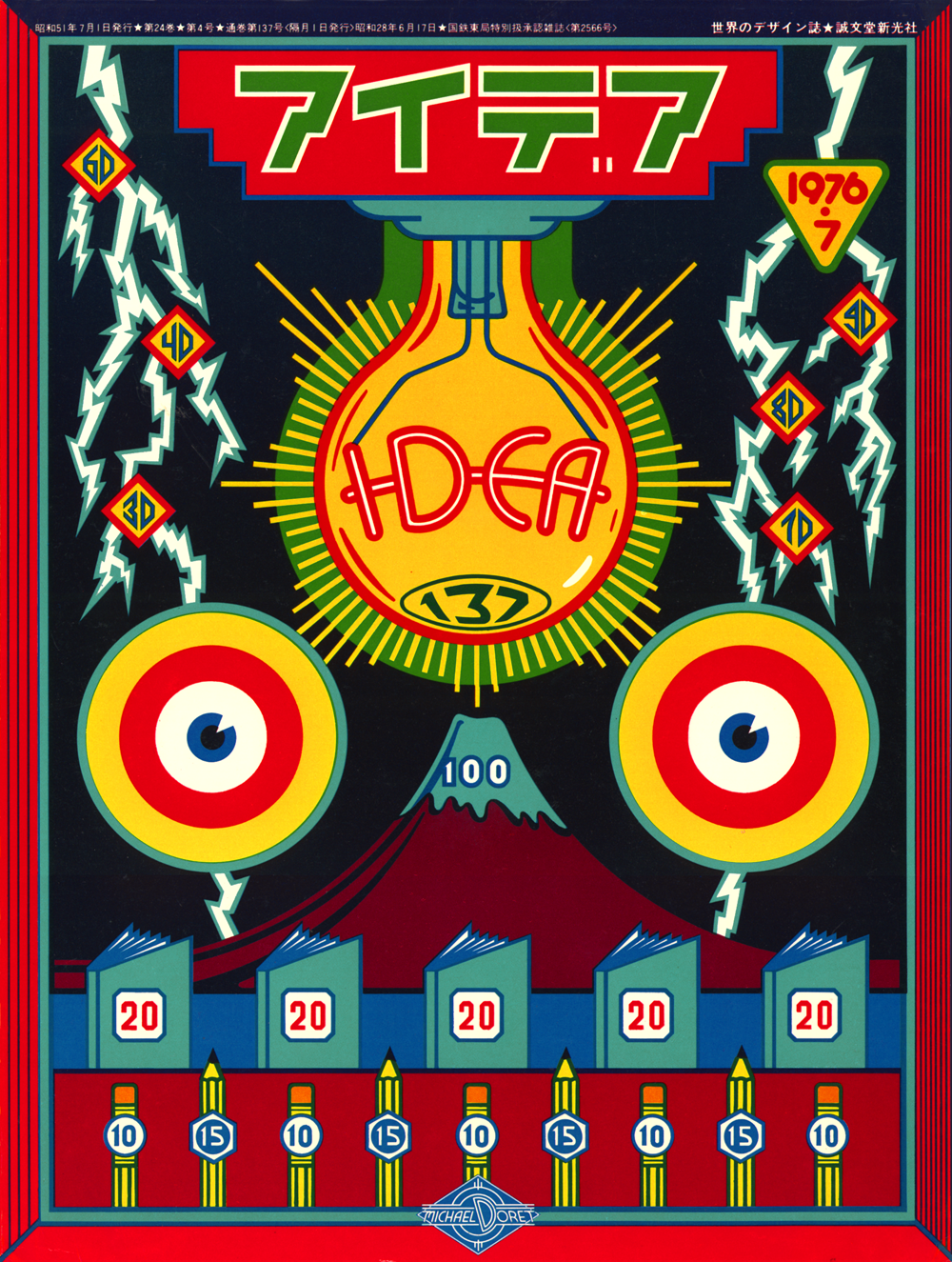
Below is the actual printed cover. It remains one of my favorite pieces. It also served as the design and color model for how I executed the album cover “Rock and Roll Over” for KISS just a few months later that year:
6 Comments
RSS feed for comments on this post. TrackBack URI
Leave a comment
Powered by WordPress and Nifty Cube with Recetas theme design by Pablo Carnaghi.
Entries and comments feeds.
Valid XHTML and CSS.

Michael, this is one of my favorite of your pieces, too. We’re so honored to have it at the Archive. Can you tell me more about the design concept? What do the numbers represent? Is it a secret? (I’d be ok with that.) It gives me a bit of a pinball machine vibe.
Comment by Stephen J Coles — May 12, 2019 #
BEAUTIFUL work!
Comment by Brinja — January 10, 2015 #
[…] comp that I used to explain my concept to the group. A few months earlier I had done a cover for IDEA, a Japanese art magazine that had done an article about my work, and for whom I had created a […]
Pingback by Alphabet Soup Blog » Blog Archive » Kiss Kulture Klash — April 17, 2013 #
What I can say is ‘Beautiful’! 🙂
Comment by Prerak Trivedi — December 11, 2012 #
Colors can make anything beautiful and this is a best example of it, it looks such a creative work, no one else can understand the colors better than you.
Comment by Kay — December 6, 2012 #
WOW Wee! One of your best and the inside track!
Those sketches and drawings sure have yellowed a bit!
Your rough sketches look as good/bad as mine.
Love this ! You are the master!
Comment by José Cruz — November 9, 2012 #