 |
|
Archive for April, 2010
Art Imitates Life…Imitates Art (Canter’s Truck #3 of 3)
April 9, 2010 on 3:55 pm | By Michael | In News, Notes | 6 CommentsSignQuest was the company that RoadStoves had recommended to “wrap” the truck with the graphics I had designed. They produce large scale banners and signs as well as vehicle wraps. One interesting project they were recently involved with was wrapping the Hollywood Sign for the “Save the Peak” campaign. The goal of this campaign is to raise funds to purchase the land adjacent to the Hollywood sign. Hopefully this would prevent commercial development that would permanently mar the view of the iconic sign and the world-famous silhouette of the hills that frame it. Wrapping the Hollywood Sign was a complex project, but wrapping a truck properly is also difficult and time consuming.
Getting it right means placing the many strips of 3M Controltac vinyl film in the right positions:
Louie Navarro is seen above carefully positioning the vinyl on the service side (the side from which the food will be served) of the truck. He must carefully gauge where to position the film at the back of the truck so that the graphics end up at the right spot by the time they reach the front.
Over on the driver’s side, Louie positions the main graphics. There are many ins and outs to the truck surface, and the Controltac film is flexible enough to conform to them all, ending up looking very much as if it had been painted on. It’s pretty amazing.
Here’s one photo of the driver’s side. I’ll post more photos from different angles as they become available.
In the meantime the Canter’s Truck has begun cruising the streets of LA with Bonnie Bloomgarden at the helm. To find out when they’re going to be in your area you can follow them on Twitter.
Photo: Adam Stein
Coming Soon . . . Canter’s Truck Post #3 of 3
April 6, 2010 on 12:46 pm | By Michael | In News, Notes | 2 CommentsDue to my inability of being able to get good photographs of the completed Canter’s truck, I’m holding up posting the final chapter in this saga. I hope to be able to get some better shots by the end of this week. If not I’ll just post what I’ve got.Thanks for your patience!
Above: Careful placement of my credit below the trash receptacle.
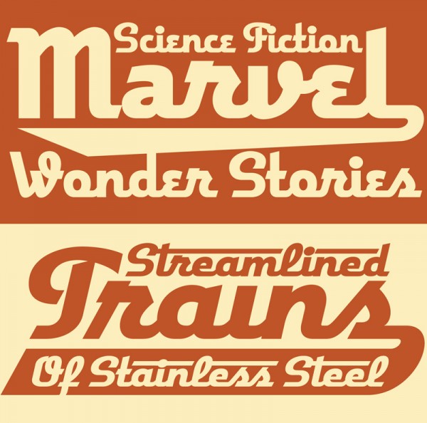
Deliscript Critique on FontFeed
April 2, 2010 on 8:57 pm | By Michael | In News, Notes | 2 CommentsBelgian designer and writer Yves Peters has been posting his comments and critiques about the winners of the TDC² 2010 Typeface Design Competition, and has finally reached the Display Type category—the one in which Deliscript was selected. While Yves’ comments are considered and thoughtful—and with regard to Deliscript were for the most part on target—I feel as if I would like to comment on a couple of his remarks.
Yves mentioned the “Word Logos” I have thrown in, and mentions that they’re only in English and that there aren’t that many. I agree with this. I probably shouldn’t have put them in at all. I had literally been working for months on Deliscript, and really wanted to get it out for release, so I guess I rushed through their creation, thinking of them as just a small extra feature to include. They probably don’t add that much to the font, and I should have thought of the European market as well. The next time I do a feature like that I’ll definitely try to do it in a much more expansive manner.
Yves also mentions that he is “unsure about the finer details in the character shapes”, citing that “some curves and joins seem rather stiff, and the weight distribution and contrast in the character strokes appear a little off in some parts”. I’m not sure, but I think this perception on his part may stem from cultural differences that we share, and from a possible misunderstanding of what I’m referencing. What I’m going for is not really in the lexicon of classical font design—rather it is from the American pop culture vernacular—from all the (traditionally) untrained eyes that created all the wonderful signage and ephemera that I grew up with.
Coming to font design from that background, I can totally understand how what I’m trying to do can seem foreign to those who are trained to look at fonts from a traditional perspective. While I’m sure we all share some of the same font heroes (such as Morris Fuller Benton) I also celebrate those whose work joyously displayed a flagrant lack of regard for what some would consider to be “the formal rules of design”. It is to these designers whose names we’ll probably never know—and to their typographic “mistakes” and flourishes that I find so engaging—that I try to pay homage to in my lettering and font design work.
Powered by WordPress and Nifty Cube with Recetas theme design by Pablo Carnaghi.
Entries and comments feeds.
Valid XHTML and CSS.


