 |
|
Archive for September, 2008
True Crime
September 29, 2008 on 2:39 pm | By Michael | In Gigs | 2 Comments |
 |
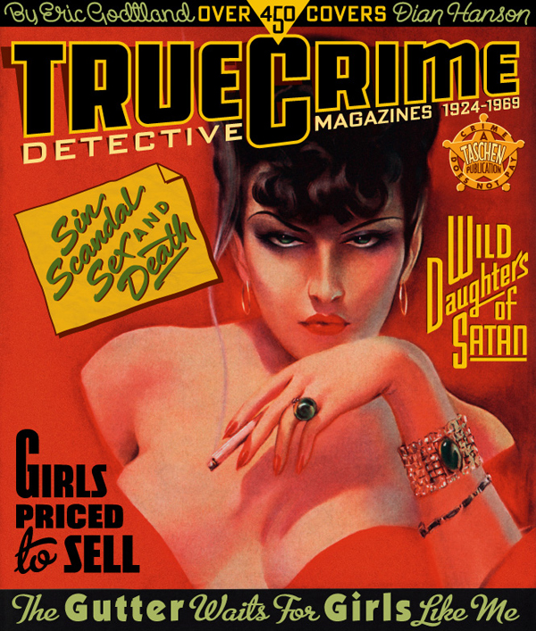
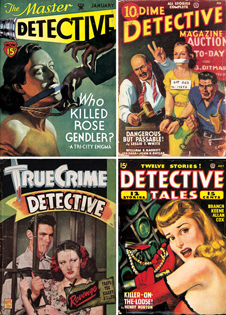
I’ve always loved, loved, LOVED the covers that graced all the various pulp magazines from the ’20s through the ’40s. Their incredibly eye-catching blends of lurid images, imaginative, fun letterforms and brilliant color palettes always spoke directly to my pop sensibilites, and has had an immeasurable influence on what I do. So I wouldn’t be exaggerating if I said I was bubbling over with perspiring enthusiasm when I accepted this assignment from Josh Baker at Taschen America: he asked me to design the cover for “True Crime Detective Magazines: 1924-1969“, Taschen’s 336 page tome on that particular pulp genre. They wanted a cover that was a direct reflection of the hundreds of pulp covers contained in the book. Particularly challenging was the integration into my design of ten separate blocks of information. I pored over hundreds of pulp covers looking for stylistic clues to help me design all these separate elements. I also searched for ways to keep them organized in a cohesive design. It was necessary to employ a variety of techniques including hand-lettering, straight typesetting and combinations (in varying degrees) of both. One thing which really helped the success of this cover was being able to use the smolderingly hot femme fatale illustration (from Real Detective—January 1938) which I was given to work around. The finished cover can be seen above (together with a few prime examples of the book’s contents).
José Cruz: ICONOCLAST
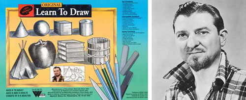
September 21, 2008 on 3:29 pm | By Michael | In Notes | 4 CommentsThat great populist TV art evangelist from the ’50s Jon Gnagy always opened his program with “If you can draw these simple forms: the ball, cone, cube and cylinder, you can draw a real picture the very first time you try”
 I’m not really sure that it was true, but my good friend and master illustrator José Cruz has taken that dictum quite literally, pushed it about as far as it can be pushed, made it his mantra and applied it to his work. It can be seen in its purest form in the geometric caricatures he has posted on his icon©last Blog. The art of the caricature has always amazed me, but even more so in his startling work. How is it that with these few lines in his carefully composed geometric configurations that we can actually identify specific individuals? I don’t understand why, but they work—and artfully so! If you’re skeptical, look at the three below: from the Sopranos—Paulie “Walnuts”, from Curb Your Enthusiasm—Cheryl David, and from Entourage—Drama.

For more on the art of the caricature, check out “Celebrity Caricature in America” at the National Portrait Gallery.
Powered by WordPress and Nifty Cube with Recetas theme design by Pablo Carnaghi.
Entries and comments feeds.
Valid XHTML and CSS.