 |
|
Archive for September, 2011
So Why No New Posts Lately?
September 18, 2011 on 9:58 pm | By Michael | In News, Notes | 1 Comment(In case you’re wondering) I haven’t really been able to post anything of note lately because I’ve just been far too busy with work. Since I decided long ago to do everything myself, if I can’t get to it, it just doesn’t get done. With that in mind I thought I’d just take this free moment to make a quick note of what I’ve been up to.
First and foremost I’ve been working with a new and exciting client in the film industry. I’m not at liberty to discuss what I’ve been doing yet, but suffice it to say that what I’ve been working on will soon be highly visible to anyone living in the civilized world . . . and I think it’s some of the best work I’ve ever done. Stay tuned, because, when I am able, I will be posting “case studies” of the stages these lettering treatments went through–from rough ideas to finished art.
Second…in case you haven’t noticed I’m not the most prodigious of font-makers, averaging maybe one new design a year at best. I’ve had a new script design in the works for quite some time now, and it’s getting close to completion – hopefully within a month or two. Like most of my font work, it’s a completely new design—not a rehash of something from the past that’s been unearthed. But at the same time many will think that it looks “familiar” without quite being able to place it! So, in the coming weeks, time willing, I’ll be posting some snippets of this new design before it’s official release.
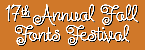
Speaking of fonts, I just learned that Steinweiss Script was voted by Graphic-Design.com as the “official font” of their 17th Annual Fall Fonts Festival. About the choice, Fred Showker wrote that this font was “a masterful creation because of the multitude of special settings, alternative characters, ligatures and frequently used pairs and triads of letters that go together differently than straight typesetting” and that “the real value of Michael Doret’s fonts is the incredible amount of work he builds into each font. He actually tries hundreds of different settings, looking for problem areas and opportunities for alternates. You’ll only find a handful of fonts out on the market that are this flexible and complete … a half dozen of those are Michaels!” Wow! Thanks Fred!
Steinweiss on Steinweiss
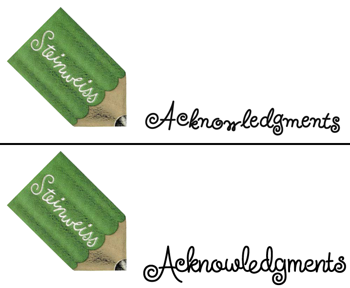
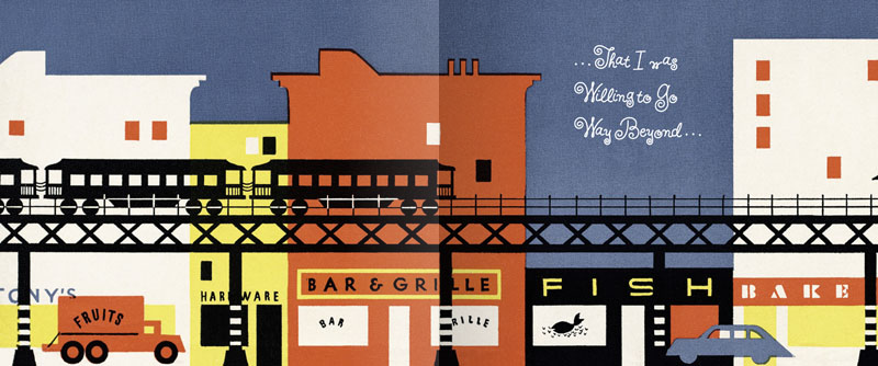
September 15, 2011 on 5:32 pm | By Michael | In News | 1 CommentWhen I originally did the title lettering for “Alex Steinweiss: The Inventor of the Modern Album Cover” I hadn’t yet designed “Steinweiss Script“. In fact it was designing this headline that spurred me to do that typeface design. In retrospect there were many interior headlines and other lines of copy for the book that Josh Baker, AD at Taschen, would have liked to have had set in a new Steinweiss Script font. But they had to settle for what was available at that time, which was one of several different digitized versions of what Alex Steinweiss had originally designed for Photo-Lettering.
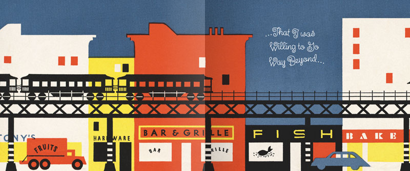
Now Taschen has released their more moderately priced trade edition of this incredible book—and just in time for this release I was able to reset all their headlines and other copy the way we had originally wanted to—in Steinweiss Script:
Above: Before and After Details from the older and newer editions
Below: You can Look Inside the earlier edition…
…or Look Inside the newer version:
Our intention was that the newer version, with everything reset in Steinweiss Script, would feel closer to what Mr. Steinweiss would have done had he been able to apply his scrawl to these pages.
Just a reminder: Steinweiss Script is available for purchase my website—Alphabet Soup. To learn more about these fonts, read Steven Heller’s Imprint article or MyFonts’ Creative Characters for January.
Powered by WordPress and Nifty Cube with Recetas theme design by Pablo Carnaghi.
Entries and comments feeds.
Valid XHTML and CSS.


