 |
|
Steinweiss on Steinweiss
September 15, 2011 on 5:32 pm | By Michael | In News | 1 CommentWhen I originally did the title lettering for “Alex Steinweiss: The Inventor of the Modern Album Cover” I hadn’t yet designed “Steinweiss Script“. In fact it was designing this headline that spurred me to do that typeface design. In retrospect there were many interior headlines and other lines of copy for the book that Josh Baker, AD at Taschen, would have liked to have had set in a new Steinweiss Script font. But they had to settle for what was available at that time, which was one of several different digitized versions of what Alex Steinweiss had originally designed for Photo-Lettering.
Now Taschen has released their more moderately priced trade edition of this incredible book—and just in time for this release I was able to reset all their headlines and other copy the way we had originally wanted to—in Steinweiss Script:
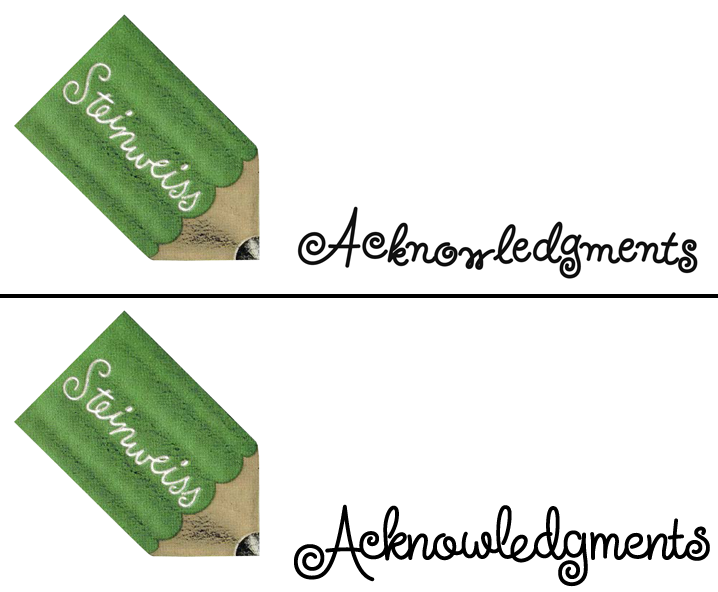
Above: Before and After Details from the older and newer editions
Below: You can Look Inside the earlier edition…
…or Look Inside the newer version:
Our intention was that the newer version, with everything reset in Steinweiss Script, would feel closer to what Mr. Steinweiss would have done had he been able to apply his scrawl to these pages.
Just a reminder: Steinweiss Script is available for purchase my website—Alphabet Soup. To learn more about these fonts, read Steven Heller’s Imprint article or MyFonts’ Creative Characters for January.
1 Comment
RSS feed for comments on this post. TrackBack URI
Leave a comment
Powered by WordPress and Nifty Cube with Recetas theme design by Pablo Carnaghi.
Entries and comments feeds.
Valid XHTML and CSS.


Oh, crap. Now I’ll have to get this edition, too.
It’s great that you were able to make a change like this in the trade edition, nevertheless. It’s really a wonderful showcase of Steinweiss’s work. I had no idea how much stuff he had done.
Comment by Mark Simonson — September 15, 2011 #