|
|
|
Archive for December, 2013
A New Logo for American Contemporary Ballet
December 18, 2013 on 6:12 pm | By Michael | In Gigs, News | 2 CommentsEarlier this year I had the pleasure of meeting Lincoln Jones and Theresa Farrell—respectively the Artistic and Associate Directors of Los Angeles’ American Contemporary Ballet. They describe themselves as producing “original contemporary classical ballets in Los Angeles, California–works that are built upon the foundation of classical ballet, and which extend the art into our own time”. When we first met their studio space was less than ideal, but it wasn’t long after meeting them before they lucked into a fantastic space on Wilshire Boulevard directly across from the main entrance to LACMA. At the time they had a professionally designed logo that did the job, but their new space presented them with a challenge: outside, directly in front of their floor-to-ceiling windows was a fountain, and centered in the fountain was a large, white, blank “monument” whose purpose obviously was to support signage for whoever was the tenant of the space behind it. Occupying their beautiful new space, and realizing that the “monument” in the fountain was the wrong proportion for their existing logo, Lincoln and Theresa asked me if I’d be interested in designing a new logo that would also work for them as signage. Lincoln described the process of our working together on this project:
“In my experience, it is rare to be delivered a design product and love it unreservedly, at first sight. With Michael it happened twice, on the same project. We needed a sign to fit the large monument in front of our new building across from the Los Angeles County Museum of Art. Our current logo didn’t work, given the size and shape of the monuments face, and I hadn’t been able to imagine even a vague outline of anything that I liked for the space.”
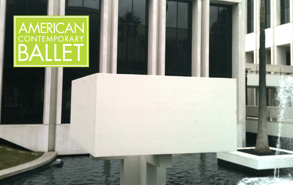 The previous logo superimposed over the blank “monument”.
“I asked Michael to make some suggestions, and he came to the studio and made a sketch in front of me. What he drew was something that I had never considered, but which was beautifully alive, eye-catching, and seemed to capture the spirit and aesthetic of our company in just the right way. It was also totally unique within our market. I told him to do it exactly like that, and that it would also serve as our new logo.”
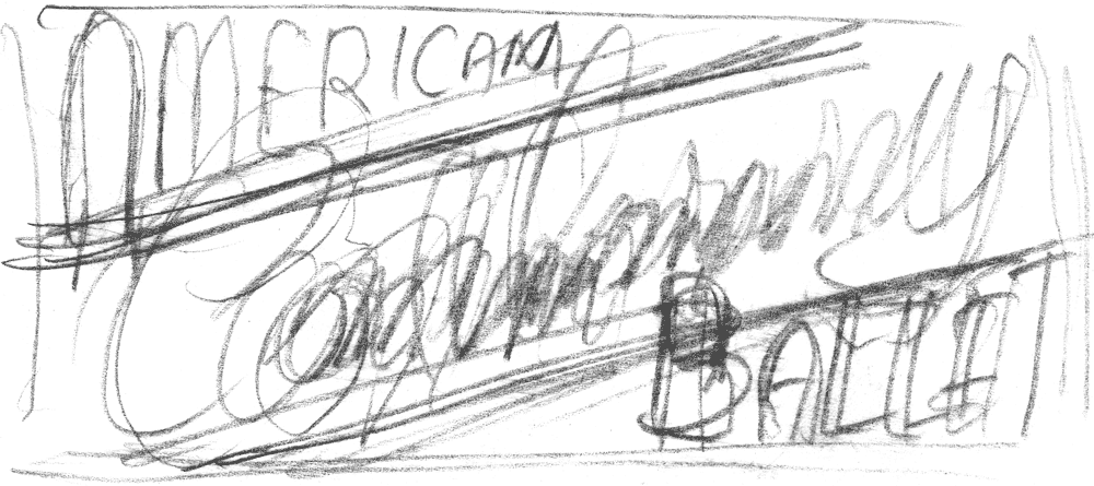
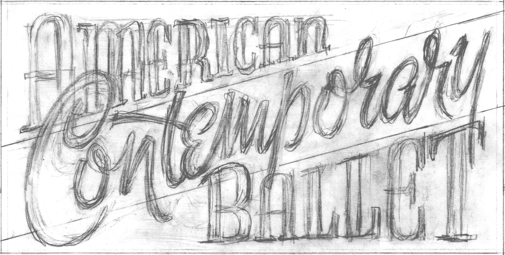
Well, in case you were wondering how anyone could tell very much from the thumbnail above, I did “fill in” quite a bit with a verbal description of what I was envisaging. I went back to the studio and subsequently started developing that very loose thumbnail into a design that was a bit more coherent—

Then taking it several steps further, I digitized it in Adobe Illustrator, trying to make it work with several different iterations:
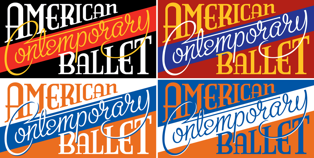
…but for various reasons I was less than happy with where this design was going. At this point I’ll let Lincoln take over, describing what happened next:
“He called me a few days later to say that while he liked the art he had done, he didn’t think it was right for the location. His reasons made sense to me, so he sent me a second design which retained a few qualities of the first, but was totally different in the overall feeling.”
![]()
I had decided to keep the script lettering of the word “Contemporary”, but shifted it to read along a horizontal plane instead of moving upwards at an angle, and I had decided to simplify the words “American” and “Ballet”, rendering them in my adaptation of one of my favorite fonts Bernhard Gothic. Making these rather large alterations didn’t totally change the nature of what I had imagined for the logo, but helped to make it more legible and coherent—especially from a distance. So this is how it worked out in the fountain in front of their new studio space:

I also convinced them to use a second color scheme on the “monument”, alternating on its sides. I felt that this should be a “living logo” that could perhaps change appearance if its immediate environment called for an adaptation.
Lincoln continues by saying: “Despite the fact that it was a highly different approach, I again felt that it beautifully represented our company, and was a strong expression of our values, in addition to being a standout design. I love having it out in front of our building, and as our new logo. It still catches me by surprise, and delights me when I walk by our building.”
More recently we made another adaptation of the logo to work with a beautiful painting created for their 2014 Season by our mutual friend Kenton Nelson. I felt that the color logo would detract from the beautiful simplicity of Kenton’s work, and so created a one color version. I then organized all the information along the bottom in boxes whose colors were derived from Kenton’s palette—note that all the copy set at the bottom of the poster is set in my font DeLuxe Gothic:
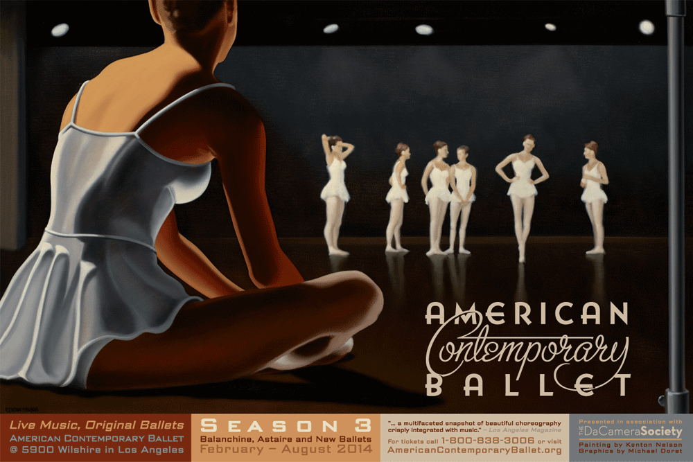
A better look at that one-color version—note the details where “Contemporary” goes over or falls under the adjacent words:
![]()
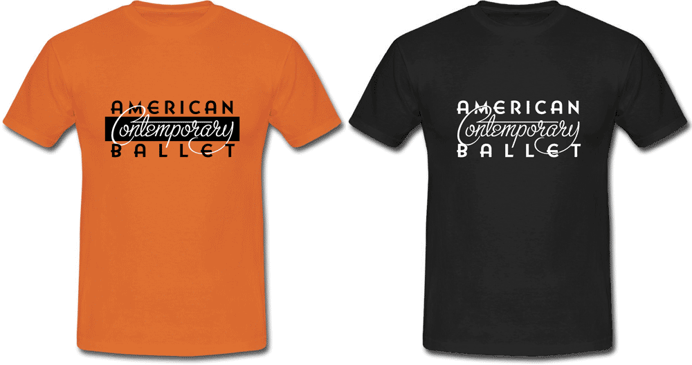
And here are a 2 color and a 1 color T-shirt design created using just the logo:
Lincoln concludes by saying:
“I think Michael’s work is tremendous, but sensitivity to the project, its requirements, and the honesty and originality of his approach make just working with him half the fun.”
For those of you who would like to read more of what Lincoln Jones has to say about his ballet company, his philosophy, and about this design, I’ve included his lengthier statement below.
“When I decided to start a ballet company, it was because I wanted to make and to see a kind of ballet that I wasn’t currently seeing anywhere. Now in our third season, I think our product, our values, and our approach to the art form are even more distinctive than when I started. Our graphic art, indeed all of our graphic, photographic, and illustrative material is very important to me because I want it to not only communicate that we are different, but specifically how. I want it to be a flag representing our values to both our audience and our potential audience. To really see what we do, you have to come to a performance, which means these materials have a big job to do the rest of the time, in terms of getting our message out.
The sign that Michael did (which also became our new logo) is totally unique within our market. The ‘Contemporary’ in our name is there because we make new work, and I want people to understand ballet as a contemporary art form. It was important that the design be in a vernacular that would feel very contemporary to people, to contrast the view that I think most people still have about the art, that it belongs more to the 19th century, or even earlier. Still, it had to have a timelessness about it – a classical strength, which is what we strive for in the ballets – something that will make sense to contemporary audiences on their terms, but which also has a substance and depth that transcends the simply current.
The ‘American’ in our name is also very important, in that we are continuing the forward-thinking work that was done in the art form in the United States in the 20th century, but it goes deeper than that. I have a strong connection to the values that this country was founded on – independence, principled thought, and a break from convention to forge new, better paths. These are not values that are necessarily automatically associated with ballet, which is often thought of as being heavily traditional.
I thought Michael did a beautiful job of creating a design that felt both contemporary and American, but it is also such a strong, balanced design with a timeless feel that it can rightly be called classical.
It is also a beautifully integrated design. The way that the ‘Contemporary’ playfully bursts between the strength of ‘American’ and ‘Ballet’ can suggest a new view of the art. But the playfulness isn’t cheap, it is strongly located within the other two words, which to me suggests not only playfulness, but substance, which are the two qualities that any great dance must have.”
Powered by WordPress and Nifty Cube with Recetas theme design by Pablo Carnaghi.
Entries and comments feeds.
Valid XHTML and CSS.