 |
|
Archive for August, 2013
DC Comics 75th Anniversary Book Jackets for Taschen Publishing
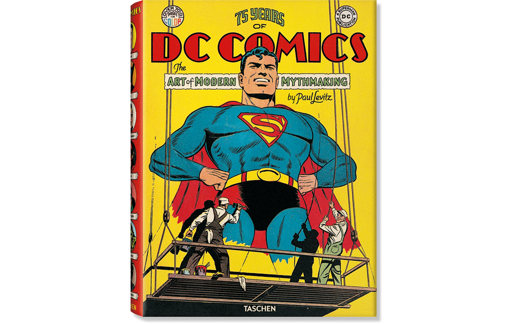
August 5, 2013 on 5:07 pm | By Michael | In Gigs, News | 3 CommentsComic Books were once considered throwaway trash aimed at adolescent boys. Now comic books are considered one of the premier art forms of the 20th century. So it wasn’t surprising that Benedikt Taschen decided to enshrine this art form in “75 Years of DC Comics – The Art of Modern Mythmaking”—one of his Extra Large scale books: “…in honor of the publisher’s 75th anniversary, TASCHEN has produced the single most comprehensive book on DC Comics, in an XL edition even Superman might have trouble lifting. More than 2,000 images—covers and interiors, original illustrations, photographs, film stills, and collectibles—are reproduced using the latest technology to bring the story lines, the characters, and their creators to vibrant life as they’ve never been seen before.”
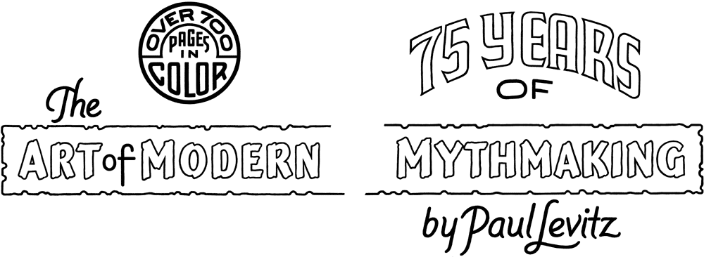
I was tasked by Taschen AD Josh Baker with helping to create letterform graphics for the cover of this monumental edition. These graphics needed to integrate seamlessly with the vintage cover image so that the new cover design might appear to have been “original”. The publisher came up with an incredible image of two sign painters painting a monumental protrait of Superman. They also found some vintage lettering of “DC COMICS” which I was to design around. Also included was an original “DC” logo in a circle which I needed to balance off on the other side of the cover with wording that read “Over 700 Pages in Color”. What I came up with seemed like the only logical layout for this. I looked at dozens and dozens of pieces of vintage comic lettering from DC’s past and distilled them to what I felt would work the best:
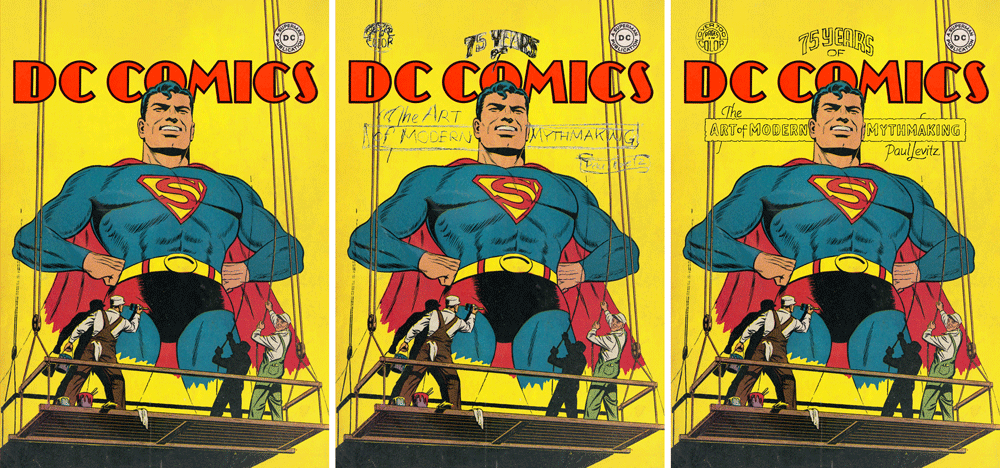
I decided to create the final lettering not digitally, but with pen and ink, to try to approach the less than perfect forms that these letters would have had—here are the various elements:
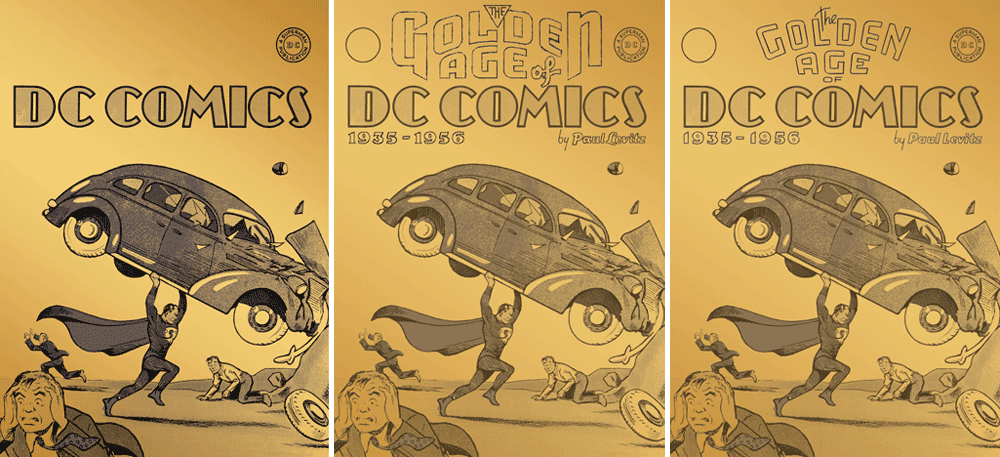
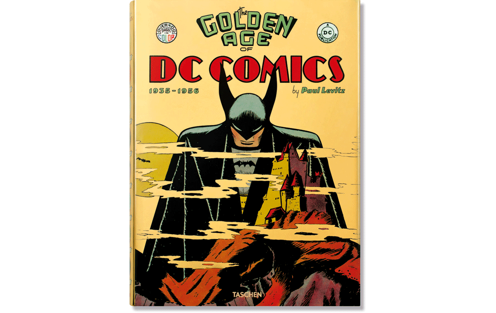
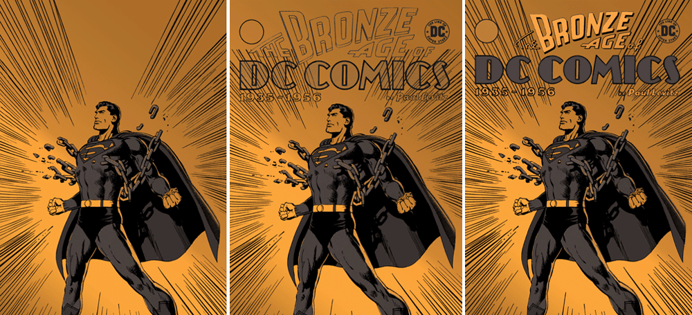
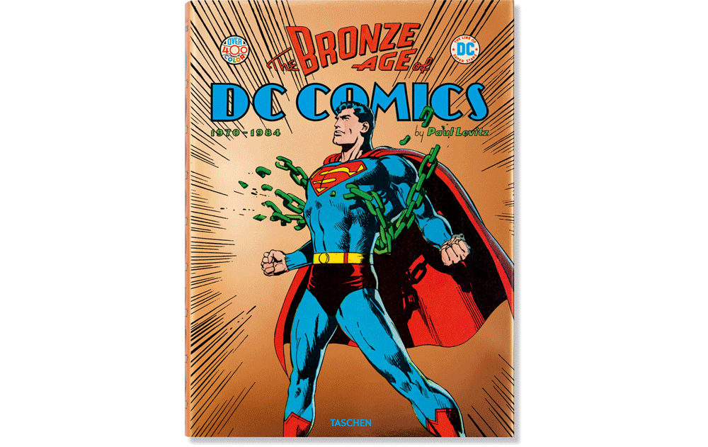
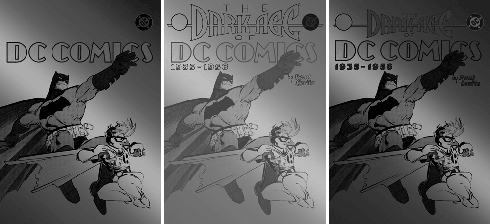
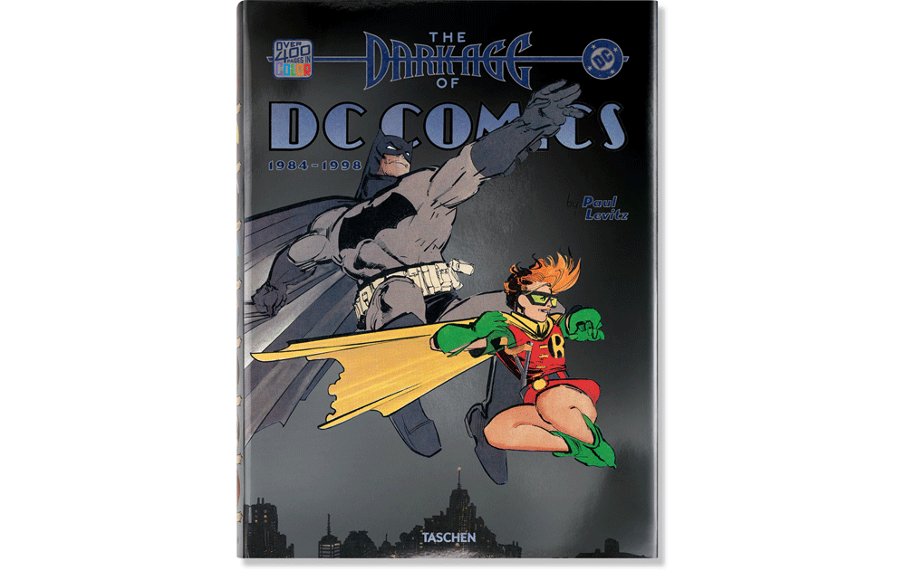
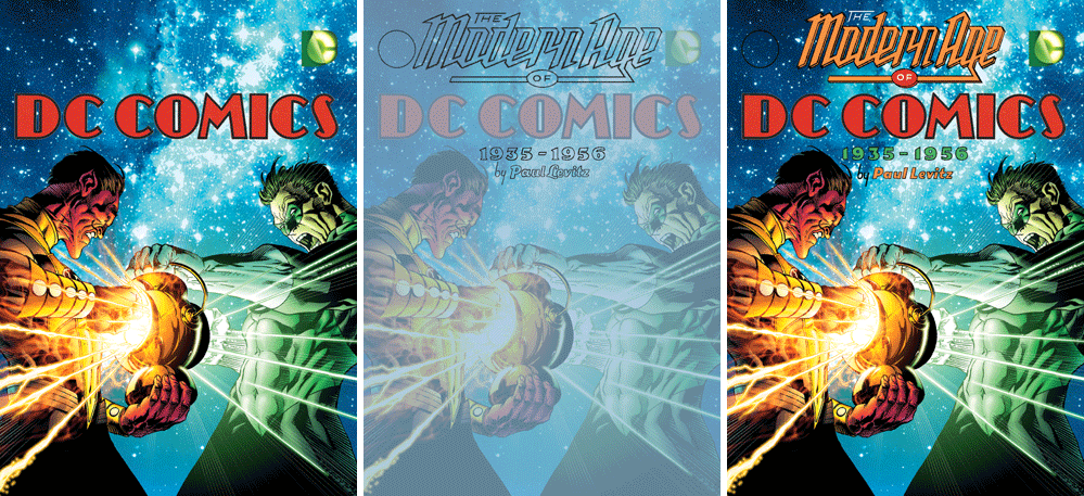
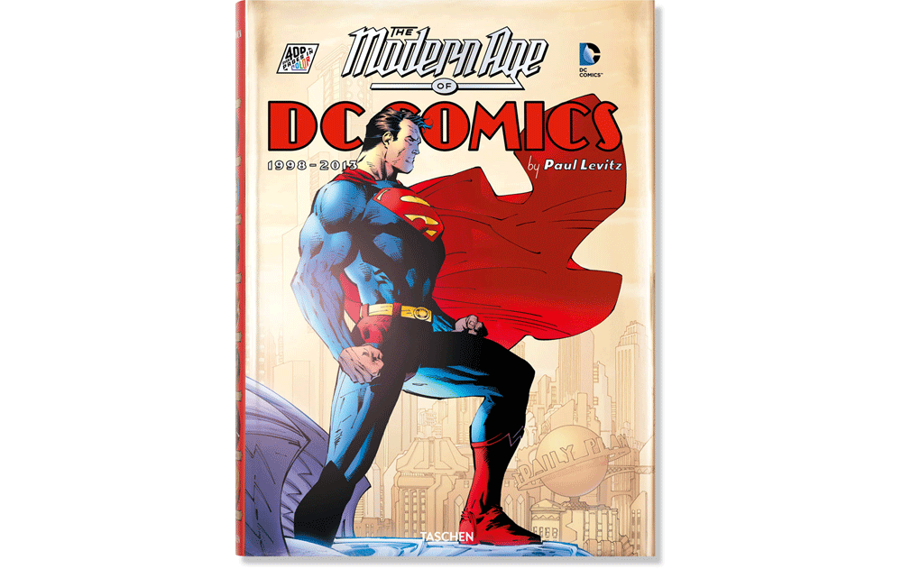
“75 Years of DC Comics” is divided into five sections, each covering a time span of between 1½ to 2 decades. Taschen decided to expand each of those five sections into its own separate, more reader-friendly sized volume, with much more artwork and commentary. Each volume then needed its own special cover art and graphics, and I was again tasked with trying to integrate titling with an appropriate look for each of the five new volumes. The jackets for each volume were to be made of metallic stock matching the contents—so the Golden Age was to be printed on gold metallic stock, the Silver Age on silver stock, and so on.
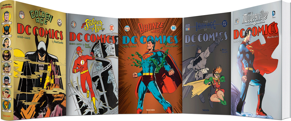
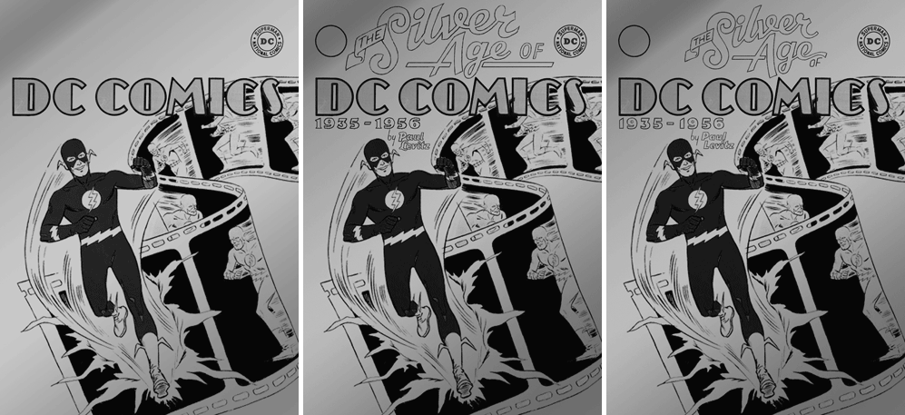
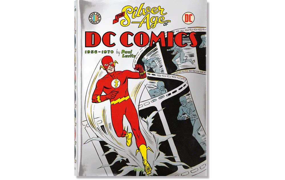
The process for creating the graphics was much the same as what I did for the “75 Years” jacket—creating five different titling units, each in keeping with the time period it represents, and four more “slugs” to play off opposite the various DC logos (we kept the same slug for “Golden Age” as we used on “75 Years”), each also in an appropriate style to its context. Lest what you see below not confuse you, on the first and last volumes Taschen changed the cover art they selected from what they originally supplied me with. To date, only the first two volumes have been published, “Bronze Age”, “Dark Age”, and “Modern Age” will follow, released one at a time.
THE SILVER AGE OF DC COMICS
Powered by WordPress and Nifty Cube with Recetas theme design by Pablo Carnaghi.
Entries and comments feeds.
Valid XHTML and CSS.
