|
|
|
Archive for August, 2016
John Waters’ “Cry-Baby” from Film to Broadway: Title Treatment Development
August 29, 2016 on 8:49 pm | By Michael | In Gigs, News, Wayback Machine | 1 Comment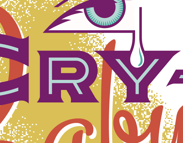
A few years ago I was asked to design a title treatment for the upcoming musical adaptaion to the Broadway stage of the 1990 John Waters cult classic film “Cry-Baby” which had originally featured Johnny Depp, Iggy Pop, Polly Bergen, Traci Lords, Ricki Lake, and Troy Donohue.
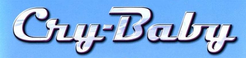
Below is the title treatment that was created for the film by others—which was simply the font “Magneto” with some added chrome effects:
“Cry-Baby–The Musical” was scheduled to open on Broadway in the Spring of 2008. The deadline on this job was unusually tight. I began work on November 15th. I had to deliver finishes by November 26th—eleven days later.
The first stage of any project is usually information gathering. In addition to a synopsis of the play, the info I received from the agency consisted of the following:
• Time Period: Early 1950’s (1950-1954/55)
• Style: Like all of your work, we need to respect the time-period but have a contemporary flair…in other words we took a 50’s logo and updated it for the 21st Century.
• We have 3 categories/styles that our Art Directors are focusing on: Pulp Fiction Book Jackets, Mad Magazine style, Early 1950s movie posters. I have attached some examples that I found on the internet when doing research for the project.
Here are two of the examples I was sent.
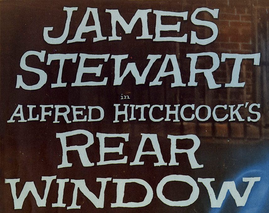
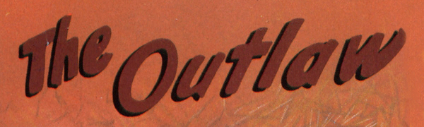
These examples were fine as far as type treatments on posters go, but a solution for “Cry-Baby” would probably have to go a bit farther in order to be able to stand on it’s own. I started doing my own research into the various genres that would be appropriate for this title treatment. In addition to the “Pulp”, “Mad Magazine” and “’50s Movie Poster” genres I felt that “Hot Rods” would also fit in nicely. I did my own research, coming up with many images such as the ones below:
I don’t use reference to “copy” from, but more to help me understand a mood, or set a theme, or push me toward a certain style. I might pull out 10 or more of my reference books—or sometimes none at all. It really depends on the project, and if my “creative juices” need a little jump-start.
Next I pick up a pencil and sketch pad and just start noodling and doodling. I might do many pages of these before I’m satisfied that I’ve got the germs of a few good ideas.
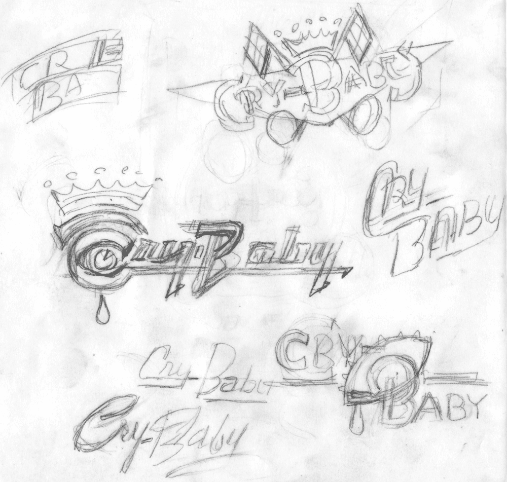
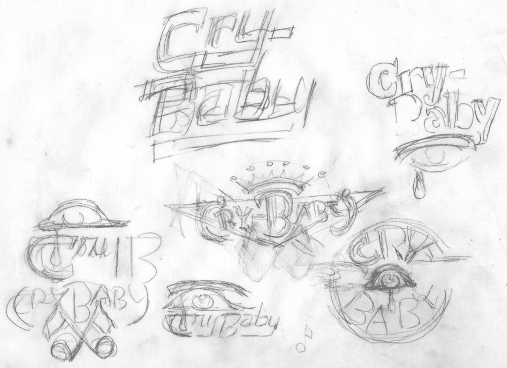
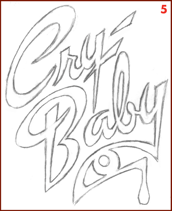
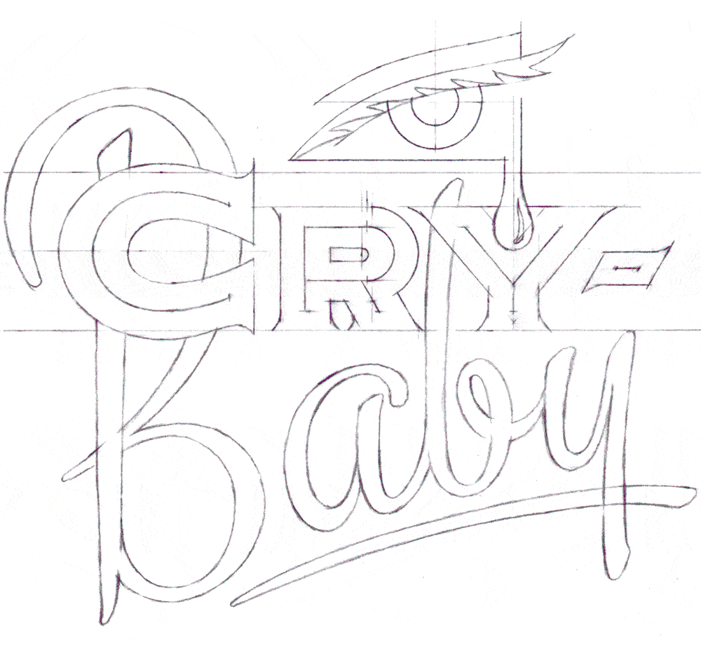
I‘ll go through all the pages of sketches, noting those that show some promise. In the case of this project, I picked out seven that I thought had potential and expanded them into rough pencil sketches that would be tight enough to present to the agency.
I try to provide graphic ideas that appear as different from one another as I can make them. Yet all of them should in some way fit within the parameters that were set out by the agency at the beginning of the project. Here is a little bit of the thinking behind the sketches:
The crowns in sketches 1 and 2 were suggested by one of the songs (“King Cry-Baby”) that appeared in the movie.
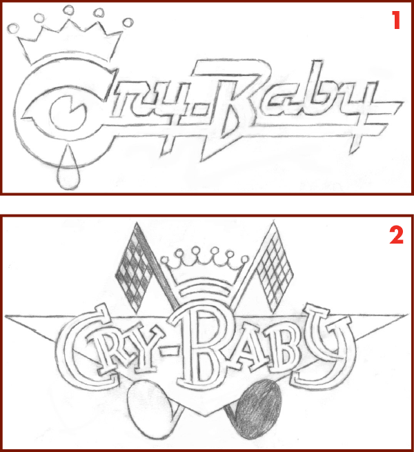
The letterforms in sketches 1 and 5 are references to “brightworks”– classic chrome car logos and ornaments of the ‘50s.
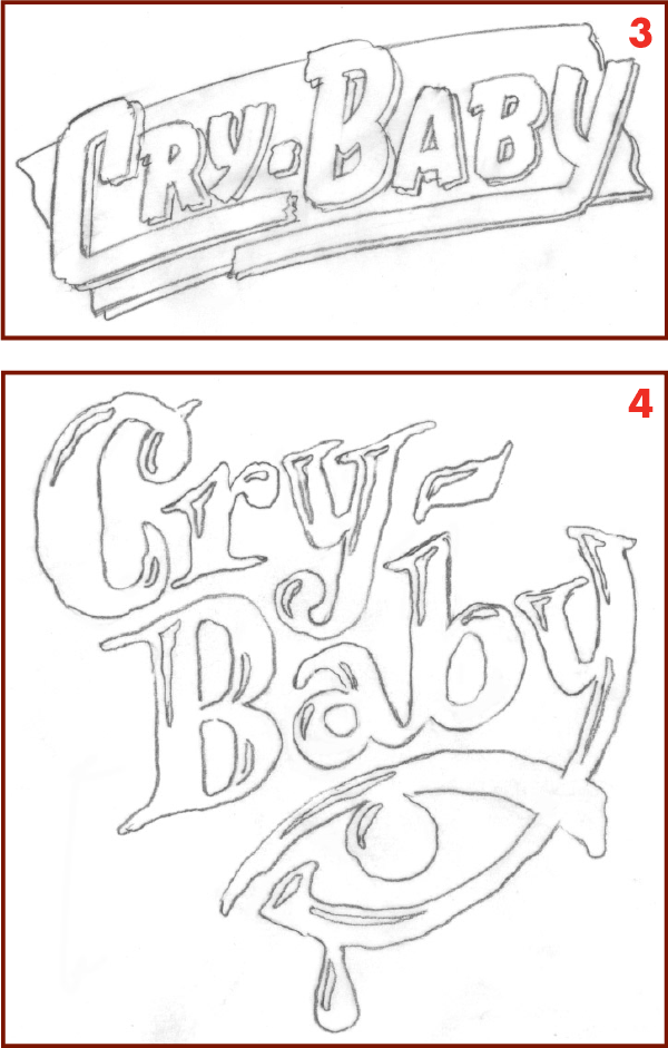
The letterforms in sketches 3 and 4 were an allusion to pulp novel covers and film noir and horror movie titles of the period.
Sketch 6 is a direct reference to hot rod decals. Sketch 7 is also a reference to hot rod decals and also to Matchbook covers.
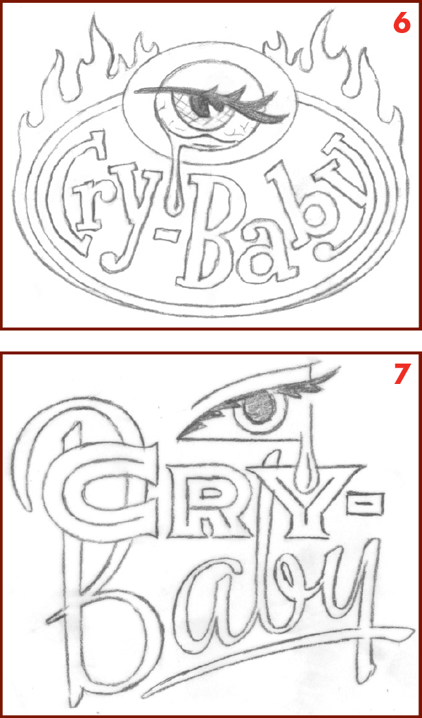
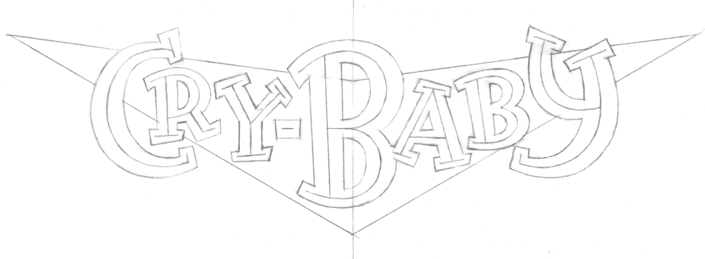
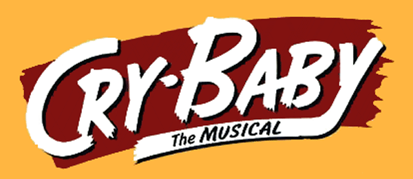
The agency asked me to bring three of the sketches to a level of finish where the producers would be able to easily visualize the treatments, and where the agency could insert them into their layouts. The agency felt that sketches 3, and 7 were fine as is. So I was to move ahead and take these three sketches to finishes in Adobe Illustrator. Typically the way I do this is to take a rough sketch and redraw it, making refinements and changes as required. Then I take the refined pencil and place it in a layer in Illustrator as a Template. Because of the impending deadline, there was no time to do redraws on most the designs, so I mostly had to make-do with the rough sketches as they were . . .
. . . except for #7 which needed a bit more detail and exactitude in the drawing before I could proceed to finish.
On sketch 2, the agency asked me to remove the racing flags/musical note motif. They also asked me to remove the crown motif, as the song “King Cry-Baby” would no longer be in the show. We discussed that it might be a good idea to change the triangular background to a V-8 “V” shape to reinforce the automotive connection.
Additionally, they asked me if I had the time before the deadline, if I could develop sketch 1—that would be great. As it turned out I was able to
squeeze in a finish on this one as well before the deadline. I also needed to edit out the crown on this design for the same reason as in sketch 2.
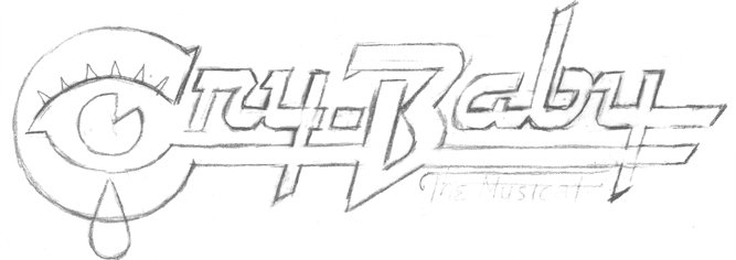
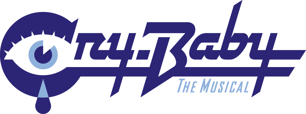
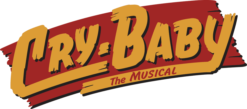
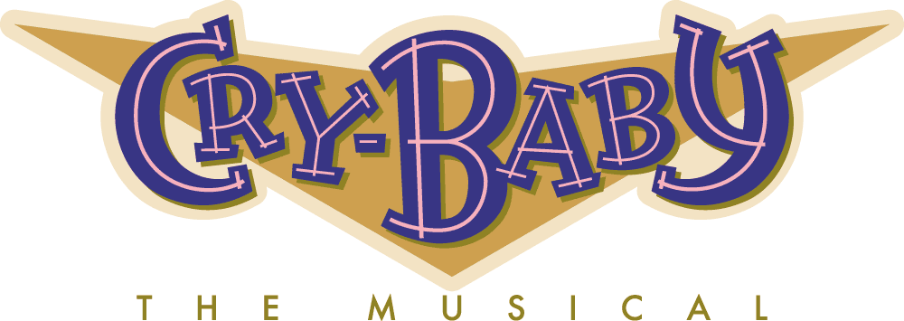
The one other thing I needed to add to these semi finished designs were the words “THE MUSICAL”. Of course I felt I should add those words in a way that would feel organic to the designs, and not “added-on”. I did a total of seven design solutions including the four you see above as finishes. The producers of the show selected design #3—the “pulp novel” style treatment. Unfortunately, and for reasons still unclear to me, this design (#3) was adapted and changed by others:
Sadly the show closed after only 45 previews and 68 performances.
#

Powered by WordPress and Nifty Cube with Recetas theme design by Pablo Carnaghi.
Entries and comments feeds.
Valid XHTML and CSS.