 |
|
What I Do (#2 of 3)
May 29, 2008 on 1:46 pm | By Michael | In Notes, Wayback Machine | No CommentsI created a teeny-tiny niche for myself when I started doing “letterforms” art—this was back in the ‘70s. For me that time was a low point for typography. There wasn’t that much going on design-wise that held my interest. I felt at the time that illustration and typography/lettering were seen and treated as two seemingly unrelated disciplines. To my mind typography had become uninteresting and was hardly ever fully integrated with images—whether they were photographic or illustrative. At the time the very popular modernist movement (as typified by such designers as Rudolf de Harak and Chermayeff & Geismar) represented a way of approaching design that for me held very little interest. When I looked back a few decades at the rich history of ephemera in this country it seemed that we were in visually lean times.
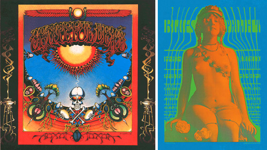
Early work by Rick Griffin (l.) and Victor Moscoso (r.)
While a student at the Cooper Union I was very taken with the “psychedelic” posters that had appeared on both coasts. The work of such artists as Victor Moscoso, Kelly & Mouse and Rick Griffin had a huge impact on me with their unusual use of color and integration of letterforms and striking images. Of course I don’t think I could have verbalized any of this at the time, I just knew what I liked—and wanted to see more of those sorts of things. So I started to create custom letterform solutions, working and collaborating with illustrators—specifically Charles White III and Doug Johnson. I soon realized that I myself could also be a maker of images and so, after gaining a little self-confidence, started to take on projects where the image and the typography associated with it became more integrated with each other—at times becoming one and the same. I guess this was to become my “thing”—the integration of letter and image. Soon, other young designers began imitating what I did. At the time I kind of resented it as “plagiarism”, but I soon realized that imitation was the most sincere form of flattery. Over the years my “imitators” branched out and found their own voices. So it’s gratifying to see that in some small way I may have influenced a generation of designers.
No Comments yet
RSS feed for comments on this post. TrackBack URI
Leave a comment
Powered by WordPress and Nifty Cube with Recetas theme design by Pablo Carnaghi.
Entries and comments feeds.
Valid XHTML and CSS.
