 |
|
Art Imitates Life…Imitates Art (Canter’s Truck #2 of 3)
March 21, 2010 on 9:05 pm | By Michael | In Gigs, News | 3 CommentsAlthough most of the food trucks are similar in appearance, many contain details that slightly alter some of their proportions. So it became necessary for me to visit the Road Stoves truck depot and to take pictures of the truck that would be closest to the one that Bonnie would be getting, and to use those photos as templates for my design—I’d also have to Photoshop out the existing graphics, making the truck as clean as I could to act as a blank canvas for my new design:
I set about to create the elements for the truck wrap, basing the graphics on the look of the Canter’s neon sign and my font Deliscript. I felt I needed to modify Deliscript a bit to make this a strong graphic statement—kind of like a logo for the truck. So I began by creating a large, circular initial “C” in Canter’s—and that became the basis for the look:
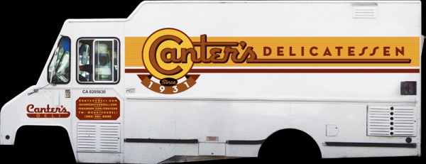
I also settled on a palette of colors that I felt would be attractive and reflect what I thought of as a Deli aesthetic. The unique double “SS” in “DELICATESSEN” was borrowed from the neon sign—one of many small details that I felt would help keep continuity between the restaurant and the truck. I added some other elements such as “Since 1931” that Bonnie wanted. In my first iteration for the truck my feeling was that I’d try it as a white truck—a good clean look— and adjust the graphics accordingly.
I might’ve had the Good Humor truck from my youth in Brooklyn in mind:
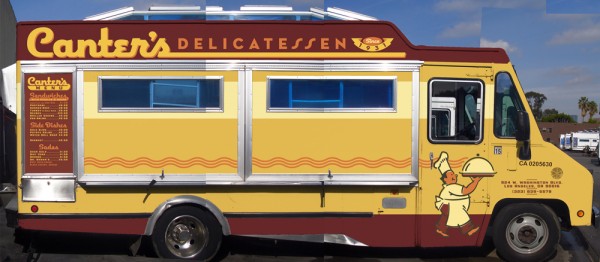
Nevertheless, a white truck wasn’t exactly what Bonnie had planned on. I have to admit that I’m glad she pushed me to do a more colorful truck. Even though the truck was to be treated as a “vehicle wrap” by SignQuest, a process that is being more and more widely used, I decided to treat the truck as if I was designing a paint job in order to give it a look that was more in keeping with its mid-century heritage. Keeping the color palette that I had first come up with I created some mock ups that I thought would work even better for Canter’s than my all white version:
We also decided that it would be a good idea to have a slogan and, after much deliberation, settled on “…home of the Kibitz Room”. The Kibitz Room is the dive bar/cocktail lounge that’s off in a corner of Canter’s Deli. Like Canter’s, it’s an LA institution that just seems to keep going and going.
I had envisioned that we would somehow use my very graphic take on the neon baker sign on the service side of the truck. So I put him on the door and let the steam from his platter trail back along the length of the truck towards the menu. Along the top of the truck yet another version of the Deliscript/Canter’s logo:
In “Art Imitates Life…Imitates Art #3″ I’ll post photos of the actual truck wrapping, and also of the finished truck.
3 Comments
RSS feed for comments on this post. TrackBack URI
Leave a comment
Powered by WordPress and Nifty Cube with Recetas theme design by Pablo Carnaghi.
Entries and comments feeds.
Valid XHTML and CSS.


Truck looks fantastic Michael!
Comment by Alex — April 1, 2010 #
Not that I will ever see that truck rolling down my street but damn you’re GOOD!
Comment by José Cruz — March 29, 2010 #
That is so cool!
Comment by Heckadude — March 21, 2010 #