 |
|
Author Archive
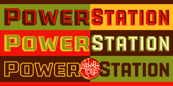
Fonts In Use: Veer Picks PowerStation
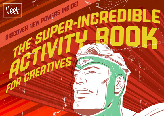
August 23, 2010 on 11:24 pm | By Michael | In News | 1 CommentToday I was surprised to see that Veer, one of my font resellers, had selected one of my fonts—PowerStation—to use throughout it’s current online and print promotion “The Super‑Incredible Activity Book for Creatives“.
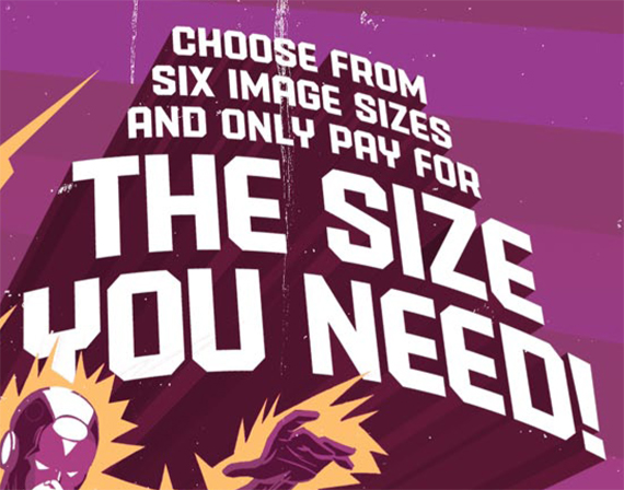
They actually used PowerStation as the basis for major graphics on over 15 pages throughout the 100 page book.
Veer selected both PowerStation Solid and PowerStation Solid Wide to feature in this promo.
I was pleased to see that they used this font in a variety of different layouts, demonstrating its flexibility—despite the fact that PowerStation’s layered typesetting features or faceted letterforms weren’t used.
Thank you Veer . . . and thank you Joe Newton!
Le Train Bleu @ Bloomingdale’s
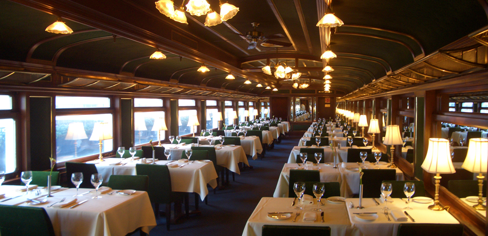
July 30, 2010 on 12:59 pm | By Michael | In Gigs, Wayback Machine | 8 CommentsWhile in New York City to give a talk at the Type Directors Club Laura and I stopped in at Bloomingdale’s. I hadn’t been back to Bloomingdale’s for many years, so while there I thought I’d check to see if some signage I had designed for their “Le Train Bleu” restaurant might still be in use. To my utter amazement, my work was there—still in use after 30 years. The restaurant itself is a stunning recreation of a vintage dining car, and has been virtually unchanged inside since the day my work first adorned its entrance.
The Original “Le Train Bleu” was a luxury French night express train which carried wealthy and famous passengers between Calais and the French Riviera from 1922 until 1938.
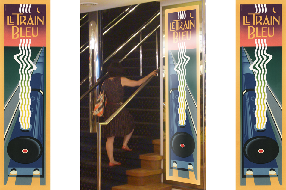
Back in 1980 I had designed and painted art for two panels that were to bookend the stairway leading up to the restaurant. The challenge, as outlined to me by then Bloomingdale’s Creative Director John Jay, was to design a poster reminiscent of the great transport posters of the ’20s, ’30s and ’40s,—but in an extremely thin vertical format: almost a 4 to 1 height to width ratio. Also the design had to be able to mirror itself so that it could appear on either side of the entrance. Designing the piece so that one had almost a bird’s-eye view of the train which was letting out a very art-moderne steam stream seemed like a natural for the format.
This was not a typical project for me at the time because I had never executed a painting like this before. In addition the typography played a much smaller role in the design, and in the end was much more toned down than in most of my other work.
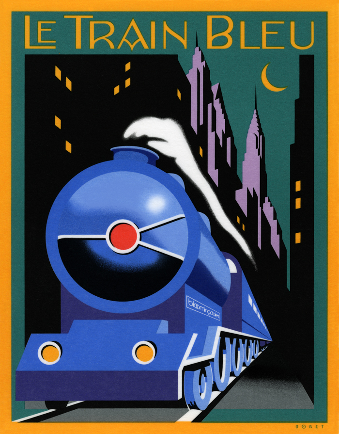
Above is the menu cover I designed as a companion to the stairway panels. It depicts the same train as in the panels from the more traditional “heroic” viewpoint seen in many transport posters of the time. I redid the lettering, but kept it in the same moderne style—only in a lighter weight. And unlike the panels the art for which I had painted in gouache, I did the menu cover as pre-separated mechanical art—much more akin to my current work which is usually done in Adobe Illustrator.
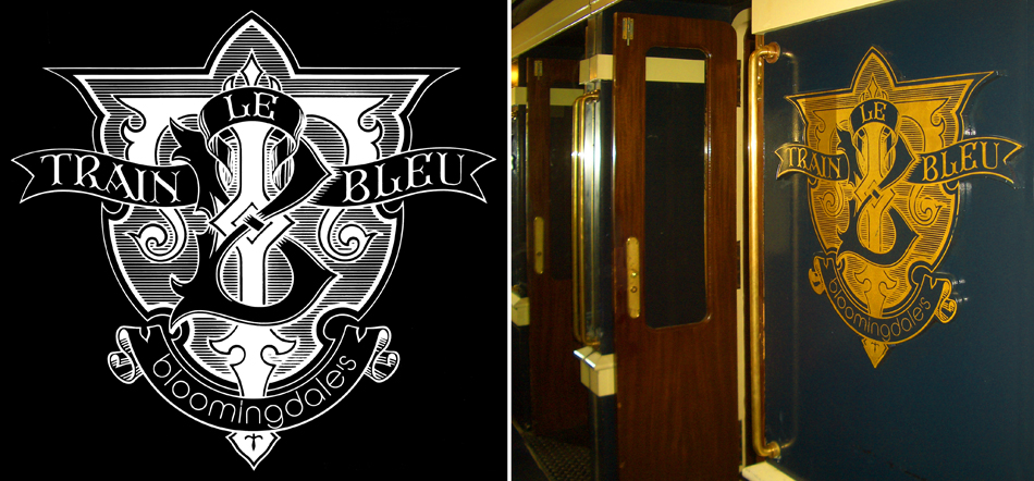
Additionally I had designed the “Le Train Bleu” seal or monogram that appears in relief outside the restaurant and on printed materials. This was much more akin to the type and letterform-centric work that I’ve become known for, and was designed to be very heraldic in nature. To my surprise this large monogram in relief was also still there, looking as fresh as the day it was first mounted in the vestibule of the restaurant at the top of the stairs.
For those who are interested there are prints of the Le Train Bleu vertical format artwork available on my ILLOZ site. These prints are finely produced, hand-crafted 12 color fine art lithographs that are virtually identical to the original painting.
Please also see my more recent supplemental posting on Le Train Bleu at Bloomingdale’s.
Back to the Future
July 3, 2010 on 4:03 pm | By Michael | In Gigs, News | 2 Comments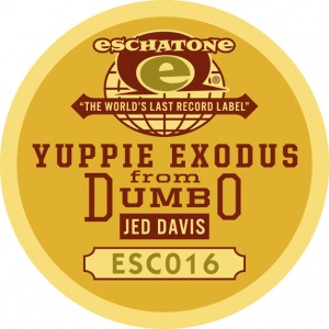 My friend Jed Davis, for whose recording company Eschatone Records I had designed a vinyl record label, recently asked me to design packaging for an unusual project. While most people in the recording industry are trying to figure out “what’s next”, Jed was asking the question: how can I get back to basics? What came before MP3s, before CDs and Casettes, before 8–Tracks, and before 33, 45 and 78 RPM records? The answer: wax gramophone cylinders, of course!
So Jed decided to release one of his own recordings not only as a digital download but, hoping to reach the untapped centenarian demographic, also as a limited edition, signed wax gramophone cylinder. But unfortunately, as Jed was to learn from The Vulcan Cylinder Record Company, it had to be made of hard plastic instead of the traditional wax. Undaunted, Jed decided to move ahead declaring that since it would be hard plastic “it will never degrade, no matter how many times you play it on your family Edison”. He also decided to accommodate all those without gramophones by including a free digital download together with the purchase of the cylinder.
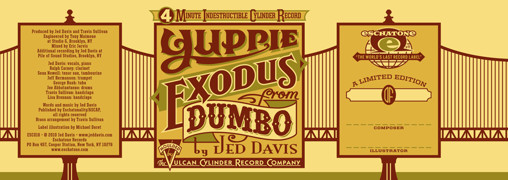
When Jed asked me to design the labels for the cylinder, I thought “Well, I’ve designed covers for LPs, for cassettes and for CDs. This may very well be my last opportunity to design a gramophone label.” The title of his release was “Yuppie Exodus from Dumbo”, and Jed gave me free reign to design both the wraparound label and the round label for the top of the cylinder container:
 When the labels were finally printed by Vulcan, the colors came out a little differently from what I had designed, but I have to say that I’m pretty much OK with it. I think it does give it a slightly more vintage feel that’s appropriate for this project:
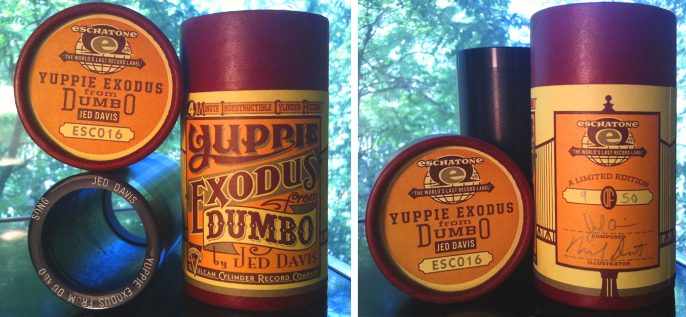 This is a signed (by Jed and by me) and numbered edition limited to 50 cylinders. Hear the song and purchase the cylinder/download HERE—before it’s too late!
Powered by WordPress and Nifty Cube with Recetas theme design by Pablo Carnaghi.
Entries and comments feeds.
Valid XHTML and CSS.
