 |
|
Author Archive
Talk at the Type Directors Club
June 28, 2010 on 3:39 pm | By Michael | In Gigs, News | 4 CommentsIf you’re going to be anywhere in the vicinity of New York City in late July, then I’d love to invite you to the talk I’ve been asked to give by the Type Directors Club. I’ll be talking about my work, both new and old—and more specifically about all the influences I’ve had over the years that helped form my aesthetic sensibility, especially those that worked on me as kid growing up on the streets of Brooklyn. So is it “Nature or Nurture”? You be the judge!
I’ll be in New York to attend the opening night festivities at Cooper Union on July 20th for TDC² 2010 – the show which honored my Deliscript fonts.
My talk will be held on Thursday, July 22nd, 6:00–8:00 PM at the Type Directors Club: 347 W. 36th St, #603, NYC.
Please RSVP to the TDC by Email or call them at (212) 633-8943 to reserve your spot.
Help the LA Food Trucks!
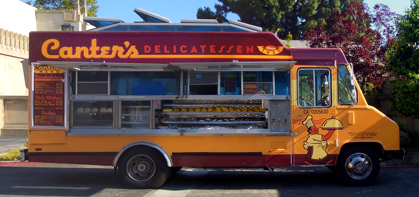
June 19, 2010 on 1:22 pm | By Michael | In News | 1 CommentBecause of my involvement with the design of the Canter’s truck, I’ve just heard about the attempt by the City of Los Angeles to severely limit where food trucks can serve the public. They’re trying to do this by prohibiting them from parking at meters in commercial zones. Without providing adequate, alternate parking areas, this would effectively put many of the trucks out of business. If you, like me, feel that these gourmet food trucks are adding to the culture and vitality of the city, and don’t want to see them gone or severely curtailed, then please sign this ONLINE PETITION. And please let others know!
Paris Loves Letters
May 17, 2010 on 9:36 pm | By Michael | In News, Notes | 1 CommentI’m just back from a stay in The City of Light, and just wanted to share an impression I had that typography and lettering are admired and extremely well respected there—possibly as much or more than anywhere else in the world. If nothing else, Paris is a city where history permeates everything, and you can almost trace its history through the many layers of lettering and signage that stretch back over many decades. I say respected because so much of it has been preserved, and not painted over or replaced just to be up to date. In fact, many shops kept and preserved the lettering from previous incarnations, even though the name and nature of the business had changed. It was refreshing to see that just about every business that had a public face, from the smallest boutique to the largest high-end stores, all took great pains to maintain an artful, thoughtfully designed appearance. Aesthetics on every level are a part of the culture, and an understanding of the importance lettering and typography seems to be universally understood and encouraged. Here is a small sampling of some snapshots I took while strolling around the city:
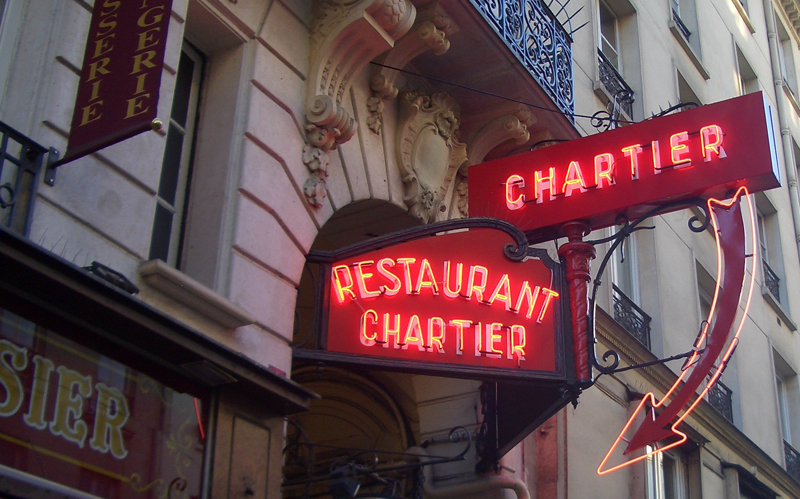
My new favorite restaurant in Paris—not so much for the food, as for it’s graphics and interior.
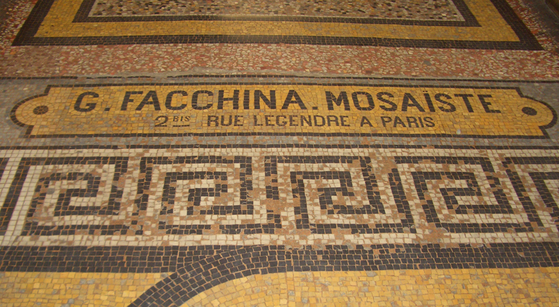
The mosaic floor of one of Paris’ many arcades.
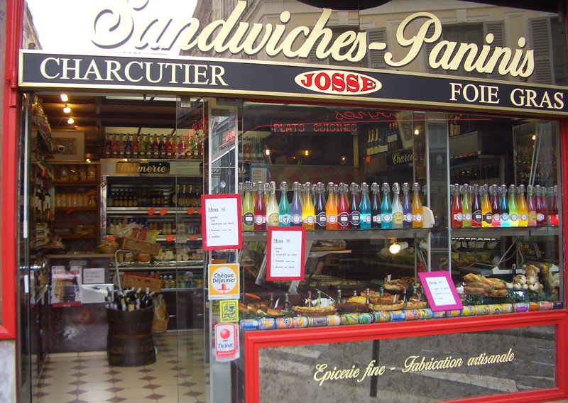
A sandwich shop. I love those colored bottles!
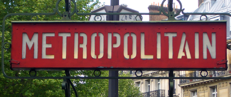
Metro signage – not the typical art nouveau version everyone’s familiar with.
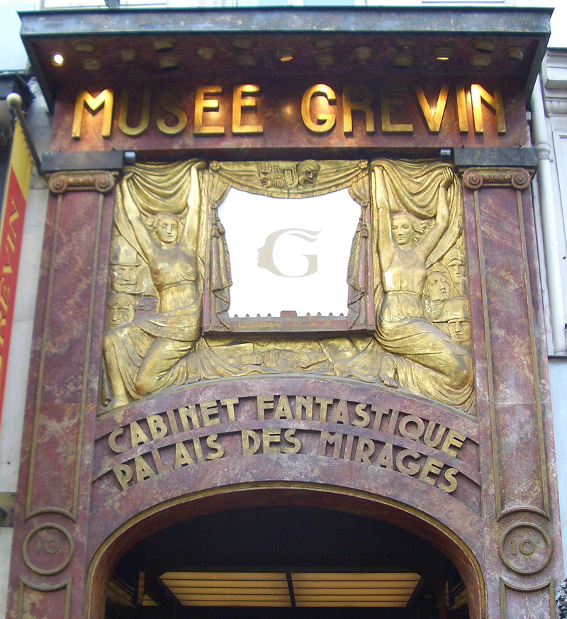
Paris’ Wax Museum . . . an Art Déco Extravaganza
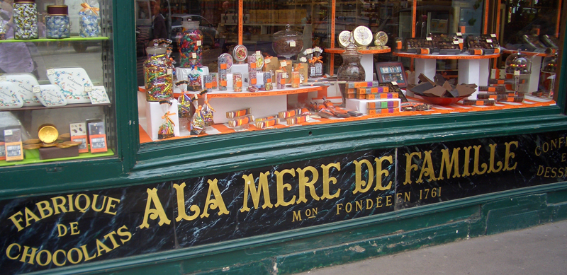
A confectionery shop with signage that dates back . . . who knows how long? Still in perfect condition.
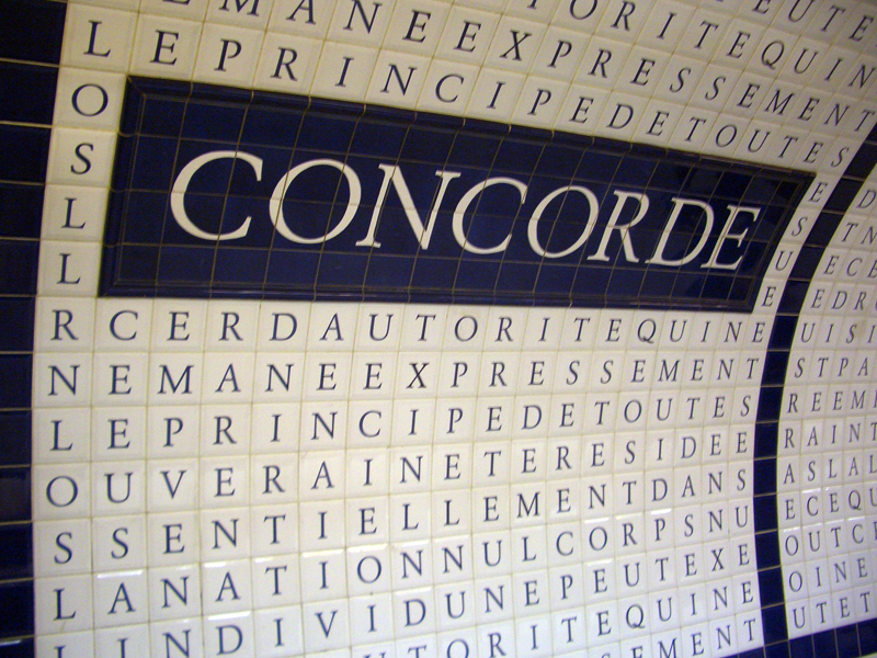
Contemporary tile work in the Metro’s Concorde Station. This incredible project was begun in 1989 and contains the text of The Universal Declaration of Human Rights. This typographic work covers the entire arched wall and ceiling of the station.
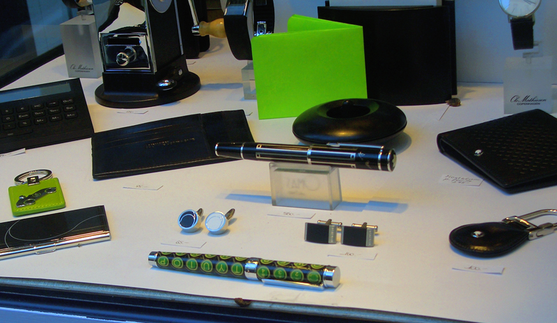
And finally, (please excuse the shameless plug) while walking the streets of the Marais, I happened across a shop called “L’Art du Buro” which had my QWERTY pen displayed front and center in its window. Certainly an ego boost, if ever there was one!
Powered by WordPress and Nifty Cube with Recetas theme design by Pablo Carnaghi.
Entries and comments feeds.
Valid XHTML and CSS.
