 |
|
Author Archive
The Jewish Zodiac™
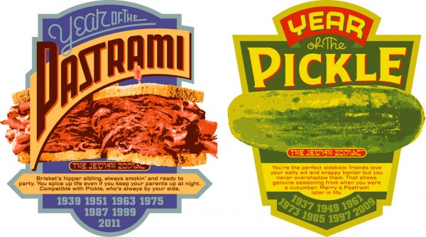
November 14, 2008 on 3:25 pm | By Michael | In Gigs, Notes | 6 CommentsAbout a year ago I was contacted by comedy screenwriter Seth Front who pitched me his idea for “The Jewish Zodiac™”: a parody of “The Chinese Zodiac” but with deli foods instead of animals. Each of the 12 signs (based on birth year) would, in a light-hearted way, personify the food’s characteristics as well as explore compatability with the other 11 signs. It seemed like a good idea, and I could design them all as vintage deli food labels with the potential of becoming a mini portfolio of 12 related but distinctly different designs.
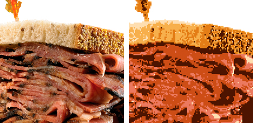
One problem I needed to solve was that Seth had already done food photography, and was intent on using it in the designs. Initially I wasn’t hot on using his photography because I thought it would be difficult to integrate into my graphics. But then I figured out a way of using Photoshop and Illustrator to translate the photos into simplified graphics using limited color. The results looking deceptively simple and easily achieved—but figuring it out and translating each photo was in actuality a very labor intensive process. I was then able to extrapolate the label designs using the limited color palettes derived from the processed photographs. Below is a section of one of the photos and the corresponding section of its simplified graphic counterpart I created, reducing it to 6 flat colors:
It took many months to get all 12 done, but I’m very pleased with the group as a whole. Below are two of them—if you’d like to see all twelve in more detail follow this link to the PROJECTS page on my website. To purchase T-shirts, mugs or magnets please visit Seth’s “The Jewish Zodiac™” website.
Office Machines & Bubblegum
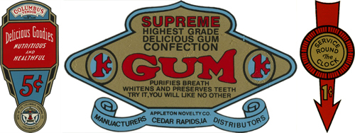
November 9, 2008 on 3:37 pm | By Michael | In Gigs, Notes | 2 CommentsI’ve always loved the graphics found on vintage office machines (you know, the ones with industrial hammered metal finishes), which are often comprised of 2 or 3 color decals. They have a lot in common with decals that were used on gum and candy vending machines back in the ’40s and ’50s. I’ve managed to collect a few of those, and have always admired the naive, bold and simplistic graphics and design sense they share. I recently found a way to pay homage to them when my friend Jed Davis, Senior AD at both Promo and Direct magazines (and who also runs the indie record label “Eschatone Records“) called me with another cover assignment for Promo Magazine.
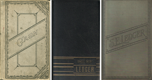
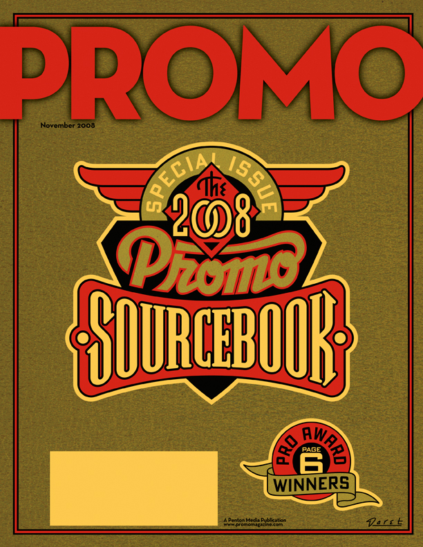
The November issue of Promo is a special issue called “The 2008 Promo Sourcebook” and they needed a cover design that was non-specific, yet eye-catching enough so that people wouldn’t mind having it around for several months. My first inclination was to give it a sort of ledger-like look:
But after consideration, I thought that idea might be a little too sedate and staid for what Jed was looking for. Then it occurred to me that perhaps this might be an opportunity to do something along the lines of the decals I had been collecting. I could get color and excitement into a cover that had the feeling of a ledger by also referencing the graphics and decals found on old office and gumball machines. To further the feeling I gave the gold color a subtle “decal” texture, and the background feeling of metal with an industrial machine-like finish.
Fame Has It’s Drawbacks…2
November 3, 2008 on 5:55 pm | By Michael | In Gigs, Notes | 2 CommentsBack in May I did a blog posting here talking about the mis-perception that my design services are too expensive for most clients. At the time I wrote:
“Something I hear quite frequently runs something like this: ‘You’d have been perfect for our project, and I’d have hired you in a minute, but you know, we probably wouldn’t have been able to afford you.’”
I’m still getting feedback from many of you out there that you believe what I do is too pricey for your budgets. While that may be true in some cases—such as in national advertising or corporate logos, I do pride myself on my ability to tailor what I do to a client’s needs and (more and more) to limited budgets. Here’s another case in point.
I was contacted by a photographer from Berlin named Tanja Ortmaier (“Spooky Sally”) who does predominantly 1940s style pin-up photography under the name “Cherrymuffin Studios“. She asked if I would be willing to design a new logo for her that she could use on her website and could be adapted for various other uses such as signage. While her budget was fairly modest, I was impressed with her work (it’s not every day that I get to work with a pinup photographer!) and her enthusiasm was, to put it mildly, infectious! Below are two samples of what I was able to do for her:
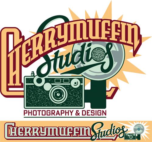
Upper: for use on website | Lower: for use on signage
Because of her openness and her ability to accept certain limitations, we were both able to bring this project to a successful conclusion in a very short amount of time. Here’s a few comments from her:
“Hey Michael, Again – this is awesome! Great how you captured the details of the camera! …and I’m very happy with the flashlight as well!…YES I’m really happy with all that! Thank you for such a great work! Yippiejaiyeah, Sally.”
So while yes—I am in it for the money—I don’t have specific rates: hourly, daily or otherwise. I try to evaluate each project on it’s own merits, and come up with a price that is fair for all involved. If a client has a set budget (e.g. such as a specific limited rate for a magazine cover) I try to figure out how I can best meet their needs while not overextending myself. Sometimes I can come up with a solution that’s a lot simpler than what might have been envisioned. Many times I can figure out a way to successfully solve a design problem that doesn’t take me a long time, yet more than satisfies the needs of the project. So please, just remember—if you’re in doubt, it doesn’t hurt to ask me!
Powered by WordPress and Nifty Cube with Recetas theme design by Pablo Carnaghi.
Entries and comments feeds.
Valid XHTML and CSS.
