 |
|
Archive for the 'Gigs' Category
Oh Canada! Logo Project for Iron Oxide Design Part 1 of 2
January 8, 2014 on 11:01 am | By Michael | In Gigs, News | No Comments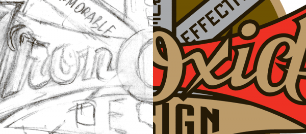
When I was first contacted for a logo design project by Blaine Casson, who runs a one man shop up in Cambridge, Ontario (near Toronto)—that handcrafts three dimensional wood signs, custom promotional pieces, and presentation cases—I was absolutely blown away by the quality of the work he was producing. Blaine specializes in raised letter wooden signs—something one doesn’t see that often in this “Age of Vinyl”. I have not seen his extremely high level of craftsmanship and attention to detail in such a looong time! He wanted me to design a logo for him, and saw in me a “kindred spirit”. We both gravitate towards a lot of the same types of vintage graphics and ephemera for certain types of inspiration. So I felt absolutely certain that whatever I did for him would be manifest perfectly in three dimensions, down to the smallest detail. I also knew that certain problems which I could never forsee in the fabrication of dimensional signage would be handled with sensitivity and with an extremely high level of problem-solving. Blaine wanted to move the design in a direction that I totally concurred with—using vintage motorcycle decals as a source of inspiration:
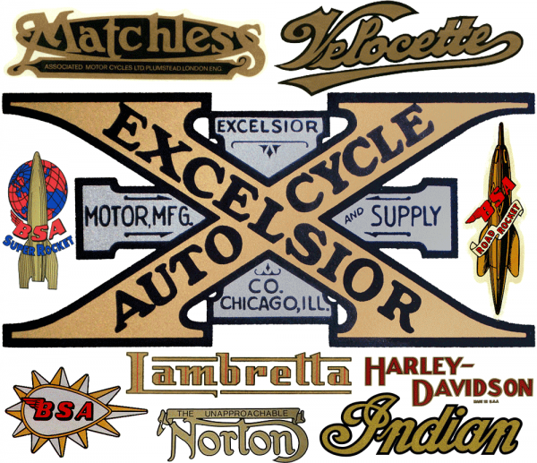
Blaine writes about these graphics:
“Beautiful cast metal logos affixed to the radiators of the automobiles of the day. Fantastic, colorful and complex water slide transfer decals on the gasoline tanks of the many hundreds of brands of motorcycles. I am mesmerized by the logos on antique motorcycles and have actually once added a motorcycle to my collection based on the decals over the mechanical attributes of the machine. A most interesting fact to me is that in the first year of some motorcycle companies existence, when they only produced a single or two or three machines, they would send the gasoline tank over to the local sign writer to get the company name hand lettered onto it. Sometimes the sign writer’s style and skill on this lettering became the genesis of the companies logo. As production increased in later years the sign writer was replaced by transfer decals but the hand lettered look often remained and was carried on.”
I saw working on this project as an opportunity to tap into this rich history—an area into which I had not delved in quite a while. There is so much in this tradition to sink one’s teeth into. I love the limited color palettes, predominently using gold and silver, the thick, heavy, black outlines, the swashes (you know I love those!), and the way type and lettering are organized within banners and shapes.
Blaine had quite a bit of information he wanted to be included in this design, because it was not only going to serve him as a logo, but as signage outside and inside his business—an old brick factory building in Cambridge. Words like “Signs • Displays • Promotionals”, and “Memorable • Effective • Unique” suggested advertising slogans from a bygone era. Never one to shy away from a challenge, I started putting my pencil to paper.
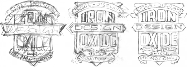
It’s important for me to try different configurations, to see how organizing the words in different sequences and relationships might either hide or illuminate what we’re trying to communicate.
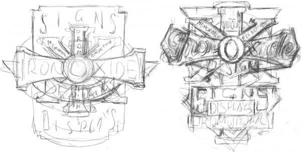
When I came up with the layouts above, I was directly referencing the Excelsior decal seen at the top of this page. I could easily justify turning the “cross” into an “I”, and using the “X” as a motif definitely seemed to fit in with the word “Oxide”.
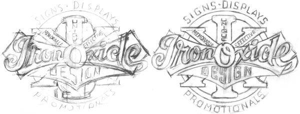
But the layouts seemed to be overly busy and a bit confusing, so I took the elements from the center of the design and re-worked them, playing down the secondary slogans quite a bit. I was quite happy with how the design was shaping up, and Blaine concurred.
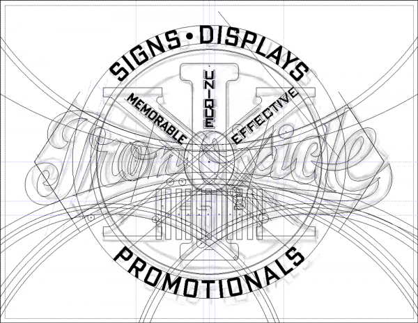
Then, placing my rough drawing on a Template layer in Illustrator I proceeded to flesh out this artwork. I used my font DeLuxe Gothic Condensed for the slogan words, and set up various arcs and curves that I would follow closely. Before I worked digitally I would have done a much tighter pencil drawing, working out all the fine details before inking, but now I do that in this Illustrator stage, using a rougher pencil drawing.
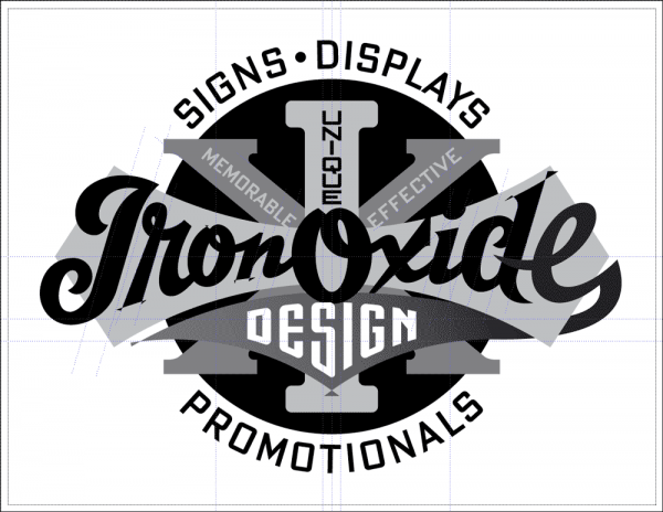
I hadn’t figured out color at this point in the process, so in Illustrator I just randomly assign different black, white, and grays to the different elements so that they separate and can clearly be seen one against the other. Also at this point I hadn’t yet decided what would get an outline, and what would be solid, but it’s still important in this phase to work out shapes and relationships to make sure everything is going to work.
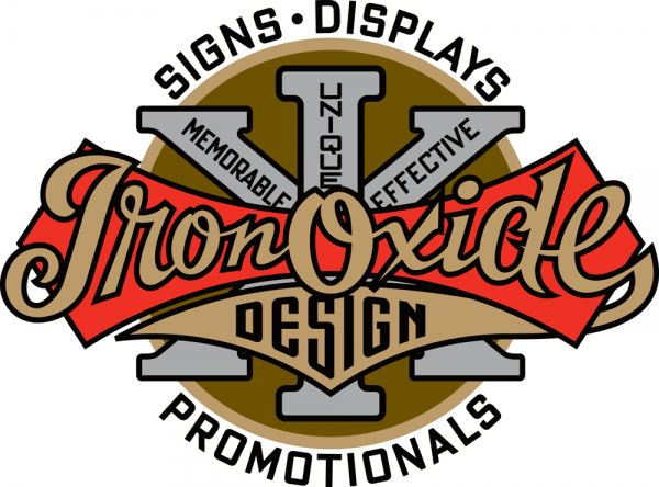
When I completed the artwork Blaine wrote:
“You nailed the feel, the era and the complexity that I was after. The outlined gold script, the swoop of the tail on the lower case ‘e’, the big ‘X’ element and especially the slightly cramped and varied kerning and stacking of the lettering within the ‘X’ and the ‘I’.”
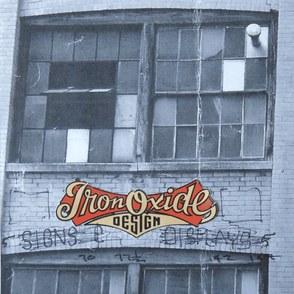
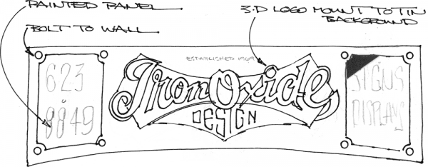
For the very large sign that was to be installed outside the third story windows, we needed to make some major alterations to the design. It needed to be fit into a long narrow space between the two floors, and have a very long arc along it’s bottom edge. Blaine sent me these sketches (above and below) as a suggestion for how he thought it could work.
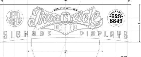
I then came up with this rough sketch on wording and placement—some of it could be typeset, other parts needed to be hand-lettered:


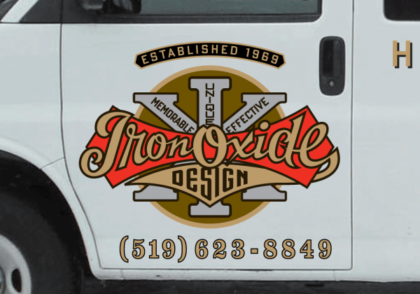
With the designs for the main logo and the horizontal exterior logo completed, the one other adaptation that needed to be addressed was for the Iron Oxide delivery van. We opted for a simpler solution, reverting to the original design, but adding a few elements.
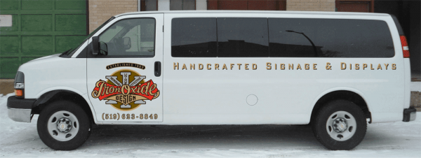
The tendency these days is to “wrap” a vehicle, covering it completely with graphics, but we decided in this case that simpler was better, opting for a cleaner look, having the white background of the truck set off the logo.
But the most exciting part of this project was yet to come. For me that was the actual fabrication of the signs by Blaine in three dimensions, cut out of wood and metal, and painted. Exciting for me because this was going to be an interpretation—not a literal translation. I would get to see how someone else chose to solve certain design problems that were inherent in translating something from two dimensions into a truly dimensional piece of art. So stay tuned for Part 2 of this story . . . where I document how a master signmaker exercises his craft . . . coming soon!
A New Logo for American Contemporary Ballet
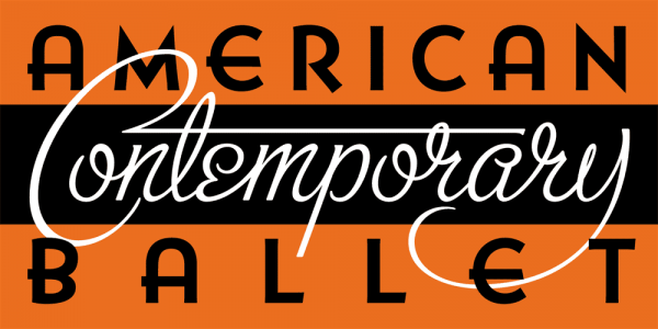
December 18, 2013 on 6:12 pm | By Michael | In Gigs, News | 2 CommentsEarlier this year I had the pleasure of meeting Lincoln Jones and Theresa Farrell—respectively the Artistic and Associate Directors of Los Angeles’ American Contemporary Ballet. They describe themselves as producing “original contemporary classical ballets in Los Angeles, California–works that are built upon the foundation of classical ballet, and which extend the art into our own time”. When we first met their studio space was less than ideal, but it wasn’t long after meeting them before they lucked into a fantastic space on Wilshire Boulevard directly across from the main entrance to LACMA. At the time they had a professionally designed logo that did the job, but their new space presented them with a challenge: outside, directly in front of their floor-to-ceiling windows was a fountain, and centered in the fountain was a large, white, blank “monument” whose purpose obviously was to support signage for whoever was the tenant of the space behind it. Occupying their beautiful new space, and realizing that the “monument” in the fountain was the wrong proportion for their existing logo, Lincoln and Theresa asked me if I’d be interested in designing a new logo that would also work for them as signage. Lincoln described the process of our working together on this project:
“In my experience, it is rare to be delivered a design product and love it unreservedly, at first sight. With Michael it happened twice, on the same project. We needed a sign to fit the large monument in front of our new building across from the Los Angeles County Museum of Art. Our current logo didn’t work, given the size and shape of the monuments face, and I hadn’t been able to imagine even a vague outline of anything that I liked for the space.”
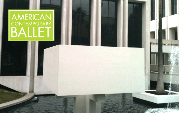 The previous logo superimposed over the blank “monument”.
“I asked Michael to make some suggestions, and he came to the studio and made a sketch in front of me. What he drew was something that I had never considered, but which was beautifully alive, eye-catching, and seemed to capture the spirit and aesthetic of our company in just the right way. It was also totally unique within our market. I told him to do it exactly like that, and that it would also serve as our new logo.”
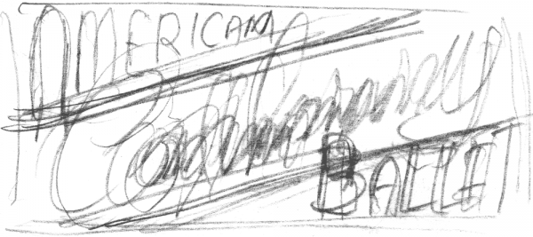
Well, in case you were wondering how anyone could tell very much from the thumbnail above, I did “fill in” quite a bit with a verbal description of what I was envisaging. I went back to the studio and subsequently started developing that very loose thumbnail into a design that was a bit more coherent—
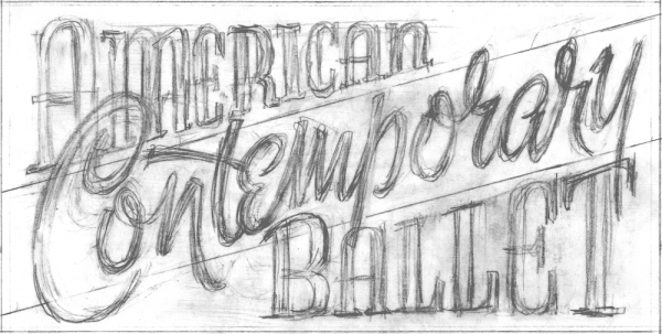
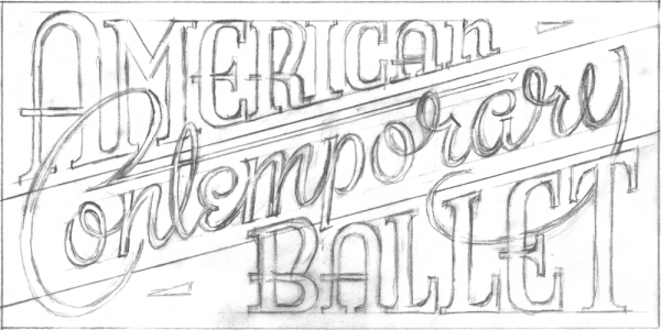
Then taking it several steps further, I digitized it in Adobe Illustrator, trying to make it work with several different iterations:
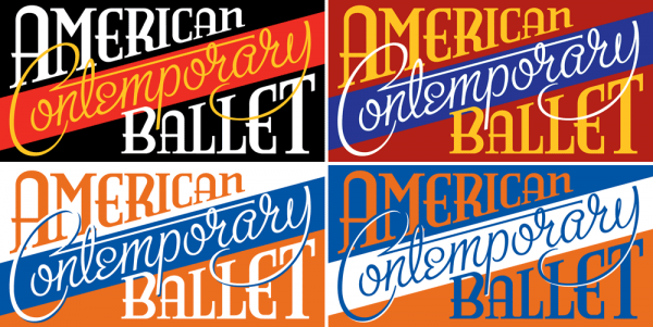
…but for various reasons I was less than happy with where this design was going. At this point I’ll let Lincoln take over, describing what happened next:
“He called me a few days later to say that while he liked the art he had done, he didn’t think it was right for the location. His reasons made sense to me, so he sent me a second design which retained a few qualities of the first, but was totally different in the overall feeling.”
I had decided to keep the script lettering of the word “Contemporary”, but shifted it to read along a horizontal plane instead of moving upwards at an angle, and I had decided to simplify the words “American” and “Ballet”, rendering them in my adaptation of one of my favorite fonts Bernhard Gothic. Making these rather large alterations didn’t totally change the nature of what I had imagined for the logo, but helped to make it more legible and coherent—especially from a distance. So this is how it worked out in the fountain in front of their new studio space:
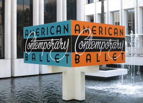
I also convinced them to use a second color scheme on the “monument”, alternating on its sides. I felt that this should be a “living logo” that could perhaps change appearance if its immediate environment called for an adaptation.
Lincoln continues by saying: “Despite the fact that it was a highly different approach, I again felt that it beautifully represented our company, and was a strong expression of our values, in addition to being a standout design. I love having it out in front of our building, and as our new logo. It still catches me by surprise, and delights me when I walk by our building.”
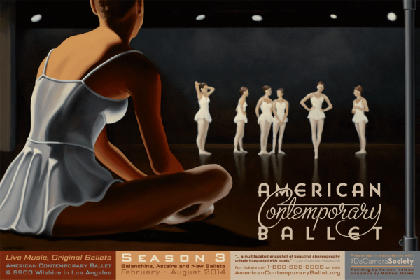
More recently we made another adaptation of the logo to work with a beautiful painting created for their 2014 Season by our mutual friend Kenton Nelson. I felt that the color logo would detract from the beautiful simplicity of Kenton’s work, and so created a one color version. I then organized all the information along the bottom in boxes whose colors were derived from Kenton’s palette—note that all the copy set at the bottom of the poster is set in my font DeLuxe Gothic:
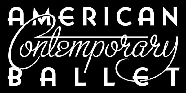
A better look at that one-color version—note the details where “Contemporary” goes over or falls under the adjacent words:
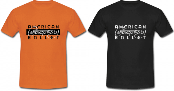
And here are a 2 color and a 1 color T-shirt design created using just the logo:
Lincoln concludes by saying:
“I think Michael’s work is tremendous, but sensitivity to the project, its requirements, and the honesty and originality of his approach make just working with him half the fun.”
For those of you who would like to read more of what Lincoln Jones has to say about his ballet company, his philosophy, and about this design, I’ve included his lengthier statement below.
“When I decided to start a ballet company, it was because I wanted to make and to see a kind of ballet that I wasn’t currently seeing anywhere. Now in our third season, I think our product, our values, and our approach to the art form are even more distinctive than when I started. Our graphic art, indeed all of our graphic, photographic, and illustrative material is very important to me because I want it to not only communicate that we are different, but specifically how. I want it to be a flag representing our values to both our audience and our potential audience. To really see what we do, you have to come to a performance, which means these materials have a big job to do the rest of the time, in terms of getting our message out.
The sign that Michael did (which also became our new logo) is totally unique within our market. The ‘Contemporary’ in our name is there because we make new work, and I want people to understand ballet as a contemporary art form. It was important that the design be in a vernacular that would feel very contemporary to people, to contrast the view that I think most people still have about the art, that it belongs more to the 19th century, or even earlier. Still, it had to have a timelessness about it – a classical strength, which is what we strive for in the ballets – something that will make sense to contemporary audiences on their terms, but which also has a substance and depth that transcends the simply current.
The ‘American’ in our name is also very important, in that we are continuing the forward-thinking work that was done in the art form in the United States in the 20th century, but it goes deeper than that. I have a strong connection to the values that this country was founded on – independence, principled thought, and a break from convention to forge new, better paths. These are not values that are necessarily automatically associated with ballet, which is often thought of as being heavily traditional.
I thought Michael did a beautiful job of creating a design that felt both contemporary and American, but it is also such a strong, balanced design with a timeless feel that it can rightly be called classical.
It is also a beautifully integrated design. The way that the ‘Contemporary’ playfully bursts between the strength of ‘American’ and ‘Ballet’ can suggest a new view of the art. But the playfulness isn’t cheap, it is strongly located within the other two words, which to me suggests not only playfulness, but substance, which are the two qualities that any great dance must have.”
DC Comics 75th Anniversary Book Jackets for Taschen Publishing
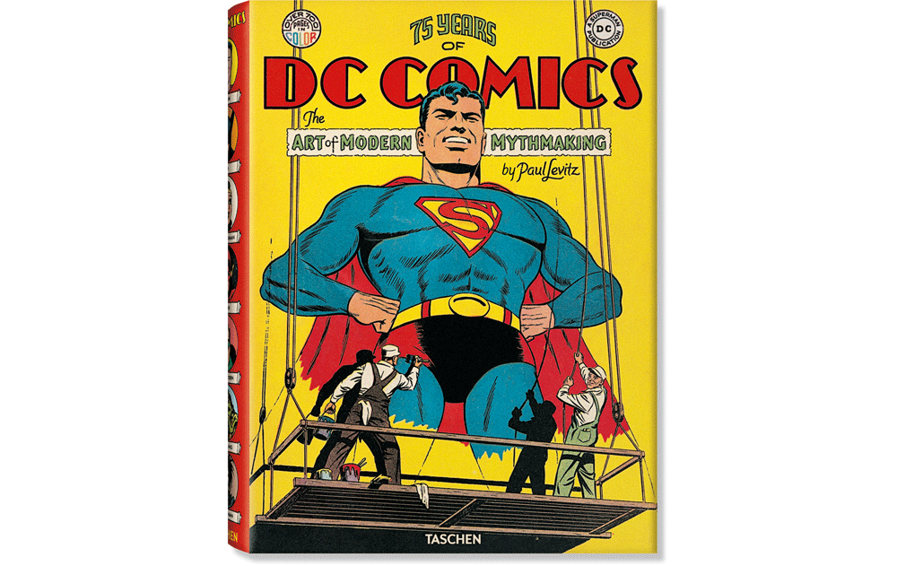
August 5, 2013 on 5:07 pm | By Michael | In Gigs, News | 3 CommentsComic Books were once considered throwaway trash aimed at adolescent boys. Now comic books are considered one of the premier art forms of the 20th century. So it wasn’t surprising that Benedikt Taschen decided to enshrine this art form in “75 Years of DC Comics – The Art of Modern Mythmaking”—one of his Extra Large scale books: “…in honor of the publisher’s 75th anniversary, TASCHEN has produced the single most comprehensive book on DC Comics, in an XL edition even Superman might have trouble lifting. More than 2,000 images—covers and interiors, original illustrations, photographs, film stills, and collectibles—are reproduced using the latest technology to bring the story lines, the characters, and their creators to vibrant life as they’ve never been seen before.”
I was tasked by Taschen AD Josh Baker with helping to create letterform graphics for the cover of this monumental edition. These graphics needed to integrate seamlessly with the vintage cover image so that the new cover design might appear to have been “original”. The publisher came up with an incredible image of two sign painters painting a monumental protrait of Superman. They also found some vintage lettering of “DC COMICS” which I was to design around. Also included was an original “DC” logo in a circle which I needed to balance off on the other side of the cover with wording that read “Over 700 Pages in Color”. What I came up with seemed like the only logical layout for this. I looked at dozens and dozens of pieces of vintage comic lettering from DC’s past and distilled them to what I felt would work the best:
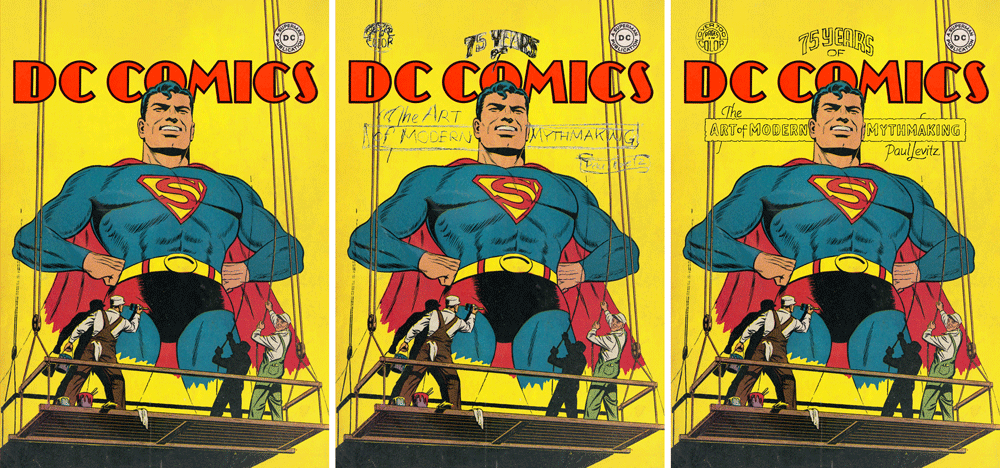
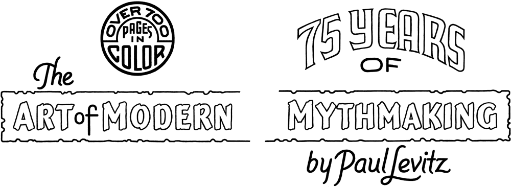
I decided to create the final lettering not digitally, but with pen and ink, to try to approach the less than perfect forms that these letters would have had—here are the various elements:
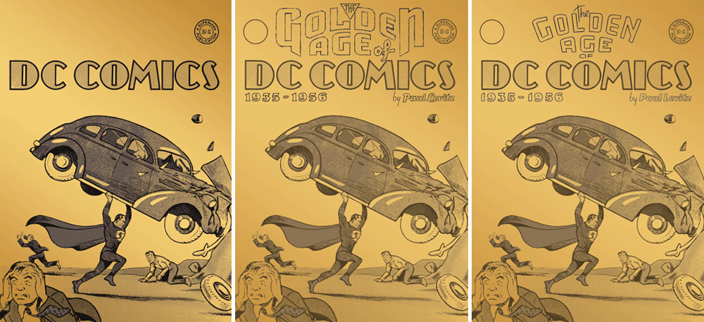
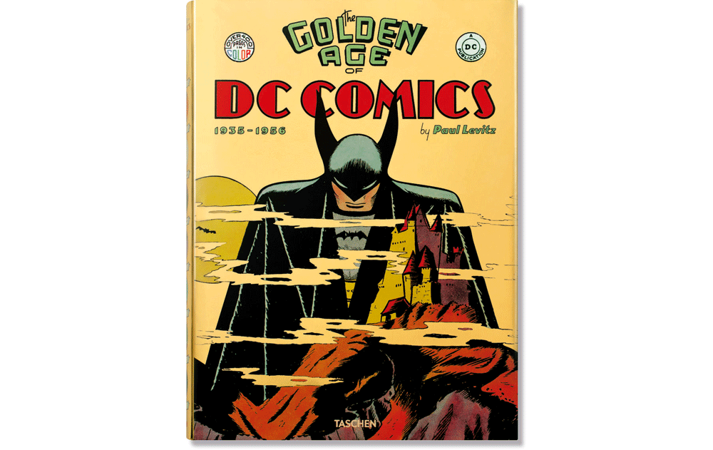
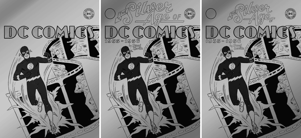
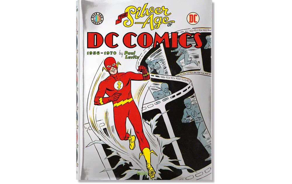
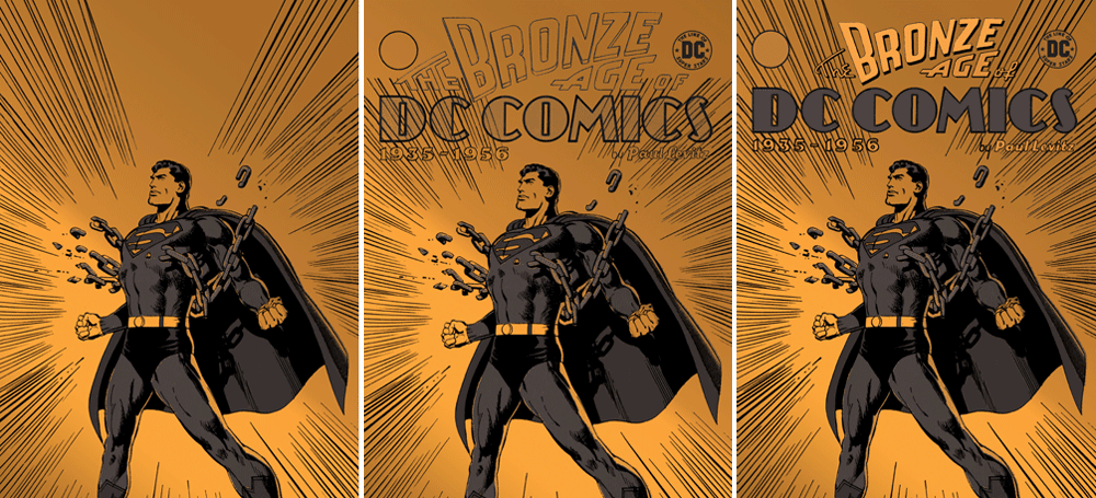
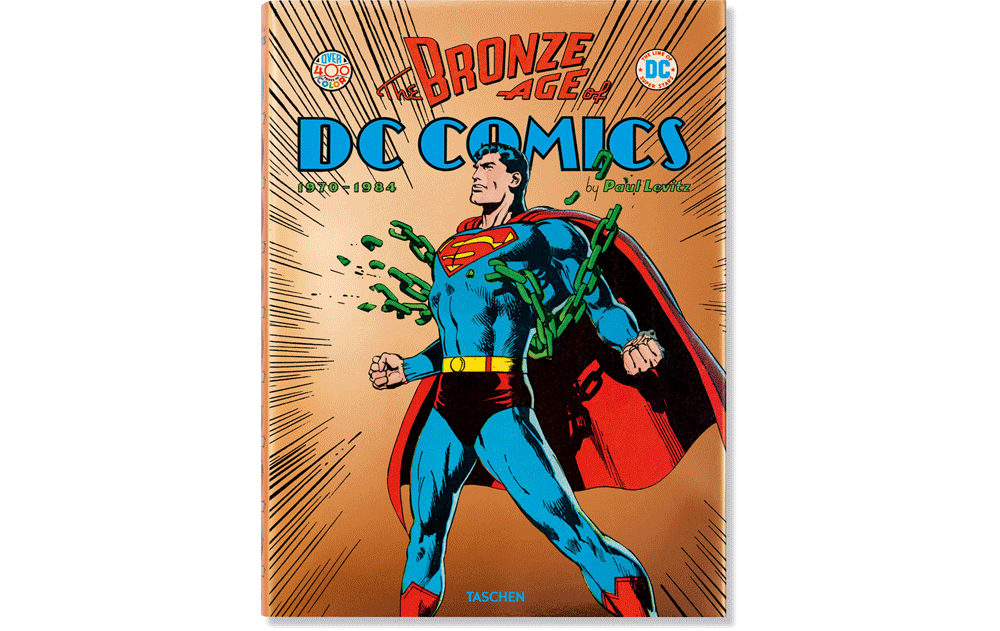
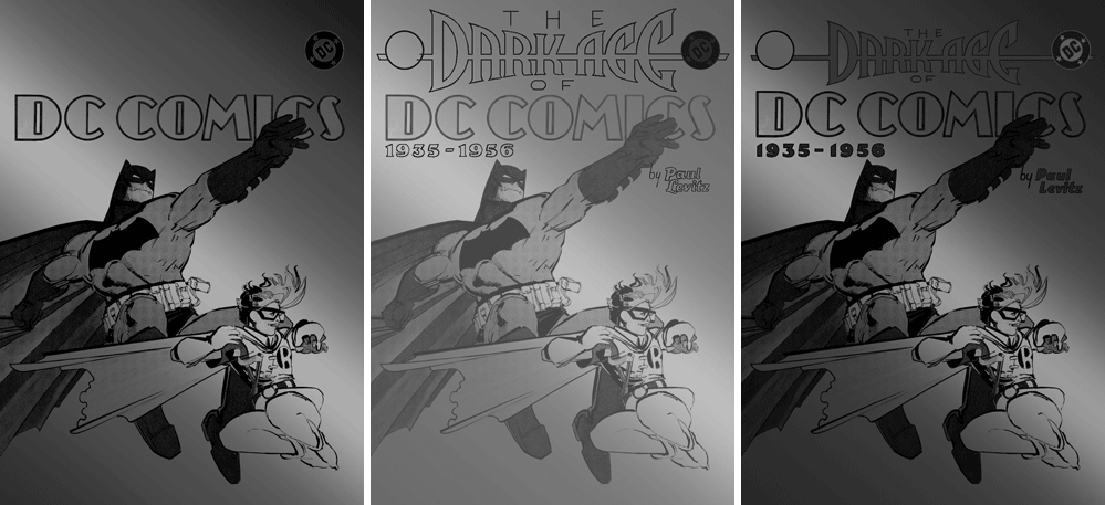
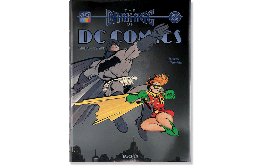
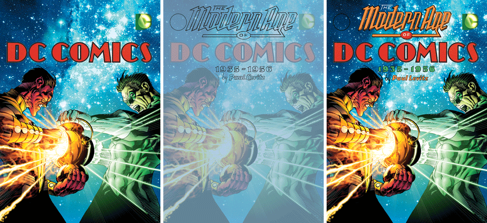
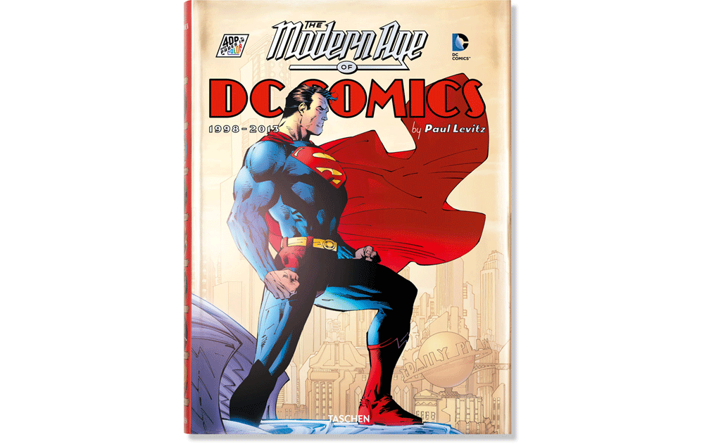
“75 Years of DC Comics” is divided into five sections, each covering a time span of between 1½ to 2 decades. Taschen decided to expand each of those five sections into its own separate, more reader-friendly sized volume, with much more artwork and commentary. Each volume then needed its own special cover art and graphics, and I was again tasked with trying to integrate titling with an appropriate look for each of the five new volumes. The jackets for each volume were to be made of metallic stock matching the contents—so the Golden Age was to be printed on gold metallic stock, the Silver Age on silver stock, and so on.
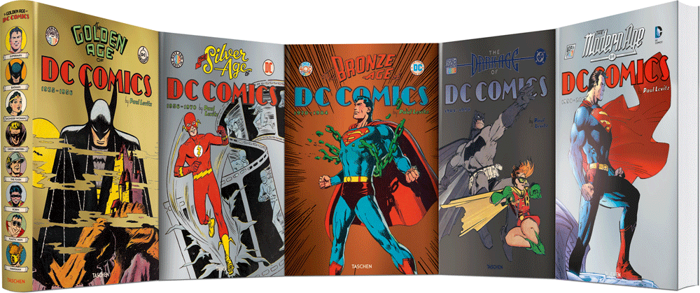
The process for creating the graphics was much the same as what I did for the “75 Years” jacket—creating five different titling units, each in keeping with the time period it represents, and four more “slugs” to play off opposite the various DC logos (we kept the same slug for “Golden Age” as we used on “75 Years”), each also in an appropriate style to its context. Lest what you see below not confuse you, on the first and last volumes Taschen changed the cover art they selected from what they originally supplied me with. To date, only the first two volumes have been published, “Bronze Age”, “Dark Age”, and “Modern Age” will follow, released one at a time.
THE SILVER AGE OF DC COMICS
Powered by WordPress and Nifty Cube with Recetas theme design by Pablo Carnaghi.
Entries and comments feeds.
Valid XHTML and CSS.

