 |
|
Archive for the 'News' Category
Title Treatment for “Wreck-It Ralph”. —— Client: Walt Disney Animation Studios
June 4, 2012 on 9:02 pm | By Michael | In News | 27 Comments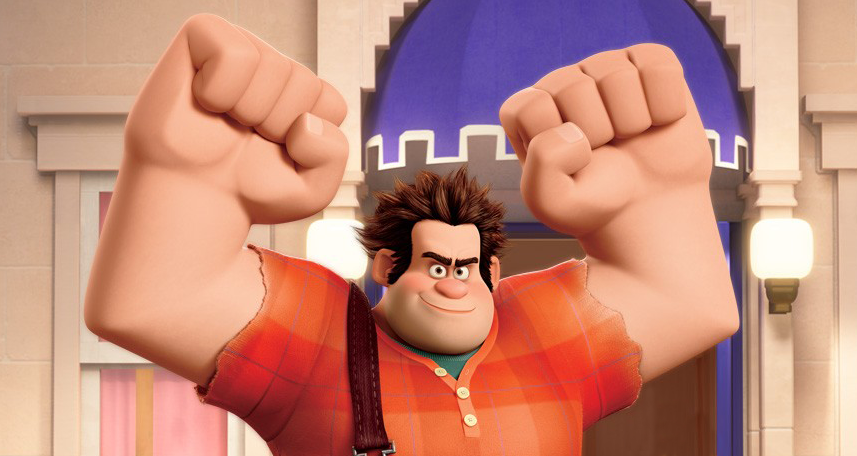 It’s been a while since I’d been called to do a title treatment for a major motion picture, so it was with great pleasure that I went in to see Disney Executive VP John Sabel to discuss working with them on developing a logo for a new animated feature slated for release this November 2nd. Wreck-It Ralph tells the story of Ralph, an arcade video game “bad guy” (John C. Reilly)—a one-man wrecking crew who is determined to prove he can be a good guy. Starting out as a classic arcade 8-bit character, Ralph travels through several arcade worlds, ending up in fully articulated 24-bit form. Here’s the final logo we ended up with:
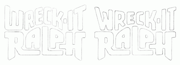
 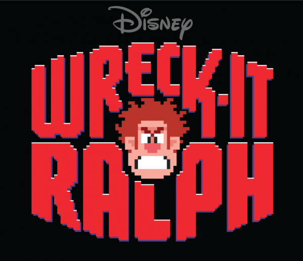 The process of developing this title treatment extended over several months. It’d be impossible to detail here all the stages we went through, but I’d like to just show here first some of my development pencil sketches:
 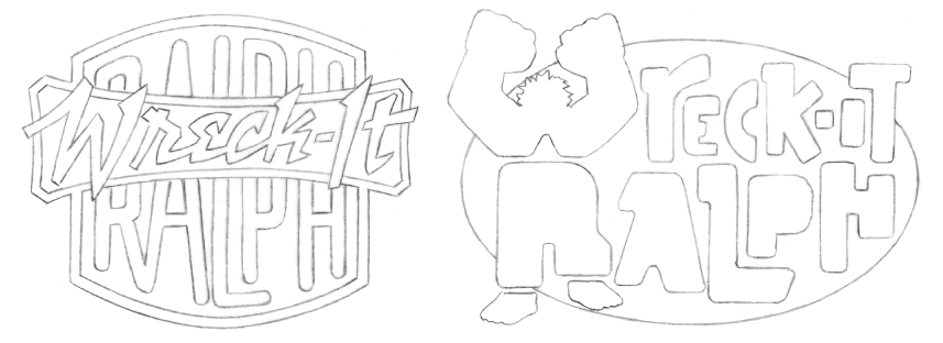 Some of the letterforms I used were reminiscent of the shapes in the character.
 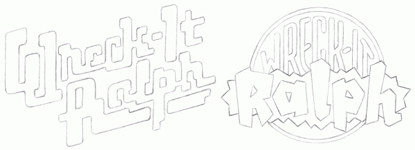 I tried to provide as many attitudes and alternatives as I felt worked for the subject matter.
 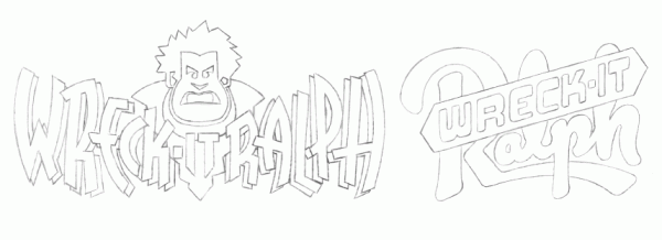 It was felt that a suggestion of the main character and his 8-bit nature might be a good way to go.
 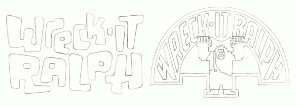 In all cases I wanted the treatment to be playful and reminiscent of some of the classic arcade logos of the ‘70s.
  When I came up with the idea of an 8-bit logo surrounding an 8-bit face, I knew we had hit paydirt.
 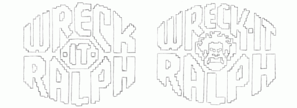 So from that point on I took that approach and developed the logo in digital form. It went through many, many different stages, culminating in the title treatment you see at the top of this post. It was decided that the face I came up with for Ralph was a little too “angry” looking . . . so I took it down a notch. Also the “Disney” logo needed to somehow be incorporated. We tried it both inside and and outside and above the treatment. I tried creating a border, making a self contained “badge” treatment with the Disney logo inside:
 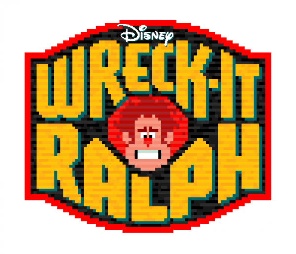 We then simplified the “badge” a bit:
 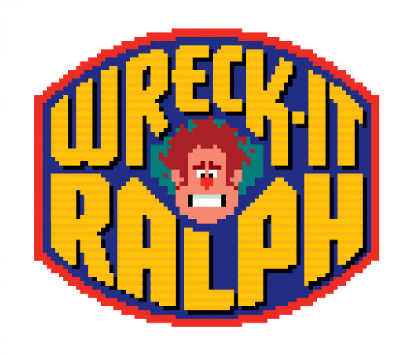 We eliminated the “badge” completely, again opting for more simplicity:
 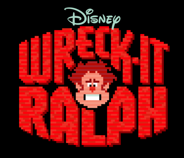 We changed Ralph’s face again, making him a little bit meaner looking, and edited the shapes of the letterforms.
 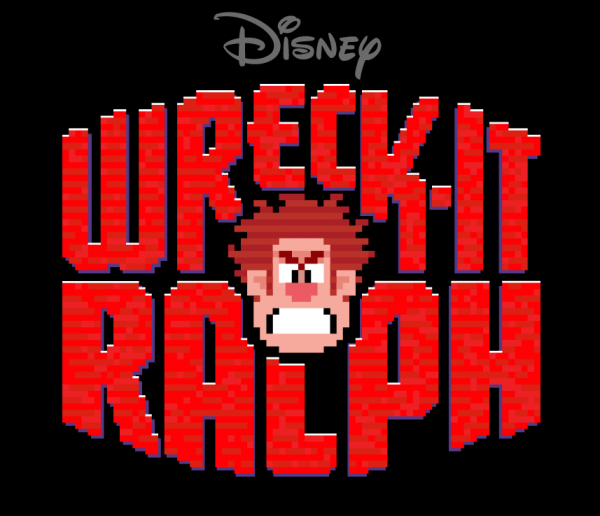 In the end we eliminated the “brick” texture that filled the letterforms, opting again for a simpler look. Here’s that final title treatment again:
Audio Interview w/Tony Ross at TonyTeach
January 17, 2012 on 5:31 pm | By Michael | In News, Wayback Machine | 1 CommentTonyTeach is an online learning center where you can find video tutorials, podcasts and live training for Flash, Toon Boom Animate, Photoshop, and more—both for free, and for purchase. Recently Tony Ross caught up with me, and we had a half hour discussion about how I work, my inspirations, digital vs. analog, and about my career in general—plus I give a couple of useful tips on using Adobe Illustrator’s pen tool that even this seasoned teacher was surprised by. Here’s a recording of that discussion:
Update: Terry Chouinard Got Your Help!
January 15, 2012 on 4:32 pm | By Michael | In News, Notes | No CommentsI’m very pleased to report that Mr. Chouinard achieved his Kickstarter goal. Those who’ve invested $35 or more can choose from among the prints by 15 different artists—myself included–to receive as one of the perks for being a contributor. See Terry’s Kickstarter page for details.
I’m also pleased to report that Terry will make available to me 100 beautifully printed 18″ x 24″ letterpress copies of my “Wonderful World” artwork, below, which I will sign and make available as soon as the ink dries. So even if you missed being a contributor to his campaign you can still obtain a copy of that print. If you’d like to reserve one, send me an email and I’ll be sure to set one aside for you. Thanks!
Powered by WordPress and Nifty Cube with Recetas theme design by Pablo Carnaghi.
Entries and comments feeds.
Valid XHTML and CSS.