 |
|
Archive for the 'News' Category
WXRX/Live Radio Chat
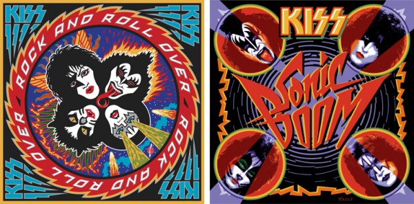
August 27, 2009 on 1:29 pm | By Michael | In Gigs, News, Wayback Machine | 3 CommentsToday I did my very first live radio interview with Stone and Double T at WXRX radio out of Rockford Illinois, home of the landmark Coronado Theater. I chatted with them about my work on KISS’ album covers: both “Rock and Roll Over” and “Sonic Boom”.
The Return of . . . KISS (#3)
August 18, 2009 on 2:52 am | By Michael | In Gigs, News | 40 CommentsIn developing and refining my pencil sketch for Sonic Boom I wasn’t completely happy with how the background was working with the diamond shape and the positioning and scale of the lightning border (a small nod to RaRO). I also wanted to play up the idea of something shattering (i.e. from a sonic boom). So I came up with the semi-abstract idea of concentric circles rippling outward like water, only breaking up incrementally into smaller and smaller segments as they expanded, changing the background color from violet to black. It seemed like a fairly simplistic idea, so I tried it and it worked. It also seemed to serve well to both ground and amplify the light beams emanating from the center, which break through the faces. I went through several color iterations, ending with one that had a dark red bleed border. I showed that version to Paul. He looked at it for a minute and then suggested we just change the border to black. We both agreed that this worked better, finishing the design process on this piece.
I did have to redo all the art for the CD/DVD package, which has a slightly more horizontal proportion. That meant shifting and manipulating the proportions of many of the elements. Because the angle of the beams had changed in the new configuration, the most complicated part of this was redoing all the faces. It’s a little difficult to tell what went into the face art, transforming them from normal color photographs, so here’s an enlarged detail:
At first glance, it might look as though I accomplished this using some version of Photoshop’s posterize filter—but I didn’t. The photos needed to be manipulated quite extensively to gain the look I was trying to achieve. I used a similar process when I did the graphics for the Jewish Zodiac pieces.
I’m hoping this art will elicit strong reactions from KISS fans and art enthusiasts alike. My intention was to stir nostalgia for the era of Rock and Roll Over, while inviting the same enthusiasm for new adventure that the Sonic Boom albums and DVD intend to do.
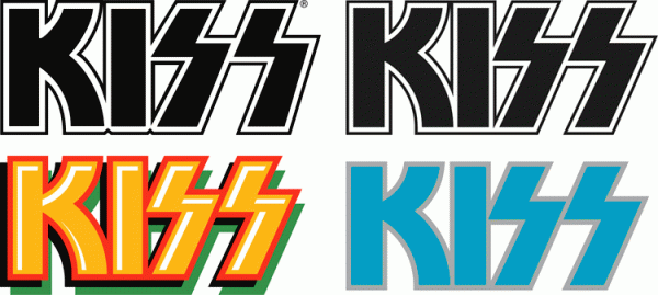
The avid KISS fan will note that the KISS logo on Sonic Boom is not the “official” logo. As I did with RaRO, I redrew the KISS logo after discussing the idea with Paul Stanley. He knew that I had redrawn it for RaRO, and liked the result. In fact, he told me that I’m the only designer who he would ever allow to do that! Below I’ve posted an image with the official KISS logo (at upper left) and just to it’s right, my redrawn version. Below that are (on the left) the logo from Sonic Boom, and the one from RaRO.
Tinkering with the KISS logo, ever so slightly, was an important step towards seamlessly blending the iconic logo with the (hopefully) iconic cover design. I’m very happy with end result, which you see on the cover of Sonic Boom. It truly has been a pleasure to return to my roots, in essence, by rejoining the creative process with KISS. As it was the first time, this experience was one to remember! I can’t wait for the next adventure…
The Return of . . . KISS (#2)
August 17, 2009 on 2:00 am | By Michael | In Gigs, News, Wayback Machine | 11 CommentsWhen Paul Stanley came by my studio to discuss how to proceed on the art for the cover of their upcoming CD/DVD package “Sonic Boom”, I had no idea what to expect. I hadn’t met with him since working on Rock and Roll Over, and had very little memory of what that had been like. Any anxiety I had melted away when we started talking. Paul is a “gentlemen’s gentleman” and I immediately felt at ease talking with him—as if all those years had not intervened since the last time we had spoken. After some small talk he explained what he was after with the new cover art. His vision for this album was to make it as vital and raw as it had been when they did RaRO. He felt that that had been some of the best work that they had ever done, and wanted the new album to recreate that energy both musically and visually. While he didn’t want me to reprise what I had done with my art for the earlier cover, he did want me to try to capture some of the same spirit, attitude, energy, and look that I had instilled in that piece. Also one of his stipulations was that unlike RaRO (where I had created abstract, graphic versions of the KISS personas) this time he wanted photographic representations of the four group members in full makeup.
When I did RaRO I had a 12″ canvas to work on. Now with CD covers and digital booklets that canvas had been reduced to less than 40% of its original size. Designing in a 4¾” space poses some very different problems from what I faced while working on covers for vinyl releases. In fact the older cover design would not have worked at that size, it’s many elements would have felt crowded into a small space. So the elements of Sonic Boom had to be bigger, bolder—and fewer. I made the decision to make the title the main focus of the graphics, moving the other elements (faces, KISS logo) into prominent—but subordinate—roles.
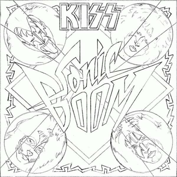
So I set about putting pencil to paper and trying to solve this the way I solve any other design problem. I did not want to get psyched-out by thinking too much about how the new design would compare with RaRO. That cover had taken on a life of its own and had become a pop culture icon. Creating an iconic cover could not have been one of my goals. All I was capable of doing was to try to create the most compelling graphics possible within the parameters and limitations that had been set out for me. So I started out at the core of this design by creating what I call a “word constellation” out of the title. I tried to make it communicate its meaning visually by not only making it angular and “explosive”, but also by creating a shape that was somewhat suggestive of flight—a “flying wing”, if you will. Bearing in mind the symmetrical, mandala-like layout of RaRO I started designing the new piece as a field growing out of the center of the square, with the four members faces moving outwards from the center, and capped with my version of the ubiquitous KISS logo.
It took about a week for me to develop my sketch to the point where I felt confident in what I had come up with. As I had done with RaRO, I felt so strongly about this cover design that I decided to not present any other options—I wanted this to be the ONE.
This is the rough pencil I first presented to Paul. I held my breath as he first took it in, and then was able to exhale when I saw a big smile appear on his face.
Next: A few changes and the final art.
Powered by WordPress and Nifty Cube with Recetas theme design by Pablo Carnaghi.
Entries and comments feeds.
Valid XHTML and CSS.

![SonicBoom_Square[trim]](http://alphabetsoupblog.com/wp-content/uploads/2009/08/SonicBoom_Squaretrim-600x600.gif)
![SonicBoom_Square[detail]](http://alphabetsoupblog.com/wp-content/uploads/2009/08/SonicBoom_Squaredetail-600x600.gif)

