 |
|
Archive for the 'Notes' Category
Office Machines & Bubblegum
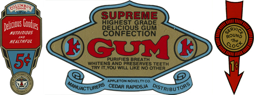
November 9, 2008 on 3:37 pm | By Michael | In Gigs, Notes | 2 CommentsI’ve always loved the graphics found on vintage office machines (you know, the ones with industrial hammered metal finishes), which are often comprised of 2 or 3 color decals. They have a lot in common with decals that were used on gum and candy vending machines back in the ’40s and ’50s. I’ve managed to collect a few of those, and have always admired the naive, bold and simplistic graphics and design sense they share. I recently found a way to pay homage to them when my friend Jed Davis, Senior AD at both Promo and Direct magazines (and who also runs the indie record label “Eschatone Records“) called me with another cover assignment for Promo Magazine.
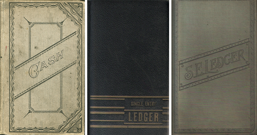
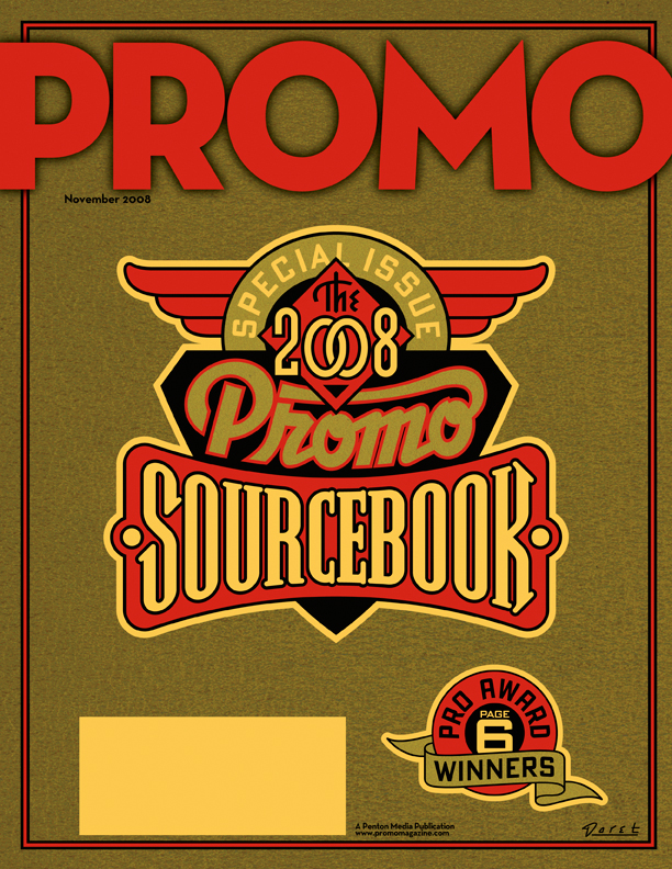
The November issue of Promo is a special issue called “The 2008 Promo Sourcebook” and they needed a cover design that was non-specific, yet eye-catching enough so that people wouldn’t mind having it around for several months. My first inclination was to give it a sort of ledger-like look:
But after consideration, I thought that idea might be a little too sedate and staid for what Jed was looking for. Then it occurred to me that perhaps this might be an opportunity to do something along the lines of the decals I had been collecting. I could get color and excitement into a cover that had the feeling of a ledger by also referencing the graphics and decals found on old office and gumball machines. To further the feeling I gave the gold color a subtle “decal” texture, and the background feeling of metal with an industrial machine-like finish.
Fame Has It’s Drawbacks…2
November 3, 2008 on 5:55 pm | By Michael | In Gigs, Notes | 2 CommentsBack in May I did a blog posting here talking about the mis-perception that my design services are too expensive for most clients. At the time I wrote:
“Something I hear quite frequently runs something like this: ‘You’d have been perfect for our project, and I’d have hired you in a minute, but you know, we probably wouldn’t have been able to afford you.’”
I’m still getting feedback from many of you out there that you believe what I do is too pricey for your budgets. While that may be true in some cases—such as in national advertising or corporate logos, I do pride myself on my ability to tailor what I do to a client’s needs and (more and more) to limited budgets. Here’s another case in point.
I was contacted by a photographer from Berlin named Tanja Ortmaier (“Spooky Sally”) who does predominantly 1940s style pin-up photography under the name “Cherrymuffin Studios“. She asked if I would be willing to design a new logo for her that she could use on her website and could be adapted for various other uses such as signage. While her budget was fairly modest, I was impressed with her work (it’s not every day that I get to work with a pinup photographer!) and her enthusiasm was, to put it mildly, infectious! Below are two samples of what I was able to do for her:
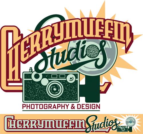
Upper: for use on website | Lower: for use on signage
Because of her openness and her ability to accept certain limitations, we were both able to bring this project to a successful conclusion in a very short amount of time. Here’s a few comments from her:
“Hey Michael, Again – this is awesome! Great how you captured the details of the camera! …and I’m very happy with the flashlight as well!…YES I’m really happy with all that! Thank you for such a great work! Yippiejaiyeah, Sally.”
So while yes—I am in it for the money—I don’t have specific rates: hourly, daily or otherwise. I try to evaluate each project on it’s own merits, and come up with a price that is fair for all involved. If a client has a set budget (e.g. such as a specific limited rate for a magazine cover) I try to figure out how I can best meet their needs while not overextending myself. Sometimes I can come up with a solution that’s a lot simpler than what might have been envisioned. Many times I can figure out a way to successfully solve a design problem that doesn’t take me a long time, yet more than satisfies the needs of the project. So please, just remember—if you’re in doubt, it doesn’t hurt to ask me!
No Second Chances?
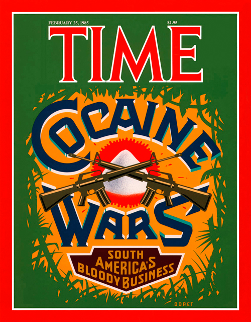
October 20, 2008 on 7:23 pm | By Michael | In Gigs, Notes, Wayback Machine | 1 CommentThey say there are no second chances, but recently I found that statement to be not entirely true. I’ve designed and executed art for many covers of TIME magazine. I was never entirely pleased with the cover I did for TIME’s “Cocaine Wars” story. I had originally wanted to focus the design around a skull image, and to have the letters in “Cocaine Wars” have snowcaps on them like the letters you’d see on ice machines. But the powers-that-be at time had me eliminate the skull (too menacing) and in it’s place illustrate a small mound of “cocaine”. The result as you can see was a still a fairly good cover but with a focal point that was kind of anti-climactic.
 |
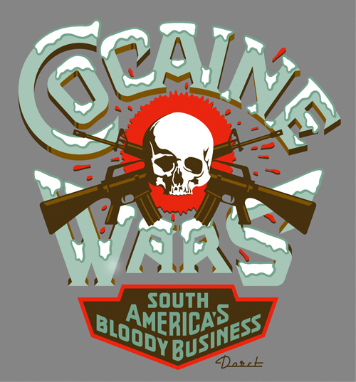 |
Fast forward to present day: Rick Klotz of FreshJive—an LA streetwear manufacturer, who also runs his flagship store Reserve in the heart of the Fairfax district—contacted me to see if they could license some of my older designs for silkscreened T-Shirts. He immediately gravitated to some of my TIME covers—including “Cocaine Wars” among others among others. Since I would have to reconfigure the art for silkscreen anyway I immediately saw this as an opportunity to make good on that design that I never felt right about. Freshjive will be distributing that T-Shirt design among others of mine in two different color schemes for their Summer ’09 line.
Powered by WordPress and Nifty Cube with Recetas theme design by Pablo Carnaghi.
Entries and comments feeds.
Valid XHTML and CSS.
