 |
|
Archive for the 'Notes' Category
José Cruz: ICONOCLAST
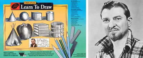
September 21, 2008 on 3:29 pm | By Michael | In Notes | 4 CommentsThat great populist TV art evangelist from the ’50s Jon Gnagy always opened his program with “If you can draw these simple forms: the ball, cone, cube and cylinder, you can draw a real picture the very first time you try”
 I’m not really sure that it was true, but my good friend and master illustrator José Cruz has taken that dictum quite literally, pushed it about as far as it can be pushed, made it his mantra and applied it to his work. It can be seen in its purest form in the geometric caricatures he has posted on his icon©last Blog. The art of the caricature has always amazed me, but even more so in his startling work. How is it that with these few lines in his carefully composed geometric configurations that we can actually identify specific individuals? I don’t understand why, but they work—and artfully so! If you’re skeptical, look at the three below: from the Sopranos—Paulie “Walnuts”, from Curb Your Enthusiasm—Cheryl David, and from Entourage—Drama.

For more on the art of the caricature, check out “Celebrity Caricature in America” at the National Portrait Gallery.
“Striking Images”
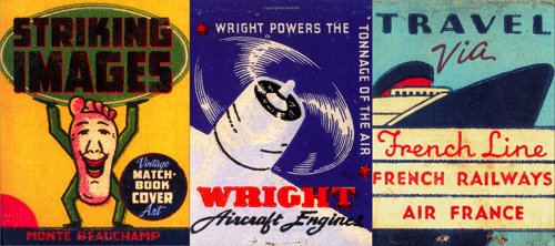
August 21, 2008 on 7:23 pm | By Michael | In Notes | No CommentsIt’s no secret that for inspiration I look at a lot of American ephemera. I collect some, but I am also constantly on the lookout for good books to have on hand to refer to for a quick jolt of brilliance. I’ve got books on neon and cigarette packs, enamelled signs and billboards, wheel charts and travel brochures, and on and on. One recent purchase really stands out in my mind—so much so that I felt I needed to mention it here: “Striking Images” – Edited and Designed by Monte Beauchamp. It’s a book of vintage matchbook cover art. There have been other books on the subject, but this one stands out in my mind as having the best, the most unusual, and the most colorful selection of this genre I have ever seen. But what really stands out in my mind is that many of the images are blown up to either full page size—or larger. Monte is also well known as the man behind “Blab!” magazine, a publication that anyone interested in what is current in the Fine Art and Illustration worlds cannot afford to be without. Also worthy of mentioning is that if any of you are going to be in the vicinity of Manhattan (Kansas that is) between the months of August and October you should definitely take in the Blab! Retrospective being held at the Beach Museum of Art.
My Hollywood: Then & Now
July 23, 2008 on 4:46 pm | By Michael | In Notes | 2 CommentsHollywood is a study in contradictions. It’s a city that on the one hand celebrates its past, but then turns around and either ignores or vilifies it. Living here is a constant love it/hate it battle with one’s own feelings. I recently decided to jump into the fray, attending meetings with the Community Redevelopment Association (CRA) with regard to signage and billboards in Hollywood. The CRA really wants to do the right thing but for too long the residents of Hollywood have not spoken up about their needs, and so the business interests have held sway.
Walking the streets here is an assault on ones senses—billboards and signage are starting to completely take over the Hollywood landscape, turning the city into one huge canvas for advertisers to hawk their wares. Landlords make large profits from renting the walls of their buildings to advertisers, and this has gone on unregulated for far too long. It has turned a once beautiful city into the poster child for visual blight. It’s no wonder nobody walks in LA—it’s not a pleasant experience.
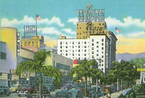
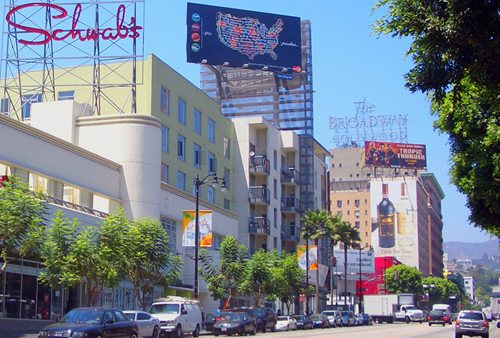
Although it’s not the best example of how bad things have gotten here, I thought I’d contrast an image from a postcard of Vine Street from the ’40s, with a current shot of the same street.
As one can see, billboards were not an issue at the time. Signage was well designed and often dramatic–adding a colorful and graphic component, enhancing the cityscape. The same view (below) although it is a commercial street, and not as an egregious example as I could have shown, demonstrates some of the problems that we face.
The worst one, I feel, is that buildings like this one are now being designed as vehicles to carry billboards. What cannot be seen in this view are the eight billboards that are on this one side of the building alone! Turn around and this humongous billboard is what’s in your face, and can be viewed for miles. Gone are the days when architecture was designed to fulfill the purposes of those who would occupy it. Now new buildings in Hollywood are thought of more for their advertising potential than their architectural significance. Also note the way the “Tropic Thunder” billboard obscures the historic “The Plaza” rooftop neon, and how the gargantuan billboard atop Sunset and Vine blots out the sky. Also note that the poor residents of The Plaza have their windows blotted out by a liquor ad. On a more positive note, an attempt was made to resurrect the famous “Schwab’s” logo as rooftop neon, but the business connected with it was just a flash in the pan, and disappeared a while ago.
Hollywood is considered one of the worst cities in the country for billboard blight. Various groups have sprung up to try to fight it, but it seems that for every step forward we’re able to make, we go back two steps.
Powered by WordPress and Nifty Cube with Recetas theme design by Pablo Carnaghi.
Entries and comments feeds.
Valid XHTML and CSS.


