|
|
|
Archive for the 'Notes' Category
The Evolution of PowerStation
February 11, 2013 on 11:09 am | By Michael | In Gigs, Notes, Wayback Machine | 2 CommentsPowerStation is my one font that specifically evolved from a prior design assignment. I had been tasked with designing signage for Hershey’s Times Square flagship store. The signage needed to be designed in the spirit of a retro future-machine, à la Jules Verne or other Victorian “Steam Punk” aesthetic. So I came up with the following sketches in which I combined various lettering and type styles:

In the tighter version I designed the word “Hershey” to have a feeling of faceted letters, similar to what you might see on an old theater marquee:

Ever since I first became aware of them I’ve been faxcinated by the tactile qualities of these extruded plastic letterforms, and how they reminded me of candy. I’ve always thought there was something “delicious” about them.

So it seemed entirely appropriate to me that the word Hershey should be rendered that way, giving it a chunky, almost chocolatebar-like flavor. Note that in the final signage we needed to change the lettering of the word “Chocolateworks” to read “Chocolate Machine”.

I loved how my art turned out, especially the word “Hershey”. After this job was over it occured to me that I wasn’t aware of any fonts that successfully captured that particular faceted look. So I thought I’d try and see if I could make that work as a typeface:

I started sketching out various letters to see if it could be viable. As the font developed and it’s strong industrial and moderne qualities became more apparent, I decided to name it “PowerStation”.

As I developed PowerStation, it evolved from the one version I had adapted from the Hershey’s assignment into four different versions. These I decided to call Block, Wedge, Solid, and Outline. Then I thought I’d expand those into another four “Wide” versions. Now I had a family of eight different fonts.

But I guess I wasn’t able to leave well enough alone. Why not provide the added ability to set PowerStation in two colors? So I took the basic four faceted versions of PowerStation (Block, Block Wide, Wedge, and Wedge Wide) and broke each of them down into two separate fonts which, if set on separate layers, could provide 2 color typesetting. The solid “base” of the letters would be formed by setting the “Low” version of the font, and the facted part of the letter would be formed by setting the “High” version of the font on a layer directly above the “Low” version.

In other words a two color version of PowerStation Wedge could be achieved by setting PowerStation Wedge High over the same copy which would be set in PowerStation Wedge Low, and applying different colors to each layer.

Setting words like this in two colors can provide richness and variation when used imaginatively.

Some time after the release of PowerStation I discovered the next step in its evolution—that you didn’t have to be limited to two color typesetting with this font. I found that by combining the various PowerStation fonts in different ways one could set this font in three colors as well. The instructions for doing that may be a little long for this article, so if you’d like to see what’s involved with that, you can download the free PowerStation User Manual.

I originally created the serigraph above to celebrate the release of PowerStation. The signed and numbered edition is limited to 100 copies, and there are still some left. Click HERE to find out more about this offer.

License the PowerStation fonts HERE .
Purchase the PowerStation Serigraph HERE.

Alphabet Soup Font Guides and Manuals – Free Downloads
January 5, 2013 on 7:16 pm | By Michael | In News, Notes | No Comments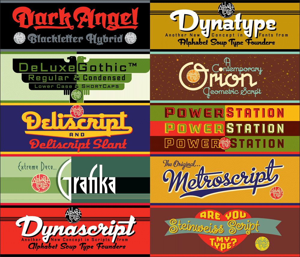
Many people have asked why I have only 10 fonts available for purchase. Part of the answer is that I’m sort of a perfectionist, and it takes me quite a long time to design, execute, and test a font to make sure it’s working properly. Also, all that work must be sandwiched in between design and lettering assignments—which must always take precedence. But there’s another reason why, at best, I can only turn out maybe one font design a year—and that is for me there’s a bit more to releasing a font than just having the font itself ready to go. There are a ton of supporting graphics that need to be created, and each font reseller has different requirements.
But more importantly, I decided early on that included with each font I would supply a full color PDF Guide or Manual (all 10 represented above). From these multi-page PDFs one can get a very good idea of what these fonts look like in use, and gain an understanding their special features and how to access them. For example, the PowerStation Manual explains how to set layered copy in 2 or three colors, and in the Deliscript Manual you’ll find out how to access the special “t-crossbar” feature (among others). You’ll also learn some important “Do’s” and “Don’ts” for each font and (if you’re interested) read about how these fonts came to be.
Originally these manuals were only intended to be included with the font download at purchase, but I realized that they should also be available for prospective buyers as well as others—they might help with a decision, or just serve as inspiration. I’ve put links for all 9 PDF downloads together on one page, together with several case studies of some of my design work. So feel free to go the DOWNLOAD page and click on 1, 2 or all 10 of them.

Update: Terry Chouinard Got Your Help!
January 15, 2012 on 4:32 pm | By Michael | In News, Notes | No CommentsI’m very pleased to report that Mr. Chouinard achieved his Kickstarter goal. Those who’ve invested $35 or more can choose from among the prints by 15 different artists—myself included–to receive as one of the perks for being a contributor. See Terry’s Kickstarter page for details.
I’m also pleased to report that Terry will make available to me 100 beautifully printed 18″ x 24″ letterpress copies of my “Wonderful World” artwork, below, which I will sign and make available as soon as the ink dries. So even if you missed being a contributor to his campaign you can still obtain a copy of that print. If you’d like to reserve one, send me an email and I’ll be sure to set one aside for you. Thanks!
Powered by WordPress and Nifty Cube with Recetas theme design by Pablo Carnaghi.
Entries and comments feeds.
Valid XHTML and CSS.