 |
|
Archive for the 'Notes' Category
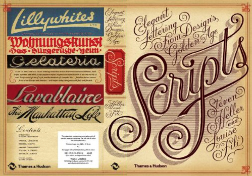
Scripts: Elegant Lettering from Design’s Golden Age
May 9, 2011 on 10:50 am | By Michael | In News, Notes | 4 CommentsSunday I picked up a book at Hennessey + Ingalls (my local bookseller), and I spent the day marveling at the treasure trove of typographic gems it contains. The book is “Scripts: Elegant Lettering from Design’s Golden Age” by the dynamic duo of Steven Heller and Louise Fili.
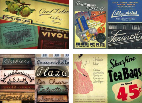
If you’re like me, and love type—especially vintage scripts—you must get this book. The culmination of over 30 years of digging through swap meets, flea markets and antiquarian bookstores, it is a priceless collection of ephemera by two passionate collectors.
The book’s 352 pages are filled with well over 300 examples from around the globe, from advertising to street signs, from type specimens to invitations and personal letters, spanning the period from the 19th to the mid-20th century. I could spend days poring over this book. It is as rich a collection of typographic material as I have seen in years—and much of it I have never seen before. I LOVE this book!
The book is readily available from Amazon.com, but (personal note) why not shop locally and check out the book in person at your nearby (non-chain) bookstore? You might pay a few dollars more, and it might not be as “convenient”, but in this day and age wouldn’t it be worth it to give them your support?
In-Depth Interview Just Posted
April 13, 2011 on 9:49 pm | By Michael | In News, Notes | No CommentsI recently did an in-depth interview with Sonali Vora a writer based in India for the blog VectorTuts+. This is a blog of tutorials, articles, freebies and more on all things vector. Their roster of writers is truly international, coming from such diverse countries as Ukraine, India, Australia, England and the good ol’ US of A.
Sonali introduces the interview with these words: “We recently had the opportunity to interview this award-wining designer, lettering artist, and illustrator. Michael talks about his childhood influences, his education and his brilliant start at a freelance career. He tells us about his experience working with some of the big clients and the valuable projects that challenged him to explore his creative potential”. Those of you out there who are curious to learn a little more about what makes me tick might want to take a look at it.
Just Revealed: 3 Colors Typesetting With PowerStation Fonts
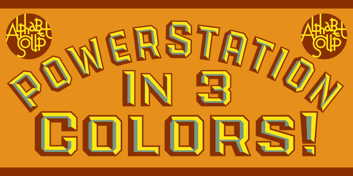
January 31, 2011 on 6:51 pm | By Michael | In News, Notes | 1 CommentIt’s always nice when someone reveals something new to you about your own work. That’s what has recently happened in the preparation of the Creative Characters newsletter that MyFonts has just published on my work. While helping to prepare font samples for the sidebar, Anthony Noel was experimenting with my PowerStation fonts, and stumbled across a capability that I had not intended.
In setting the copy he inadvertantly combined both PowerStation Block and PowerStation Wedge. When I designed this font for 2-color layered typesetting, I had not even considered combining these two fonts on layers, one over the other. But that’s exactly what Mr. Noel did, with what for me were unexpectedly interesting results. I would have never thought it would work, and so never tried it.
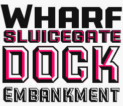
So what’s come out of this is that we’ve discovered that PowerStation can now be typeset in three colors. Two color typesetting was always achievable with either the PowerStation Block fonts or the PowerStation Wedge fonts. The difference is that one would need BOTH of those packages in order to set type in three colors. PowerStation my be purchased from Alphabet Soup Type Founders.
Powered by WordPress and Nifty Cube with Recetas theme design by Pablo Carnaghi.
Entries and comments feeds.
Valid XHTML and CSS.


