 |
|
Archive for the 'Wayback Machine' Category
An Interview With “Posting and Toasting”
September 11, 2012 on 2:30 pm | By Michael | In Gigs, Wayback Machine | 3 CommentsMy good friend Norman Hathaway is an avid New York Knicks fan, and follower of Seth Rosenthal‘s humorous Knicks blog Posting and Toasting which boasts one of the biggest communities of Knicks fans on the internet. Apparently Norman spoke or wrote to Seth about my involvement with the NBA, and specifically about how I created the current identity for the Knicks. So Seth contacted me, and we talked about how that whole thing went down. I dug up a ton of my old sketches and comps for this project and sent them to Seth who put them all together, interviewed me and is now posting the story in two parts over two days on his blog.
Today, I’ve reproduced verbatim (below) Seth’s first post, and tomorrow will do so again with the second:

Behind the Knicks Logo with Michael Doret: Part 1
This is the current Knicks logo. This is what the Knicks logo looked like in 1992. Little has changed, y’all. They added a little “New York” and modified the colors recently, but have done nothing else to alter a design that’s been the primary logo for over twenty years. That emblem has been a constant symbol of the team, and its distinctive big, block lettering echoed throughout several other teams’ redesigns in the ’90s, some of which are still in place today. So, where did this logo– which has persisted through multiple Knicks regimes– come from? With the help of P&T citizen normanhathaway, I had the pleasure of corresponding with Michael Doret, the man who made the Knicks logo.
Doret is a New York-raised, Los Angeles-based designer and lettering artist with a rather extensive resume. When the NBA approached him in Spring of 1991, he’d already done some work for the league, as well as designs and design ideas for the MLB, the NFL, TIME Magazine, the band Kiss(!), and a lot more. So, the league felt pretty confident in his abilities and gave him pretty much free reign to try out different logos and letterforms:
“Before starting on this design project I didn’t receive that much input from the NBA other than the directive that they wanted to have something symbolic of New York CIty incorporated into the logo. After discussion we eliminated several options (such as the Statue of Liberty), and settled on the iconic Empire State Building as the only viable alternative that might work in the new logo. So in the beginning stages that was the given which, as we all know, they ended up deciding against as the logo development progressed. I think other than keeping the original blue and orange from the old logo, there wasn’t that much else given me in terms of requirements. The directions I took were mostly left up to me.”
It was a fairly open-ended task and, as Michael notes, the only specific request made of him didn’t even make it to the final product. So, with that dearth of instruction in mind, he set about producing a variety of design concepts. In Part 1 of our magical journey through Michael’s old files, he’ll show us some of the concepts that didn’t make it.
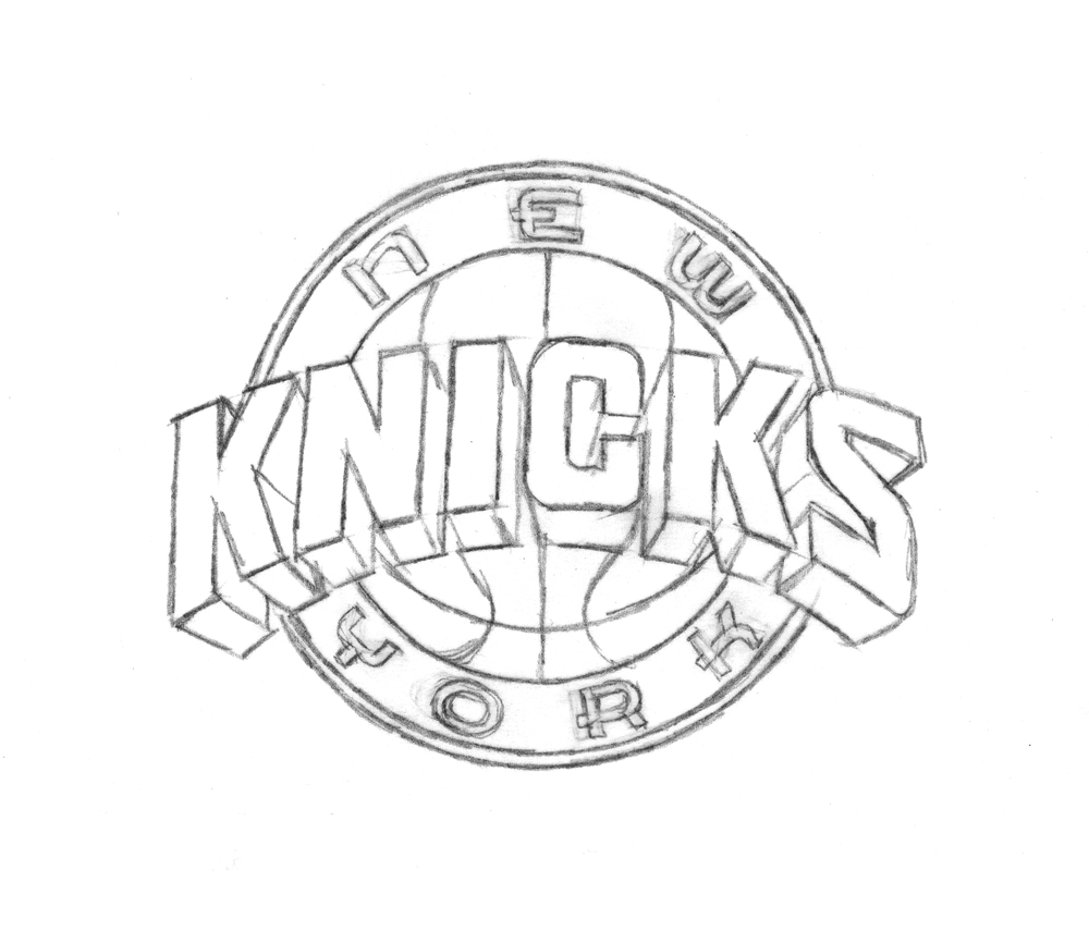
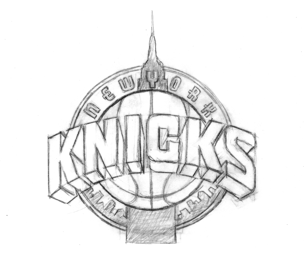
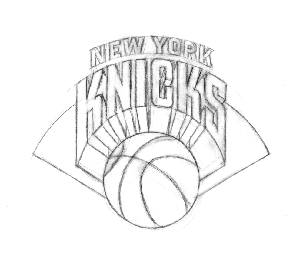
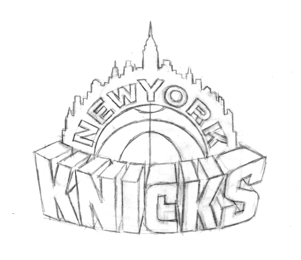
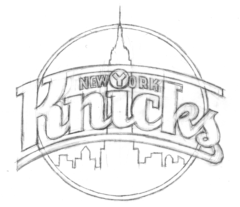
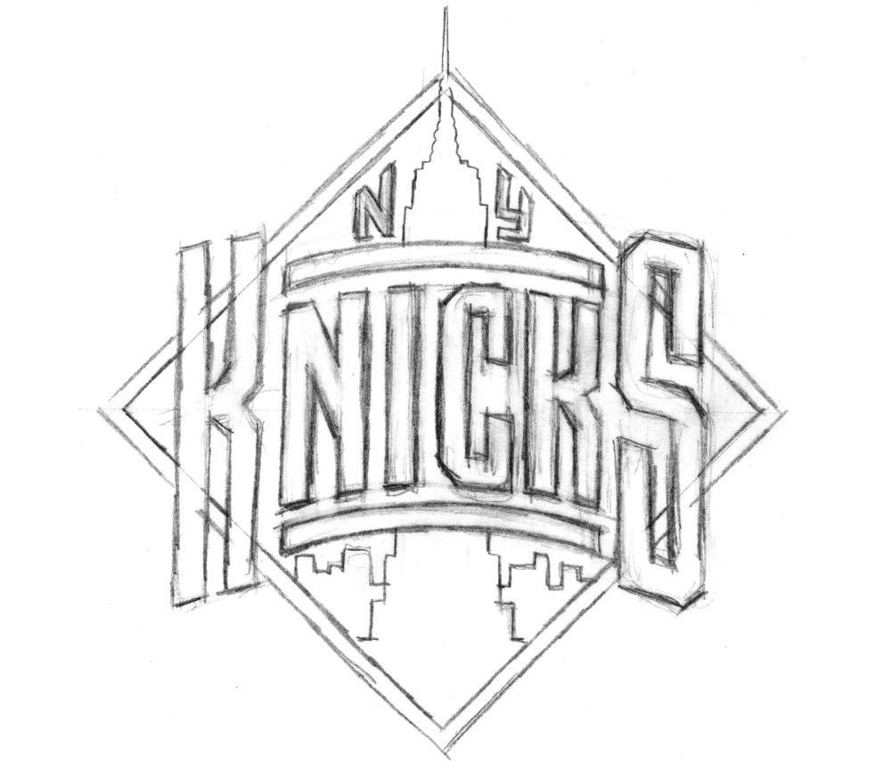
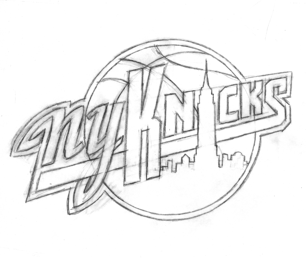
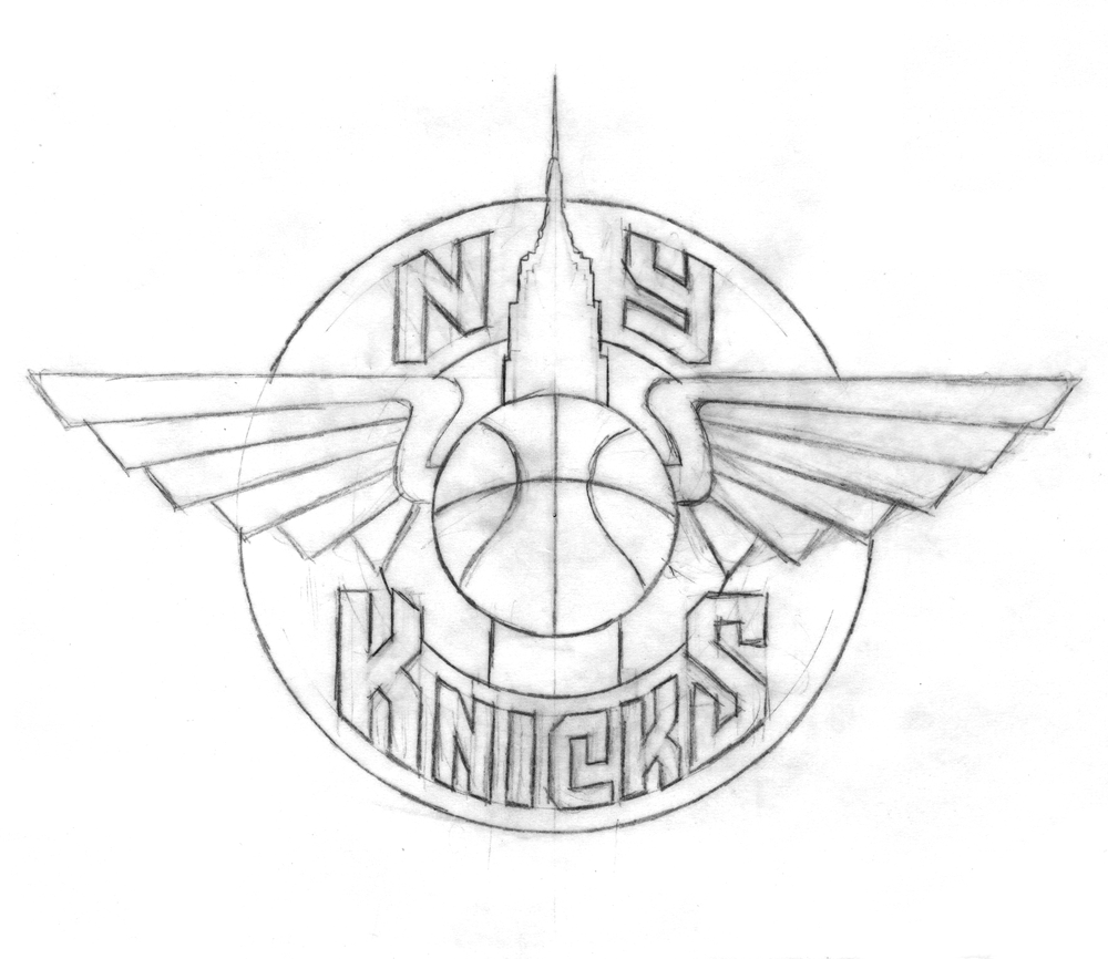
To generate ideas, Michael began with some rough sketches, examples of which are below.
With the Empire State Building icon relatively unchangeable, Michael focused his imagination on the lettering:
“At that time (and even still) my work was all very lettering-oriented. I was trying to open up new areas of letterform design that, up until that point, had tended to be a bit stodgy and traditional. I was just trying to do something different for the time. In actuality I was picking up a lot of cues from bygone eras, from when lettering was really in its heyday-like in the 1930s and ’40s-only this time around with a slight twist.”
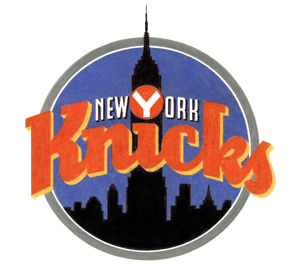
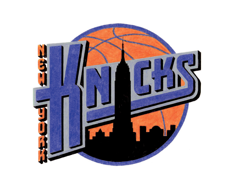
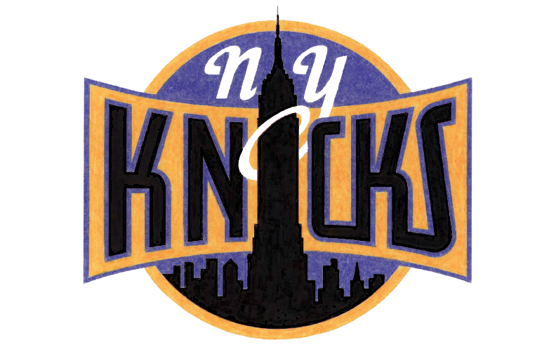
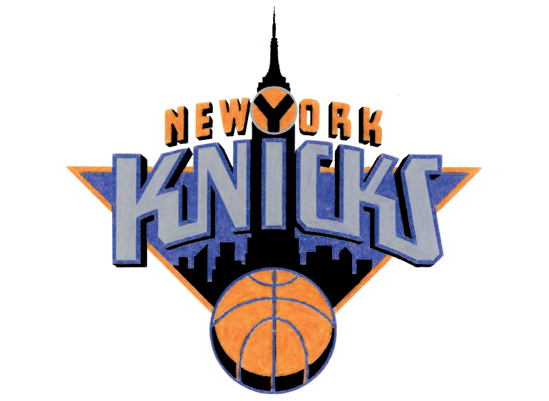
Some of the sketches and elements of others eventually made it into color concepts which, before the widespread use of computer design programs, Michael rendered in colored pencil (the ’90s were a dark time).
Any of these could have ended up as the Knicks’ primary logo (and, incidentally, Michael loves all his logo babies, but told me the first of those color logos was his favorite), but alas, they could only pick one
In Part 2 we’ll look at the process behind the logo of Michael’s that the Knicks did choose, and learn about how another familiar piece of Knicks iconography also comes from Michael’s desk.
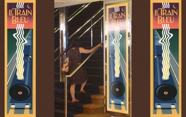
Le Train Bleu #2
June 20, 2012 on 5:34 pm | By Michael | In Gigs, Wayback Machine | 2 CommentsTwo years ago I visited Bloomingdale’s in NYC, and specifically their Le Train Bleu restaurant for which “back in the day” I had originally designed many of the original elements. In my visit to NY last month I revisited the restaurant—and this time dined there. If I was surprised the last time to see that my signage and monograms were apparently still in use, dining in the restaurant this time allowed me to see the full extent to which everything I had done was still there—just as it was the day it opened back in the ’80s.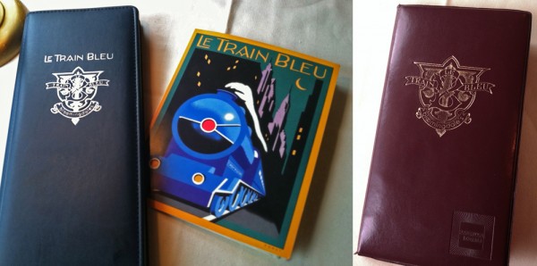
I hadn’t known that they were still using the menu design I had done for them, or to the extent that they were using the emblematic monogram I had done at the same time. After years and years of use I would have imagined that the menu would have been a bit dog-eared, but apparently they’ve been printing and reprinting it all this time.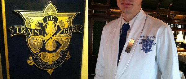
Aside from it being rendered in gold leaf on the outside of the train car and imprinted on the wine list and check wallet, they’d gone so far as to embroider the monogram on each and every uniform in the restaurant—classy! Perhaps that says something about a designs longevity?
And here’s a reminder for those who are interested: there are prints of the Le Train Bleu vertical format artwork—identical to the signage murals outside the restaurant—available on my ILLOZ site. These prints are finely produced, hand-crafted 12 color fine art lithographs that are virtually identical to the original painting.
Audio Interview w/Tony Ross at TonyTeach
January 17, 2012 on 5:31 pm | By Michael | In News, Wayback Machine | 1 CommentTonyTeach is an online learning center where you can find video tutorials, podcasts and live training for Flash, Toon Boom Animate, Photoshop, and more—both for free, and for purchase. Recently Tony Ross caught up with me, and we had a half hour discussion about how I work, my inspirations, digital vs. analog, and about my career in general—plus I give a couple of useful tips on using Adobe Illustrator’s pen tool that even this seasoned teacher was surprised by. Here’s a recording of that discussion:
Powered by WordPress and Nifty Cube with Recetas theme design by Pablo Carnaghi.
Entries and comments feeds.
Valid XHTML and CSS.
