 |
|
Author Archive
Art Imitates Life…Imitates Art (Canter’s Truck #1 of 3)
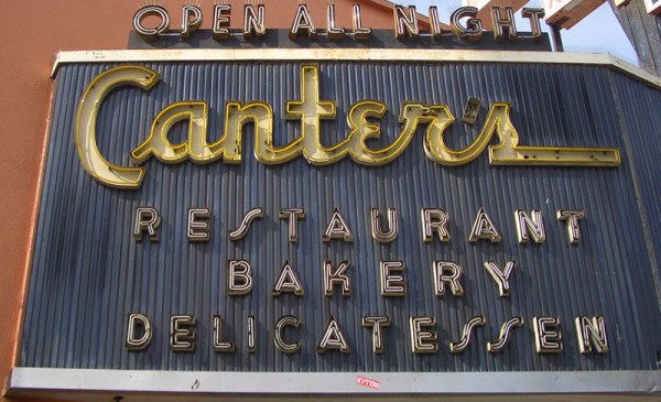
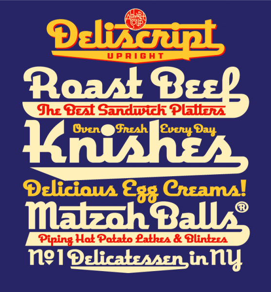
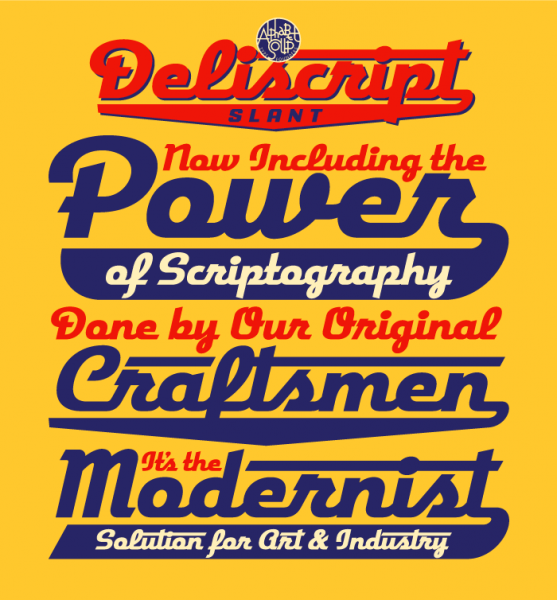
March 18, 2010 on 6:38 pm | By Michael | In Gigs, News | 2 CommentsRecently I had a strange (and kind of wonderful) confluence of circumstance—combined with a smattering of coincidence and random luck. It all started right here in this blog over a year ago when I started sharing my thoughts about creating my new font Deliscript. In the posting I mentioned how the design was “loosely inspired by one of the signs at Canter’s Deli,” a Los Angeles staple for almost 80 years:
At any rate my good fortune with Deliscript began about two months ago when I learned that it been selected by the Type Directors Club in NYC for inclusion in their annual show. About a month later I got a call from Bonnie Bloomgarden, the great-granddaughter of Ben Canter—one of the original Canter Bros. She and her sister Dena were trying to do a few things to gently update the Deli, while still respecting its heritage. One of their ideas was to create a “Canter’s Truck” and take advantage of the recent mobile gourmet food trucks craze. A lot of the newer trucks have been completely “wrapped” with colorful graphics using fairly new printing technology.
She told me that they had started looking for fonts to design the wrap for the truck themselves, but then realized it might be a little difficult for them without having a lot of graphic design experience. Then fortune smiled on Bonnie and Dena when they did a web search Googling “Deli” and “Font” and ran smack into Deliscript (probably because of the Canter’s mention in this blog) and then in turn found, and contacted me.
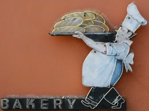
It has been a real pleasure working with Bonnie, a young person with good entrepreneurial instincts that are combined with a keen sense of what is worth keeping in the Canter’s visual vocabulary, and what perhaps should be let go. We both concurred that the truck identity should be based on that neon sign, and that I should use Deliscript as the starting point. I also suggested that we somehow should try to incorporate into the truck design their famous neon chef, who for years has been carrying that platter of freshly baked bread:
At first I tried to graphically recreate him pretty much as he was for the side of the truck. I soon realized that my rendition seemed far too literal for the look I was going for. Then, in an old matchbook catalog, I found a cut of a little round chef carrying a platter of turkey, and decided to use that as the basis for creating my updated baker (a little slimmed down) for the door of the truck:
In “Art Imitates Life…Imitates Art #2” I’ll discuss how we created the design for the truck.
Deliscript Lauded by Type Directors Club
February 10, 2010 on 2:15 am | By Michael | In News | 5 CommentsI was extremely excited to learn recently that my Deliscript font family (Alphabet Soup’s major font project of 2009) was chosen by the Type Directors Club to receive their prestigious “Certificate of Excellence in Type Design” in the display fonts category for their TDC² 2010 Typeface Design Competition`. Deliscript was one of only 16 designs chosen from the many typefaces entered from 29 countries.
Deliscript will be showcased in TDC² 2010, will be on display in New York City throughout the summer of 2010, and will be published in TDC’s Typography 31, the Annual of the Type Directors Club. The exhibition will then go on tour traveling throughout North and South America, Europe, and East Asia.
Once again I’d like to extend my thanks to the very talented Patrick Griffin of CanadaType for his invaluable help with Deliscript’s OpenType programming.
“QWERTY” Pen & Card Case Released by Acme Studio
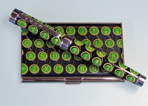
January 9, 2010 on 3:20 am | By Michael | In Gigs, News | 4 CommentsAcme Studio of Maui, Hawaii is known for having an incredible roster of world reknowned designers who have designed pens, watches, cufflinks, wallets and various other accoutrements for them. Some time ago I proposed a pen and business card case to them with a vintage typewriter key theme. This January they’ve released my “QWERTY” pen and business card case design. Currently it’s at the top of their New Releases page (click on “New Releases” at upper left) and and on their Designers page (click on my name a little ways down the list at the left).
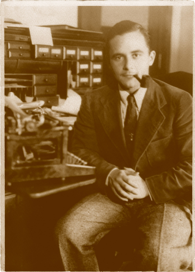
I’ve always loved vintage office machines—especially old typewriters. I guess it’s because I grew up with them. My Dad was a writer, and my memories of him are filled with the sound of his tap, tap, tapping away day and night on his trusty old Underwood. When word processors started taking over, he just found it too difficult to make the transition. It’s hard to explain, but I think it had something to do with a kind of personal bond that he had formed with his machine. Because of my early associations with manual typewriters I still love not just their look and graphics, but especially the feel and clackety-clack sound of the keys, and the imperfect impressions they’d make on paper.
Those memories of my father and his Underwood are now very near and dear to me. Typewriters have now been pretty much relegated to the dustbin of history. The “QWERTY” keyboard layout still survives despite many attempts to improve on it. In designing this pen and case I saw an opportunity for me to create a small homage to these wonderful machines. It may sound odd, but the way I see it, in a way it’s kind of like one almost obsolete writing instrument paying tribute to another.
Acme Studio products can be purchased in Acme Shops worldwide, in better stationery and art supply stores, in museum shops, and online.
Powered by WordPress and Nifty Cube with Recetas theme design by Pablo Carnaghi.
Entries and comments feeds.
Valid XHTML and CSS.
