 |
|
Author Archive
Another Accolade for Metroscript
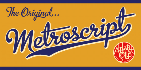
April 16, 2009 on 4:41 pm | By Michael | In News | 4 CommentsIn addition to being named “MyFonts’ Brush Script Font of the Year” and before that being named as a “Rising Star“, Metroscript has now been named as #5 in Smashing Magazine’s “30 Brilliant Typefaces For Corporate Design“—which they call “a great reference for professional designers looking for some fresh, beautiful typefaces for their corporate projects.” They go on to say “With Metroscript, …lettering artist Michael Doret has adapted his trademark hand-lettering style to the computer, creating one of the most sophisticated suites of script fonts on the market.”
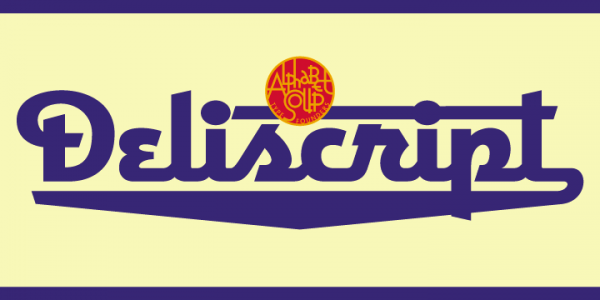
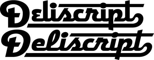
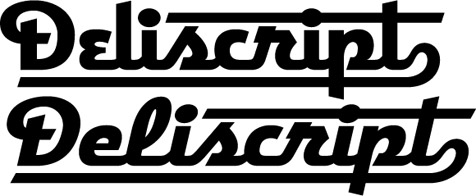
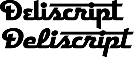
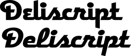
…and coming soon to a type distributor near you: Alphabet Soup’s newest release—Deliscript! Over six months in the making, this font is in the final stages of its OpenType encoding (which has been entrusted to master fontmeister Patrick Griffin of Canada Type). Done in the same spirit as Metroscript, and unlike many “vintage” fonts currently in release, this is not a rehash of an historic font design or showcard lettering that had been unearthed, but a completely new creation. It does have something of the look and feel of a vintage style, but is also fresh and contemporary. Check back here soon for more info, and for the release announcement!
Dept. of Redundancy Dept.
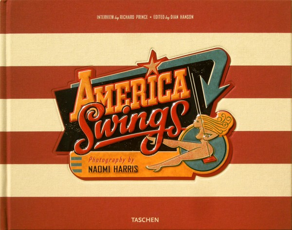
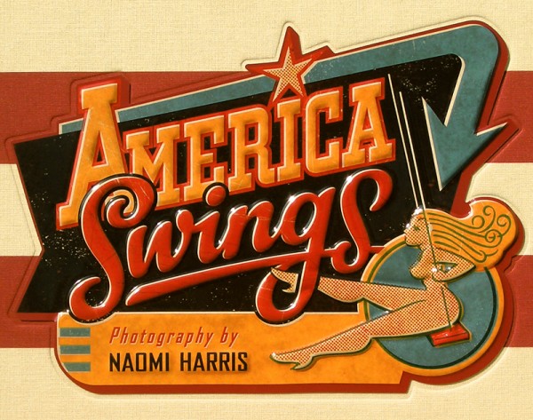
March 14, 2009 on 7:36 pm | By Michael | In Gigs | 2 CommentsI haven’t yet repeated a posting on a particular project, but I felt I needed to do it just this once. I wanted to show off the actual cover that I designed for “America Swings“. I designed it to be an actual tin-lithograph like the toys that were produced by companies like Chein and Marx back in the 20th Century. I was absolutely thrilled with the job that Taschen publishing did with fabricating and putting together this cover from the quality of the tin-lithography to the American flag background fabric. Click on the bottom image below for an even better view.
“Deliscript” Font Preview: Followup
February 27, 2009 on 12:36 am | By Michael | In Notes | 10 CommentsA huge Thank You to those who took the time to take a look at my preliminary ideas for “Deliscript”. A few of you confirmed some thoughts that had already entered my mind about how to approach this font:
The biggest stumbling block for me was that with the large caps that I initially conceived this font as having, there was a problem if one chose not to set an underscore (such as when setting more than one word): the caps would then appear too large. José and Marcus both suggested reducing the cap size to align with the baseline. Initially I thought that might make the caps too small. But when I tried it out it seemed to work fine—admittedly it took some getting used to after seeing the cap so grandiose at the beginning of the word:
And it seems to work fine if one chooses not to set the underscore:
Or even without the extended crossbars on the “t”:
I think that doing it this way will give the font more flexibility. Perhaps I could still include a set of the larger caps as an extra for more dramatic effect. I haven’t yet figured out what I’ll do about the lighter weight. I’m not that crazy about it, so I was kinda surprised to see both Norman and Marcus commenting that they were partial to it. I’ll have to think on that, but any more comments on any of this would really be welcome!
Powered by WordPress and Nifty Cube with Recetas theme design by Pablo Carnaghi.
Entries and comments feeds.
Valid XHTML and CSS.
