 |
|
“Deliscript” Font Preview: Followup
February 27, 2009 on 12:36 am | By Michael | In Notes | 10 CommentsA huge Thank You to those who took the time to take a look at my preliminary ideas for “Deliscript”. A few of you confirmed some thoughts that had already entered my mind about how to approach this font:
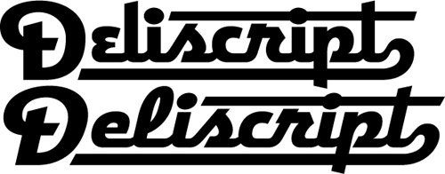
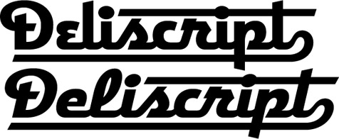
The biggest stumbling block for me was that with the large caps that I initially conceived this font as having, there was a problem if one chose not to set an underscore (such as when setting more than one word): the caps would then appear too large. José and Marcus both suggested reducing the cap size to align with the baseline. Initially I thought that might make the caps too small. But when I tried it out it seemed to work fine—admittedly it took some getting used to after seeing the cap so grandiose at the beginning of the word:
And it seems to work fine if one chooses not to set the underscore:
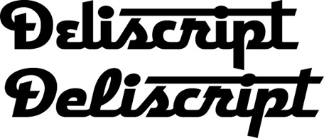
Or even without the extended crossbars on the “t”:
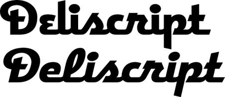
I think that doing it this way will give the font more flexibility. Perhaps I could still include a set of the larger caps as an extra for more dramatic effect. I haven’t yet figured out what I’ll do about the lighter weight. I’m not that crazy about it, so I was kinda surprised to see both Norman and Marcus commenting that they were partial to it. I’ll have to think on that, but any more comments on any of this would really be welcome!
10 Comments
RSS feed for comments on this post. TrackBack URI
Leave a comment
Powered by WordPress and Nifty Cube with Recetas theme design by Pablo Carnaghi.
Entries and comments feeds.
Valid XHTML and CSS.


Dear Mr. “Le Mechanic”,
Thanks for your supportive comments. You shouldn’t be so modest—you DO know your stuff, and your opinion would be greatly valued by me. Anyway, why the “Nom de Plume”? Be proud!
MD
Comment by MD — March 31, 2009 #
Above the line below the line? weights? its all design G(r)eek to me. Let me underscore your fonts are the finest in fine design. You are the detail guy, I just sit back and relax and know anything I use them on will be that much better.
Comment by le mechanic — March 31, 2009 #
Deliscript!- I also agree with Marcus & Jose regarding the Caps. I like the smaller cap aligning with the baseline and not going below. Alternate large caps for special situations would be nice, providing the weights are consistent with the lower case.
I prefer the non italic version of this font.
Go for it Michael…
TN
Comment by Tom Nikosey — March 19, 2009 #
Super-Duper site! I am loving it!! Will come back again – taking you feeds also, Thanks.
Comment by Webkatalog — March 18, 2009 #
Hi Michael–these are all great. I like the large caps better when the underscore is used–just seems to draw the eye to the beginning of the word and give the whole thing a bit more punch. With no underscore I like the letters all sharing the same baseline–really nice! I agree with Norman who so eloquently lobbied for the light weight font. It could be the more “sophisticated” of the two. I picture the Deli using it to advertise their “upscale” menu items. Thanks again for letting us weigh in.
Comment by Heckadude — March 2, 2009 #
Language, Spanglish! You don’t know kids today! Sh!t is an acceptable word and so is “fuck” as long as it’s not used in a sexual way. You need to go to movies more often.
Anywho, I hope you have great success with this type as you have with all your other type.
¡Viva George Carlin!
Comment by José Cruz — March 1, 2009 #
Looks great, Michael. It works great with the caps reduced and lined up with the baseline. And if designers want, they can always increase the initial cap, if need be. I like it a lot.
For some reason, I’m craving pastrami.
Comment by Marcus — March 1, 2009 #
he’s right this is the motherfucking bomb.
cap to lc ratio is fine as is, no need for alt set with larger caps.
though am giving no latitude on the light weight. produce!
Comment by norman hathaway — February 27, 2009 #
Hey! Yo! Language! There may be kids tuning in.
Comment by MD — February 27, 2009 #
Glad to have helped.
Your Sh!t’s the Bomb!
Comment by José Cruz — February 27, 2009 #