 |
|
Author Archive
“Deliscript” Font Preview: Your Feedback, Please!
February 6, 2009 on 8:37 pm | By Michael | In Notes | 12 CommentsI’m not the most prolific of font designers—perhaps I come up with one a year—but when I do one I try to do a design that’s not only uncompromising, but also one that is usable by people with a wide variety of tastes. For the last several months I’ve been working on a new design that was loosely inspired by one of the signs at Canter’s Deli here in Los Angeles. I’ve been vacillating on several points with regard to the design of this font, and also how many fonts should go into this package. So I thought I’d put it out there to you, my friends and fans, to take a look, read my remarks, and give me your considered opinions via the comments section below.
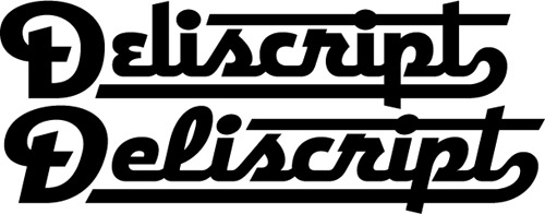
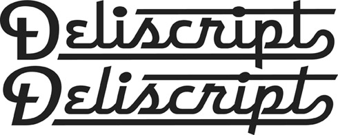
Above is my original concept for this font which I’m calling “Deliscript”. It started out as a straight up and down script, but then I decided to also include a variation that was italicized. In the same fashion as my highly successful Metroscript I thought that having underscore “tails” that would emanate from either certain cap letters or from the last letter of the word in lowercase would be a nice idea.
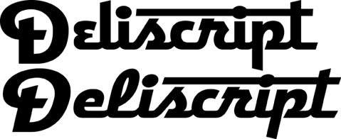
As you can see above, I immediately ran into a problem: if one choses not to set copy with an underscore (a very likely occurrence), then the caps end up looking much too large for the lowercase.
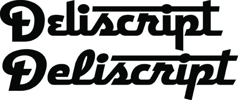
The solution, of course, was to reduce the size of the caps (above). But then the question arises, do I create two sets of fonts—one with larger caps and underscores (Deliscript Special and Deliscript Special Oblique), and another with smaller caps and no underscores (Deliscript and Deliscript Oblique)? Or do I eliminate the Deliscript Special fonts altogether and just have the more normal versions?
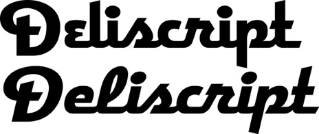
Another question that arises is whether or not it’s worth it to have features like the extensions on the “t”s. Part of me likes things like that, but another part says it may not be worth the trouble. It looks perfectly fine without (above). Opinions, anyone?
Finally, I had originally conceived this design as having a lighter weight as well, but I’m not sure it will be worth it. Aesthetically I much prefer the chunkier, heavier versions, and I don’t want to go to the trouble of doing this weight just to create a larger font family. So feedback on this question would also be appreciated! Comments?
Barack Obama & JFK
January 20, 2009 on 5:06 pm | By Michael | In News, Notes | 7 CommentsToday is history. I cannot remember ever feeling this thrilled or so hopeful about a new president. The closest thing I can associate with this was the tenor of the nation during the years before the Kennedy assasination. The country was unified behind him and he was beloved by almost everyone. When he was shot I was in school, and I remember students were either stunned or openly weeping. My daughter Wenonah reminded me this morning that once many years ago I spoke to her about the Kennedy years, about how he was loved, how everyone was so positive about—and supportive of—our government. She had told me that she just couldn’t imagine ever feeling that way, or even relate to that experience. After the inauguration this morning she told me that now she understood what I meant.
After November 22nd, 1963, our country entered a long dark era, from which only now it may be emerging. I never thought a day like this would be possible in my lifetime. After all the US has been through I never imagined that we could again elect a person of such intellect and potential as Barack Obama. I believe he is capable of being one of the greatest leaders this nation has ever had. We will all need to re-evaluate what is truly important in our lives, and he and his administration will need the support of all of us to tackle the monumental challenges that lie ahead.
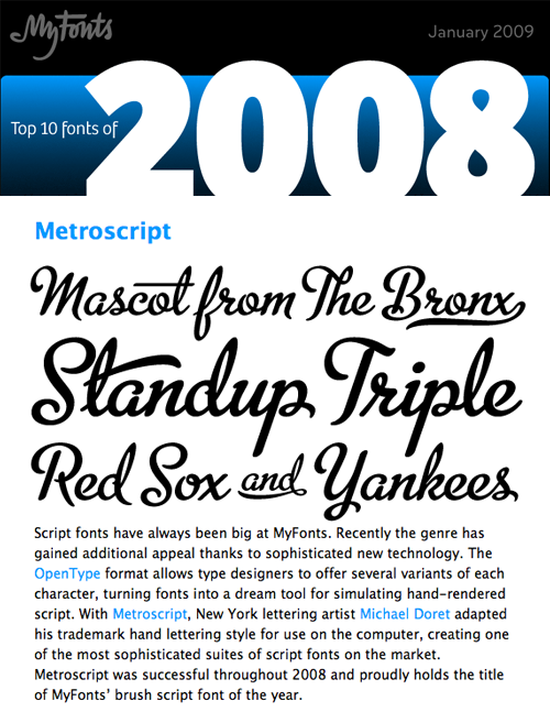
MyFonts Names Metroscript “Brush Script Font of the Year”
January 14, 2009 on 1:48 pm | By Michael | In News | 6 CommentsThe lead item in the January ’09 issue of MyFonts News is reproduced below. I have been thrilled that this font has been accepted so readily by the design community (and beyond), and would like to thank Stuart Sandler of Font Bros and Mr Retro for his assistance in helping me realize this design.
Powered by WordPress and Nifty Cube with Recetas theme design by Pablo Carnaghi.
Entries and comments feeds.
Valid XHTML and CSS.
