 |
|
“Deliscript” Font Preview: Your Feedback, Please!
February 6, 2009 on 8:37 pm | By Michael | In Notes | 12 CommentsI’m not the most prolific of font designers—perhaps I come up with one a year—but when I do one I try to do a design that’s not only uncompromising, but also one that is usable by people with a wide variety of tastes. For the last several months I’ve been working on a new design that was loosely inspired by one of the signs at Canter’s Deli here in Los Angeles. I’ve been vacillating on several points with regard to the design of this font, and also how many fonts should go into this package. So I thought I’d put it out there to you, my friends and fans, to take a look, read my remarks, and give me your considered opinions via the comments section below.
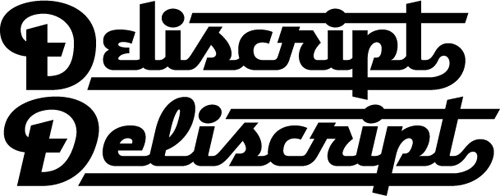
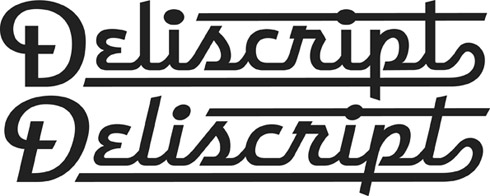
Above is my original concept for this font which I’m calling “Deliscript”. It started out as a straight up and down script, but then I decided to also include a variation that was italicized. In the same fashion as my highly successful Metroscript I thought that having underscore “tails” that would emanate from either certain cap letters or from the last letter of the word in lowercase would be a nice idea.
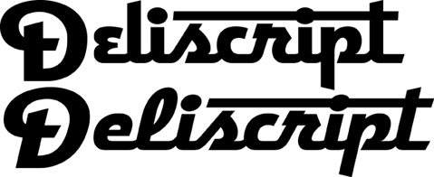
As you can see above, I immediately ran into a problem: if one choses not to set copy with an underscore (a very likely occurrence), then the caps end up looking much too large for the lowercase.
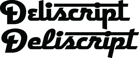
The solution, of course, was to reduce the size of the caps (above). But then the question arises, do I create two sets of fonts—one with larger caps and underscores (Deliscript Special and Deliscript Special Oblique), and another with smaller caps and no underscores (Deliscript and Deliscript Oblique)? Or do I eliminate the Deliscript Special fonts altogether and just have the more normal versions?
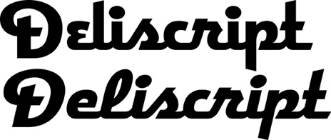
Another question that arises is whether or not it’s worth it to have features like the extensions on the “t”s. Part of me likes things like that, but another part says it may not be worth the trouble. It looks perfectly fine without (above). Opinions, anyone?
Finally, I had originally conceived this design as having a lighter weight as well, but I’m not sure it will be worth it. Aesthetically I much prefer the chunkier, heavier versions, and I don’t want to go to the trouble of doing this weight just to create a larger font family. So feedback on this question would also be appreciated! Comments?
12 Comments
RSS feed for comments on this post. TrackBack URI
Leave a comment
Powered by WordPress and Nifty Cube with Recetas theme design by Pablo Carnaghi.
Entries and comments feeds.
Valid XHTML and CSS.
[…] here in this blog over a year ago when I started sharing my thoughts about creating my new font Deliscript. In the posting I mentioned how the design was “loosely inspired by one of the signs at […]
Pingback by Alphabet Soup » Blog Archive » Art Imitates Life…Imitates Art (#1 of 3) — March 18, 2010 #
Hi Doug!
Funny you should ask. That’s one thing I’m currently considering. If I do that hairline weight I can generate other weights in between that one and the current bold weight. I should be able to release the first members of this family by the beginning of next month.
Comment by MD — April 8, 2009 #
Nice job Michael. The thinner weight is also nice. What about a neon style ultra thin weight?
Comment by Doug May — April 6, 2009 #
i think the proportions you have now, between cap and lc is right. If you want baseline alignment I’d just scoot them vertically, not resize.
dammit whip up some examples of each for us to peruse you lazy bastard.
Comment by norman hathaway — February 27, 2009 #
Interesting, Marcus. I wasn’t sure the work involved in creating the thinner weight would be worth it, so I find yours and Norman’s comments kinda unexpected. I think the underscores really need the larger caps, but after reading yours and José’s comments I might try out reducing the caps even further and aligning them with the baseline, and see how that works.
Comment by MD — February 22, 2009 #
I personally LOVE the thinner weight. The thicker weight is great for logos and large design pieces, but I can see the delicate thin working well, too. I think it would be more than worth it t o create both.
Why not just create a font set with the beautiful underscores WITH smaller caps? Will that work?
This would be GREAT in neon, too:
http://flickr.com/photos/therealdevildoll/749389145/
Nice work Michael!
Comment by Marcus — February 21, 2009 #
i want both weights.
the thinner one is beautiful and will read wall at smaller sizes.
i want underscored, and it would be nice to have the nude version as well – but if forced to choose, i’d take the score.
the crossed t’s are nice, but seem like they’d be a pain in the ass to execute within a font. besides they would be easy-peasy to do manually when needed.
Comment by norman hathaway — February 13, 2009 #
Not if you make the caps smaller!
Comment by José Cruz — February 12, 2009 #
You’ve got a point José. I’m thinking that I may need to offer it with and without underscore (Special and Regular). Aligning the bottom of the caps with the baseline would make them even smaller, but I’ll check it out.
Comment by MD — February 11, 2009 #
I think that if you offer it without underscore the Capitals should align with the base of the lowercase letters instead of centering to accommodate the underscore.
I really like the first two but then again what do I know about type, I’m an illustrator?
Comment by José Cruz — February 11, 2009 #
Thanks Andy. I appreciate the feedback.
Anyone else? You don’t have to be a font expert to chime in here!
Comment by MD — February 9, 2009 #
I love the direction you’re going here! The thickness of the bolder version does gives the lettering more punch–I would probably use that version more often.
If forced to live on a desert isle with the tails or the “t” extensions, I’d choose (after a long deliberation and many tears shed) to keep the “t” extensions because they are so darn unique. The third example down from the top looks great with the reduced caps and the “t” extensions, even without the tail.
I’d love to use all the variations you’ve worked on, but if I had to pick I’d go with Deliscript and Deliscript Oblique.
Comment by Heckadude — February 9, 2009 #