 |
|
Author Archive
Set the Wayback Machine: “Viva” Astrology
January 5, 2009 on 12:57 am | By Michael | In Gigs, Notes | 4 CommentsI thought it would apropos and an interesting idea to start the New Year off by initiating a series of posts that looks back at some of my work from times gone by. Much of this work will be pre-digital—done the old fashioned “analog” way, with pen and ink. Most was done as pre-separated art: I inked my art on multiple cells of frosted mylar using a Rapid-O-Graph technical pen. Basically the areas of black ink on each cell could be designated to print either with CMYK callouts or with Pantone numbers. It was a very laborious process that was easily duplicated after the first few versions of Adobe Illustrator had come out.
 |
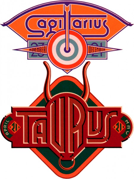 |
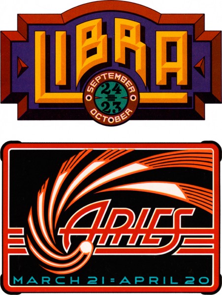
Four Astrology Sign “Logos” for VIVA Magazine
So right now let’s set the Wayback Machine for the mid ’70s and VIVA magazine published by Penthouse (a kind of Playboy for women). The Art Director—the late Rowan Johnson—asked me to design logos for their monthly astrology column which would change with each issue. Even though at the time I was paid quite a paltry sum for my efforts, this was a great ongoing project for me. Much like my recent “Jewish Zodiac” project, I saw this assignment as an opportunity to create a portfolio of distinct yet related logos. I think they really highlight the possibilities of using letterform design not as an end in itself, but as part of a total design concept where letters are treated as one of several related illustrative elements, and integrated into an expressive whole.
America Swings
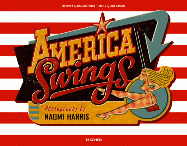
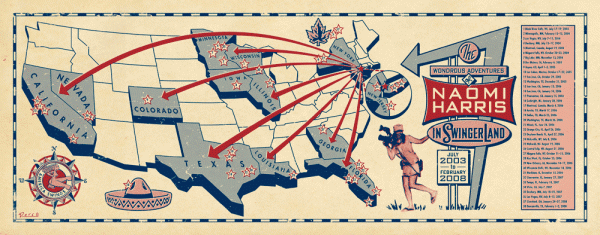
December 11, 2008 on 3:54 pm | By Michael | In Gigs | 1 CommentJosh Baker, Art Director/Designer at Taschen Publishing, needed a cover design for a book by New York photographer Naomi Harris. The book: America Swings. The subject: a photographic odyssey spanning the 50 States chronicling the swinging sex lives of everyday Americans. My challenge was to come up with a cover design that would encapsulate the “Route 66” flavor of Ms. Harris’ travels and communicate the uninhibited/explicit nature of the subject without spelling it out on the cover. For the cover’s swingin’ blonde figure I got a little help from my wife, illustrator Laura Smith. I then created one of the more complex graphics of my career—this time working almost exclusively in Photoshop—as opposed to Illustrator which is my usual application of choice. I also created a detailed map of Naomi’s travels across America for the book’s endpapers.
Overspray
November 17, 2008 on 2:31 pm | By Michael | In News, Notes, Wayback Machine | 3 Comments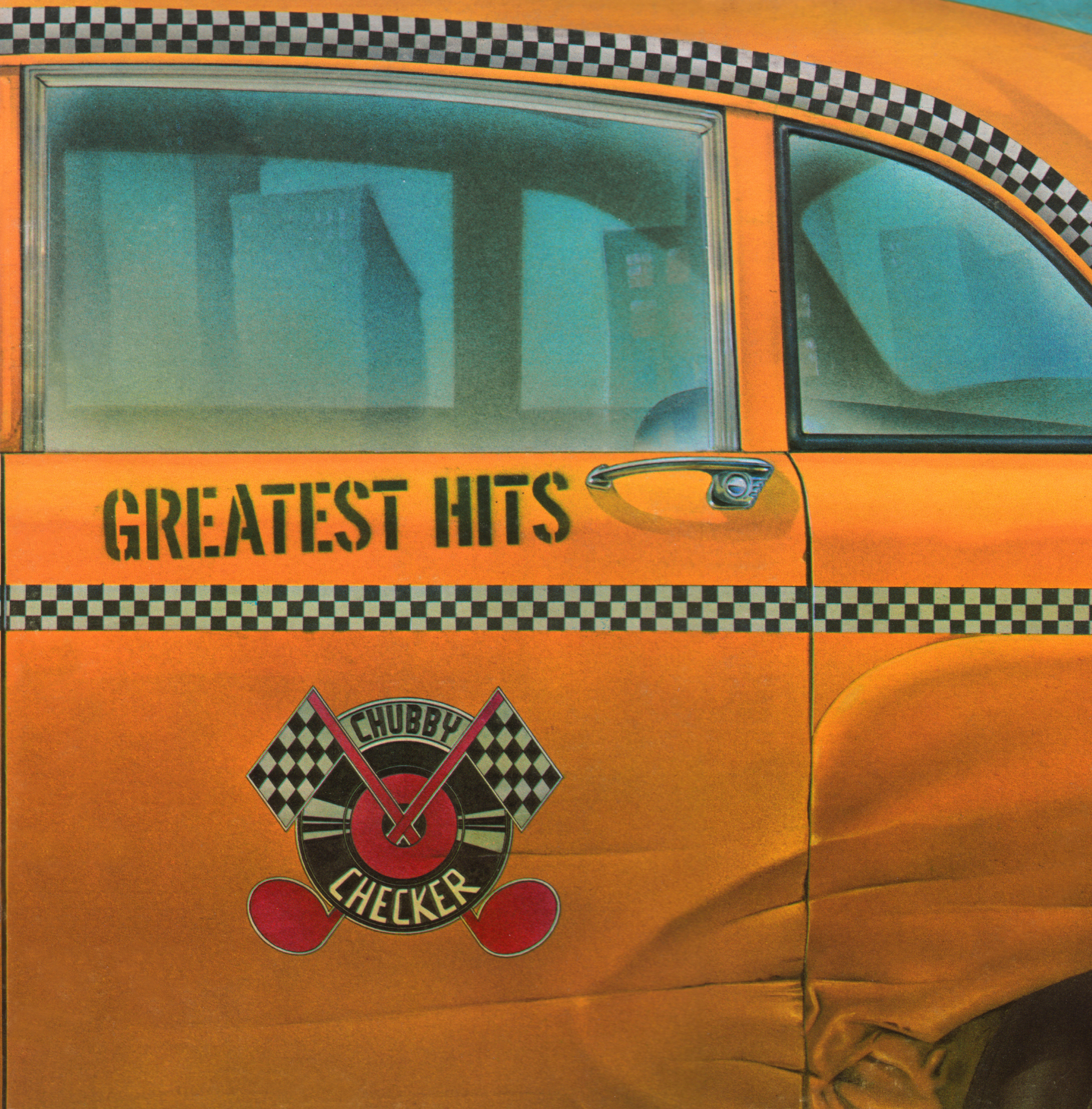 |
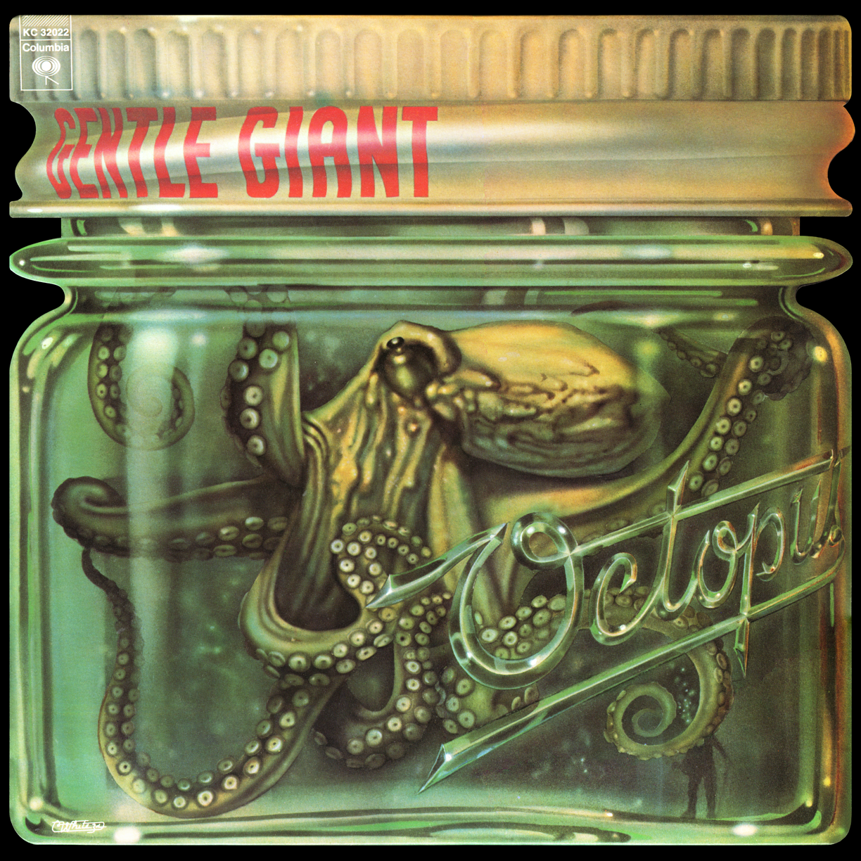 |
At the very beginning of my career I hooked up with airbrush wiz Charles White III. He rented me deskspace in his studio on Lexington & 26th Street in Manhattan, and helped give my career the push it needed. We did quite a bit of work together in those days—work that I’d like to think was groundbreaking illustration work. Rather than have typography slapped over an illustration, we tried to figure out new and inventive ways of integrating letter and image. This is evident in pieces like the Chubby Checker album cover where the title was part of the illustration—contained in the Checker Cab-like decal I created—or the Gentle Giant cover where I painstakingly figured out what dimensional lettering would look like as it wrapped around a glass jar. One of our first collaborations was the incredibly complex Screaming Yellow Zonkers poster which took a more traditional approach to the integration of letterforms and illustration.
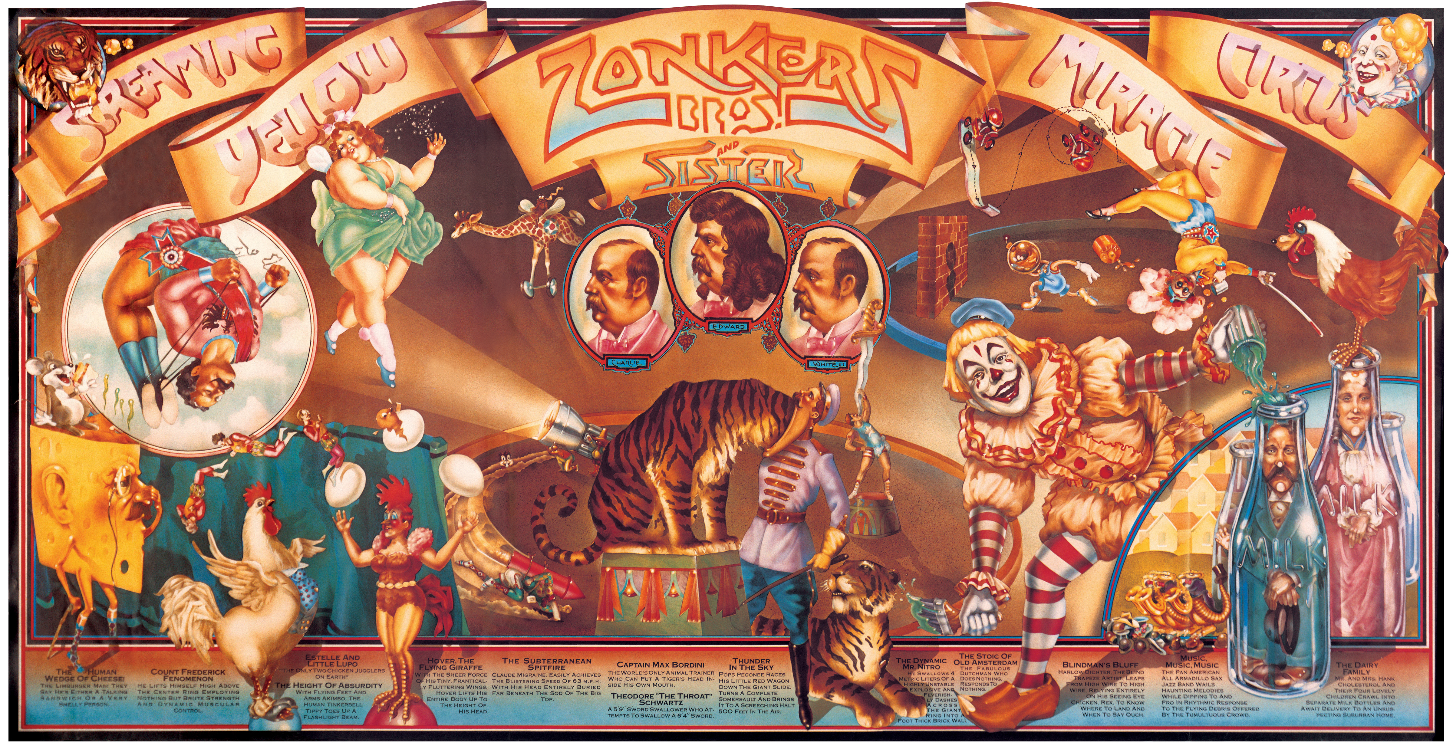
Charlie is finally getting the recognition he deserves for that early work in the just released book Overspray by Norman Hathaway. The book features Charlie who, along with fellow artists Dave Willardson, Peter Lloyd and Peter Palombi, formed a quartet of California artists that transformed the illustration landscape in the ’70s. Charlie, Dave and Norman together with legendary designer and art director Mike Salisbury (who contributed an essay to the book) were all in attendance at a book signing at FAMILY in Los Angeles on 11/12/08. To see photos from the FAMILY booksigning (which includes the back of my head) and some discussion from Norman Hathaway about the process and problems he encountered putting together this book, check out his Overspray Blog. To see more of Charlie’s work from this period, I’ve put together a PDF of images (not currently available) culled from his website. Throughout his career Charles White III has been consistently one of the most interesting talents around. Visit his Olio website to see what he’s been up to.
Powered by WordPress and Nifty Cube with Recetas theme design by Pablo Carnaghi.
Entries and comments feeds.
Valid XHTML and CSS.
