 |
|
Author Archive
“Striking Images”
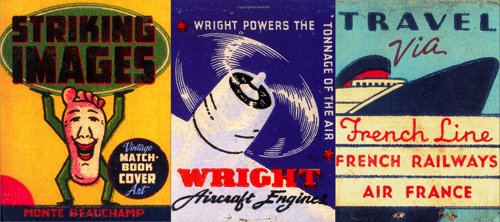
August 21, 2008 on 7:23 pm | By Michael | In Notes | No CommentsIt’s no secret that for inspiration I look at a lot of American ephemera. I collect some, but I am also constantly on the lookout for good books to have on hand to refer to for a quick jolt of brilliance. I’ve got books on neon and cigarette packs, enamelled signs and billboards, wheel charts and travel brochures, and on and on. One recent purchase really stands out in my mind—so much so that I felt I needed to mention it here: “Striking Images” – Edited and Designed by Monte Beauchamp. It’s a book of vintage matchbook cover art. There have been other books on the subject, but this one stands out in my mind as having the best, the most unusual, and the most colorful selection of this genre I have ever seen. But what really stands out in my mind is that many of the images are blown up to either full page size—or larger. Monte is also well known as the man behind “Blab!” magazine, a publication that anyone interested in what is current in the Fine Art and Illustration worlds cannot afford to be without. Also worthy of mentioning is that if any of you are going to be in the vicinity of Manhattan (Kansas that is) between the months of August and October you should definitely take in the Blab! Retrospective being held at the Beach Museum of Art.
“Cry-Baby” on Broadway
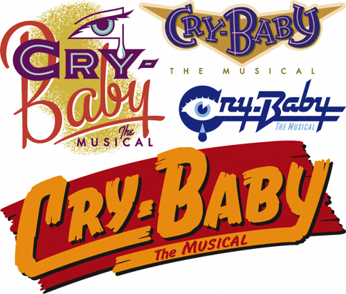
August 11, 2008 on 9:32 pm | By Michael | In Gigs | 1 CommentI was asked by Moira Deakin, Creative Projects Manager at Serino Coyne Advertising, to design a title treatment for the Broadway musical adaptation of the John Waters film “Cry-Baby”. I did seven design solutions including the four you see below. The producers of the show selected the one at the bottom. For reasons unclear to me this design was eventually adapted and changed slightly, but still remained fairly faithful to my original intent. Unfortnately the show closed recently after only 45 previews and 68 performances.
I was quite proud of all the work I had done on this title treatment. I’ve put together a Case Study PDF of the steps I followed from start to finish on this project, which can be downloaded from my page of downloads.
Two Magazine Covers for August
July 24, 2008 on 11:17 pm | By Michael | In Gigs | No Comments
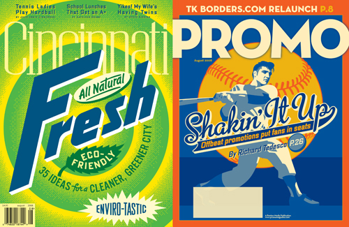
Just completed (almost simultaneously) 2 magazine covers. The first one for Cincinnati Magazine. Cincinnati is the home of Tide laundry detergent, and so Art Director Grace Saunders suggested using the classic Tide packaging as a jumping off point for a cover on environmental awareness in that city. I suggested that they really go “green” with the graphic, making the familiar orange, yellow and blue iconic image more of a statement by using an unexpected color treatment. The “Fresh” graphic was hand-lettered while the various subheads were created with different fonts including my recently released DeLuxe Gothic which adds lowercase characters to Morris Fuller Benton‘s classic font.
The second cover was completed for Art Director Jed Davis for Promo Magazine. Because of time constraints, I was forced to rework an illustration of a batter I had originally created for my silkscreen poster celebrating the release of my font Metroscript. The cover story was about how stadiums these days are having to come up with ever more creative ways of attracting people to ballparks—including promotions like having Elvis impersonators parachute into the stadium: thus the Elvis themed “scorebook”–like cover.
Powered by WordPress and Nifty Cube with Recetas theme design by Pablo Carnaghi.
Entries and comments feeds.
Valid XHTML and CSS.

