 |
|
Archive for the 'Gigs' Category
Kiss Kulture Klash
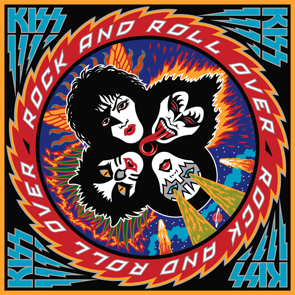
April 17, 2013 on 5:19 pm | By Michael | In Gigs, Notes, Wayback Machine | 1 CommentWhen I was asked to design and do the art for KISS’ 4th studio album Rock and Roll Over, I was fairly ignorant of the culture that was forming around the group. I was unencumbered by any preconceived ideas as to what the group and their music was about. Many are surprised to hear that Gene, Paul, Ace and Peter had to explain their different personas to me before I started working on the design.
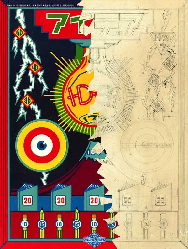
I’d love to be able to show my working pencil sketches, but over the years they’d gotten lost or destroyed, and the only record left was the original colored pencil comp that I used to explain my concept to the group. A few months earlier I had done a cover for IDEA, a Japanese art magazine that had done an article about my work, and for whom I had created a cover. I really loved how that cover had turned out, so my thought was to try to emulate the look I had come up with on this new cover for KISS. My cover for IDEA had certain gamelike, and very graphic elements that I thought would work well telling the story of what KISS were about.
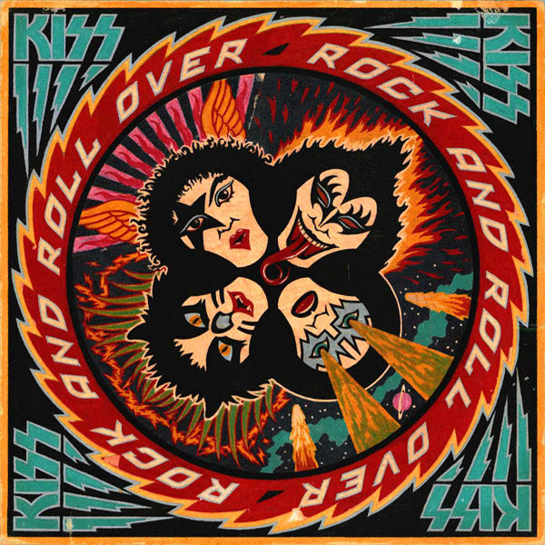
Since their makeup reminded me of classic Japanese Kabuki players, I thought the look would be appropriate. So I created a little story around each character and put them all together in a sort of “mandala” motif surrounded by a sawtooth blade with lettering. I kept the colors simple and bold as I had done with my IDEA cover. Here (yellowed and a bit worn with age) is the original colored pencil sketch I created for the group’s approval:
The meeting went particularly well, since I was expecting outright rejection of my idea—which at the time was pretty unorthodox for an LP cover. The changes gthey asked for, I felt, were fairly minor—adjustments to the faces (with the exception of Peter Criss), and rotating the lettering 90°.
The KISS logo already existed, but I felt it needed some help to work better with my design (Paul told me he had drawn it on his dining room table). So I redrew it, making the design more consistent, and adding the lightning strokes to help give movement to the sawtooth blade.
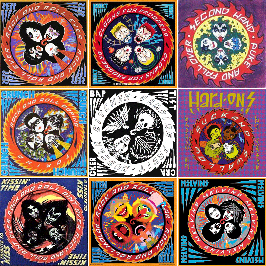
After the cover was done, I didn’t think about it very much. It was only years later that I came to understand that this cover had taken on a life of its own and become sort of a cultural icon. I started to realize that when I discoved all the incredibly blatant and poorly done rip-offs of my design. Rather than upsetting me, seeing all that was quite amusing . . . after all, isn’t imitation “the sincerest form of flattery”?
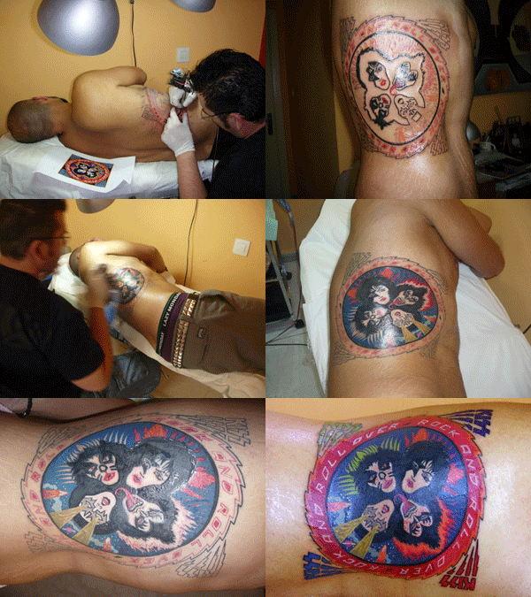
Another indicator to me of how pervasive this design had become in the culture was that people were having it permanently etched onto their bodies. This both horrified, and delighted me at the same time! Personally I would never have anything tattooed on my body—especially one of my own graphics: I’d get bored with the design way too quickly, and then it would be too late to do anything about it. Here are some shots of the process of one lucky soul having the complete Rock and Roll Over art permanently engraved on his right flank. The tattoo artist did a pretty good job, if you ask me!
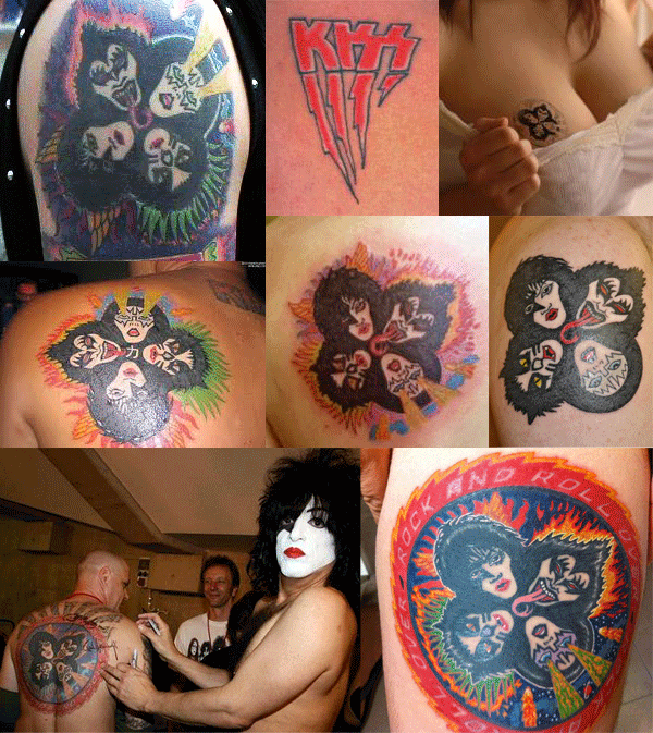
And below, for your viewing pleasure, a few more of my favorite RaRO tattoo shots. I especially like the one of the guy getting his back autographed by Paul Stanley. Now that’s what I call Kiss Kommitment!
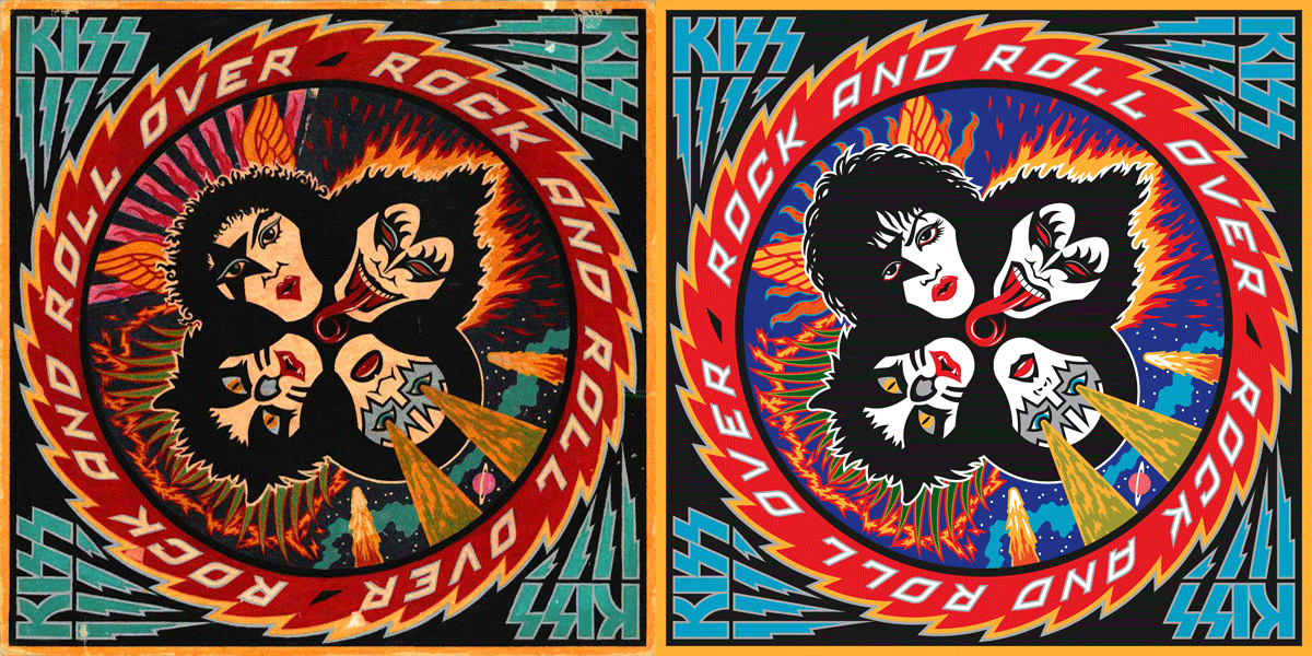
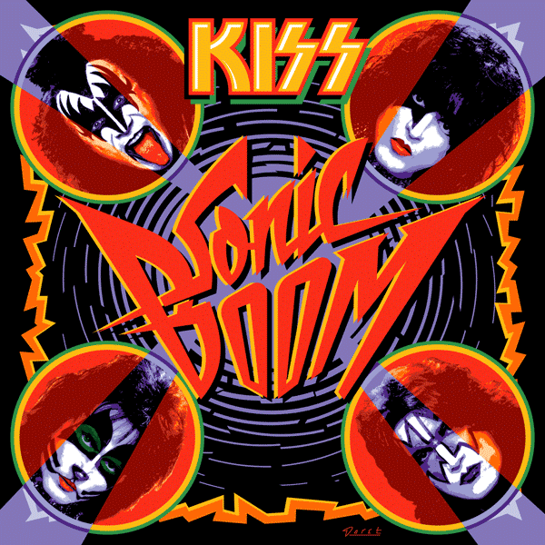
Speaking of Paul, he contacted me again recently. It seems that KISS were about to record their 19th studio album. They hadn’t done one of those for eleven years, and he told me they wanted to recapture some of the magic that the Rock and Roll Over design had provided for them when they were starting out. So, in a way they kind of wanted Rock and Roll Over All Over Again—the same . . . but different.
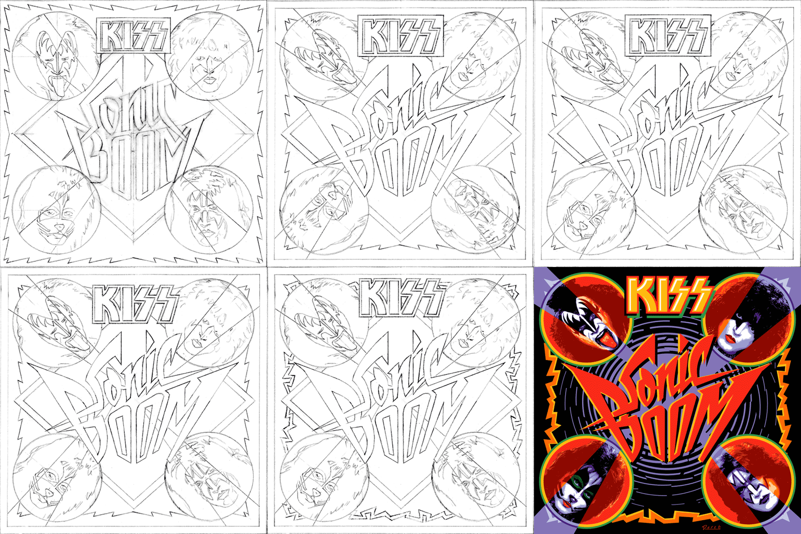
Attempting to recreate the success of an iconic image is a thankless task. You can’t realistically have that as a goal. The most you can do is to give it your all and try to do the best piece of art you’re capable of doing. Here are a series of rough sketches that led up to the finished design
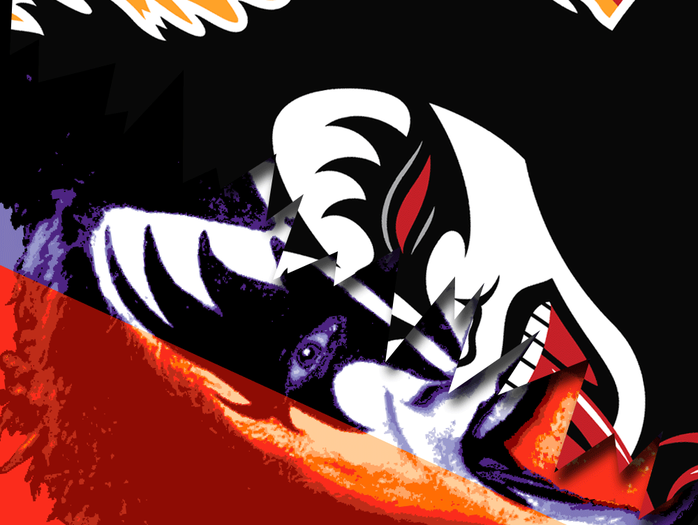
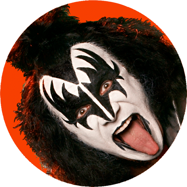
The hardest part of this process was figuring out what to do with the four faces. This time Paul wanted them to be photographic instead of just plain old graphic—as they were the first time around. And I couldn’t get new photography—it had to be taken from existing files. The approach I decided on was to take the best photos I could find with the most contrast and shadows, and translate them into flat graphics that I could make work with the rest of the art. I’ve simplified the steps a bit, but here’s an example of what I did with the faces, using a photo I found of Gene’s face:
Everybody’s got an opinion as to whether the art for Sonic Boom is better or worse than that for Rock and Roll Over. Being so close to both designs it’s difficult for me to say. As far as Sonic Boom is concerned, I did the best I could within strict limitations provided by Paul. I think it solved the problem, and I’m quite happy with the results.
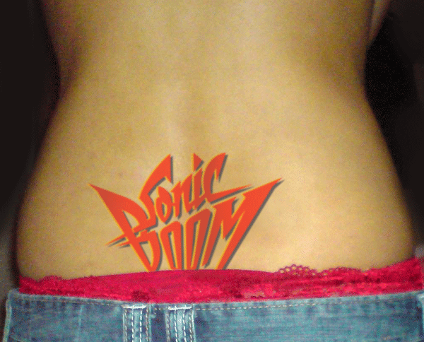
I’ll leave it to time, to posterity, and to others to decide if Sonic Boom becomes as much a cultural touchstone as Rock and Roll Over did. If it does, we may soon start seeing . . .
Purchase an original “Rock and Roll Over” press proof HERE
The Evolution of PowerStation
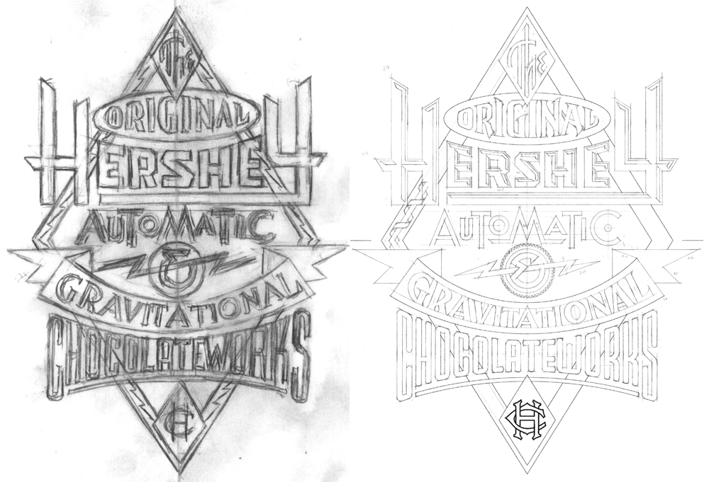
February 11, 2013 on 11:09 am | By Michael | In Gigs, Notes, Wayback Machine | 2 CommentsPowerStation is my one font that specifically evolved from a prior design assignment. I had been tasked with designing signage for Hershey’s Times Square flagship store. The signage needed to be designed in the spirit of a retro future-machine, à la Jules Verne or other Victorian “Steam Punk” aesthetic. So I came up with the following sketches in which I combined various lettering and type styles:
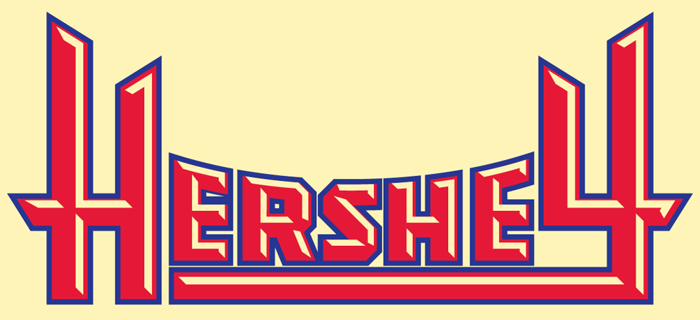
In the tighter version I designed the word “Hershey” to have a feeling of faceted letters, similar to what you might see on an old theater marquee:
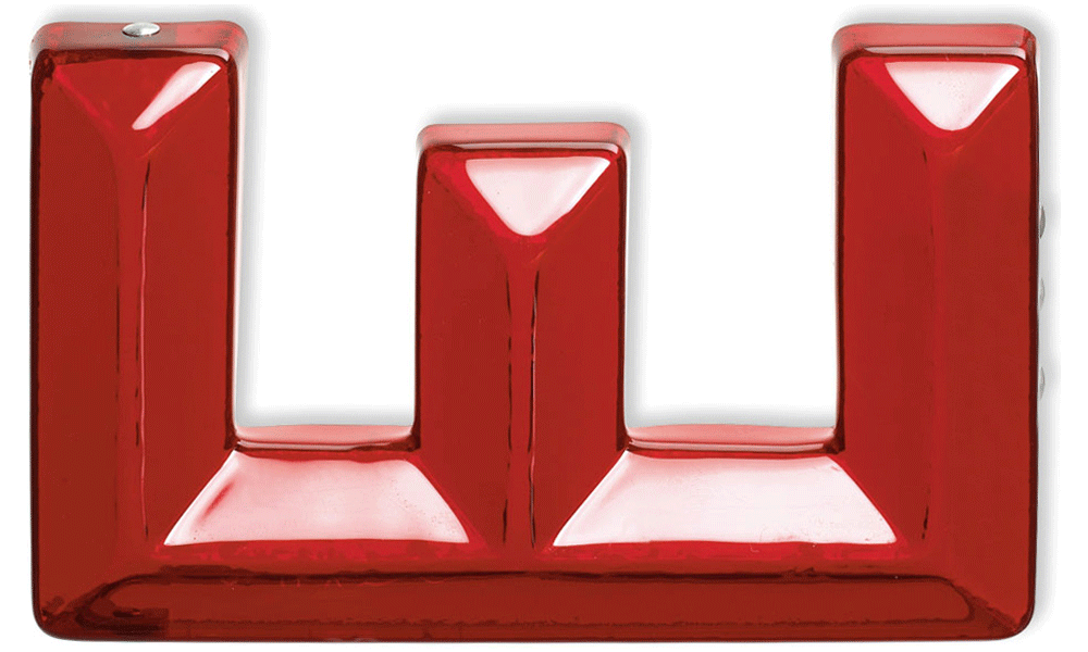
Ever since I first became aware of them I’ve been faxcinated by the tactile qualities of these extruded plastic letterforms, and how they reminded me of candy. I’ve always thought there was something “delicious” about them.
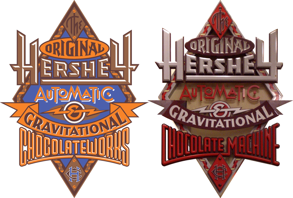
So it seemed entirely appropriate to me that the word Hershey should be rendered that way, giving it a chunky, almost chocolatebar-like flavor. Note that in the final signage we needed to change the lettering of the word “Chocolateworks” to read “Chocolate Machine”.
I loved how my art turned out, especially the word “Hershey”. After this job was over it occured to me that I wasn’t aware of any fonts that successfully captured that particular faceted look. So I thought I’d try and see if I could make that work as a typeface:
I started sketching out various letters to see if it could be viable. As the font developed and it’s strong industrial and moderne qualities became more apparent, I decided to name it “PowerStation”.
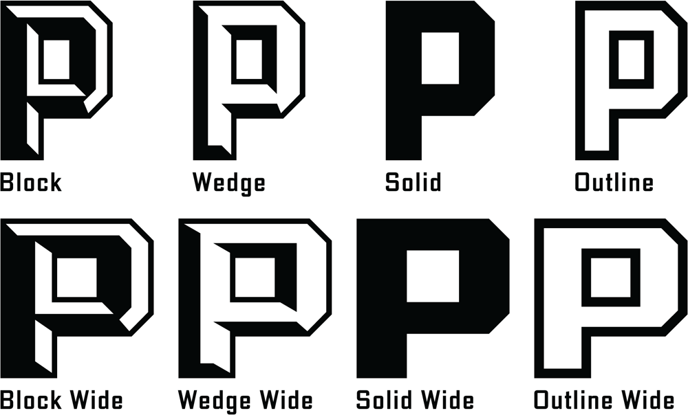
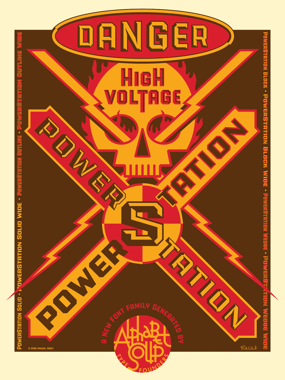
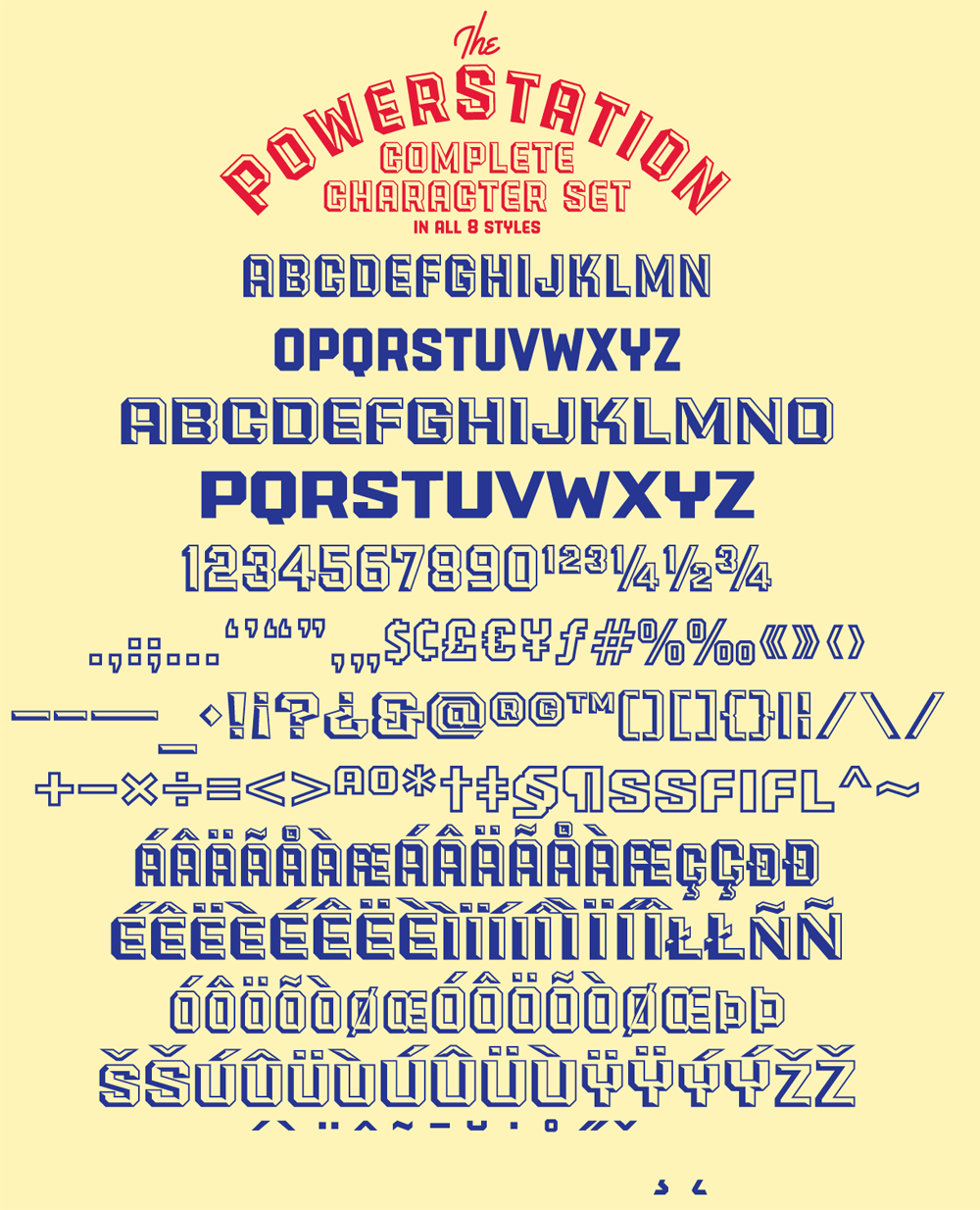
As I developed PowerStation, it evolved from the one version I had adapted from the Hershey’s assignment into four different versions. These I decided to call Block, Wedge, Solid, and Outline. Then I thought I’d expand those into another four “Wide” versions. Now I had a family of eight different fonts.
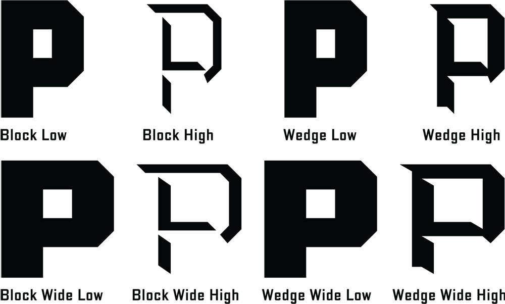
But I guess I wasn’t able to leave well enough alone. Why not provide the added ability to set PowerStation in two colors? So I took the basic four faceted versions of PowerStation (Block, Block Wide, Wedge, and Wedge Wide) and broke each of them down into two separate fonts which, if set on separate layers, could provide 2 color typesetting. The solid “base” of the letters would be formed by setting the “Low” version of the font, and the facted part of the letter would be formed by setting the “High” version of the font on a layer directly above the “Low” version.
In other words a two color version of PowerStation Wedge could be achieved by setting PowerStation Wedge High over the same copy which would be set in PowerStation Wedge Low, and applying different colors to each layer.
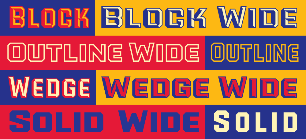
Setting words like this in two colors can provide richness and variation when used imaginatively.
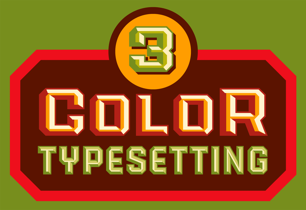
Some time after the release of PowerStation I discovered the next step in its evolution—that you didn’t have to be limited to two color typesetting with this font. I found that by combining the various PowerStation fonts in different ways one could set this font in three colors as well. The instructions for doing that may be a little long for this article, so if you’d like to see what’s involved with that, you can download the free PowerStation User Manual.
I originally created the serigraph above to celebrate the release of PowerStation. The signed and numbered edition is limited to 100 copies, and there are still some left. Click HERE to find out more about this offer.
License the PowerStation fonts HERE .
Purchase the PowerStation Serigraph HERE.
60 Second Green—An Eco-Friendly Logo
January 9, 2013 on 8:41 pm | By Michael | In Gigs, News | 1 CommentThis logo was selected for inclusion in Graphis Logo Design 8
Much of the design work I do tends to be seen by many as “vintage inspired”. I do frequently look to the past for inspiration, but it would be wrong to categorize all my work that way. Case in point: the logo I designed for “Sixty Second Green”. This website will have a series of tips presenting simple ideas and products that are “green” and eco-friendly. The site will propose simple yet powerful ideas on how people can save money and at the same time do good things for the environment—all within videos no longer than 60 seconds. My challenge was to create a memorable logo that would be reflective of the green/sustainability movement.
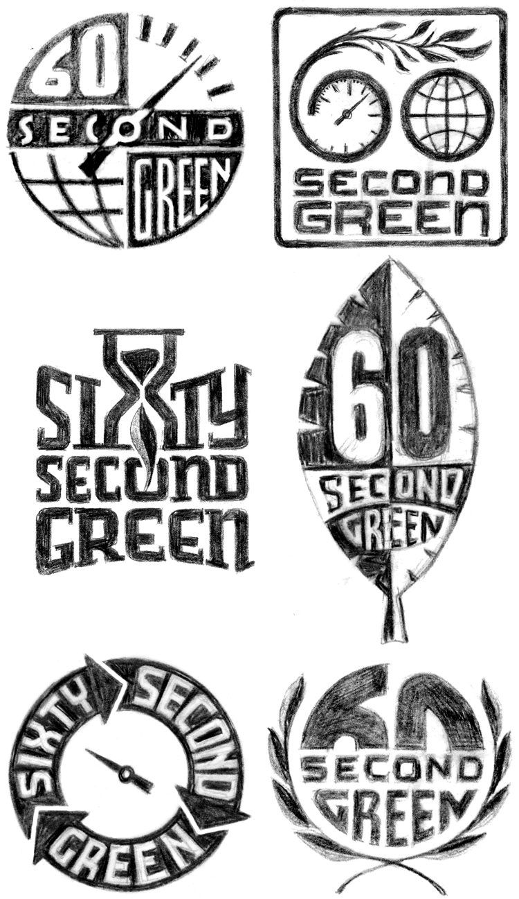
Working with Mark Pruett, owner and senior editor at Storyville Post (whom I had previously worked with some years back designing their logo) I came up with several loose ideas:
Many of the roughs used the obvious element of a leaf as a motif, but one was reminiscent of the design of the Universal Recycling Symbol, designed back in 1970 by USC student Gary Anderson.
Fortunately this rough was what the client reacted most strongly to, and we were able to develop a unique logo that didn’t resort to the usual visual clichés.
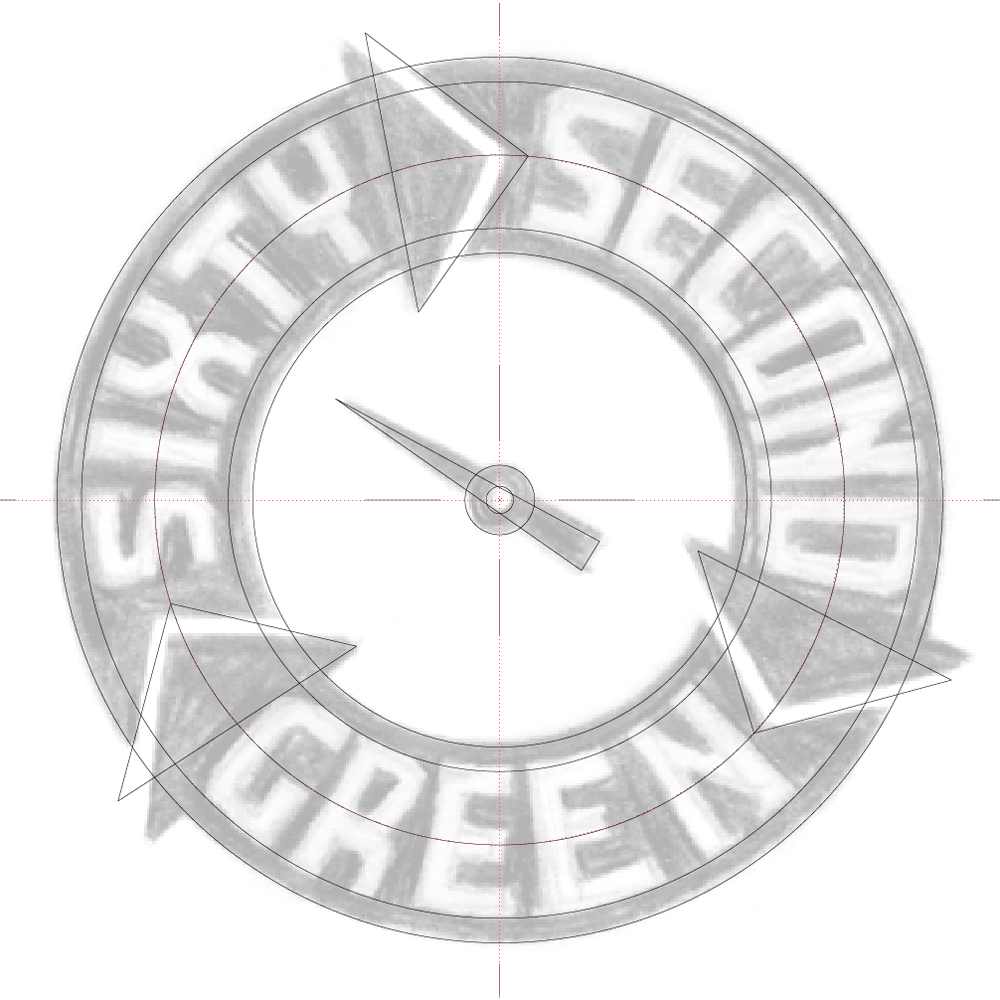
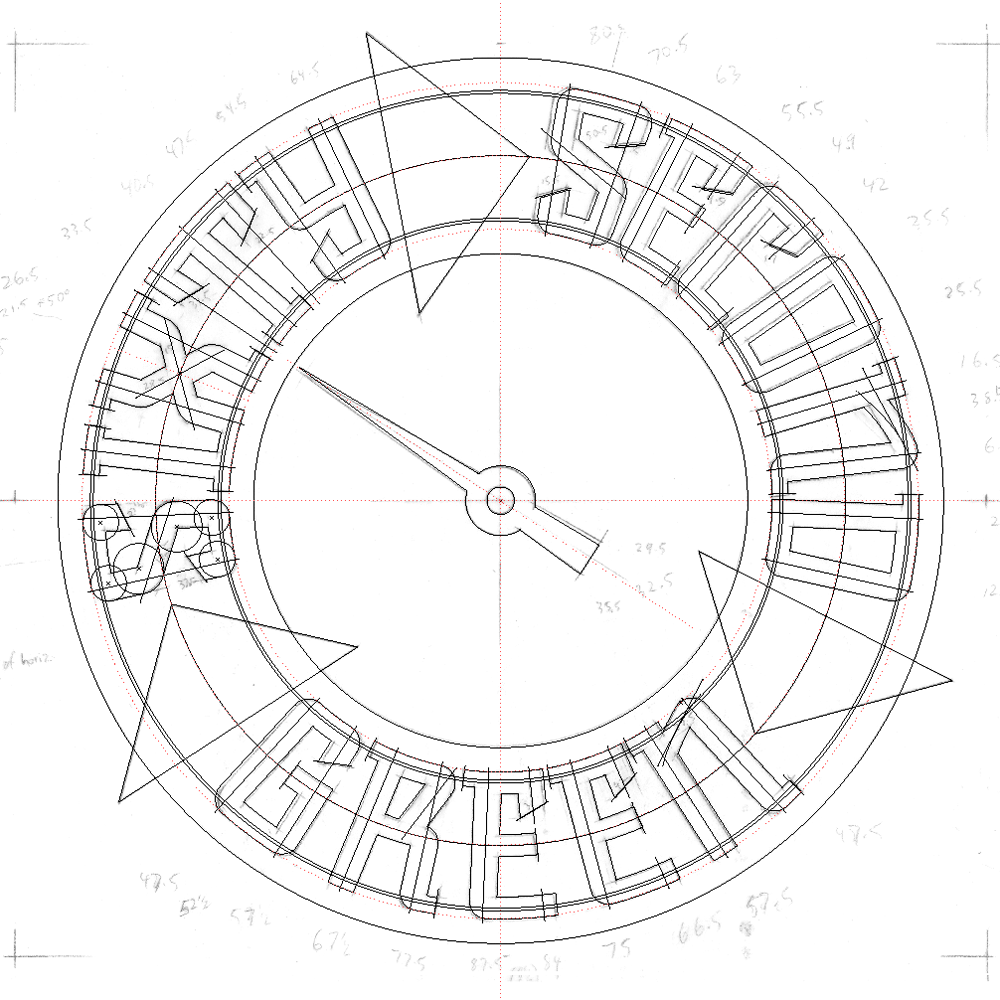
So to develop this design I first had to figure out its geometry by placing my original rough drawing in Adobe Illustrator and working over it:
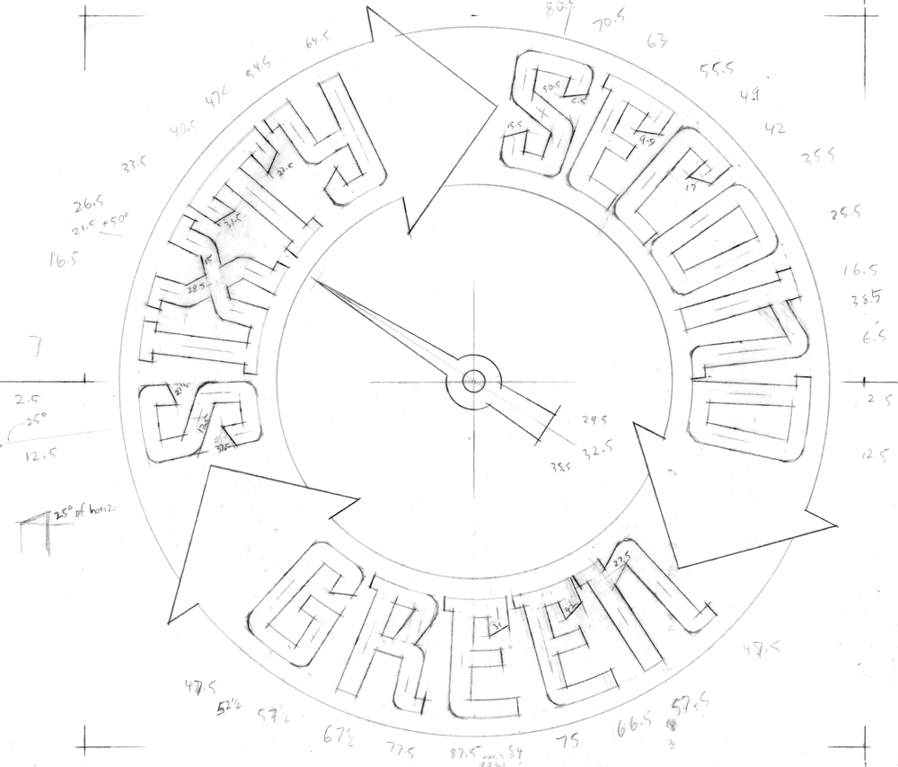
Then I created a new drawing using the inner mechanics derived from my Illustrator sketch. One really cannot set type around a circle without it looking somewhat awkward, so you can see that the verticals in each letterform I’m creating point directly towards the center of the circle, and are marked in the pencil drawing with angle notations:
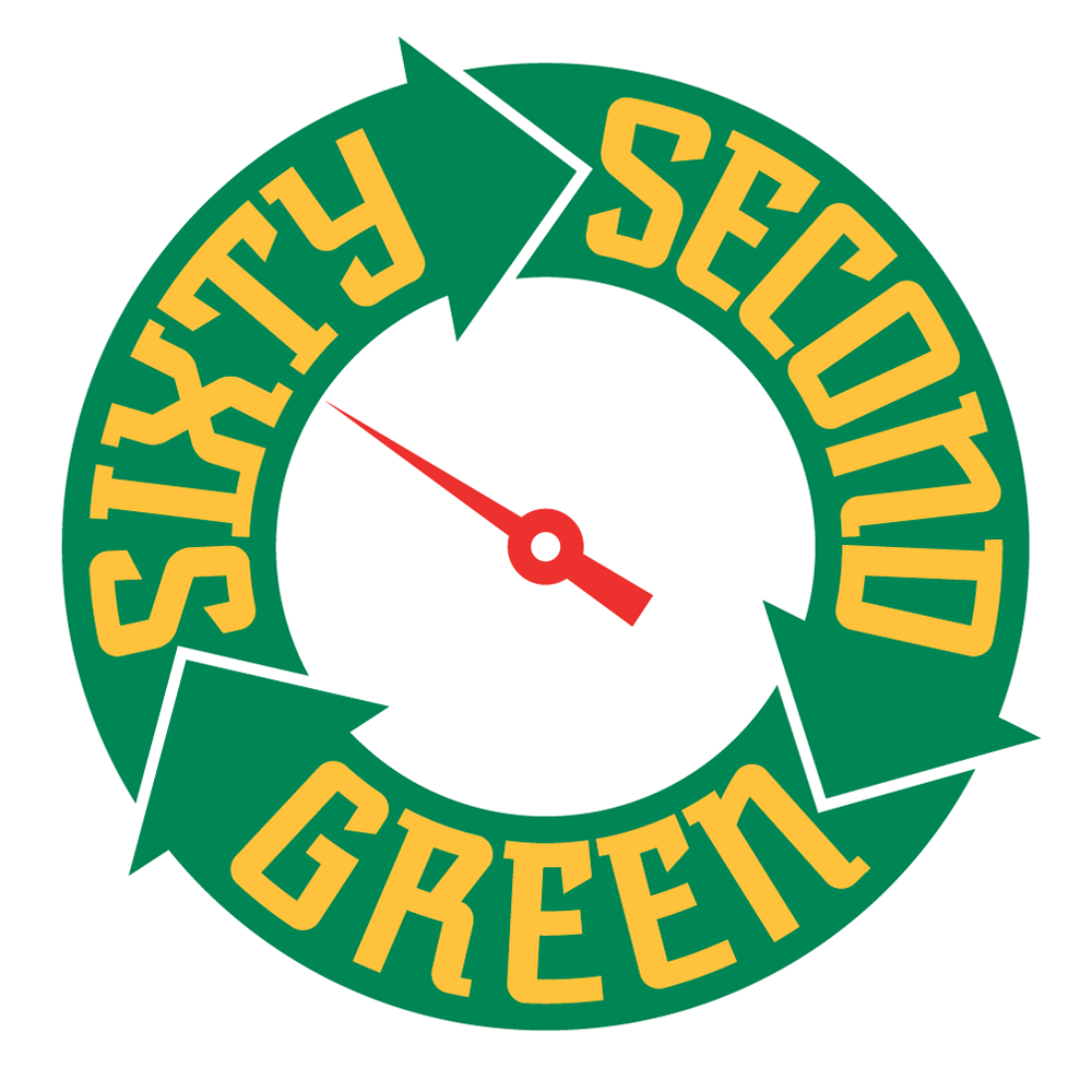
Using the angles I had earlier jotted down on the drawing, I started building the letterforms and the logo.
Note that the letterforms in the upper portion of the logo flare outwards at the top, while those at the bottom are pinched in at the their tops. Yet they’re all consistent within the logic of the design and don’t read as different sorts of letters:
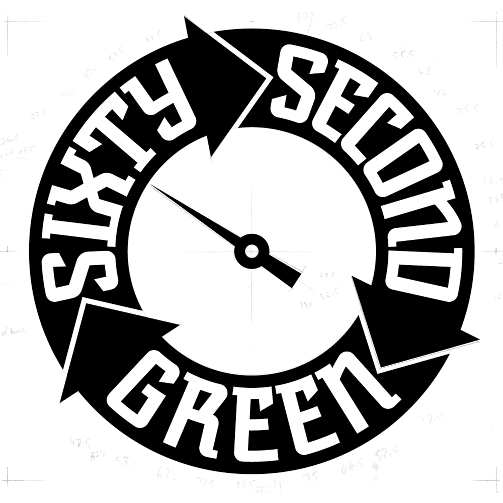
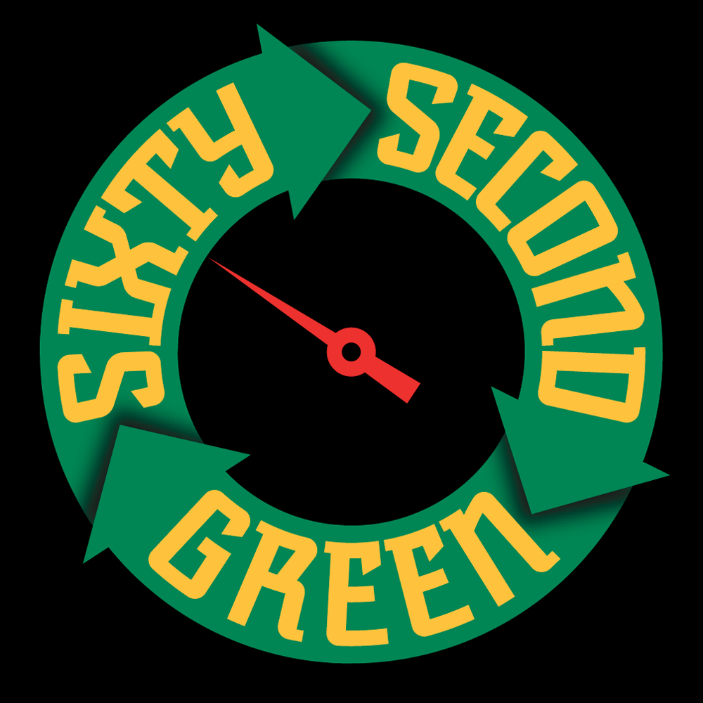
I then created a version with a bit of shading and a black background:
This iteration was used for the animated version that Storyville Post created from my art for the Sixty Second Green videos:
Powered by WordPress and Nifty Cube with Recetas theme design by Pablo Carnaghi.
Entries and comments feeds.
Valid XHTML and CSS.
