 |
|
Archive for the 'Gigs' Category
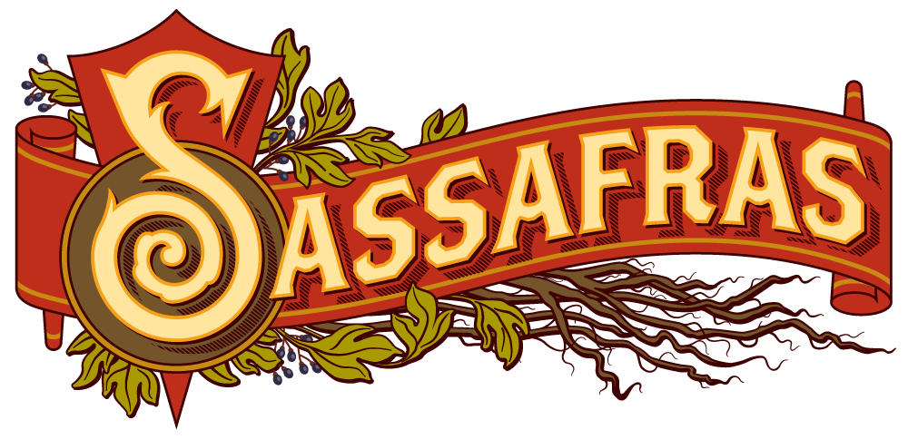
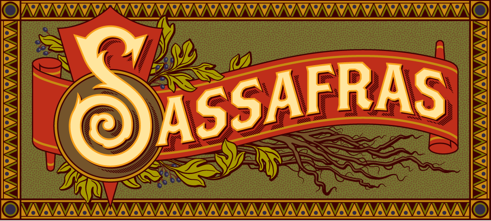
The “Sassafras” Logo Project—New Bar Set to Open in Hollywood
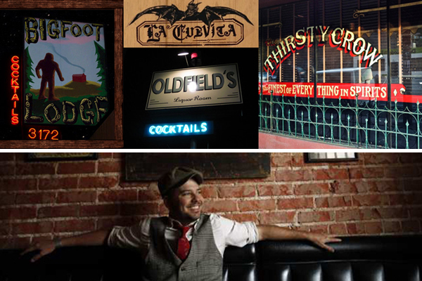
July 30, 2012 on 9:13 pm | By Michael | In Gigs, News | 8 CommentsBobby Green of 1933 Group has cornered the market for drinking establishments in Los Angeles with a string of bars including Atwater’s Bigfoot Lodge, Highland Park’s La Cuevita, Culver City’s Oldfield’s Liquor Room, and Silverlake’s Thirsty Crow.
Now Bobby’s about to carve the another notch in his belt of Los Angeles watering holes with the opening of the Deep South inspired “Sassafras” in Hollywood on Vine Street—which at 3000 square feet will be the group’s flagship location.
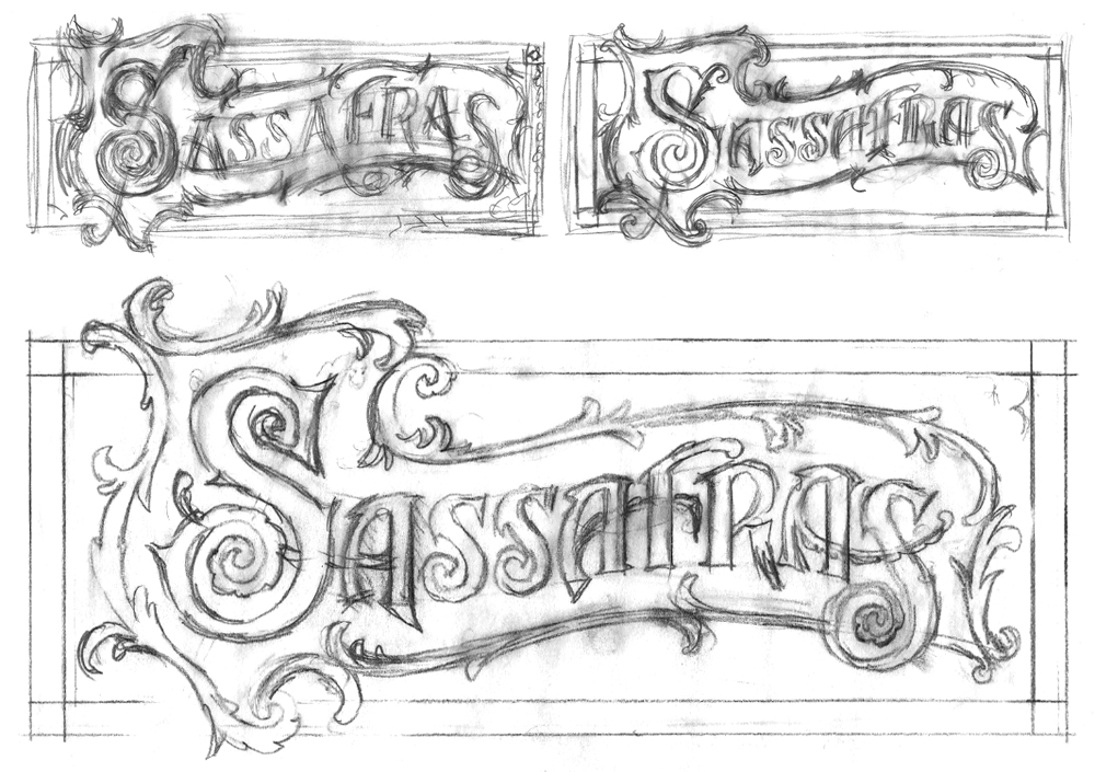
Tasked with designing the Sassafras logo, I first met with Jim Heimann, who’d acted as AD for several of Bobby’s other projects (and who’s also an editor at Taschen America). Discussing the look that Bobby wanted, it became clear that we needed to move towards a turn-of-the-century (19th to 20th)—and decidedly decorative look,with a sort of organic/plant-like flavor . . . perhaps using decorative borders that felt like vines or roots, to try to get across the feeling of the root-inspired intoxicants that Sassafras will be featuring. Thinking I knew exactly what they wanted, I went through the following roughs, presenting the tighter one to both Bobby and Jim:
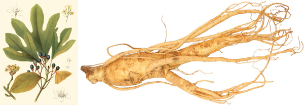
The design generally went over OK, except that Bobby wanted the design to become even more specific to the actual sassafras plant. We discussed various ways we could achieve that, and Bobby also provided me with images of roots and of the sassafras plant and flowers. He further explained that the bar will serve root-inspired intoxicants containing both sassafras (from which root beer is made) and sarsaparilla, in addition to barrel-aged cocktails.
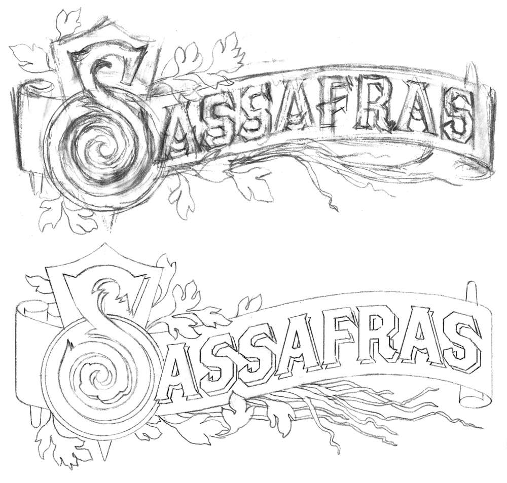
So I went back to the drawing board and started over taking into consideration the reference and other comments from the meeting. I then developed the following layout—what I had in mind was to use the “Brothers” typeface (this font was designed by my friend John Downer) as the basis for the word (except for the cap “S”), so that if we needed to create a straighter, simpler “Sassafras”, it wouldn’t be that much of a problem.
Feeling confident of this direction, I presented it to both Bobby and Jim. With the exception of my needing to add a border back in, it went over well, and I proceeded to flesh the logo out in Illustrator. So here’s where we ended up, both with and without borders:
Sassafras is located at 1233 Vine Street, next door to the historic Villa Elaine. During the 1940s this historic landmark apartment building was home to Man Ray, Orson Welles and Henry Miller (there is a lot of history in this town). Sassafras’ opening will be towards the end of August—so watch this blog for update postings. Hope to see you all there!
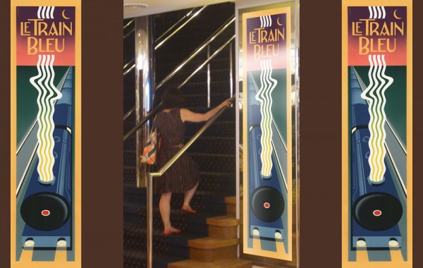
Le Train Bleu #2
June 20, 2012 on 5:34 pm | By Michael | In Gigs, Wayback Machine | 2 CommentsTwo years ago I visited Bloomingdale’s in NYC, and specifically their Le Train Bleu restaurant for which “back in the day” I had originally designed many of the original elements. In my visit to NY last month I revisited the restaurant—and this time dined there. If I was surprised the last time to see that my signage and monograms were apparently still in use, dining in the restaurant this time allowed me to see the full extent to which everything I had done was still there—just as it was the day it opened back in the ’80s.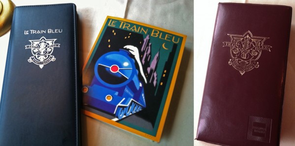
I hadn’t known that they were still using the menu design I had done for them, or to the extent that they were using the emblematic monogram I had done at the same time. After years and years of use I would have imagined that the menu would have been a bit dog-eared, but apparently they’ve been printing and reprinting it all this time.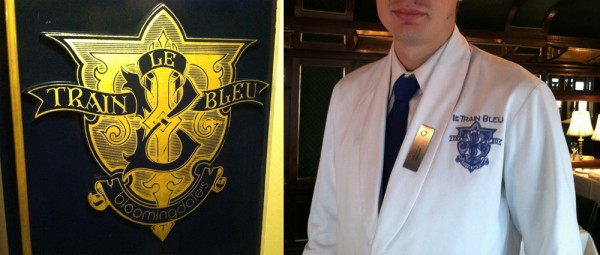
Aside from it being rendered in gold leaf on the outside of the train car and imprinted on the wine list and check wallet, they’d gone so far as to embroider the monogram on each and every uniform in the restaurant—classy! Perhaps that says something about a designs longevity?
And here’s a reminder for those who are interested: there are prints of the Le Train Bleu vertical format artwork—identical to the signage murals outside the restaurant—available on my ILLOZ site. These prints are finely produced, hand-crafted 12 color fine art lithographs that are virtually identical to the original painting.
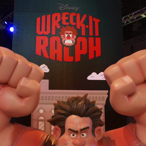
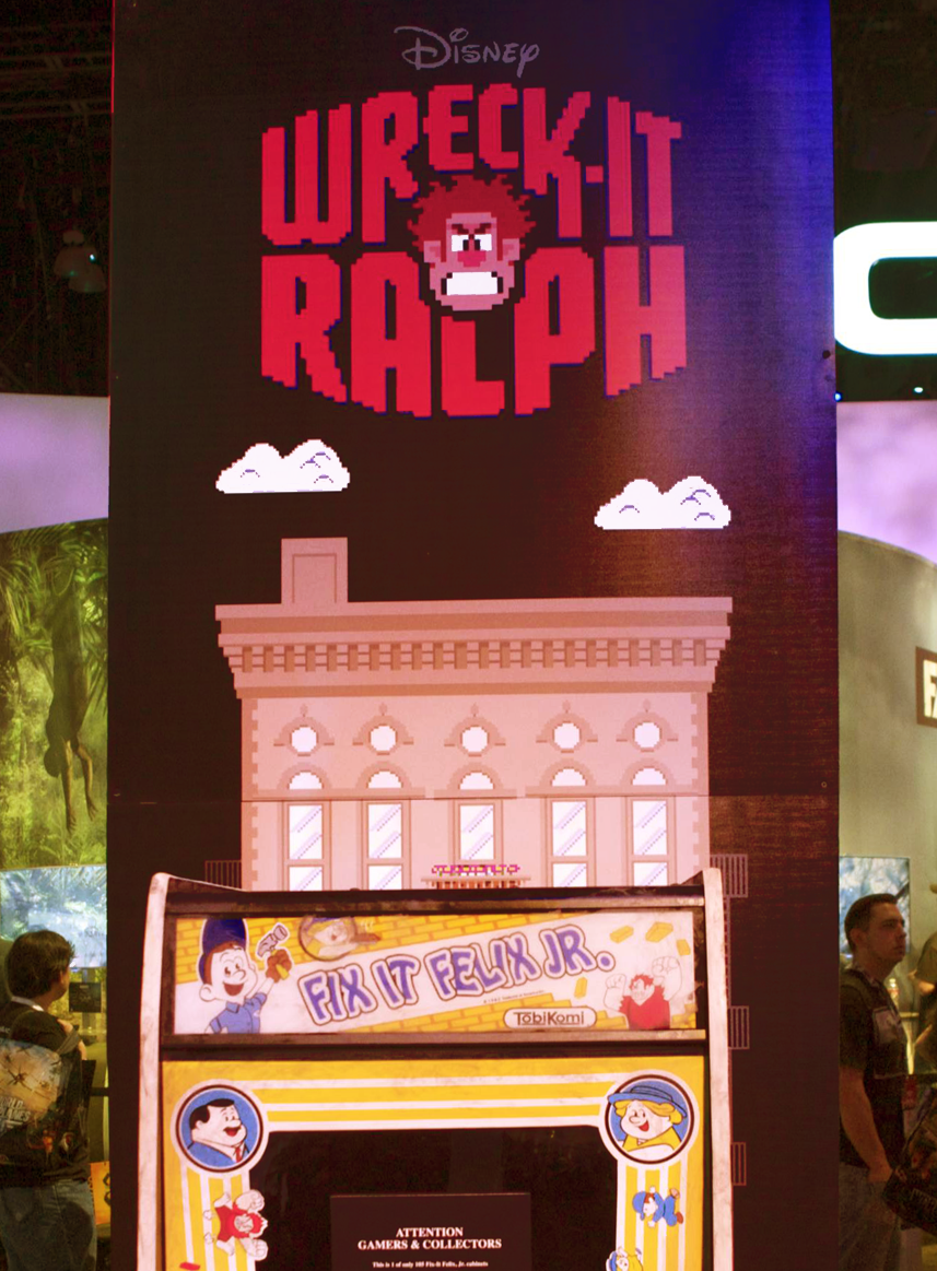
Wreck-It Ralph Title Treatment Seen at E3 Conference
June 19, 2012 on 7:23 pm | By Michael | In Gigs, News | No CommentsSome friends of mine were good enough to send along a few photos of the Wreck-It Ralph title treatment lording it over the attendees recently at Los Angeles” E3EXPO. These were sent by Steve Silvas and taken by Mike Moreno. Thanks guys! I’m extremely pleased to see that Disney Motion Pictures is making this title treatment one of the key components of its promotion for this upcoming animated film.
Powered by WordPress and Nifty Cube with Recetas theme design by Pablo Carnaghi.
Entries and comments feeds.
Valid XHTML and CSS.
