|
|
|
Archive for the 'News' Category
12 Years in the Making — Fruit & Vegetable Stamps for the USPS — Part 2 of 2
January 22, 2015 on 3:43 pm | By Michael | In Gigs, News | 15 Comments![BlogOpener[600px]](http://alphabetsoupblog.com/wp-content/uploads/2015/01/BlogOpener600px.png)
Ten years had slipped by since I completed my work on the Fruit and Vegetable stamp series for the USPS back in 2002 (read Part 1). But then in May of 2012, when I was contacted by Art Director Antonio Alcalá of Studio A in Washington DC about another stamp project, I started thinking about the ill-fated Fruit and Vegetable stamps that I had done a decade earlier. To make a long story short Antonio agreed to re-present my original Fruit and Vegetable stamp comps at his next meeting with the USPS. It didn’t take long for him to get back to me with an emphatic “Yes”—the Post Office was indeed interested in reviving this theme for a new set of stamps!
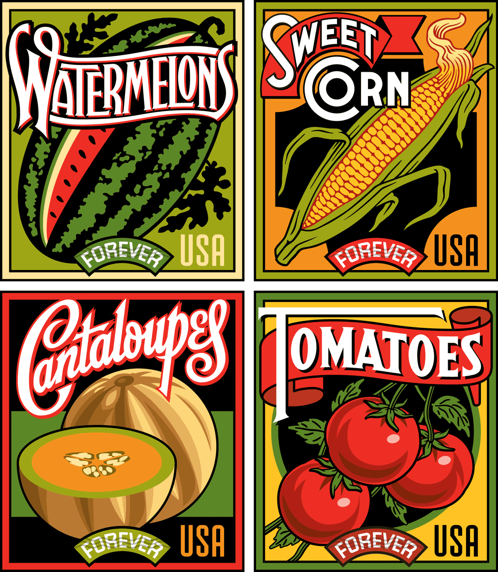
Of course I was hoping that the USPS would pick up the designs I had done without any changes—but that was not to be! Of the six different fruits and vegetables that we had chosen in the first go round the only one to survive was Sweet Corn. The new list was this: Cantaloupes, Squash, Sweet Corn, Tomatoes, and Watermelons, and the series was to be called “Summer Harvest”. One thing that worked in my favor was that we kept the same overall size for the new stamps.
When I started working on this new project I wanted to differentiate the stamps from each other as much as possible. I started by trying to have fun with different elements such as the “USA” and the denominations, and by choosing different color palettes. You’ll see that in many of the earlier stages I was trying to design these graphic elements differently from one another. While the earlier stamp designs held together because they all shared my aesthetic vision, it became clear that the new stamps were going to need to be much more uniform in approach, sharing similar design elements and color palettes. This made the challenge a little more difficult than the first series, but I decided that despite the uniformity challenge, I would still want to differentiate them as much as possible. So one thing I did was to give each of them their own distinct lettering style.
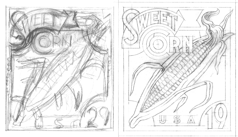
It turned out that because we were keeping the basic design for Sweet Corn, that design also served as a template for the others as well. Starting with the original Sweet Corn design from 2002 (below at upper left), here are a sampling of a few of the iterations as they progressed—with the final approved design at the bottom.
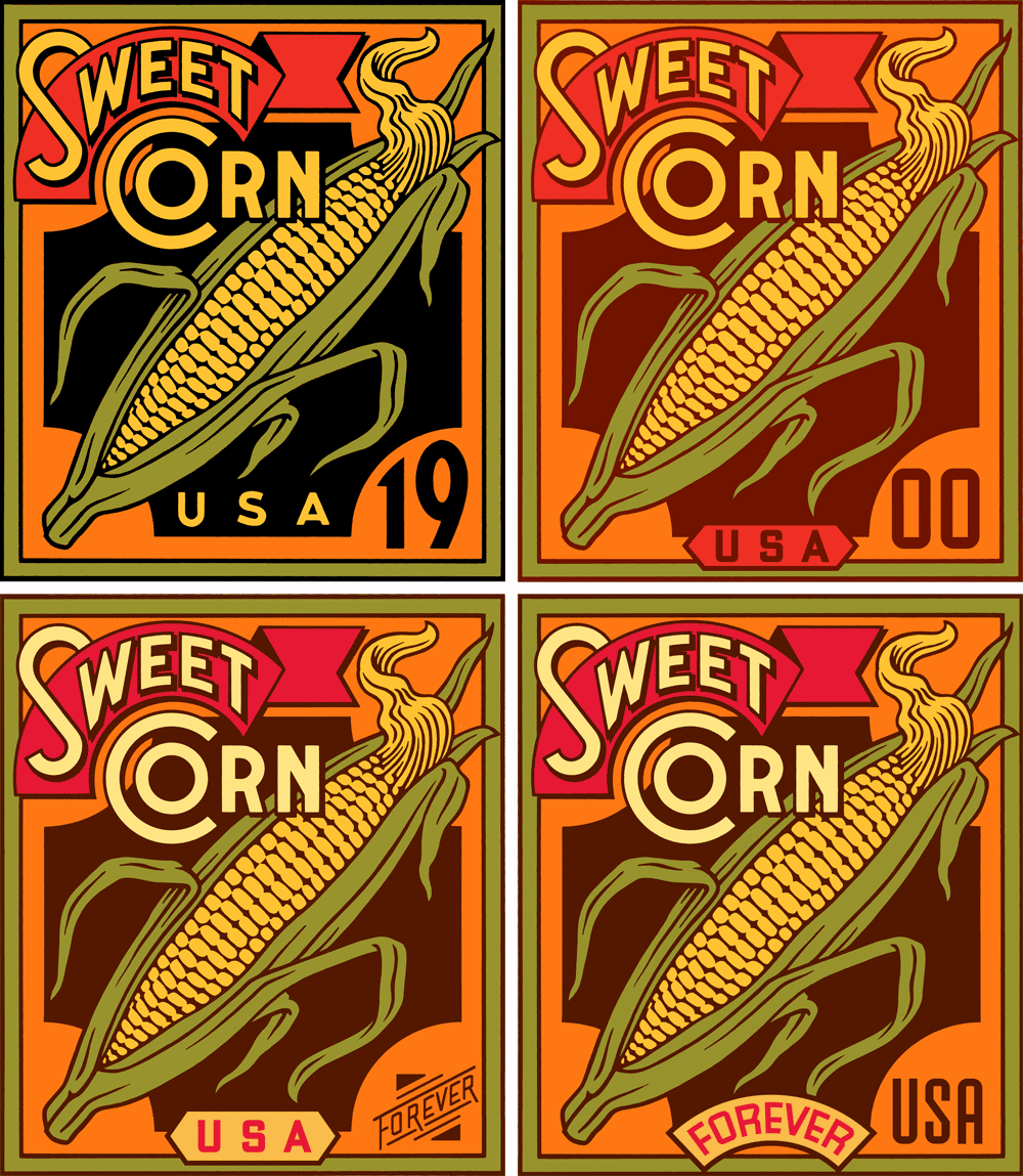
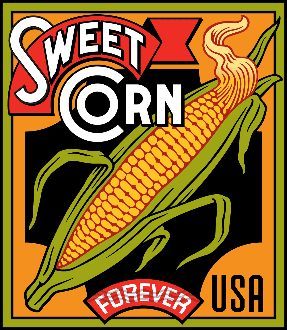
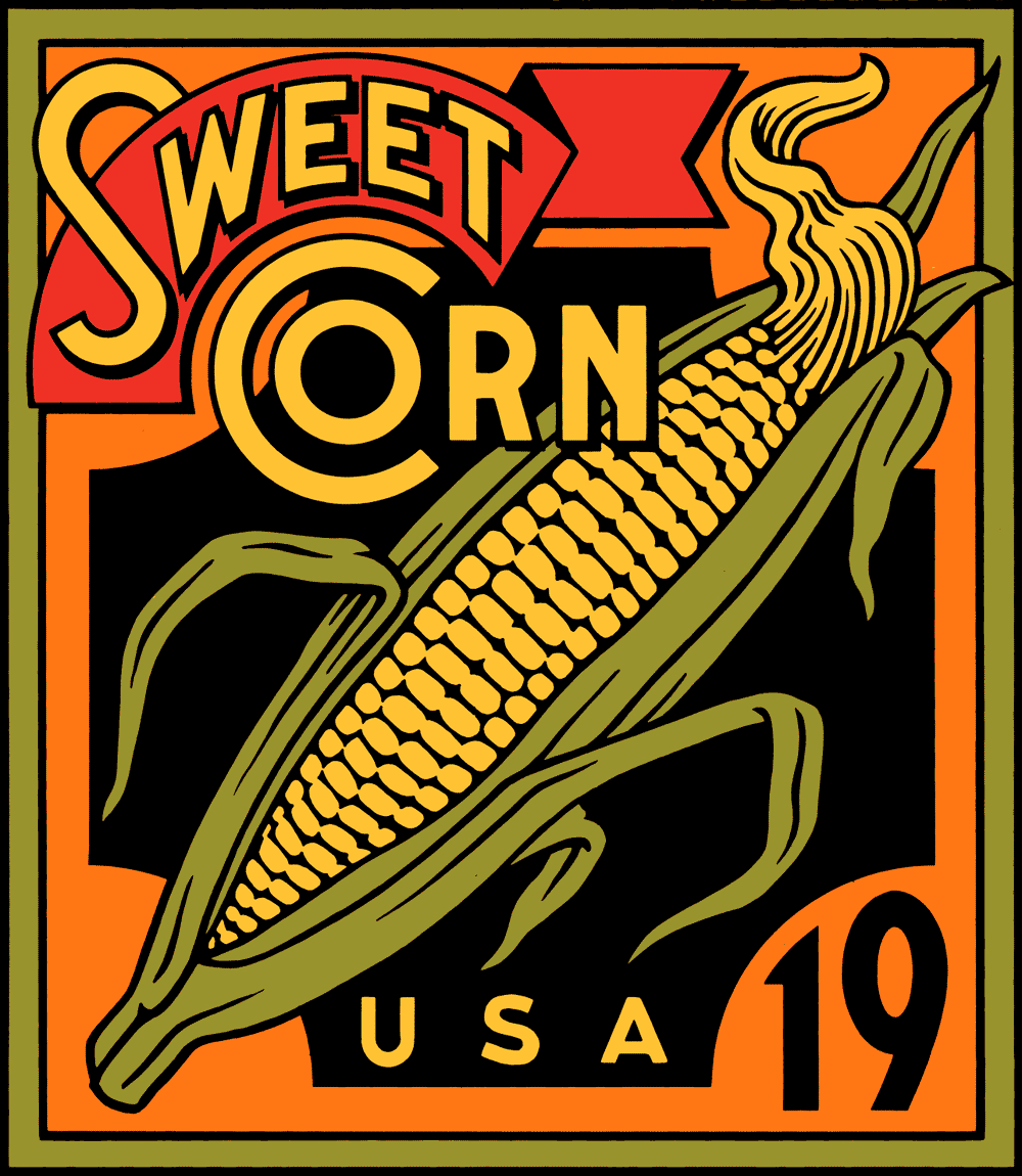
In the end the palette changed to one which could be applied to all the stamp designs. Also, note that the Sweet Corn lettering is a bit bolder on the final design (below), making it a bit more legible at the stamp’s small reproduction size.
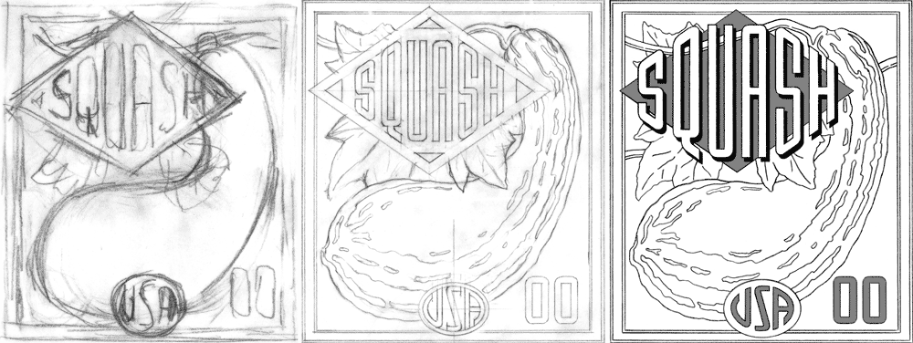
Before I had gone that far with it, the stamp depicting Squash was (pun intended) squashed. This was as far as I got before Squash was eliminated from the group.
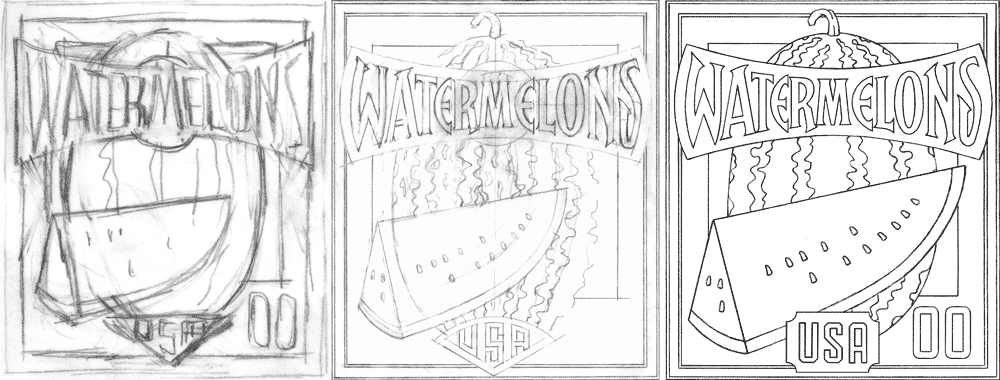
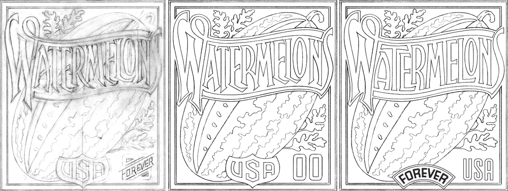
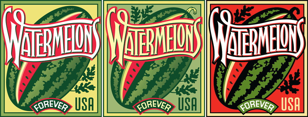
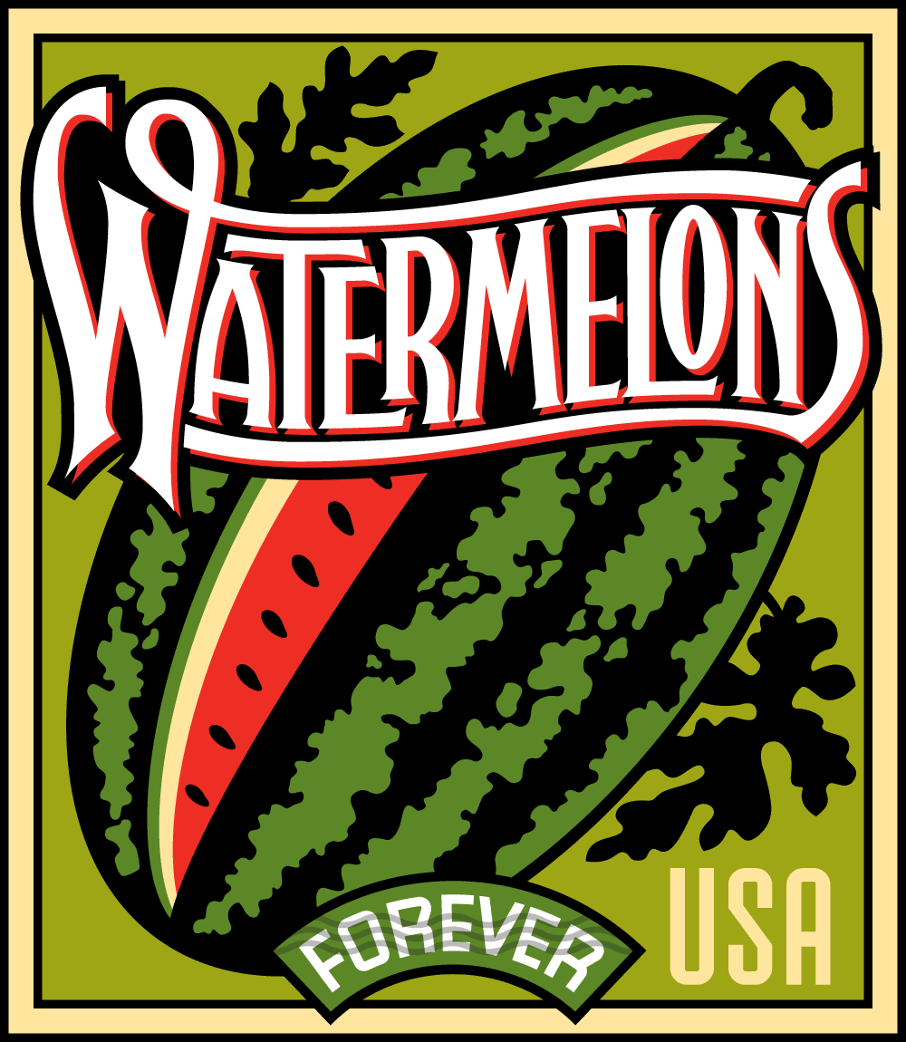
The Watermelons design was a bit more problematic than the others. For some reason the layout depicting a vertically oriented watermelon with a slice in front did not meet with USPS approval. So I opted for the more traditional approach with the watermelon leaning at an angle. Another problem was the length of the word “Watermelons”: I needed to really condense and overlap the letters so that they would be legible at the tiny size they would reproduce. Also, it was felt that in the earlier iterations the letters were a bit too pointy, and so you can see those modifications in the later stages.
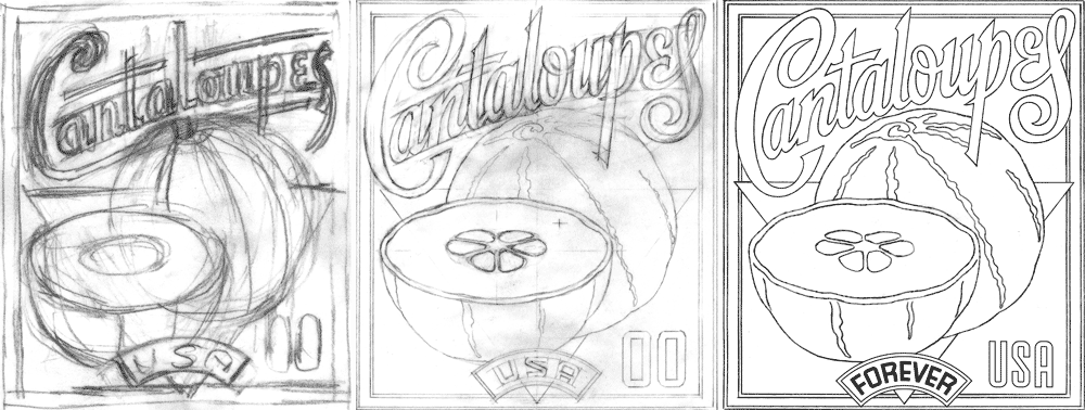
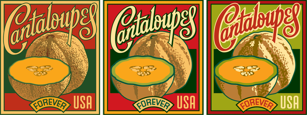
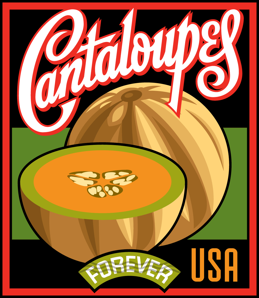
The biggest stumbling block for Cantaloupes was how to render it—what to do about its textured skin. You’ll notice that the texture went from fairly realistic and finely detailed earlier on to a much, much simpler depiction by the time we got to the final approved design.
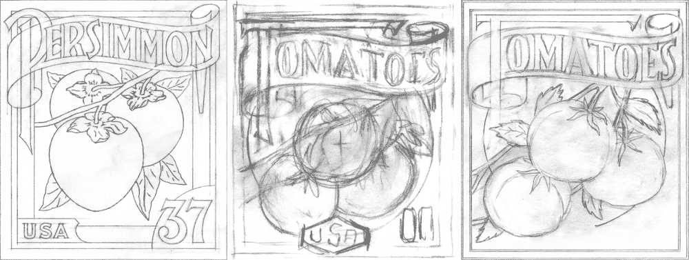
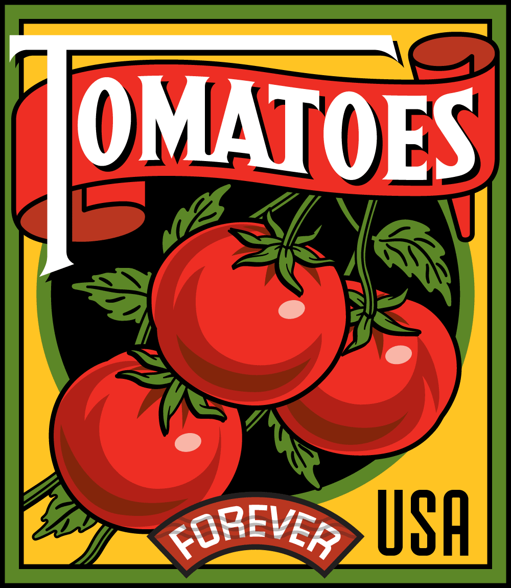
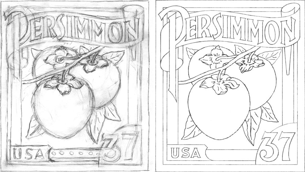
In addition to re-using the Sweet Corn design from the ill-fated 2002 set I also saw the opportunity to recycle the earlier design for Persimmon. It seemed perfectly suited to adapt for Tomatoes. This design then came together fairly quickly. The two smaller color versions (below at lower right) may seem quite similar, but they have several important differences: 1) the background color on the later design is brighter, to be more in line with Sweet Corn, 2) the shading on the two tomoatoes on the right changes a bit, and 3) I re-did the leaves with more detail where the branches meet the tomatoes.
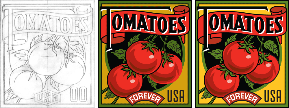 A significant difference in the final version of Tomatoes is that I reversed the colors of the type so that now all four of the stamps had white type (for consitency).
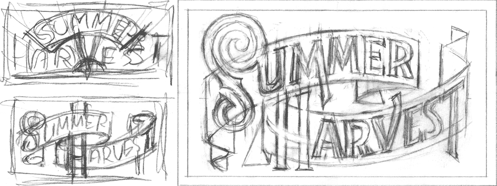
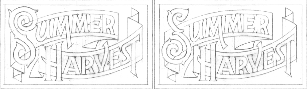
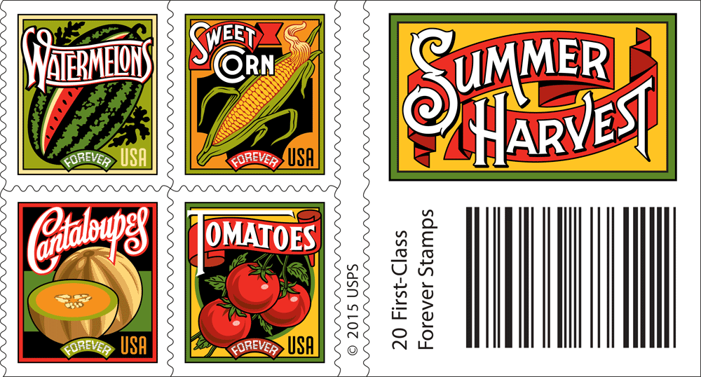
Finally we needed a label for the booklets that the stamps would be in. Working with the title “Summer Harvest”, here’s how I worked that out.
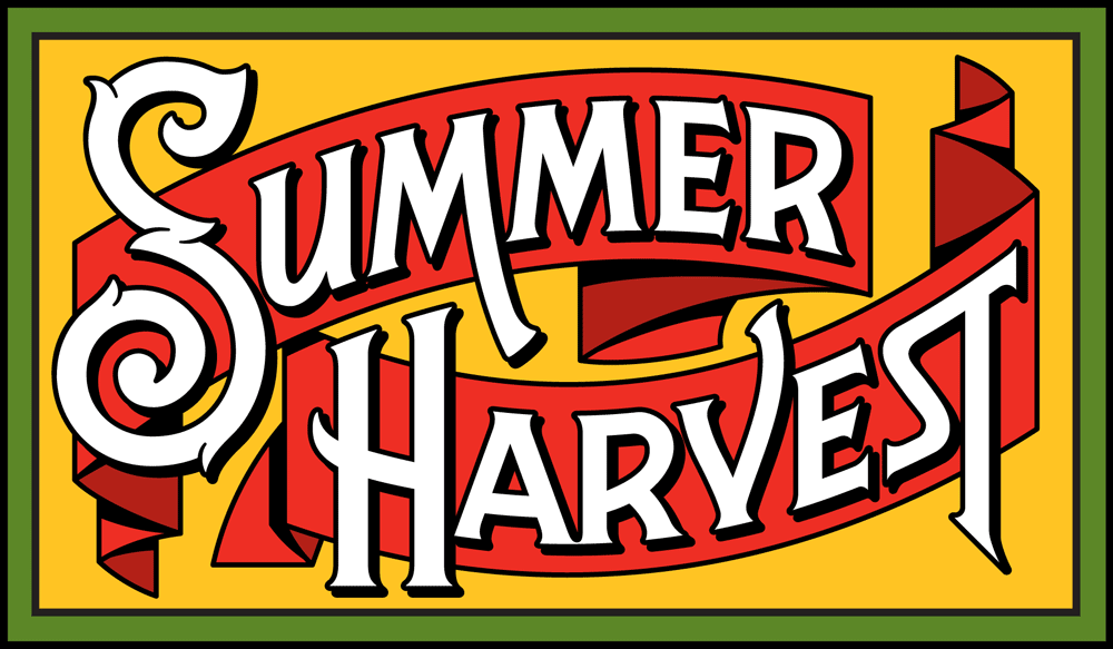
I think the similar palettes, the bold white lettering, and the consistent nature of the borders and the other design elements create a group whose individual members stand out as unique. But they all seem to work together as a family as well.
Here’s the series together in their booklet form—which will be available in June 2015 (just in time for Summer), and will be sold in booklets of 20.
You can also see these stamps on the USPS website. If you happened to miss Part 1 of this article, you can read it HERE.
 .
.
12 Years in the Making: Fruit & Vegetable Stamps for the USPS — Part 1 of 2
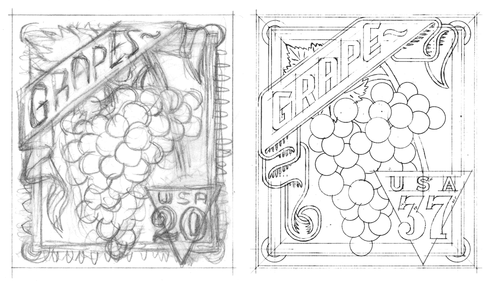
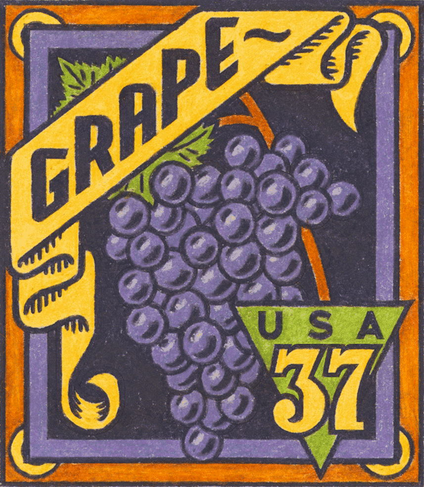
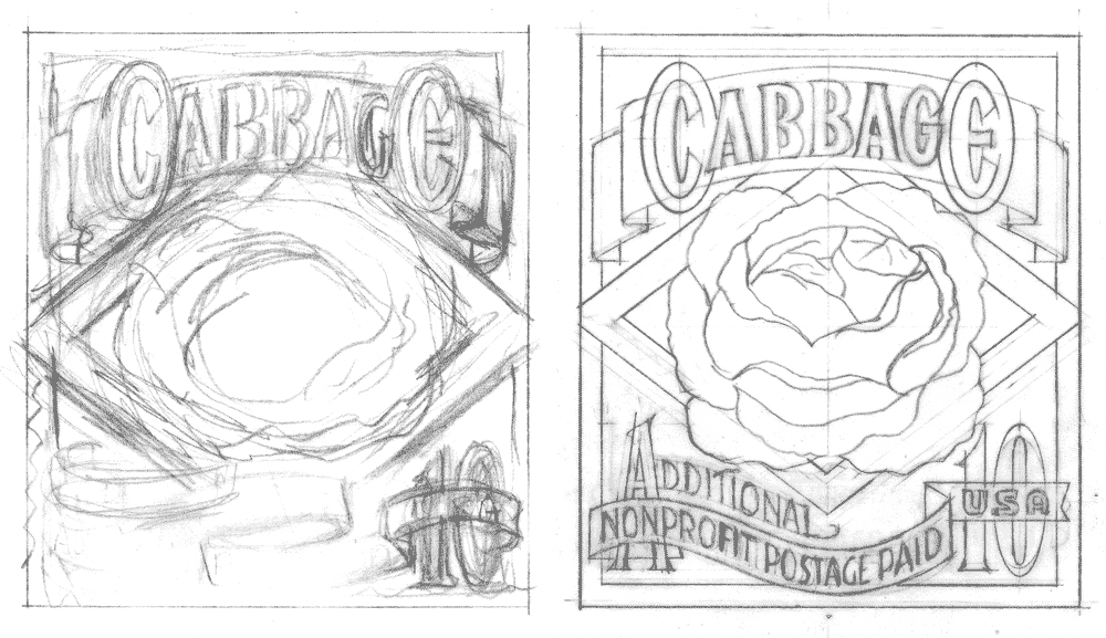
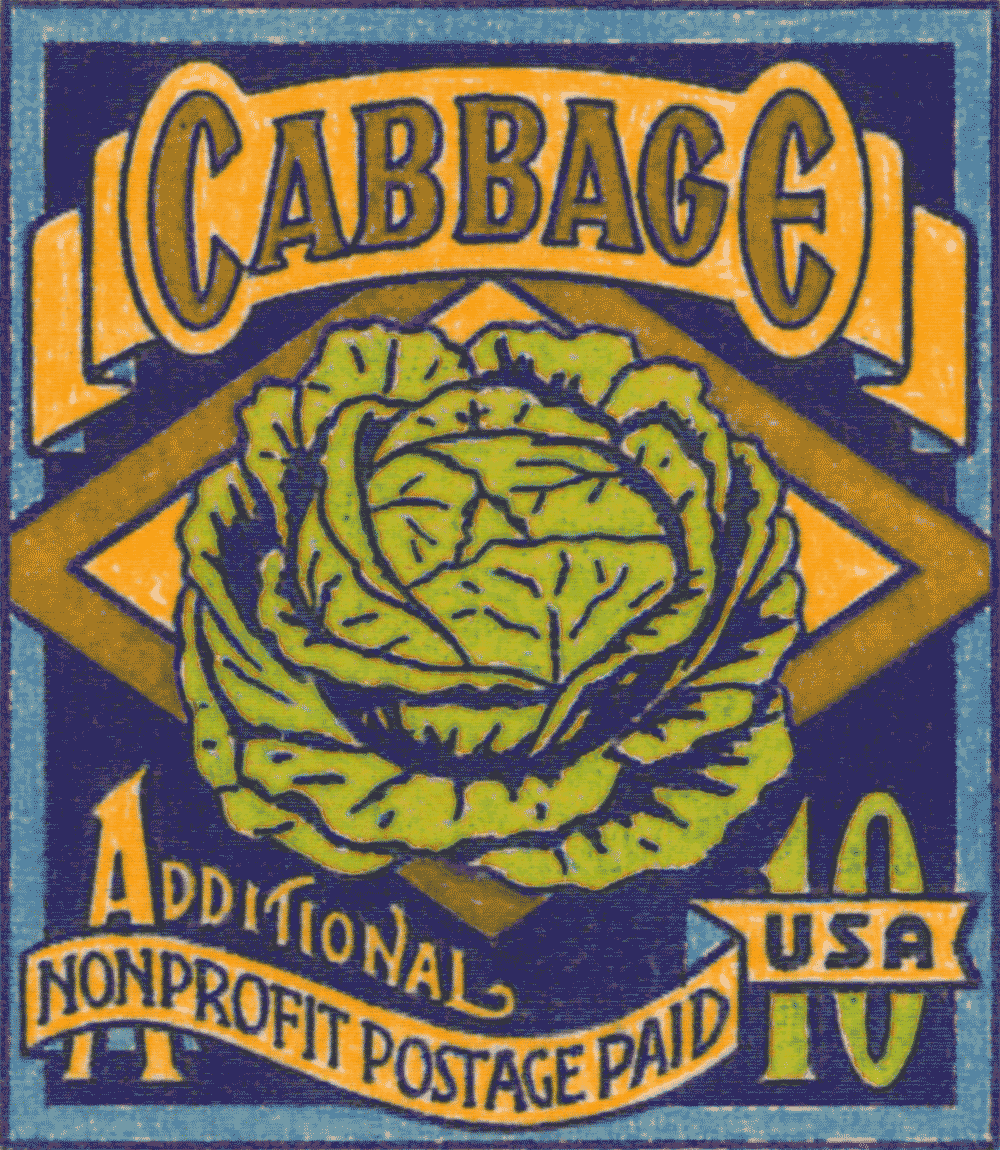
January 19, 2015 on 4:32 pm | By Michael | In Gigs, News | 5 Comments![BlogOpener[600]](http://alphabetsoupblog.com/wp-content/uploads/2015/01/BlogOpener600.png) We all know that some projects can take a bit of time to come to fruition (no pun intended!). It’s not uncommon for some projects to even take months to see the light of day. But with these stamps for the USPS I never anticipated that the approval process would span over 12 years! I was first contacted by Art Director and design consultant to the Citizens Stamp Advisory Committee Richard Sheaff back in 2002 to work on a series of stamps celebrating American fruits and vegetables. There were to be six different designs in the set. We had a list of possibilities to choose from including Avocado, Cherry, Grape, Persimmon, Pineapple, Plum, Prickly Pear, and Strawberry. The final selection was Cabbage, Grape Lemon, Persimmon, Pineapple and Sweet Corn. We decided that as a point of departure I would reference vintage seed packets, catalogs and fruit crate labels. Here are a few choice pieces of vintage reference that served to help inspire my designs:
We all know that some projects can take a bit of time to come to fruition (no pun intended!). It’s not uncommon for some projects to even take months to see the light of day. But with these stamps for the USPS I never anticipated that the approval process would span over 12 years! I was first contacted by Art Director and design consultant to the Citizens Stamp Advisory Committee Richard Sheaff back in 2002 to work on a series of stamps celebrating American fruits and vegetables. There were to be six different designs in the set. We had a list of possibilities to choose from including Avocado, Cherry, Grape, Persimmon, Pineapple, Plum, Prickly Pear, and Strawberry. The final selection was Cabbage, Grape Lemon, Persimmon, Pineapple and Sweet Corn. We decided that as a point of departure I would reference vintage seed packets, catalogs and fruit crate labels. Here are a few choice pieces of vintage reference that served to help inspire my designs:
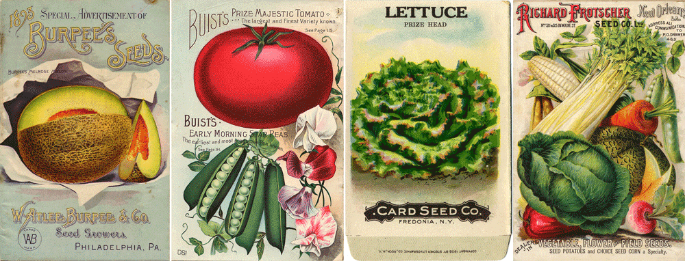
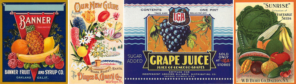
What I gleaned from all the reference was not so much layout and design, but more the attitude of these graphics—and how the various fruits and vegetables were represented.
I was not trying so much to do faithful renditions of seed packets or fruit crate labels, but to create graphics that might be seen as contemporary versions of their earlier cousins. So I never borrowed any of the elements from the earlier graphics verbatim, but attempted to update them to a more current sensibility. Also the small size and scale of these stamps prohibited using the reference in a very literal manner: reducing any one of them to the size of one of these stamps would have rendered much of their fine detail unreadable. So I needed to play loosely with the idea of referencing these graphics, making them much bolder and simpler than one might have imagined.
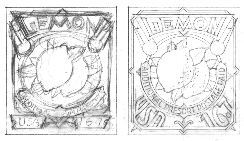
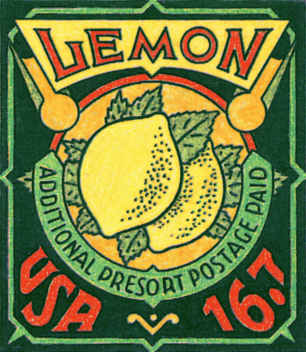
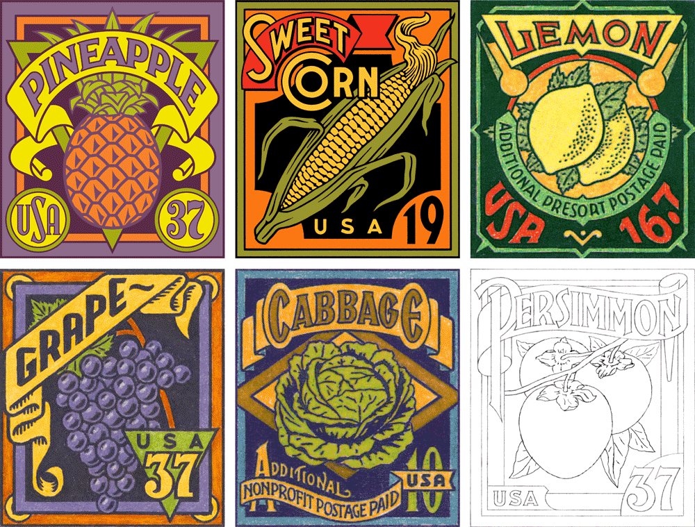
Here are the six stamp designs I created in 2002 preceded in each instance by a couple of the pencil drawings created in their development. Of the six, these first three—Grape, Cabbage and Lemon only made it to the colored pencil comp stage (yes, back in 2002 I still occasionally did color comps the old-fashioned way—by hand!).
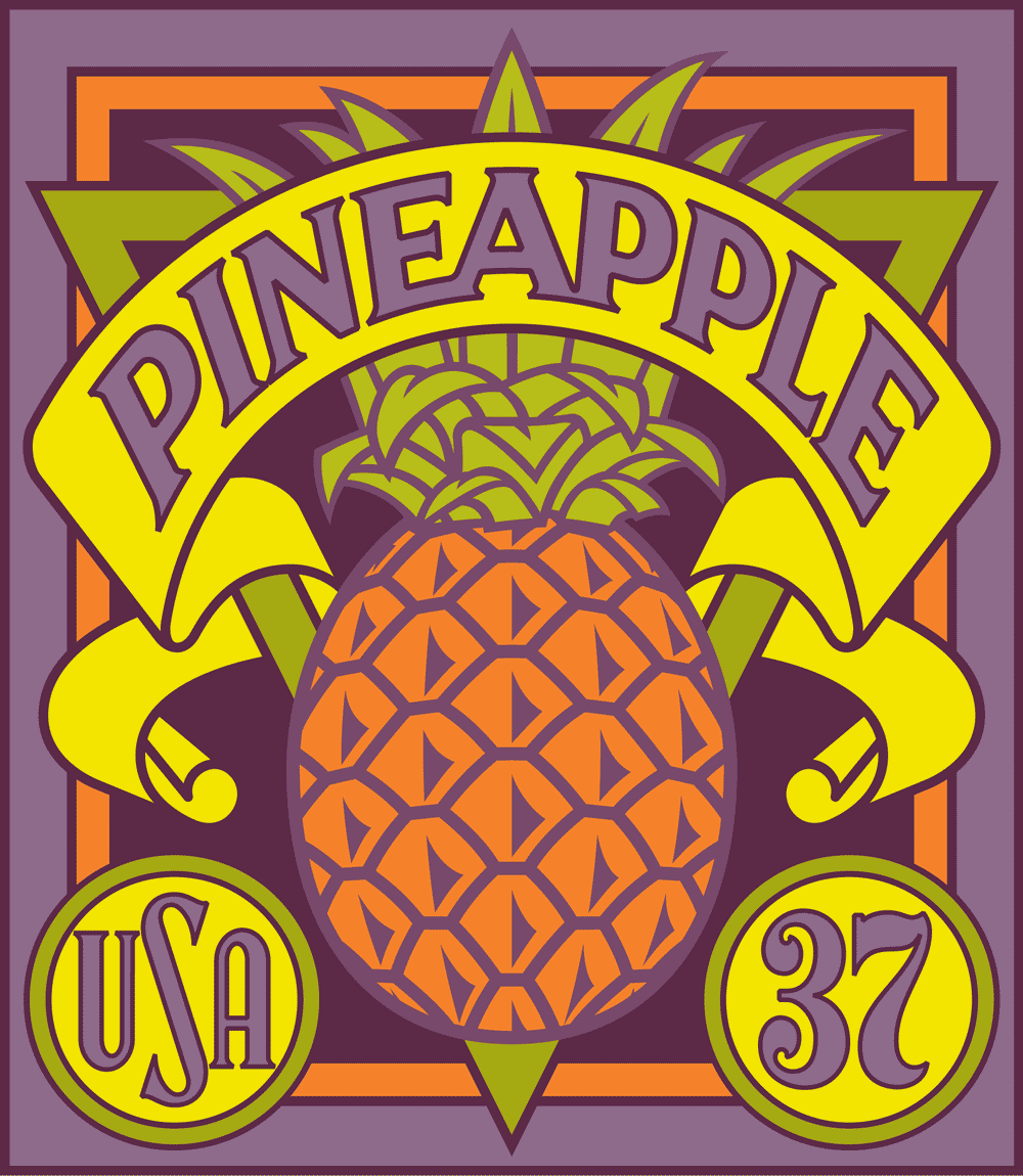
The following two designs—Pineapple and Sweet Corn—were developed to a more finished, digital stage, and so were more refined and worked out than the preceding three designs.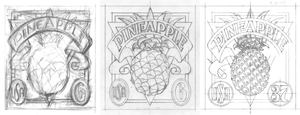
Finally, the sixth subject Persimmon, which was the last to be developed never made it past the rough pencil stage. If memory serves, the project at that point was kept to the previous five designs
.
Below, the entire series as we left it back in 2002:
But things don’t always turn out as you would imagine. I never felt that I should have given up hope for these designs . . . so in 2012 an opportunity presented itself with regard to these designs that I couldn’t ignore. If you’d like to know what happened, please check out Part 2 of this post.

Oh Canada! Logo Project for Iron Oxide Design – Part 2 of 2
January 17, 2014 on 1:30 pm | By Michael | In Gigs, News | 4 Comments
In Part 1 of this post I outlined this project from inception until completion of the finished art. But the part that was the most fun for me was when that artwork was finally placed in the client’s hands—a client who himself is a master signmaker, and who had ideas about how to take the design to the next level. I had never worked with someone like that, and was anxious to see how my art would be interpreted by such a craftsman. Because I was unable to be up there in Canada to see the fabrication first-hand, I asked Blaine Casson to photographically document the different stages of his project. In the end the final photos of the finished signs were taken by Blaine’s good friend, photographer Bryn Gladding. Following are Blaine’s notes on how he translated my 2D art into 3D signage.
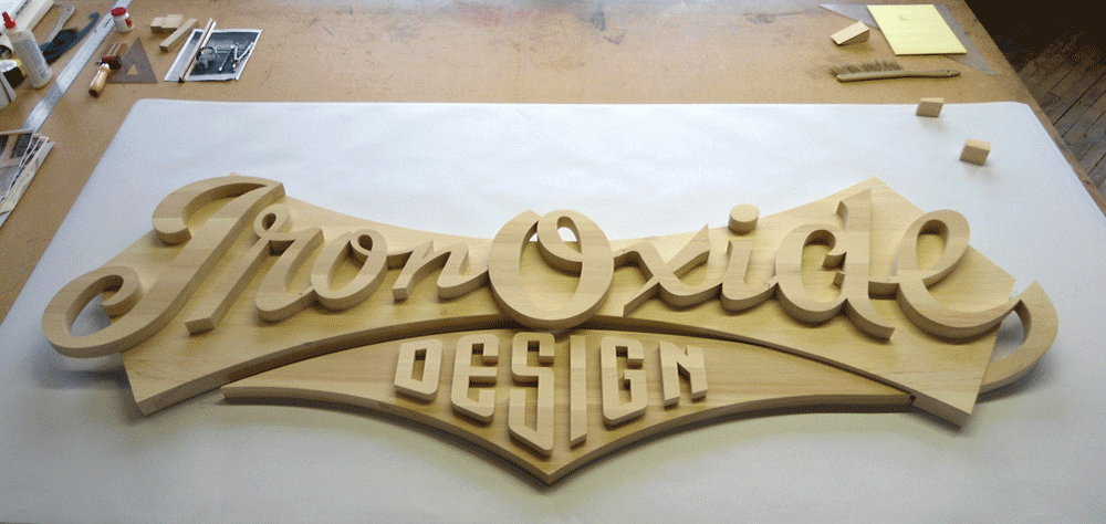
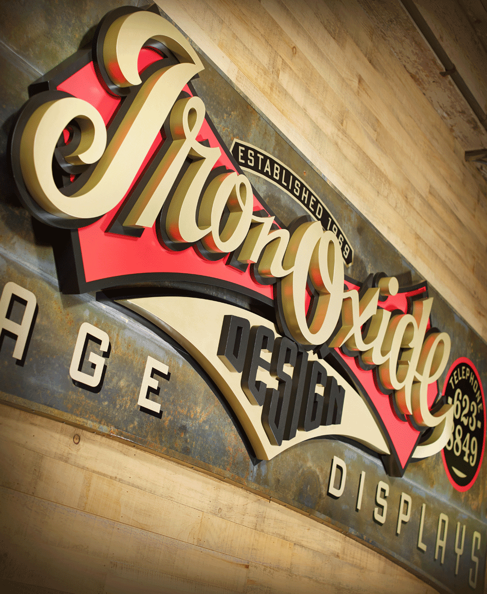
The Making of the IRON OXIDE DESIGN Sign. Three-Dimensional. 40 1/2″ high x 138″ wide x 5 1/2″ thick
“With no available drawings of the 105 year old building I began by photographing the destined sign location below one section of my third floor windows. I then scaled that photograph up, made a full size card pattern and checked it in the installation area to prove out the dimensions and arch shape.
“It was decided that the full version of the logo would not work well in this space so I made a scale model of the sign blank for Michael. I sent him vector art of the sign blank shape and dictated the background of the sign would be oxidized metal sheets and that his Iron Oxide script was already committed to be 80″ wide. Michael took over the design from there and I began to plot out full size paper patterns of the script and it’s background shield.
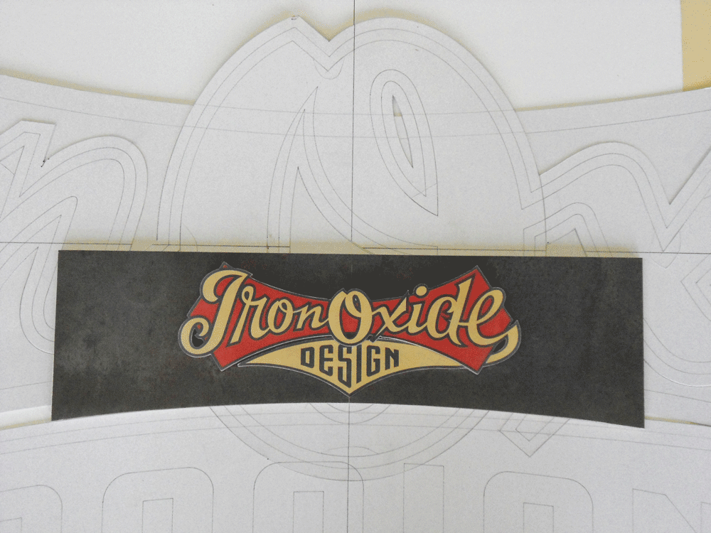
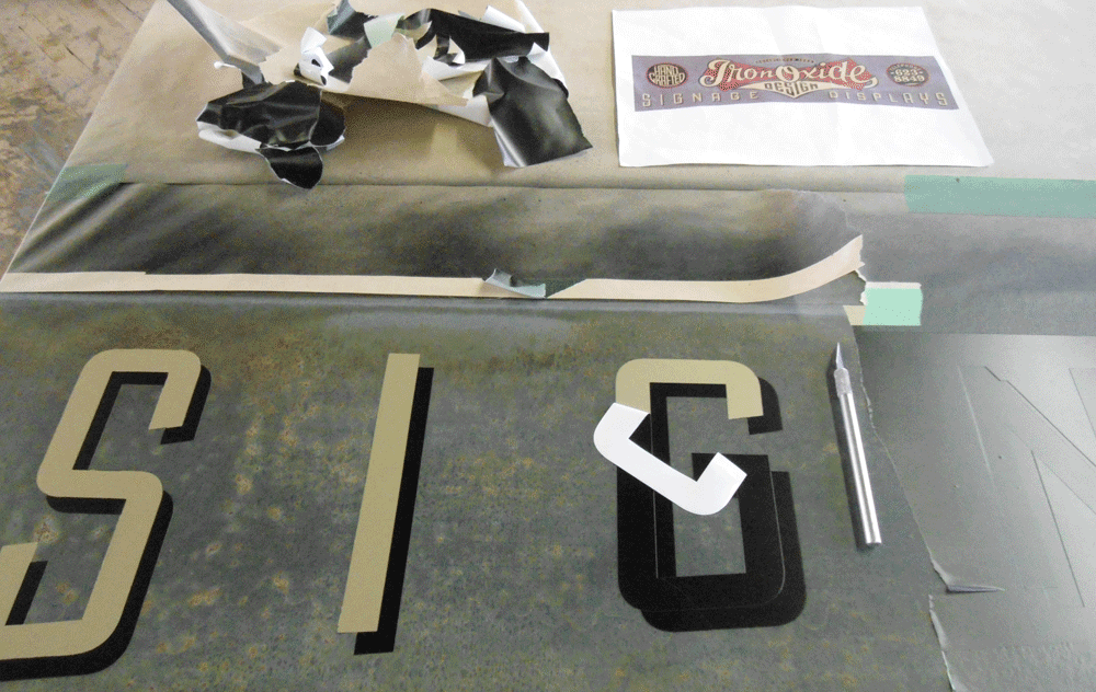
“I milled rough cut select Pine, glued and clamped it up into oversize blanks for the different layers that I had decided to use in the multi-layered three-dimensional logo script. As my sign was on a third floor in height and to be viewed from about 150 feet away I thought that to really convey the three-dimensional effect I was after I would have to be aggressive and chose to over compensate in layers and thickness. I assigned the first layer to the metal clad sign blank then broke Michael’s vector art up into the red shield and the gold tail of the “e”. These were on the same plane but of different thicknesses. Next layer would yield the black outline of the Iron Oxide script and finally the actual cut out script characters. The pending design copy from Michael would be painted directly onto the oxidized metal background.

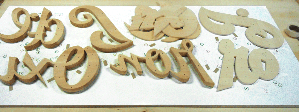
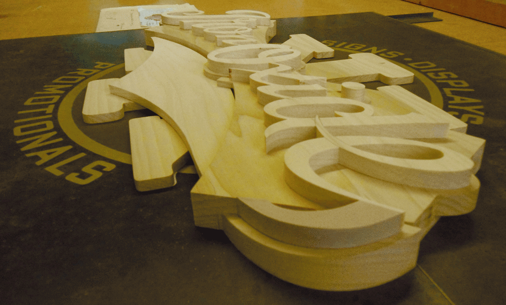
“Patterns now generated, I transfered them to my Pine blanks and cut out all the individual letters and logo elements using either my 50 year old Oliver pattern makers scroll saw or my slightly more modern Hegner scroll saw. Vector art was flawless, so it was just a matter of splitting that pencil line as I cut.
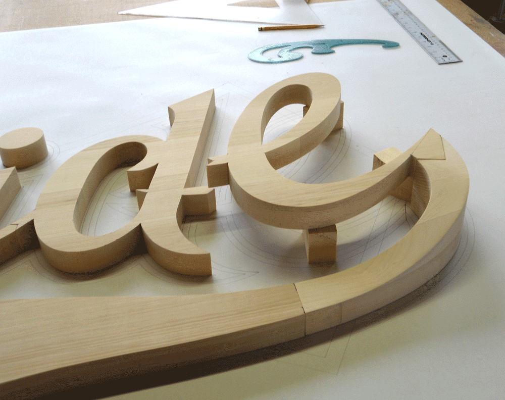
“Translating Michael’s logo design into the three-dimensional realm was simple enough but proved a little time consuming at the stage where I had to descend the tail of the “e” by 2″ from the script layer to the metal sign blank layer. As well, it had to pass under and through the red shield. I built up wood on the end of the “e” and between the band saw, chisels and plenty of hand sanding I was able to fashion the profile. I routed a path in the underside of the red shield to accommodate the tail.
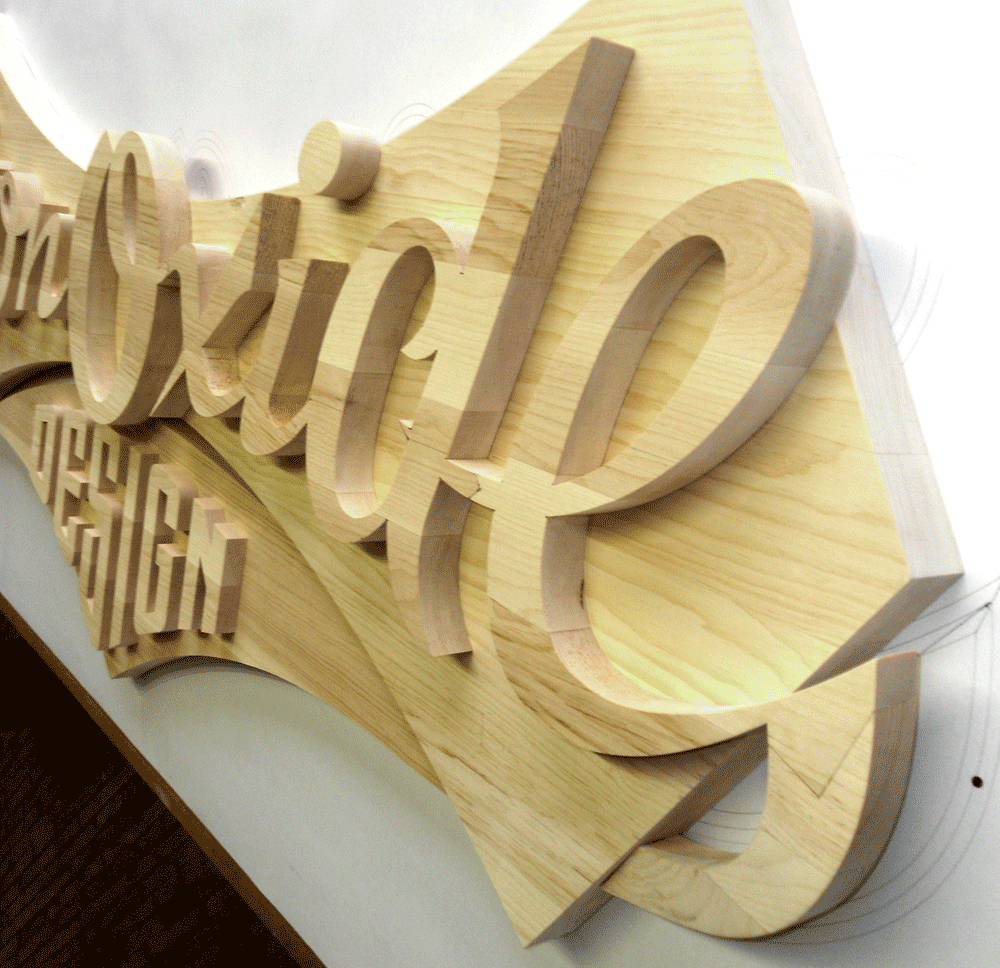
“All wood characters were then primed and sanded three times and sprayed with two coats of exterior paint.”
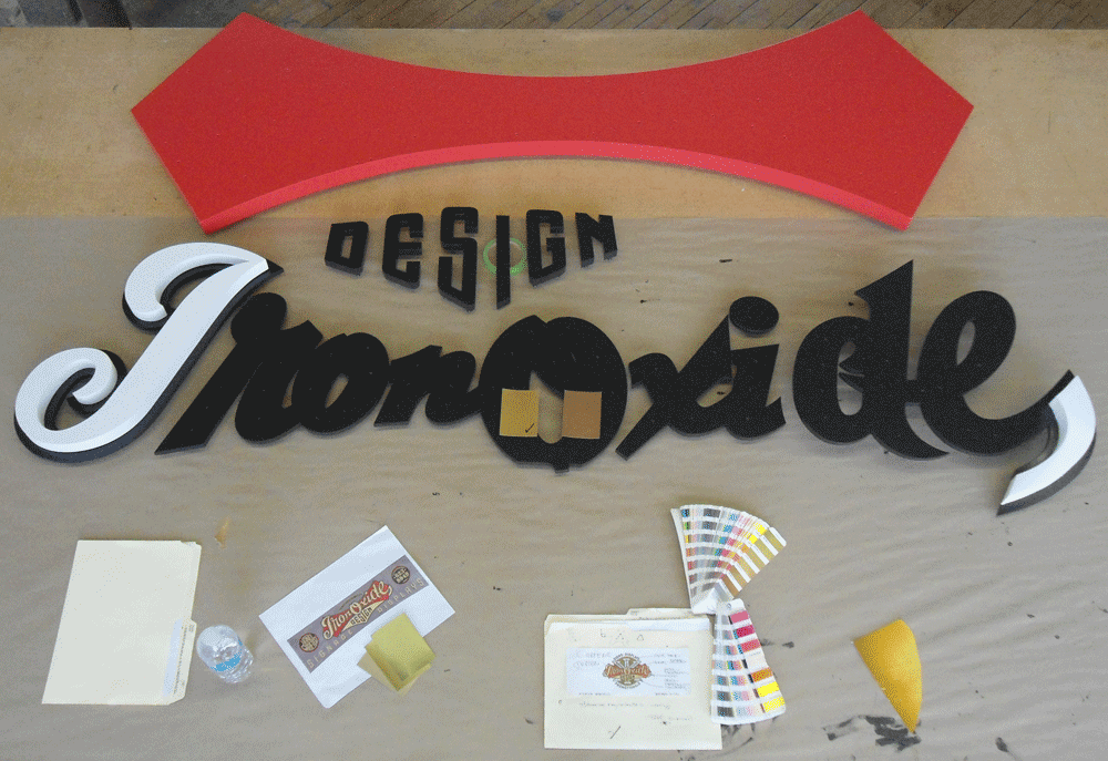

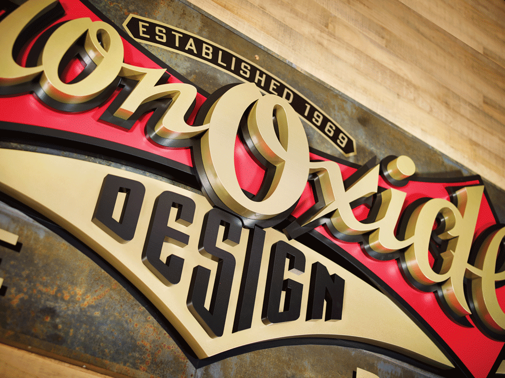
Et voila! The finished sign finally emerges. The following photos were taken indoors by Bryn Gladding, prior to exterior installation.

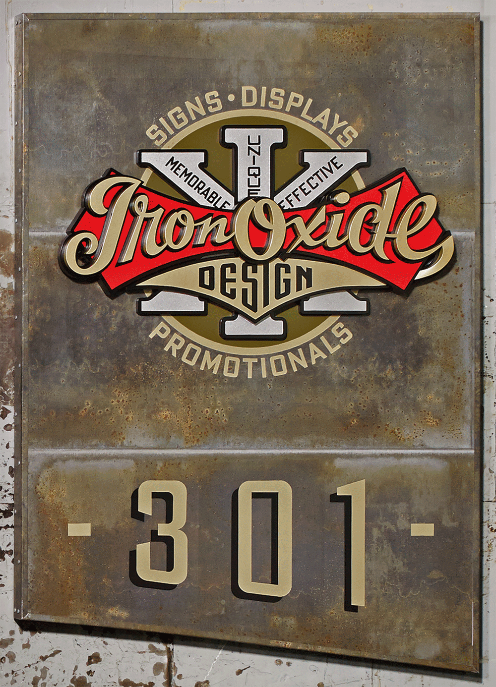
The making of the IRON OXIDE DESIGN interior door sign. Three-dimensional. 28″ wide x 40 1/2″ high x 3″ thick.
The interior sign was scaled down considerably from the exterior one, and utilized the full logo as designed. Blaine Casson writes about its fabrication:
“Working in Poplar wood this time, the production of my interior door sign was basically a downsizing of the exterior fascia sign project.

“I changed things a little bit given that this time I was reproducing the full “as designed” version of my logo. I eliminated the separate cut out layer for the script’s black outline and made it integral with the cut out shield layer, differentiated by painting the outline profile. I also painted “DESIGN” rather than individually cutting out the characters as I had on the fascia sign.

“I routed out the back of the shield to accommodate the “X” element as in the logo design it peeks through the area between the shield and the underlying tail from the “e”. This guaranteed alignment over the other option of cutting up the “X” and butt jointing the sections against the shield.”
Finally, below is the full version of the logo as used for interior signage in Blaine’s loft building.
Client, Signage Fabrication, Progress Photography: Blaine Casson – Iron Oxide Design
Photography–Finished Signage: Bryn Gladding

Powered by WordPress and Nifty Cube with Recetas theme design by Pablo Carnaghi.
Entries and comments feeds.
Valid XHTML and CSS.