|
|
|
12 Years in the Making — Fruit & Vegetable Stamps for the USPS — Part 2 of 2
January 22, 2015 on 3:43 pm | By Michael | In Gigs, News | 15 Comments![BlogOpener[600px]](http://alphabetsoupblog.com/wp-content/uploads/2015/01/BlogOpener600px.png)
Ten years had slipped by since I completed my work on the Fruit and Vegetable stamp series for the USPS back in 2002 (read Part 1). But then in May of 2012, when I was contacted by Art Director Antonio Alcalá of Studio A in Washington DC about another stamp project, I started thinking about the ill-fated Fruit and Vegetable stamps that I had done a decade earlier. To make a long story short Antonio agreed to re-present my original Fruit and Vegetable stamp comps at his next meeting with the USPS. It didn’t take long for him to get back to me with an emphatic “Yes”—the Post Office was indeed interested in reviving this theme for a new set of stamps!
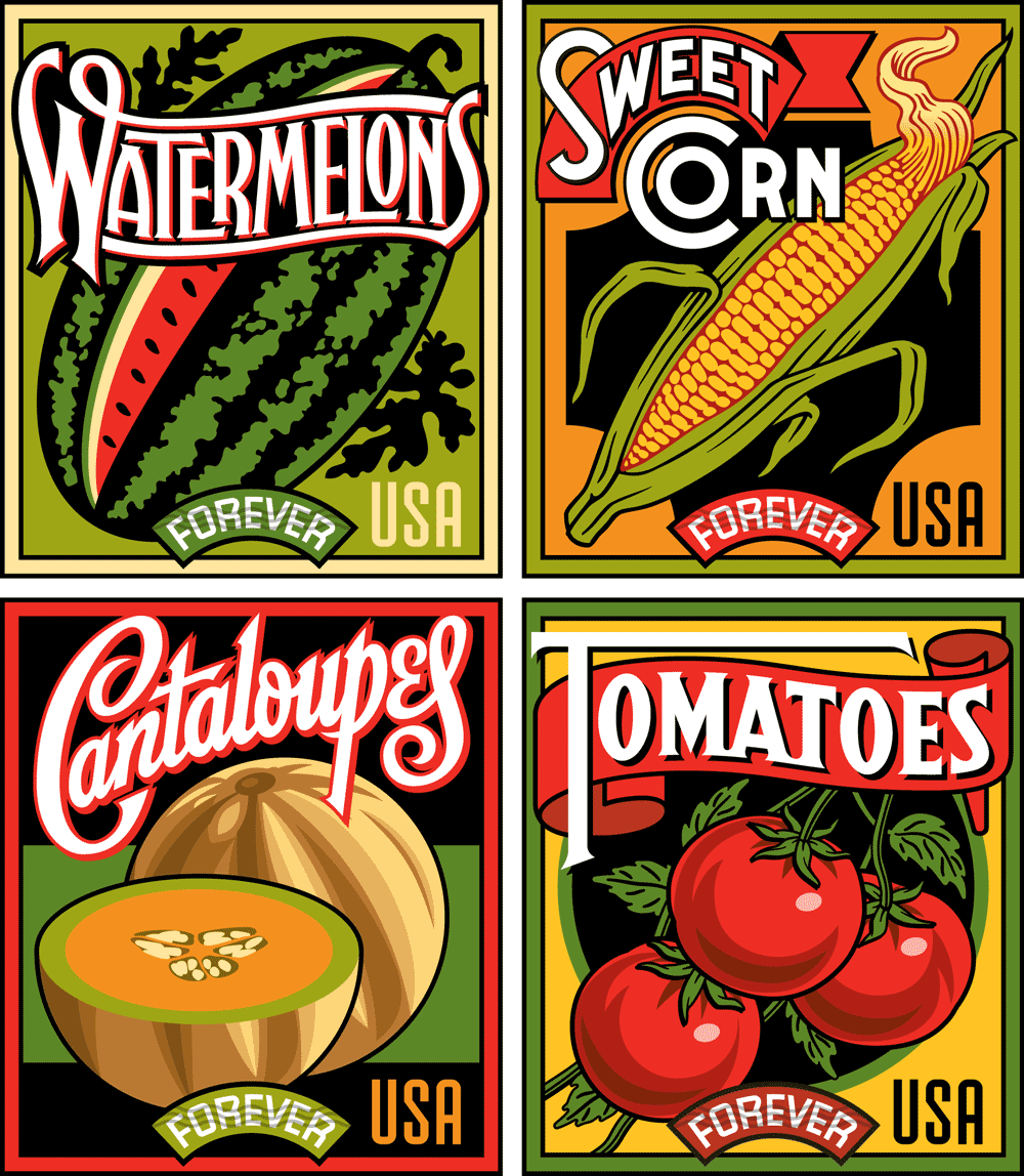
Of course I was hoping that the USPS would pick up the designs I had done without any changes—but that was not to be! Of the six different fruits and vegetables that we had chosen in the first go round the only one to survive was Sweet Corn. The new list was this: Cantaloupes, Squash, Sweet Corn, Tomatoes, and Watermelons, and the series was to be called “Summer Harvest”. One thing that worked in my favor was that we kept the same overall size for the new stamps.
When I started working on this new project I wanted to differentiate the stamps from each other as much as possible. I started by trying to have fun with different elements such as the “USA” and the denominations, and by choosing different color palettes. You’ll see that in many of the earlier stages I was trying to design these graphic elements differently from one another. While the earlier stamp designs held together because they all shared my aesthetic vision, it became clear that the new stamps were going to need to be much more uniform in approach, sharing similar design elements and color palettes. This made the challenge a little more difficult than the first series, but I decided that despite the uniformity challenge, I would still want to differentiate them as much as possible. So one thing I did was to give each of them their own distinct lettering style.
It turned out that because we were keeping the basic design for Sweet Corn, that design also served as a template for the others as well. Starting with the original Sweet Corn design from 2002 (below at upper left), here are a sampling of a few of the iterations as they progressed—with the final approved design at the bottom.
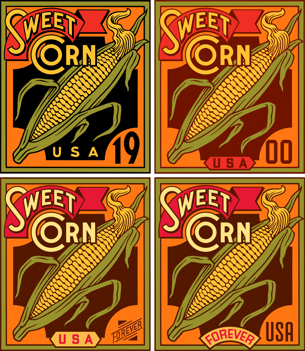
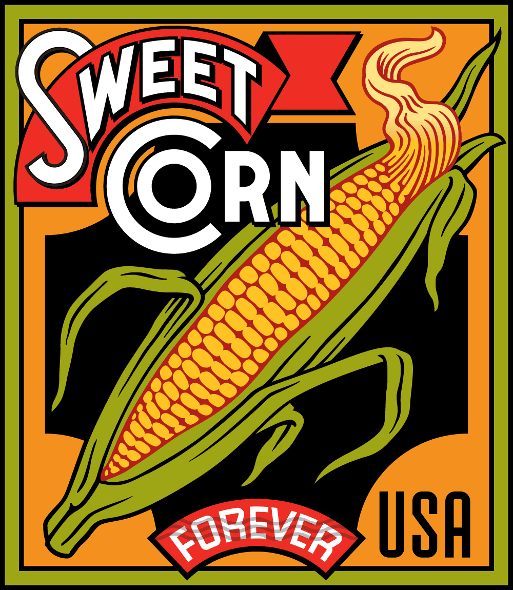
In the end the palette changed to one which could be applied to all the stamp designs. Also, note that the Sweet Corn lettering is a bit bolder on the final design (below), making it a bit more legible at the stamp’s small reproduction size.
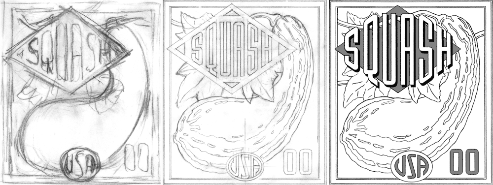
Before I had gone that far with it, the stamp depicting Squash was (pun intended) squashed. This was as far as I got before Squash was eliminated from the group.
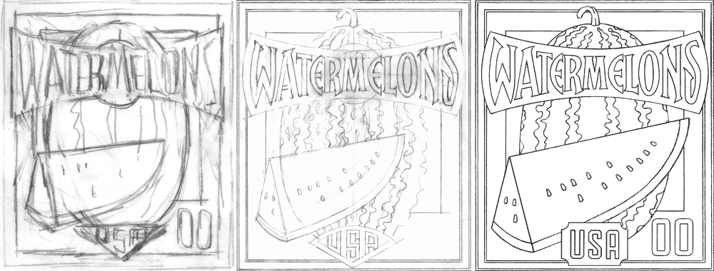
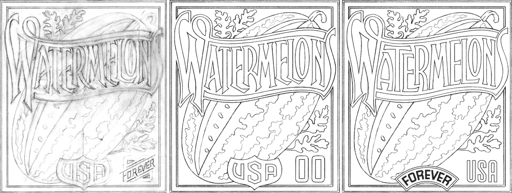
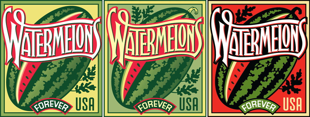
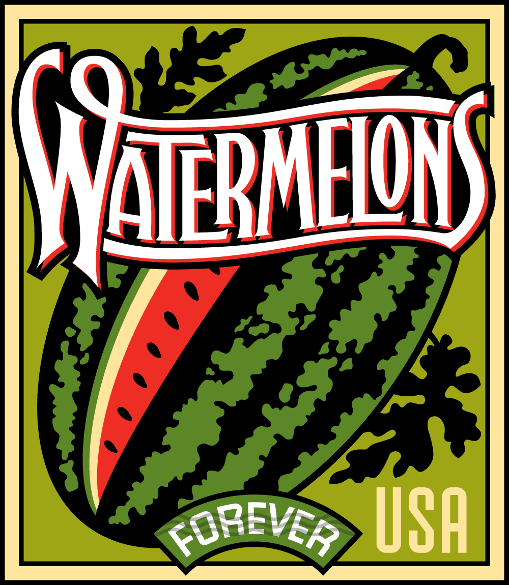
The Watermelons design was a bit more problematic than the others. For some reason the layout depicting a vertically oriented watermelon with a slice in front did not meet with USPS approval. So I opted for the more traditional approach with the watermelon leaning at an angle. Another problem was the length of the word “Watermelons”: I needed to really condense and overlap the letters so that they would be legible at the tiny size they would reproduce. Also, it was felt that in the earlier iterations the letters were a bit too pointy, and so you can see those modifications in the later stages.
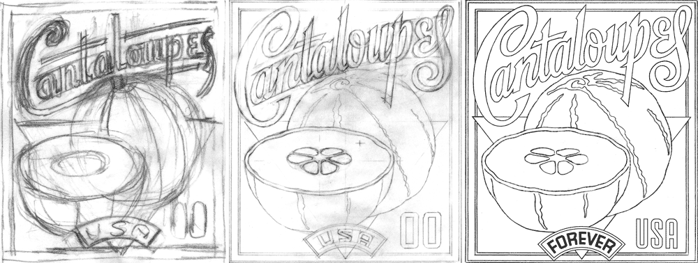
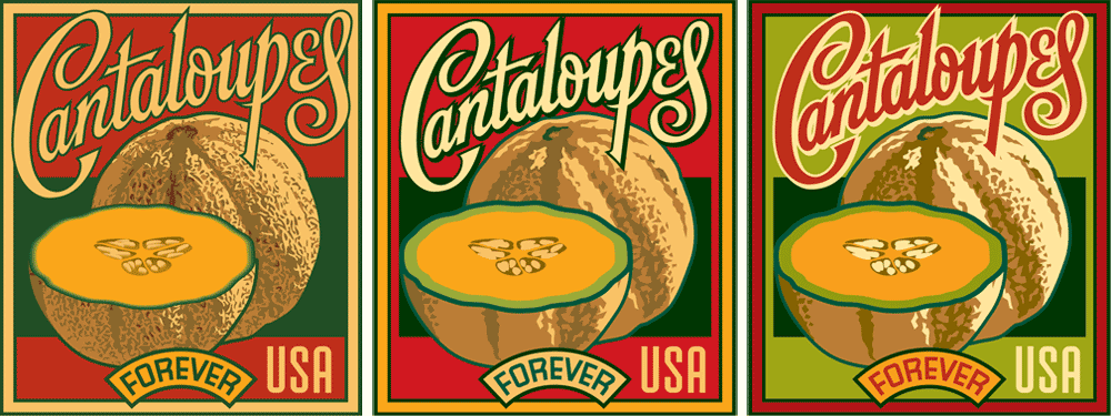
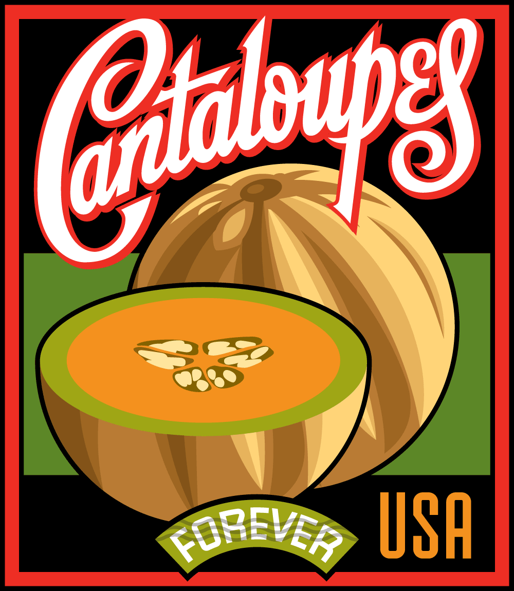
The biggest stumbling block for Cantaloupes was how to render it—what to do about its textured skin. You’ll notice that the texture went from fairly realistic and finely detailed earlier on to a much, much simpler depiction by the time we got to the final approved design.
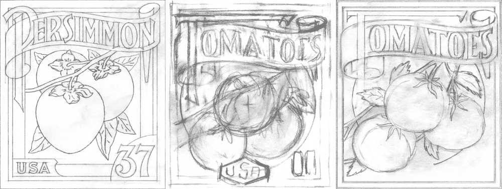
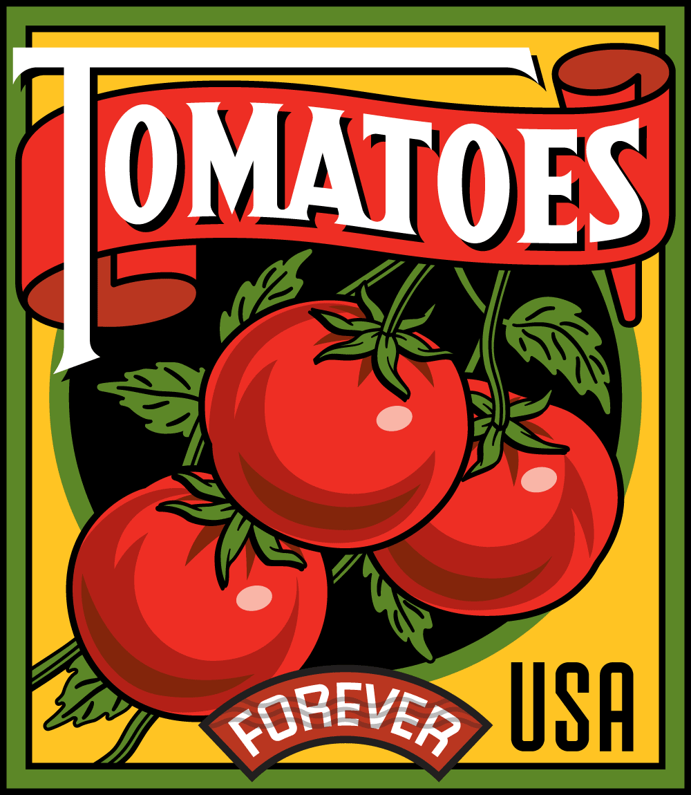
In addition to re-using the Sweet Corn design from the ill-fated 2002 set I also saw the opportunity to recycle the earlier design for Persimmon. It seemed perfectly suited to adapt for Tomatoes. This design then came together fairly quickly. The two smaller color versions (below at lower right) may seem quite similar, but they have several important differences: 1) the background color on the later design is brighter, to be more in line with Sweet Corn, 2) the shading on the two tomoatoes on the right changes a bit, and 3) I re-did the leaves with more detail where the branches meet the tomatoes.
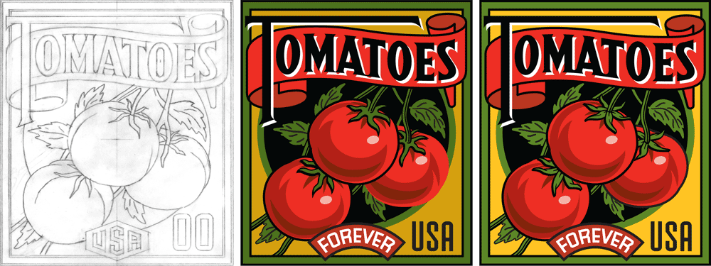 A significant difference in the final version of Tomatoes is that I reversed the colors of the type so that now all four of the stamps had white type (for consitency).
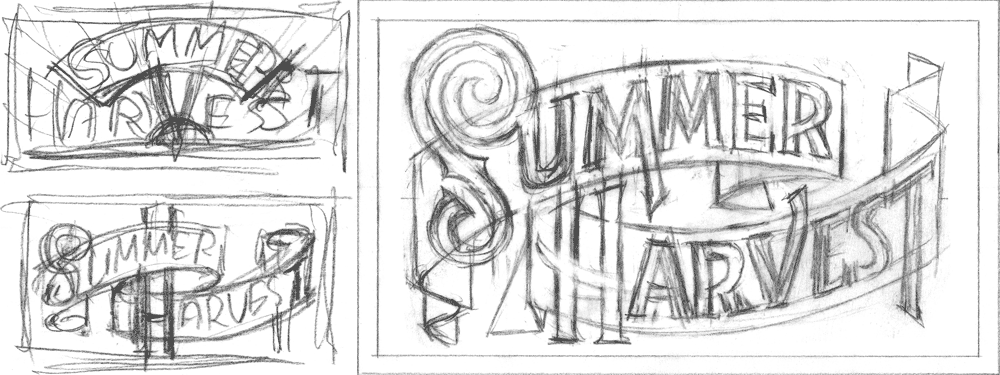
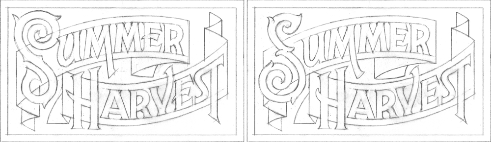
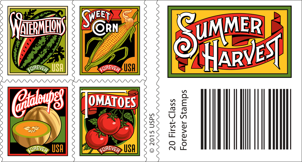
Finally we needed a label for the booklets that the stamps would be in. Working with the title “Summer Harvest”, here’s how I worked that out.
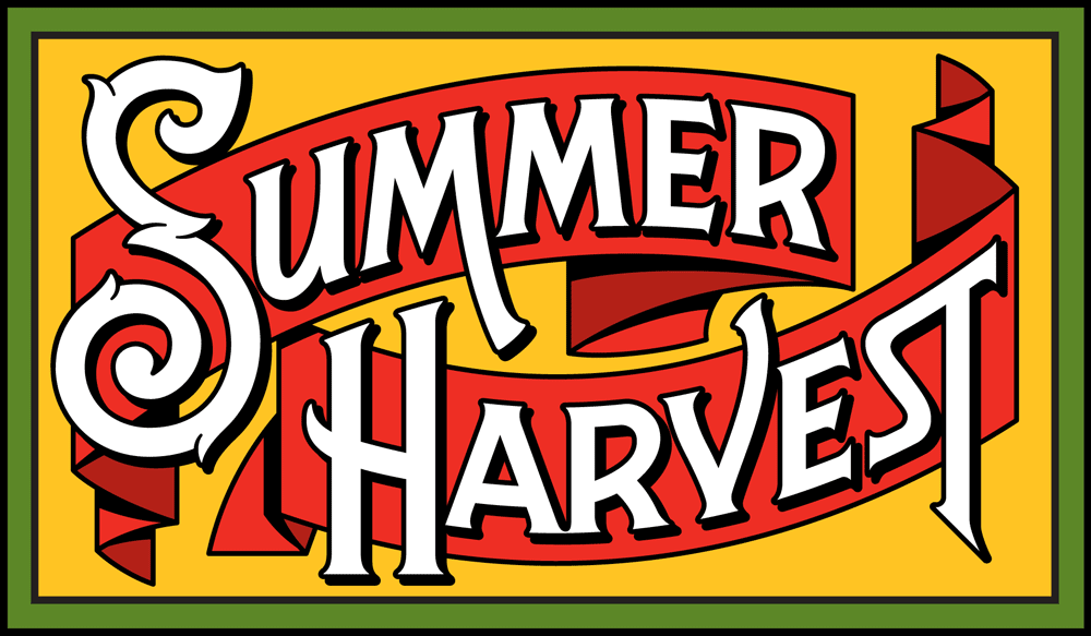
I think the similar palettes, the bold white lettering, and the consistent nature of the borders and the other design elements create a group whose individual members stand out as unique. But they all seem to work together as a family as well.
Here’s the series together in their booklet form—which will be available in June 2015 (just in time for Summer), and will be sold in booklets of 20.
You can also see these stamps on the USPS website. If you happened to miss Part 1 of this article, you can read it HERE.
 .
.
15 Comments
RSS feed for comments on this post. TrackBack URI
Leave a comment
Powered by WordPress and Nifty Cube with Recetas theme design by Pablo Carnaghi.
Entries and comments feeds.
Valid XHTML and CSS.
Hi Michael,
I would love to find a poster of your Summer Harvest postage stamps. If the USPS ever sold one, I’m too late to buy it from them. Do you know of a place where I could order one, or is there any way I could get the art in high-res digital form to print it myself? I swear I would only print the one copy!
Thanks,
Martha
Comment by Martha — October 13, 2016 #
Posters of these please!
Comment by Alphabetics — April 1, 2016 #
Absolute Beautiful Designs! Do you have Larger Prints available on these Summer Harvest Stamps? I own a farm stand and would LOVE to frame these and have them hanging.
Thanks for your time,
J
Comment by Jay — March 7, 2016 #
Kudos to everyone involved in the design and production of these gorgeous stamps. Clearly a long time coming, but well worth the wait. As a graphic designer who just happens to work at a Post Office, these are by far my favorites – so far.
Comment by Amy Pfeiffer — November 22, 2015 #
Michael,
I should have known that these were yours. I always look for great stamp designs. I actually brought a book in to show my class at Pratt a few months ago. I wanted to impress on them
to keep their eyes open for GOOD DESIGN anywhere. Your stuff
always was and is terrific.
Comment by Bob Feldgus — November 17, 2015 #
Such a valuable tool you have placed on line for the world to see and learn from. Thank you.
I see an art neuve influence in some of your typography of the fruit series.
I will continue to visit your blog and continue to look at all of the value work and comments you have posted.
Comment by Lisa Fusco — November 5, 2015 #
Simply looking at the variations on the letter “S” alone shows this is the work of a master. Plus one gets to own one for the price of postage.
Comment by Griffy — October 14, 2015 #
Michael,
you are a master from pencils to Adobe CS.
I dabble in logos and your work gives me inspiration.
Comment by Len Willis — August 8, 2015 #
Barbara: Sorry, I didn’t write the copy—ask the USPS!
Comment by Michael — July 8, 2015 #
Love the designs! They are beautiful. Can’t wait to buy, use, and gift! I am curious why the plural form? Watermelon, Cantaloupe and tomato not representative enough of a summer harvest? Or to reminds us all how to spell tomatoes? haha
Comment by Barbara Bringardner — July 8, 2015 #
I love these so much! I always buy stamps based on their designs and colors… this set just moved to the top of my list. Gorgeous 🙂
Comment by Anne — June 27, 2015 #
Wow! I just discovered these after looking for something online and saw your photo of the Canters place on Google.
I absolutely love the show of progression from rough to finished. Cannot wait to see these and hope they pop up in our post office in Greensburg, PA.
Again…fantastic job.
Comment by Doug Thomas — June 27, 2015 #
Kudos, Michael. I am so glad to see these stamps finally come to fruition. I kept pulling the original concepts out of the files and urging CSAC to produce them, but it never seemed to be the right time. Thanks so much for mentioning them to Antonio. Great designs! Can’t wait to use them on my mail.
Comment by Terry McCaffrey — June 20, 2015 #
Can’t wait to see these on actual mail!
Congrats!
Comment by Jose Cruz — May 2, 2015 #
Fantaztik, Mr. Green Jeans!
Comment by Jose Cruz — February 1, 2015 #