 |
|
Archive for the 'News' Category
For All You ‘KISS’ Fans Out There…
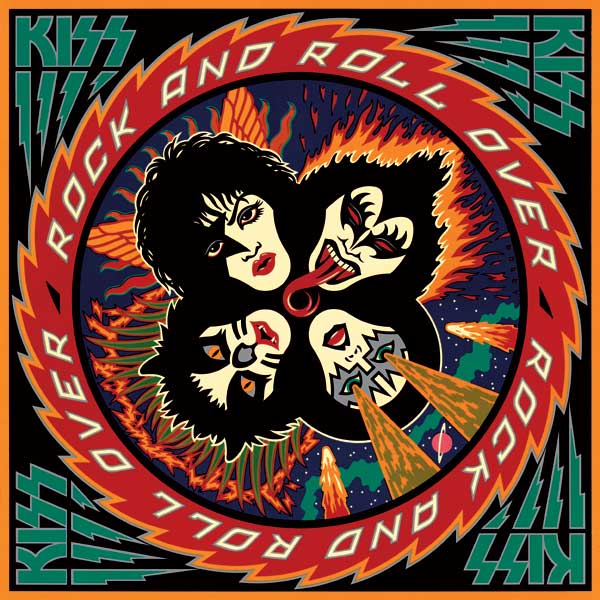
June 18, 2008 on 10:16 am | By Michael | In News, Wayback Machine | 6 CommentsYears ago I did the cover for Kiss’ album “Rock and Roll Over”. When I did it, I styled it after another piece I had done—a cover for the Japanese graphics magazine IDEA. Over the years this piece has gotten more notoriety (founded or unfounded) than almost any other piece of art I’ve done. I’ve done many interviews about my experience doing this cover. This short interview was done for Rockpages Web Magazine, out of Greece, which is part of their year-long special on this rock group. Another more recent interview was done for “Tokyo Five” and can be seen HERE.
“Rising Star” at MyFonts (June Edition)
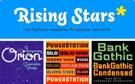
June 4, 2008 on 12:17 pm | By Michael | In News | No CommentsA month ago Metroscript was featured in the MyFonts monthly newsletter “Rising Stars” which highlights the bestsellers among their newer fonts. To our surprise Metroscript was featured again in the just released June edition of “Rising Stars“—but in addition they are now highlighting in the newslettter my three other font familes: my take on Bank Gothic (with lowercase characters), PowerStation and Orion. Thank you MyFonts!
Metroscript a “Rising Star” at MyFonts
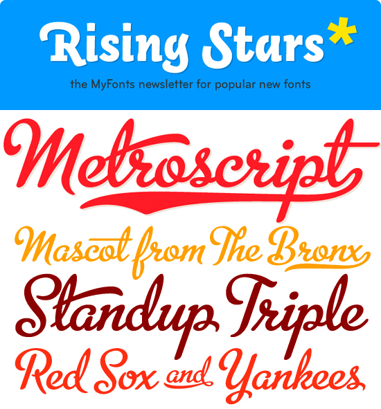
May 6, 2008 on 8:37 pm | By Michael | In News | 2 CommentsIn mid-March I began selling my Alphabet Soup fonts through MyFonts. To my surprise, in that short period of time “Metroscript” rose to the top of their list of “Starlets”. The Starlets list ranks all fonts that appeared on MyFonts within the previous 50 days according to their sales volume. MyFonts just sent out their May newsletter Rising Stars highlighting the best-sellers among their new fonts, and I’m proud to say that Metroscript is prominently featured.
This is all very gratifying to me—I arrived at font design by way of my career as a lettering artist—which is not the route taken by most font designers. Font design is a very different discipline from lettering in that it is a much more disciplined craft. I can make a piece of lettering sing by using all kinds of tricks and devices to create visual excitement. It does take a keen eye and lots of imagination and know-how to make a piece of lettering stand out, but font design is much less forgiving: you are limited to one letter next to another in a straight line, and every letter in a font must be in harmony with every other letter. I think much of Metroscript’s success has to do with the fact that I brought a lettering artist’s eye to a font designer’s craft, and I think this may be appreciated by those who are looking for something a little different. I’ve been told that copy set in Metroscript resembles hand lettering more than any other font.
Powered by WordPress and Nifty Cube with Recetas theme design by Pablo Carnaghi.
Entries and comments feeds.
Valid XHTML and CSS.


