 |
|
Archive for the 'Notes' Category
Coming Soon . . . Canter’s Truck Post #3 of 3
April 6, 2010 on 12:46 pm | By Michael | In News, Notes | 2 CommentsDue to my inability of being able to get good photographs of the completed Canter’s truck, I’m holding up posting the final chapter in this saga. I hope to be able to get some better shots by the end of this week. If not I’ll just post what I’ve got.Thanks for your patience!
Above: Careful placement of my credit below the trash receptacle.
Deliscript Critique on FontFeed
April 2, 2010 on 8:57 pm | By Michael | In News, Notes | 2 CommentsBelgian designer and writer Yves Peters has been posting his comments and critiques about the winners of the TDC² 2010 Typeface Design Competition, and has finally reached the Display Type category—the one in which Deliscript was selected. While Yves’ comments are considered and thoughtful—and with regard to Deliscript were for the most part on target—I feel as if I would like to comment on a couple of his remarks.
Yves mentioned the “Word Logos” I have thrown in, and mentions that they’re only in English and that there aren’t that many. I agree with this. I probably shouldn’t have put them in at all. I had literally been working for months on Deliscript, and really wanted to get it out for release, so I guess I rushed through their creation, thinking of them as just a small extra feature to include. They probably don’t add that much to the font, and I should have thought of the European market as well. The next time I do a feature like that I’ll definitely try to do it in a much more expansive manner.
Yves also mentions that he is “unsure about the finer details in the character shapes”, citing that “some curves and joins seem rather stiff, and the weight distribution and contrast in the character strokes appear a little off in some parts”. I’m not sure, but I think this perception on his part may stem from cultural differences that we share, and from a possible misunderstanding of what I’m referencing. What I’m going for is not really in the lexicon of classical font design—rather it is from the American pop culture vernacular—from all the (traditionally) untrained eyes that created all the wonderful signage and ephemera that I grew up with.
Coming to font design from that background, I can totally understand how what I’m trying to do can seem foreign to those who are trained to look at fonts from a traditional perspective. While I’m sure we all share some of the same font heroes (such as Morris Fuller Benton) I also celebrate those whose work joyously displayed a flagrant lack of regard for what some would consider to be “the formal rules of design”. It is to these designers whose names we’ll probably never know—and to their typographic “mistakes” and flourishes that I find so engaging—that I try to pay homage to in my lettering and font design work.
Alphabet Soup Fonts In Use
October 2, 2009 on 3:24 pm | By Michael | In News, Notes | 4 CommentsFrom time to time people send me (or I find on my own) examples of how other designers have used my fonts. Sometimes these samples are really wonderful. So when I come across examples that I feel are unusual, different or extremely well-done, I’d like to post them here. Recently I posted an example of how Metroscript was used in the movie “The Hulk“. I would welcome submissions from anyone who would like to email them to me.
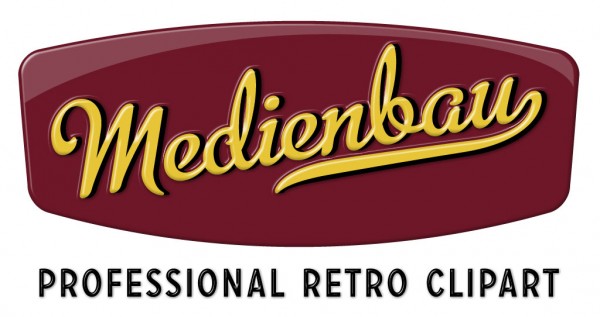
My first posting in this series comes from Switzerland and was sent to me by its designer. The font is again Metroscript. Usually I’m not a big fan of extruding type dimensionally—I’m kind of a type “purist”. But I thought that this one was done really well, keeping it simple and avoiding the temptation to just keep going and going. I love its simple colors and clean lines. Somehow the designer has taken what I feel is a very “American” font and imbued the design with a very European flavor.
It was sent to me by Bernhard Huber who asked that the credit read as follows— Design: Medienbau, Agentur für Konzept und Design, Switzerland
Powered by WordPress and Nifty Cube with Recetas theme design by Pablo Carnaghi.
Entries and comments feeds.
Valid XHTML and CSS.


