 |
|
Archive for the 'Wayback Machine' Category
The Evolution of PowerStation
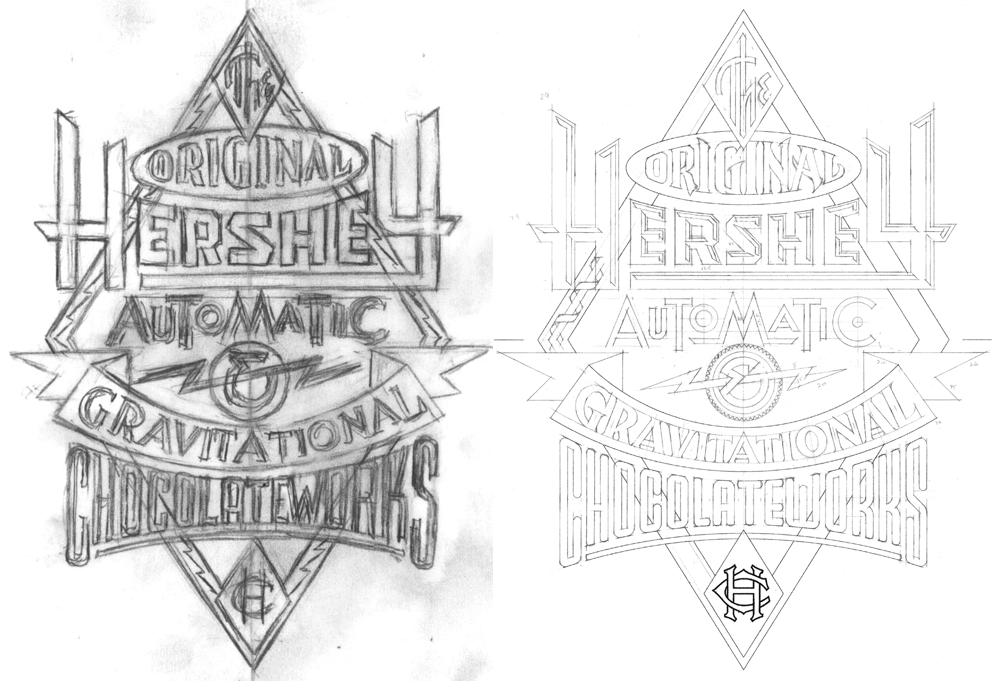
February 11, 2013 on 11:09 am | By Michael | In Gigs, Notes, Wayback Machine | 2 CommentsPowerStation is my one font that specifically evolved from a prior design assignment. I had been tasked with designing signage for Hershey’s Times Square flagship store. The signage needed to be designed in the spirit of a retro future-machine, à la Jules Verne or other Victorian “Steam Punk” aesthetic. So I came up with the following sketches in which I combined various lettering and type styles:
In the tighter version I designed the word “Hershey” to have a feeling of faceted letters, similar to what you might see on an old theater marquee:
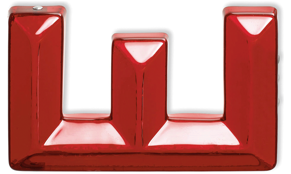
Ever since I first became aware of them I’ve been faxcinated by the tactile qualities of these extruded plastic letterforms, and how they reminded me of candy. I’ve always thought there was something “delicious” about them.
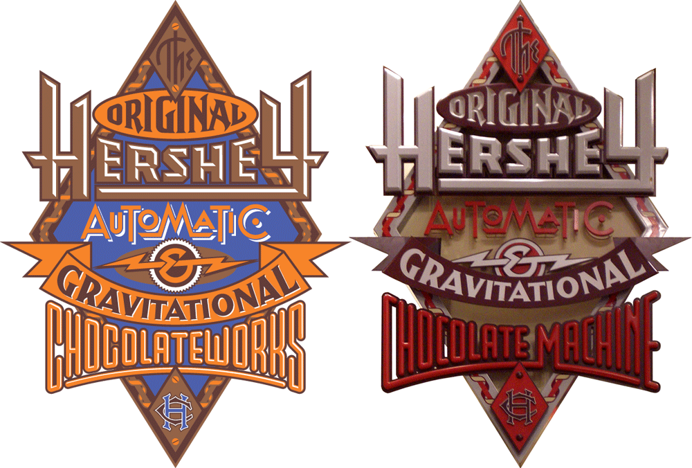
So it seemed entirely appropriate to me that the word Hershey should be rendered that way, giving it a chunky, almost chocolatebar-like flavor. Note that in the final signage we needed to change the lettering of the word “Chocolateworks” to read “Chocolate Machine”.
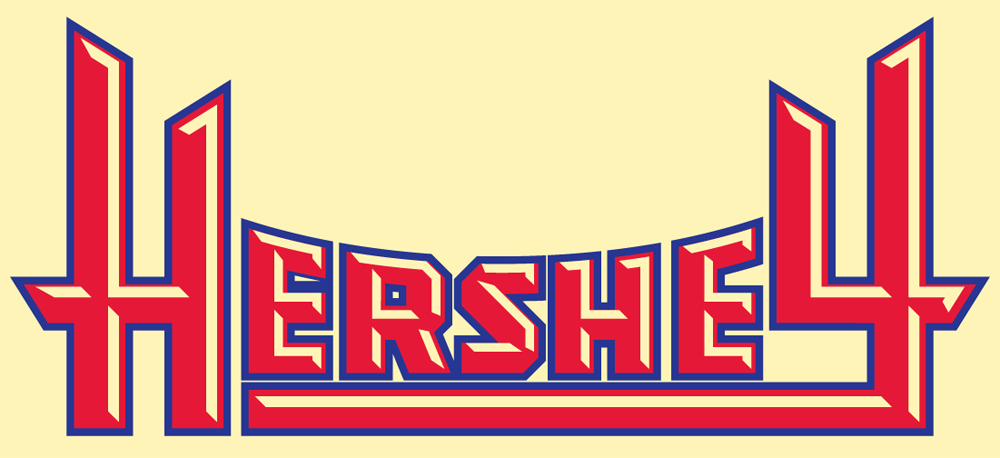
I loved how my art turned out, especially the word “Hershey”. After this job was over it occured to me that I wasn’t aware of any fonts that successfully captured that particular faceted look. So I thought I’d try and see if I could make that work as a typeface:
I started sketching out various letters to see if it could be viable. As the font developed and it’s strong industrial and moderne qualities became more apparent, I decided to name it “PowerStation”.
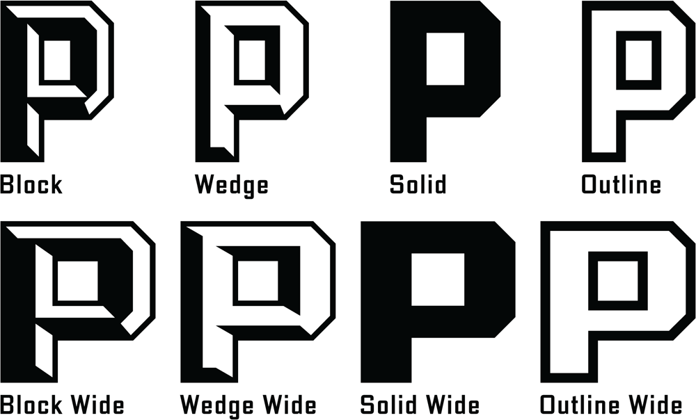
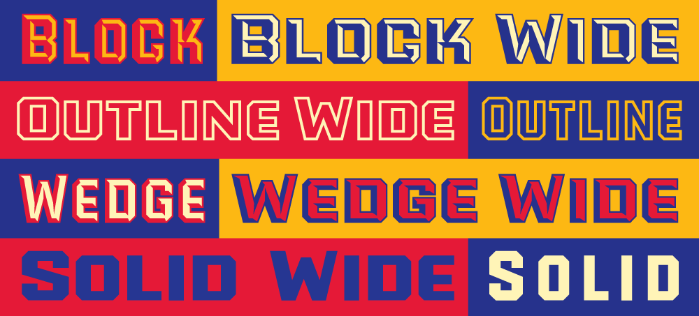
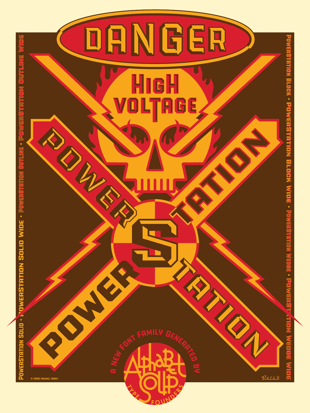
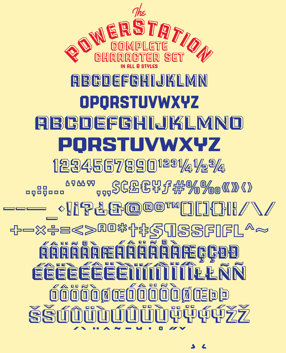
As I developed PowerStation, it evolved from the one version I had adapted from the Hershey’s assignment into four different versions. These I decided to call Block, Wedge, Solid, and Outline. Then I thought I’d expand those into another four “Wide” versions. Now I had a family of eight different fonts.
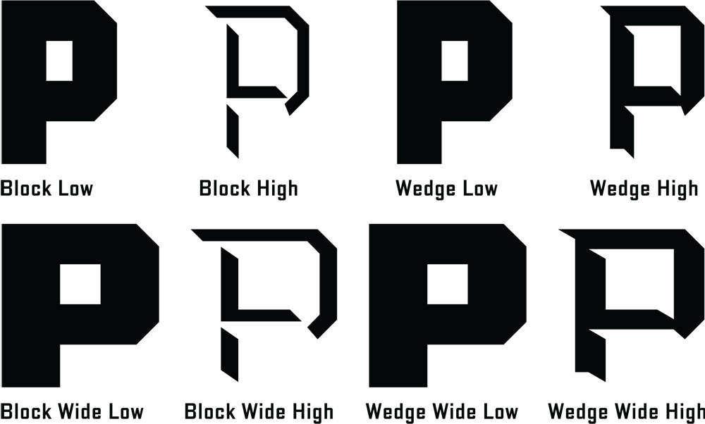
But I guess I wasn’t able to leave well enough alone. Why not provide the added ability to set PowerStation in two colors? So I took the basic four faceted versions of PowerStation (Block, Block Wide, Wedge, and Wedge Wide) and broke each of them down into two separate fonts which, if set on separate layers, could provide 2 color typesetting. The solid “base” of the letters would be formed by setting the “Low” version of the font, and the facted part of the letter would be formed by setting the “High” version of the font on a layer directly above the “Low” version.
In other words a two color version of PowerStation Wedge could be achieved by setting PowerStation Wedge High over the same copy which would be set in PowerStation Wedge Low, and applying different colors to each layer.
Setting words like this in two colors can provide richness and variation when used imaginatively.
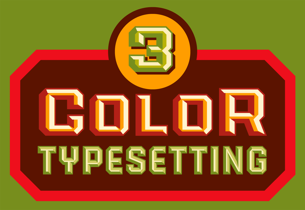
Some time after the release of PowerStation I discovered the next step in its evolution—that you didn’t have to be limited to two color typesetting with this font. I found that by combining the various PowerStation fonts in different ways one could set this font in three colors as well. The instructions for doing that may be a little long for this article, so if you’d like to see what’s involved with that, you can download the free PowerStation User Manual.
I originally created the serigraph above to celebrate the release of PowerStation. The signed and numbered edition is limited to 100 copies, and there are still some left. Click HERE to find out more about this offer.
License the PowerStation fonts HERE .
Purchase the PowerStation Serigraph HERE.
Japanese Time Machine
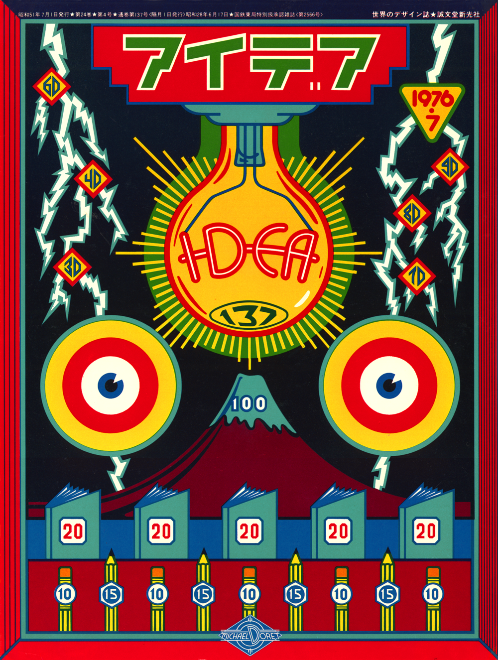
October 25, 2012 on 10:34 am | By Michael | In Gigs, Wayback Machine | 6 CommentsMy friend José Cruz recently posted this LINK on my Facebook page, reminding me about one of my earliest, favorite projects—one which set the tone for much of my work that followed. In the page that was linked the reproduction my cover was so tiny that I figured it might be time to unearth the real thing and tell its story.
I had only been freelancing for a couple of years when the Japanese magazine “Idea” contacted me, wanting to do an article about my work. I proposed doing a cover for that issue, and they agreed. Rather than designing a standard 4 color process cover, I prepared the art for 5 flat Pantone colors. Overlapping the transparent inks would create even more colors, and I hoped to achieve a richness and depth of color that approached the look of a silkscreen. It all worked out really well.
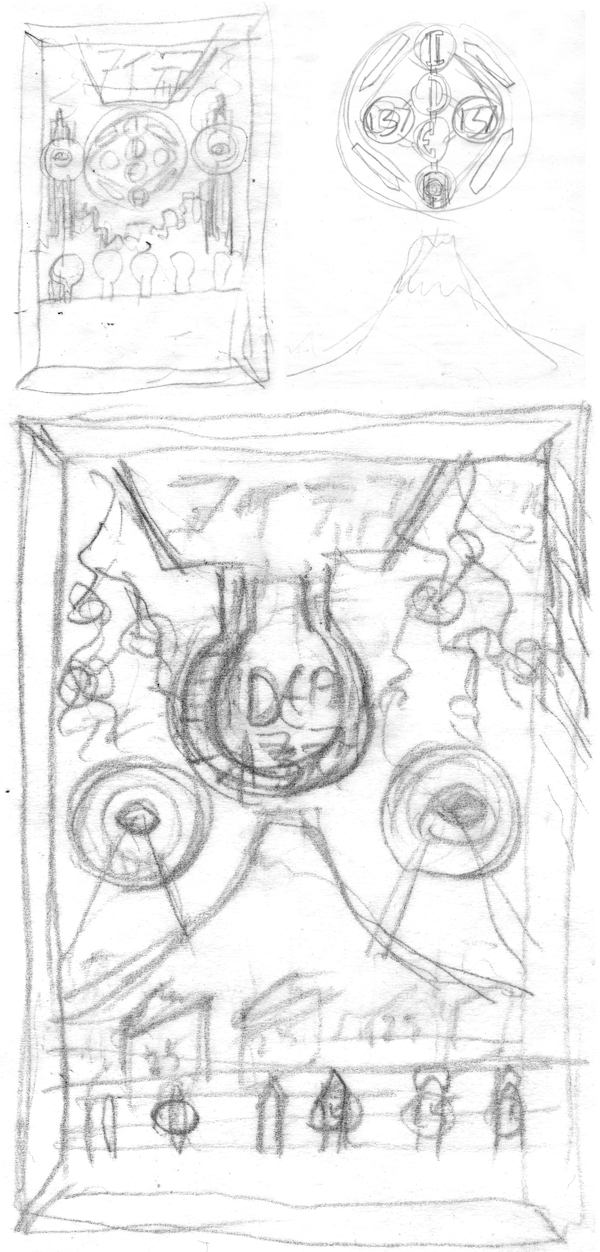
Starting with a few thumbnail pencils, I developed the look for the cover, which was based on an arcade/shooting gallery/metal target game look:
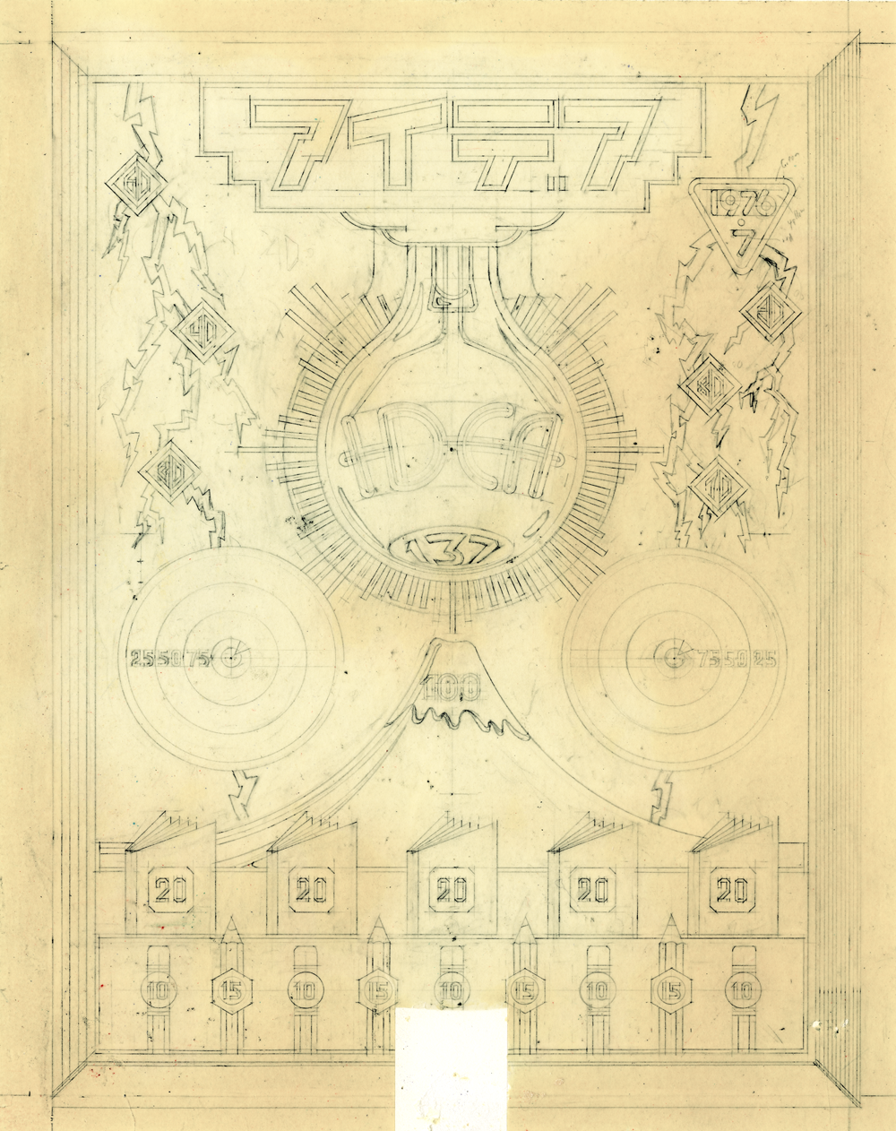
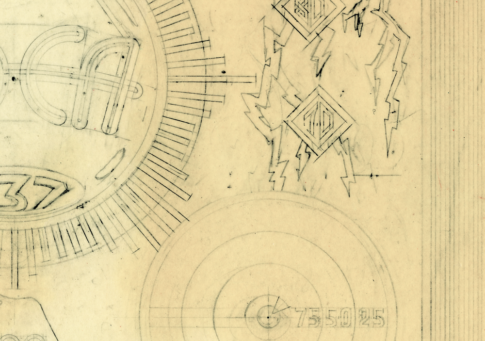
I’m sure there were a couple of pencil drawings between the ones above and the next one, but it’s been many years, and things tend to disappear. This next drawing demonstrates how I used to work pre-computer. I needed to work out the drawing in the finest detail, because once I inked the linework on prepared acetate, there was no such thing as ⌘-Z: making changes was difficult. You’ll notice in the detail, the great care I used when drawing—this was extremely painstaking work (the yellowing of the vellum is mostly due to the aging of the rubber cement used to glue it to a board:
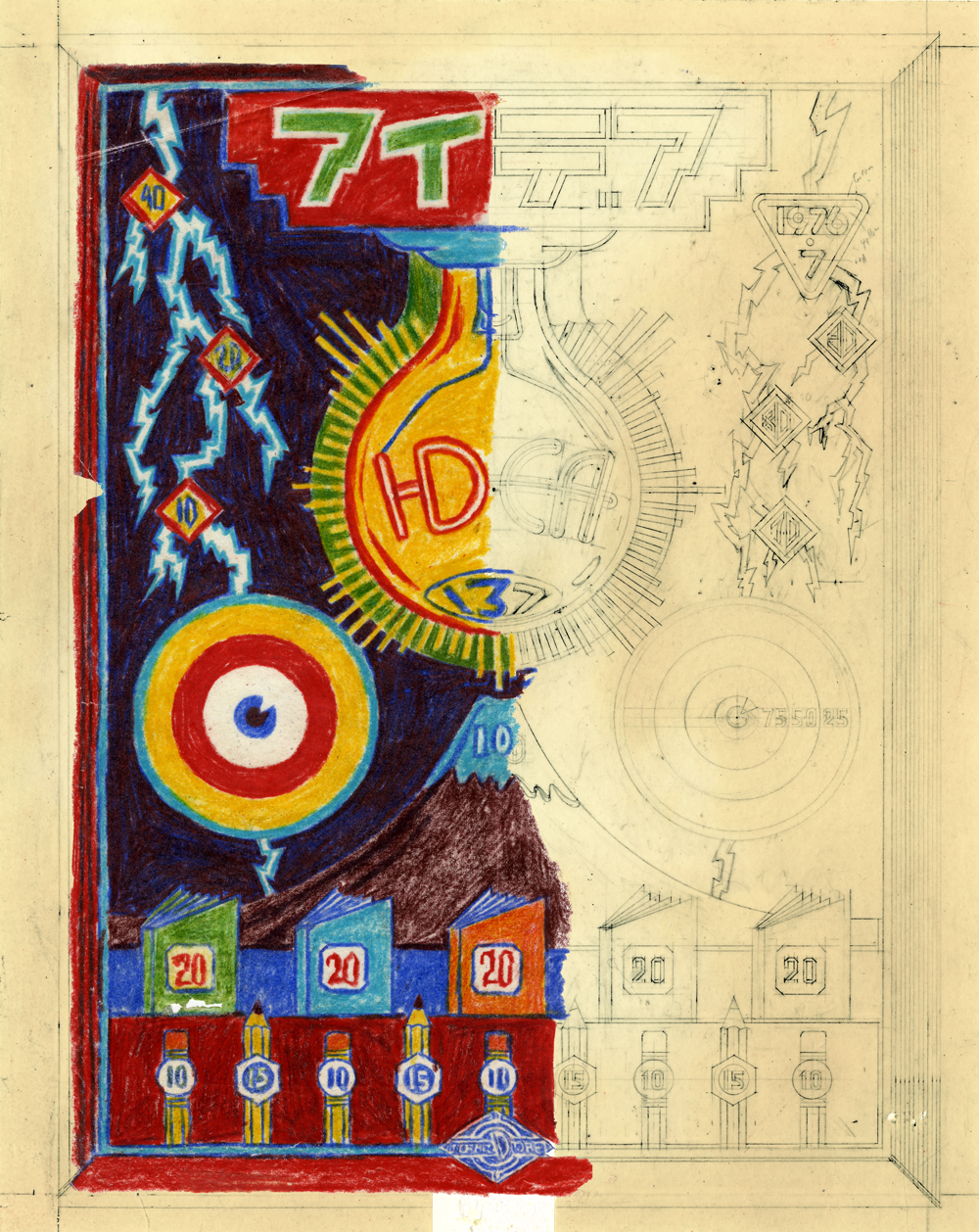
Next I worked out rough color with Prismacolor pencils on a piece of tracing paper over the tight drawing. I was tryng to approximate how transparent Pantone colors would react when laying one over the other. For example laying the blue/violet over the burgundy would get me a very dark—almost black-ish color. There were probably other color studies, but this is all I have left:
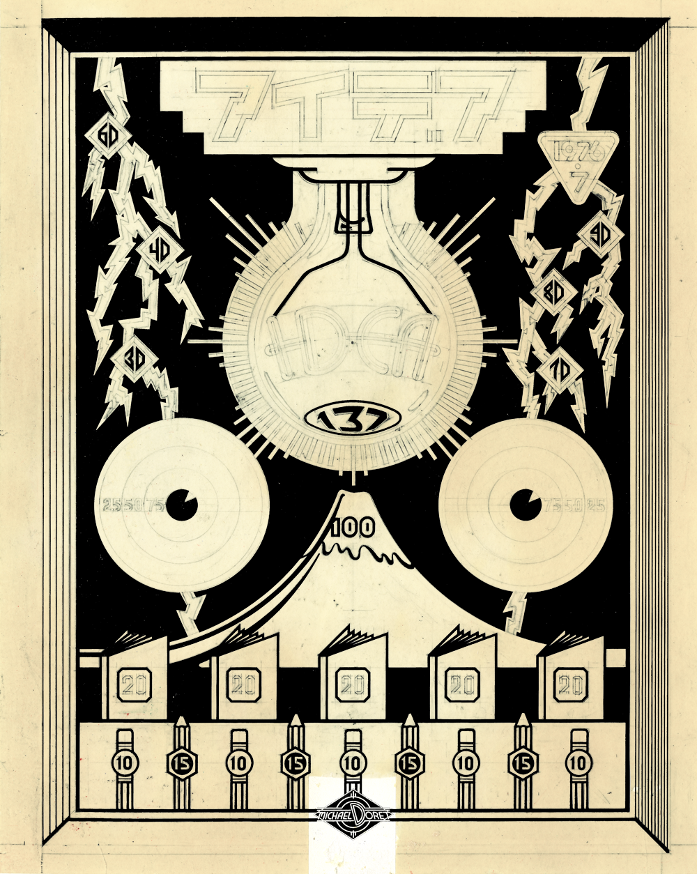
After working out the color, all that remained was to create the finished pre-separated art, inked in black with technical drawing pens (Koh-I-Noor Rapidograph). In this case the art consisted of seven inked, prepared acetate overlays, plus the base art that was inked on vellum and glued to an illustration board. Below is a representation of just one of the overlays in position over the tight tracing—where it was when it was inked—this represented the dark blue ink:
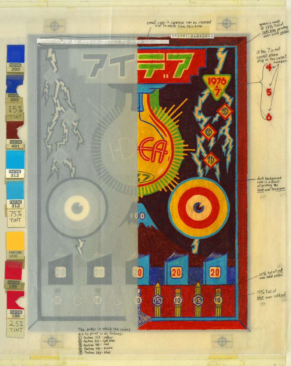
When all the inking was done, all the overlays were registered to each other (note the register marks), and the whole was prepared for the printer in Japan with detailed instructions written on a vellum overlay with a more accurate representation of what the finished piece would look like (rendered in colored pencil). Pantone color chips were taped alongside for color matching. It’s a hell of a lot easier to render art like this today using Adobe Illustrator!
Below is the actual printed cover. It remains one of my favorite pieces. It also served as the design and color model for how I executed the album cover “Rock and Roll Over” for KISS just a few months later that year:
An Interview With “Posting and Toasting”–Pt. 2
September 12, 2012 on 12:10 pm | By Michael | In Gigs, Wayback Machine | 3 CommentsYesterday I presented Part 1 of Seth Rosenthal‘s interview from his blog (Posting and Toasting) with me about my experience in creating the identity for the NY Knicks. So without further adieu, reproduced below is Seth’s second installment:

Behind the Knicks Logo with Michael Doret: Part 2
In Part 1 of our conversation with Knicks logo designer Michael Doret, we talked to Michael about the initial assignment he received in 1991 and got to see a few of his sketches and logo concepts that didn’t end up getting picked. It was a prolonged back-and-forth process between Michael and the league, and today we’ll look back at the steps of that process leading up to the Knicks logo that’s been in place for 20 year sand counting.
Before we take a look at some more sketches, I should mention that, out of sheer coincidence, ESPN’s Jared Zwerling has an interview up today with Tom O’Grady, who was– at the time– a representative of the league office that contracted Michael’s work for this project. Though this conversation has been more about turning up old sketches than it’s been about the stories surrounding them, I invite you to check out Jared’s piece for another perspective on the logo’s history.
Here’s more from Michael:
“The development of this logo lasted about six months, and during that time there was a lot of back-and-forth in terms of which designs were developed further and which designs were shelved. I was hired by NBA Creative Director Tom O’Grady, who was great to work with. He was very open to all the ideas I presented to the league. In the one idea they ended up selecting, I had pretty much taken many of my design cues from their old Knicks logo. I had thought “I know they’re telling me to shoot for the moon on this, but I know that the way these things work—they’ll get scared and won’t want to make a big change”. So, I gave them that one as a sketch, which was kind of like an updated, contemporized and cleaned up version of the old logo.”
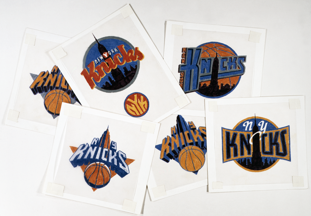
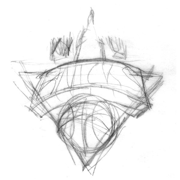
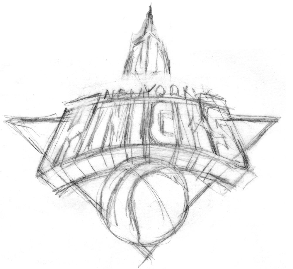
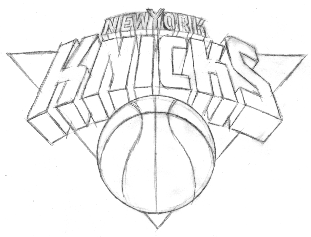
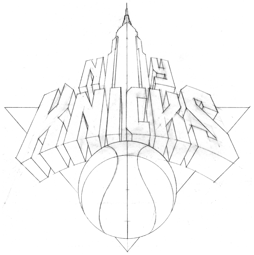
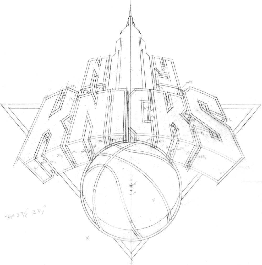
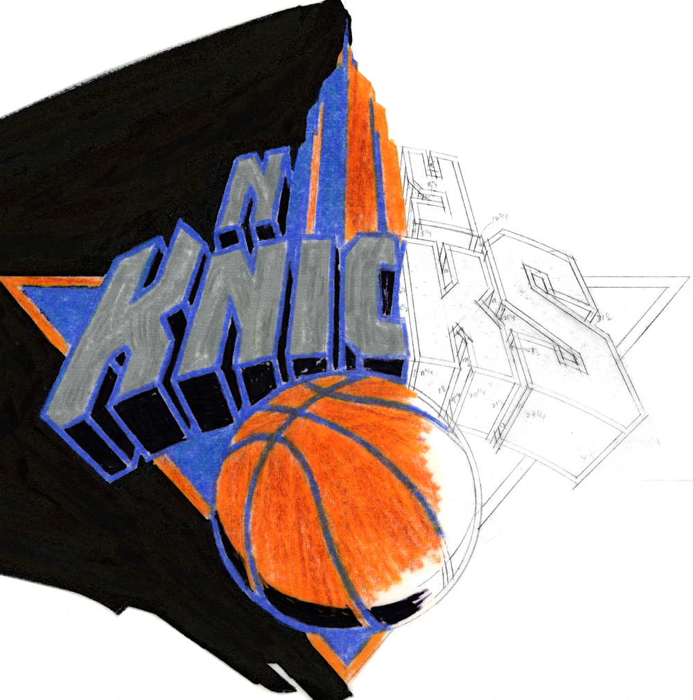
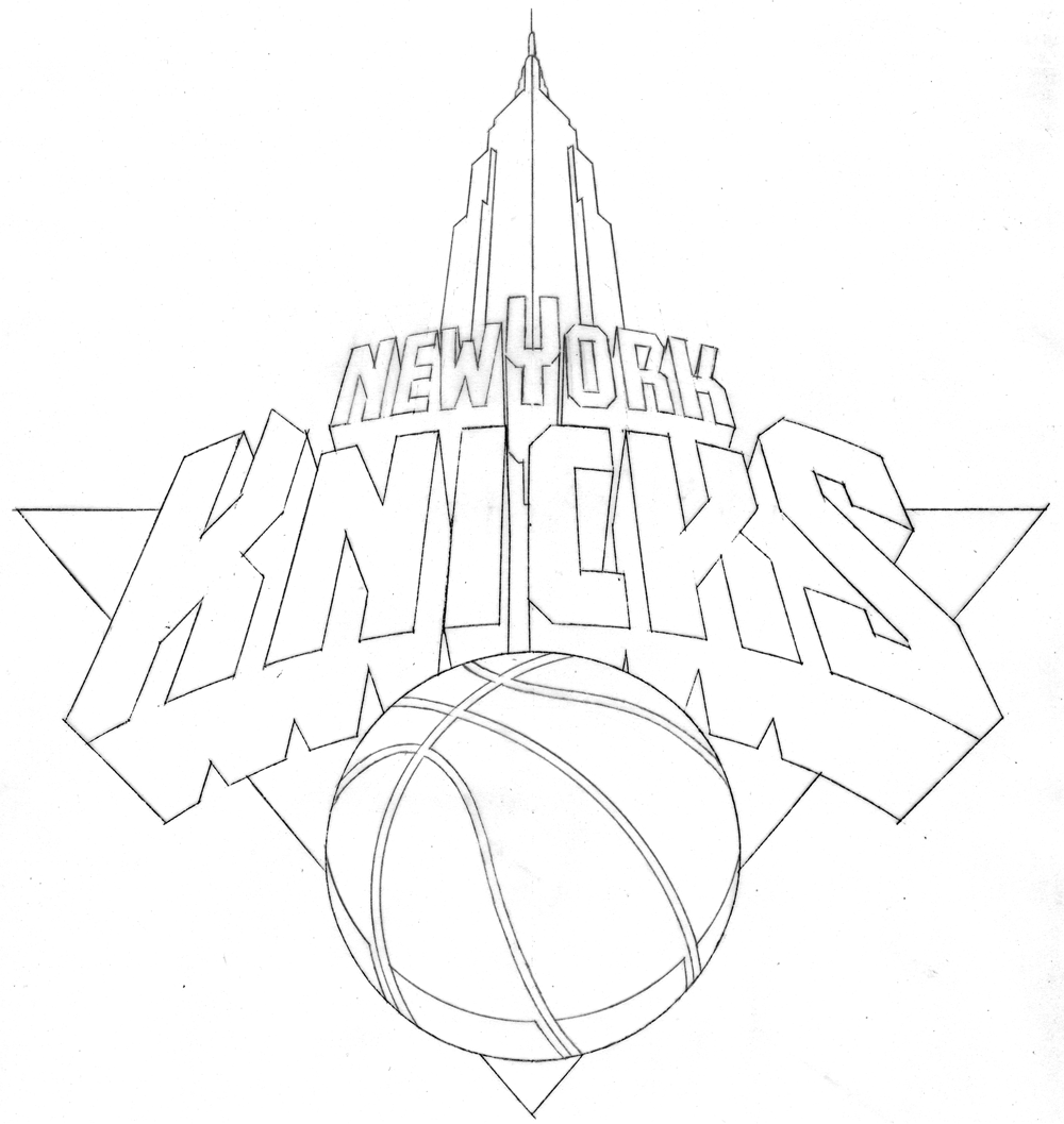
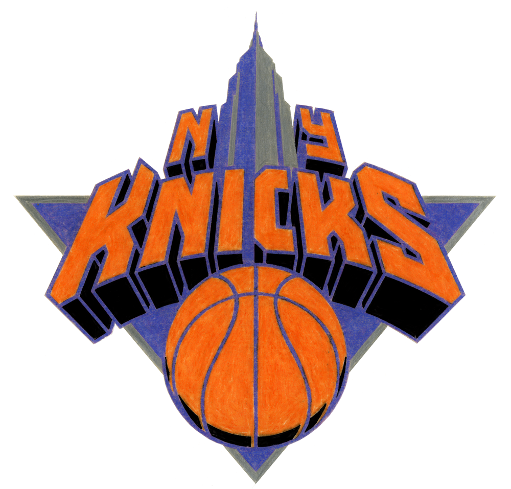
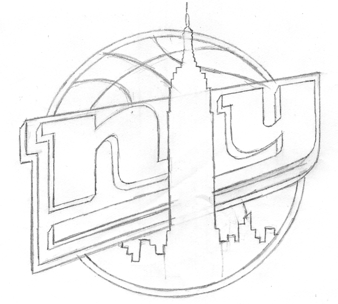
With that in mind, here’s a look at the metamorphosis of the logo with which we’re familiar today:
A couple of things:
1. You can see in that third-to-last sketch where Michael started experimenting with the color scheme (which is different from the final one).
2. Recall from Part 1 that one of the initial design requests was the inclusion of the Empire State Building, so some of these look just like the familiar logo, but wearing a building hat. Obviously, that element got cut from the final logo.
Ultimately, this was the design of Michael’s that the Knicks chose heading into the 1992 season. A few years later, Michael was asked to design and integrate the “New York” line above the “Knicks”. Recently the logo has undergone a minor color makeover, but it’s otherwise the same as it was back in ’92, not unlike my voice.
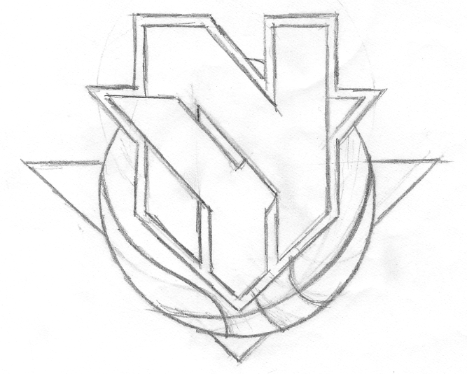
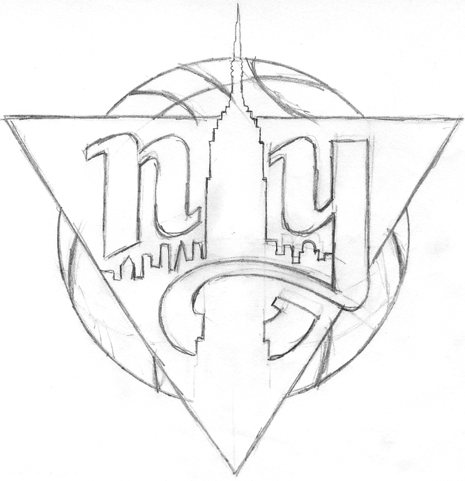
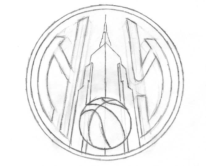
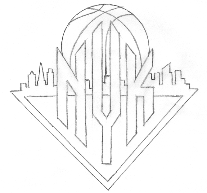
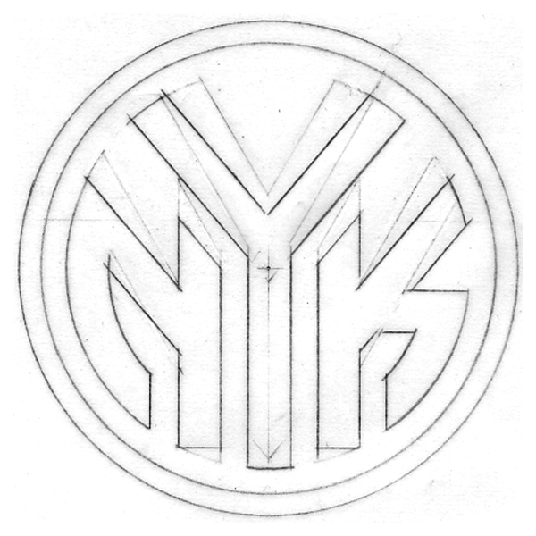
Now, that wasn’t the only thing Michael was working on for the Knicks project. He also presented them with a series of monogram sketches– more compact, initial-based logos that could be used for other purposes. Here are some of those sketches:
The league ended up setting for just the main logo and none of Michael’s monogram designs. But wait– that last one looks familiar, doesn’t it? Indeed, it’s the token insignia the Knicks have been using as a secondary logo in 1995. It’s graced equipment and merchandise since then, and was featured on the back of the uniform until recently. Michael’s design drew its inspiration from the old MTA subway tokens, and, if you look back at yesterday’s post, elements of it crept into early concepts of the main logo. New York’s adoption of the design has a bit of a story behind it:
“Being a New Yorker and growing up riding the subways, I always had that image of the subway token with the Y cut out of it somewhere in the back of my head. I just saw an opportunity to somehow use that iconic NY image for an iconic NY team. Using it for a secondary Knicks logo was something I wanted to push for. When we started discussing a secondary logo—”a monogram or something”. I gave them quite a few different ideas, but at the time, they decided not to use any of them. I thought “okay, that’s fine”– I was being paid fairly for the logo development work that I was doing. That whole secondary logo/monogram thing was dropped, and I got paid for the work I had done on it (but not for finished art or usage). Then, several years later, after this whole project was done, an old friend of mine called and said “did you know the Knicks are using that token logo you did for them in your sketches?”. I had had no idea-and more importantly, I had not been paid for any usage fees for that design. No one from the organization had informed me, so I contacted the people at the NBA. I don’t think Tom O’Grady was there anymore, or maybe he wasn’t in the same position—at any rate I don’t remember speaking to him about this. I tried to discuss it with some people there, and they informed me that no, the token monogram was their idea—they had created it, and I had had nothing to do with it.
A couple of years had gone by before I found out about this infringement, and In the meantime some of my work had been published in a book called “Design In Progress – What Happens Behind the Scenes“, which was about how design projects are developed. I had picked the Knicks logo as a case study of how I develop a logo design, and so in the book were printed many of the sketches seen in this blog. It was just one or two pages in the book, but among the material published was one of the sketches that had included the NYK token monogram. This book was published just after I had completed the Knicks project, and well before the Knicks had started using the token logo. So when they said to me “well, you didn’t do it, and if you’re going to insist on this and say you did, you’re going to need to prove it”, I just pointed them towards the book, which had a copyright date of 1992. Realizing they were caught with their pants down and wanting to avoid any kind of legal entanglements, they begrudgingly told me “well, okay we’ll pay you for this”, and then to punish me said “but you’ll never work for the NBA again”. That, of course, has been borne out by history.
I felt like I was there at the beginning helping to create a look that a lot of sports teams have picked up on, and from which a lot of other designers really benefited. After that debacle it wasn’t me that was being consulted for my design expertise—but other designers who took their cues from what I had begun—and you can see that in a lot of the team logos these days. I feel like I should have been part of that. But if I had to do it all over, I would still stick to my guns and fight for what’s right.”
Cool. Thus concludes our journey through the history of the Knicks logo(s). Huge thanks to Michael for sharing all this with us, and to P&T’s Norman Hathaway for helping to set it up. Once again, I encourage you to check out Michael’s website and blog, and to read the ESPN interview with Tom O’Grady for more logo history.
Powered by WordPress and Nifty Cube with Recetas theme design by Pablo Carnaghi.
Entries and comments feeds.
Valid XHTML and CSS.
