 |
|
Archive for the 'Wayback Machine' Category
Lettering & Typographic Artists: Sucker Punched by Film Industry?
March 24, 2011 on 12:04 am | By Michael | In Gigs, Wayback Machine | 14 Comments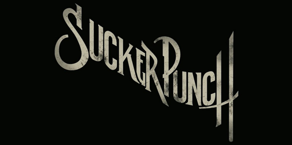 No doubt by now you’ve seen the title treatment for “Sucker Punch”. It seems to be everywhere. I don’t know who designed and did the art for it—and perhaps it’s best that I don’t—because I have a lot of issues with this design including its plethora of inconsistencies. BUT . . . on the bright side, I will say that its free-wheeling disregard for convention is a welcome reprieve from the unimaginative, dull but “safe” typographic treatments that have taken over film promotions for the last few decades. The genres of action and sci-fi movies would seem likely candidates where designers could “stretch their wings” so to speak, and be much more creative with their typography and lettering. If “Sucker Punch” is seen as a successful promotion, perhaps it will be the beginning of a trend, marking the moment when it was OK for creative typography and lettering to return to movie advertising.
There was a time when I was regularly called upon to work on title treatments for feature films. In retrospect there seemed to be more creative freedom back then—less control exerted on creativity by clients. A lot of what I did never saw the light of day, and much of it I’d prefer not to show. But there were some that I’m still proud of.
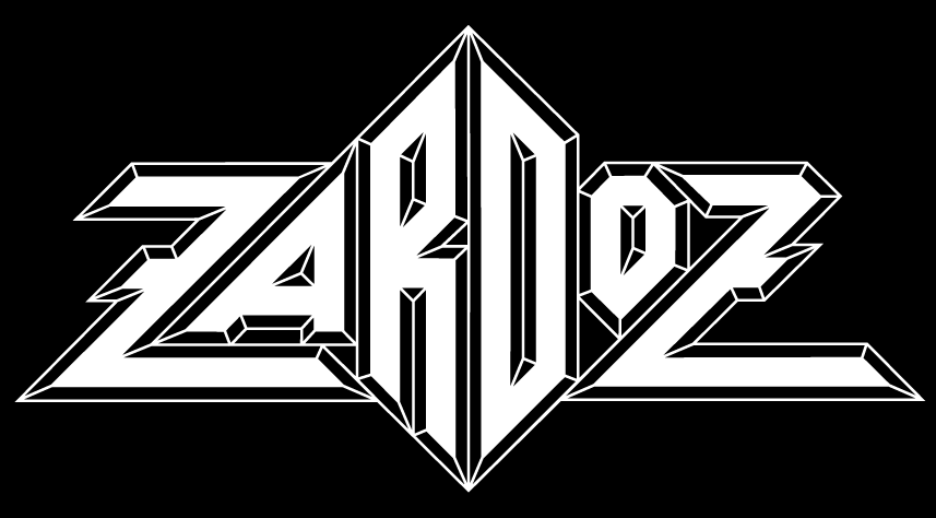 The one that most people remember is my treatment for Zardoz, a film directed by John Boorman—who had previously directed the amazing Deliverance.
The design of this treatment was derived from one of the plot elements in the film—crystal rings. Originally my design had the two Zs mirroring each other, but it was decided that would interfere with legibility. John Boorman liked my solution so much that he used it in the opening credits for the film:
![zardoz[blog]](http://alphabetsoupblog.com/wp-content/uploads/2011/03/zardozblog.png) It has been suggested by others that this design was the original inspiration of many rock and roll band logos done by others—such as “Asia” and “Anthrax”:
It has been suggested by others that this design was the original inspiration of many rock and roll band logos done by others—such as “Asia” and “Anthrax”:
 I have no knowledge that this actually was the case, but looking at them now I have to admit that it seems likely.
Another treatment I’m happy to have worked on was for Wolfen. This little seen film was directed by Michael Wadleigh and starred Albert Finney, Diane Venora, Gregory Hines and Edward James Olmos.
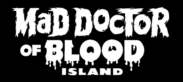
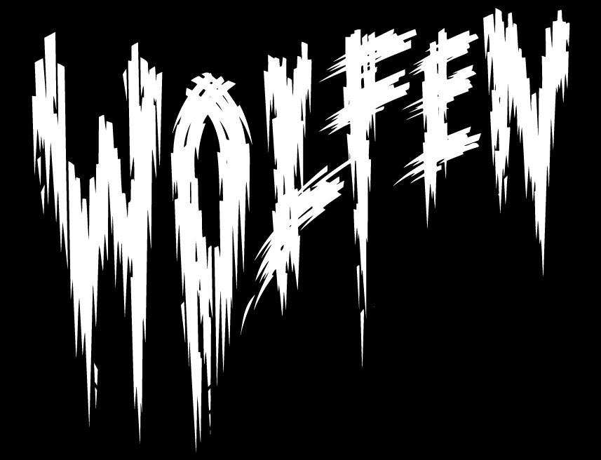 In this particular design I was trying to do my sort of tongue-in-cheek take on all those great horror movie titles from the ’40s and ’50s . . . the ones with the lettering suggestive of dripping blood and ripping flesh—such as:
And finally, the one that I would really have loved to have seen the light of day:
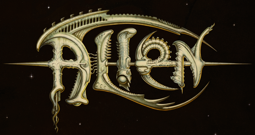
The title treatment I designed for Ridley Scott’s Alien never made it into the public arena. It had some small promotional uses before it was run over by the Bill Gold Advertising machine and relegated to the back burner. At any rate, this was great fun to have worked on—the more so since I was able to work on it with my friend (the now famous “pop-surrealist”) Todd Schorr. I designed and drew the forms based on the “bio-mechanical” forms I saw in some publicity stills from the production, and Todd painted the absolutely gorgeous finished art. Perhaps we went too far with this piece? I’ll probably never know what really happened.
But what I do know is that in the years between then and now we haven’t seen any great strides forward in the art of title treatments. Am I being over-optimistic in thinking that perhaps now we’re at the beginning of a new Golden Age? I hope not.
#
MyFonts Creative Characters Newsletter
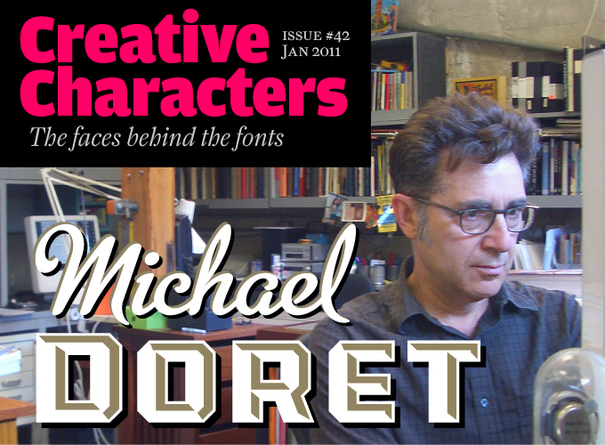
January 27, 2011 on 2:55 pm | By Michael | In News, Wayback Machine | 1 CommentI feel very honored that MyFonts chose me as the subject of their January 2011 Creative Characters Newsletter. It took the form of an interview, and in it I’ve answered a lot of questions, probably at greater length than I have in the past. So if you’re curious as to what makes me tick, set aside 10 or 15 minutes and read this interview. If you still have any questions, I’ll entertain them here!
All you information hounds can also check out the new “Interviews & Articles” page I’ve just set up on my website, where I’ve posted other interviews, articles, PDFs, etc., that I’ve done in the past. Now go write that report!
“Appetite” Opens at Cooper’s Lubalin Center
September 15, 2010 on 1:30 pm | By Michael | In News, Notes, Wayback Machine | 1 Comment“Appetite – A reciprocal relationship between Food & Design” opened last night at my alma mater The Cooper Union, hosted by the Herb Lubalin Study Center. The exhibition explores how design influences our day to day relationship with food, and covers everything from restaurant signs and menus to supermarket price labels and takeout packaging.
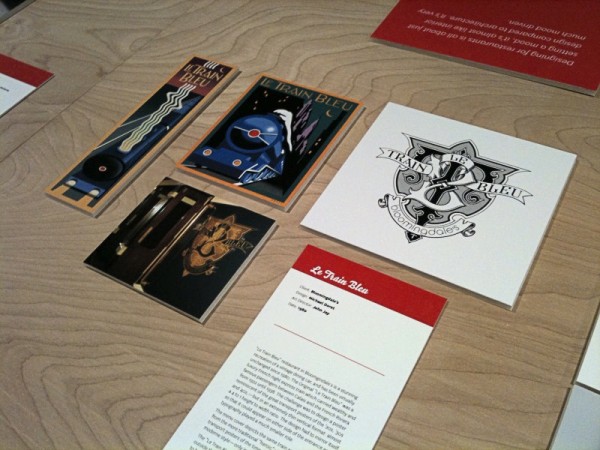
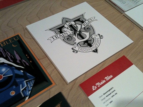
I was fortunate enough to have some of my work included in this show—my “Le Train Bleu” project that I had recently highlighted in this blog. Although I couldn’t make it to the opening, my good friend Louise Fili was kind enough to send me some snaps of my work displayed in the exhibition:
Hungry for more? The exhibition is at 41 Cooper Square (3rd Avenue between 6th and 7th Streets), NYC. The show runs through October 9th. The gallery hours are Monday through Friday: 12–7; Saturday: 12–5. The exhibition was curated by Alexander Tochilovsky. Read an interview with Alexander about this exhibition at Eye Blog, and read more about it and see more photos of the exhibition from the opening at Design:Related.
Powered by WordPress and Nifty Cube with Recetas theme design by Pablo Carnaghi.
Entries and comments feeds.
Valid XHTML and CSS.
