 |
|
Lettering & Typographic Artists: Sucker Punched by Film Industry?
March 24, 2011 on 12:04 am | By Michael | In Gigs, Wayback Machine | 14 Comments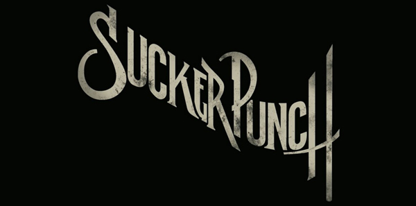 No doubt by now you’ve seen the title treatment for “Sucker Punch”. It seems to be everywhere. I don’t know who designed and did the art for it—and perhaps it’s best that I don’t—because I have a lot of issues with this design including its plethora of inconsistencies. BUT . . . on the bright side, I will say that its free-wheeling disregard for convention is a welcome reprieve from the unimaginative, dull but “safe” typographic treatments that have taken over film promotions for the last few decades. The genres of action and sci-fi movies would seem likely candidates where designers could “stretch their wings” so to speak, and be much more creative with their typography and lettering. If “Sucker Punch” is seen as a successful promotion, perhaps it will be the beginning of a trend, marking the moment when it was OK for creative typography and lettering to return to movie advertising.
There was a time when I was regularly called upon to work on title treatments for feature films. In retrospect there seemed to be more creative freedom back then—less control exerted on creativity by clients. A lot of what I did never saw the light of day, and much of it I’d prefer not to show. But there were some that I’m still proud of.
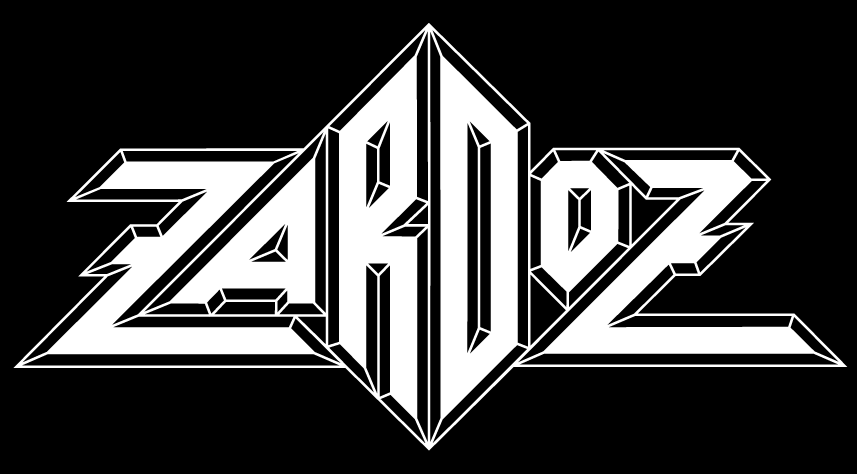 The one that most people remember is my treatment for Zardoz, a film directed by John Boorman—who had previously directed the amazing Deliverance.
The design of this treatment was derived from one of the plot elements in the film—crystal rings. Originally my design had the two Zs mirroring each other, but it was decided that would interfere with legibility. John Boorman liked my solution so much that he used it in the opening credits for the film:
![zardoz[blog]](http://alphabetsoupblog.com/wp-content/uploads/2011/03/zardozblog.png) It has been suggested by others that this design was the original inspiration of many rock and roll band logos done by others—such as “Asia” and “Anthrax”:
It has been suggested by others that this design was the original inspiration of many rock and roll band logos done by others—such as “Asia” and “Anthrax”:
 I have no knowledge that this actually was the case, but looking at them now I have to admit that it seems likely.
Another treatment I’m happy to have worked on was for Wolfen. This little seen film was directed by Michael Wadleigh and starred Albert Finney, Diane Venora, Gregory Hines and Edward James Olmos.
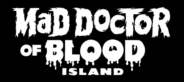
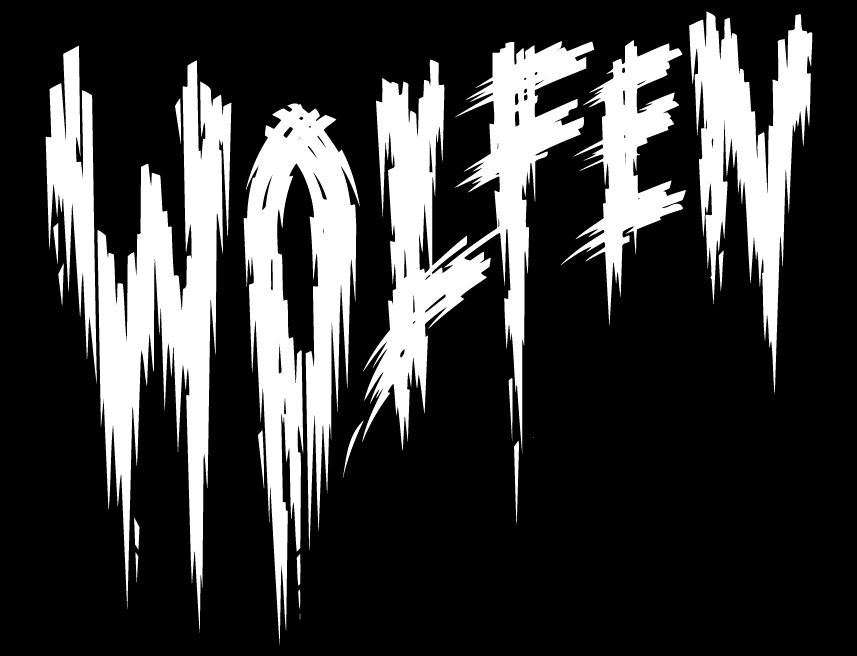 In this particular design I was trying to do my sort of tongue-in-cheek take on all those great horror movie titles from the ’40s and ’50s . . . the ones with the lettering suggestive of dripping blood and ripping flesh—such as:
And finally, the one that I would really have loved to have seen the light of day:
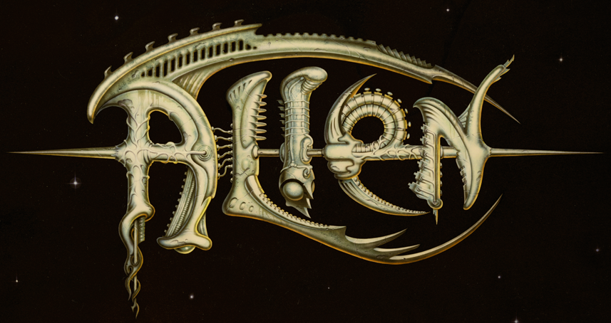
The title treatment I designed for Ridley Scott’s Alien never made it into the public arena. It had some small promotional uses before it was run over by the Bill Gold Advertising machine and relegated to the back burner. At any rate, this was great fun to have worked on—the more so since I was able to work on it with my friend (the now famous “pop-surrealist”) Todd Schorr. I designed and drew the forms based on the “bio-mechanical” forms I saw in some publicity stills from the production, and Todd painted the absolutely gorgeous finished art. Perhaps we went too far with this piece? I’ll probably never know what really happened.
But what I do know is that in the years between then and now we haven’t seen any great strides forward in the art of title treatments. Am I being over-optimistic in thinking that perhaps now we’re at the beginning of a new Golden Age? I hope not.
#
14 Comments
RSS feed for comments on this post. TrackBack URI
Leave a comment
Powered by WordPress and Nifty Cube with Recetas theme design by Pablo Carnaghi.
Entries and comments feeds.
Valid XHTML and CSS.
Dear Wmmvrrvrrmm, I have never seen Jean Delville’s Treasures of Satan (until now). Any resemblance between that work and my design for the Alien title treatment is purely coincidental. In all likelihood Giger never saw what I did.
Comment by Michael — January 27, 2017 #
Do you think that Jean Delville’s Treasures of Satan from the 19th Century might have been another source of reference behind the Alien logo design? The square blades on the wings on the left and the Caduceus like tendrils below the “A” make me wonder, and other elements of the design seem to roughly echo the painting. I’m starting to wonder if Giger took interest in the logo and used it as a starting point for his Alien Monster IV done somewhere around the end of 1978, so your logo would have possibly been a starting point for Giger. I’m having a theory that Giger’s painting referenced or absorbed about a dozen different works, a few others of which were connected with Delville’s painting. I’ve linked my page about this on my blog about the Giger painting
Comment by wmmvrrvrrmm — November 24, 2016 #
Actually it was at the very early stages of production. The only thing I had as reference was a contact sheet of black and white photos from the set. I had to extrapolate a lot.
Comment by Michael — October 24, 2016 #
I’m just wondering when during the Alien production you actually worked on the illustration.
Comment by wmmvrrvrrmm — October 20, 2016 #
[…] and numerous covers for “Time,” Doret discusses his “Alien” design on his website, revealing that the project “was great fun to have worked on — the more so since I was able […]
Pingback by Unused Logo For Ridley Scott’s Alien Is Scary Gorgeous — October 13, 2016 #
Michael,
As a kid I had a t-shirt that featured your ALIEN logo on the front and the standard release poster art on the back. It was my favorite shirt I ever had and have searched for years for a picture of me wearing it or just a picture of the shirt anywhere online. I’ve never had much luck, but I just saw your logo again in the MAKING OF ALIEN doc from the Quadrilogy set, saved the image, and then did a Google search which brought me here. Just wanted you to know that I loved the design and that it did reach the public in at least a small way.
BeAst WisheS – Leif Jonker
Comment by Leif Jonker — November 5, 2015 #
Have you no google-fu? Or do you choose to not even bother typing “sucker punch lettering” into the infernal text box? You come off as an old fogey.
The Sucker Punch lettering is done by Alex Pardee, and is perhaps a bit disjointed for someone with an old time typographic viewpoint. Partly, it is because the lettering is based off of graffiti art…. partly because the movie is itself a bit disjointed.
I recommend you look at Alex’s web site, and the work of Aaron Horkey. This disjointed typographic aesthetic has been around for a bit, and looks here to stay.
It may offend your traditional sensibilities as to what a good logotype should look like, but both artists are very accomplished, and look to be the future of type treatments in film.
Oh, and the Alien logotype you designed is far more inconsistent and illegible than the Sucker Punch one. Maybe the reason Hollywood left you behind is because you yourself have not made any great strides in your work…
Comment by Anon O'Muss — September 30, 2011 #
Steve: Who knows? I saw those various iterations early on. I think it says more about confusion than about anything else.
Comment by Michael Doret — April 6, 2011 #
Seeing more and more ads for this film, I’ve noticed that there are actually several iterations of this logo in use. Some have the rogue serifs and some do not. Some have this squished E, some do not. I wonder if various stages fo the logo were given out to designers at different phases of the promotional campaign and now it’s too late.
Comment by Steve — April 6, 2011 #
Yeah Glenn, I forgot to mention Saul Bass (limited space). With his passing a huge vacuum was created in the field. Lately there has been a bit of a renaissance in film credit design…but sadly that hasn’t been extended into title treatments.
Comment by Michael Doret — March 28, 2011 #
Truer words were never spoken. The film business and typography have not been friends since Saul Bass was doing posters. While the feeling of Sucker Punch was interesting, I agree execution was a big problem,
Comment by Glenn — March 28, 2011 #
I couldn’t agree with you more, Michael. I feel like the “Sucker Punch” treatment is a step in the right direction for film promotion via type, but as you say, there are issues.
My biggest being why do SOME characters have serifs and some don’t and also… why is the E so small???
Comment by Steve — March 24, 2011 #
James: I do think the “SuckerPunch” logo looks good from afar—and in context with the photography around it. It’s when you focus on it that it starts to (at least to me) fall apart.
Comment by Michael Doret — March 24, 2011 #
I hope you’re not being overly optimistic!
The Suckerpunch logo is a weird one. Individually, the letters look poorly drawn, some distorted, and uneven spacing all around, but looking at it as one word, there is some nice cohesiveness about it. Feels like a good first draft.
That Wolfen logo is awesome!
Comment by James Edmondson — March 24, 2011 #