 |
|
Archive for the 'Wayback Machine' Category
Announcing Grafika: It’s a New “Old” Font . . . (or is it an Old “New” Font?)
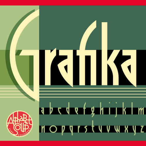
September 11, 2009 on 1:59 am | By Michael | In News, Wayback Machine | 3 CommentsI’m very pleased to announce the release of Grafika, a font design that has been “in the making” for many more years than I’d care to remember! It can now be purchased from Alphabet Soup Type Founders.
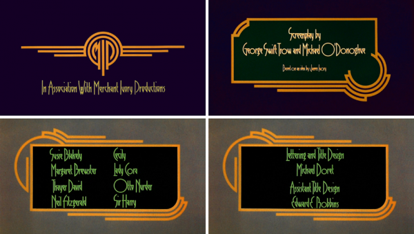
Grafika began its genesis when I received a call to work on a feature film. That phone call came from Ismail Merchant and James Ivory, the reknowned team who have given us such films as “A Room With a View”, “Howard’s End” and “Remains of the Day”. The assignment was to create a title treatment for their upcoming film “Savages“.
The title treatment (above) that I created to reflect the Art Deco sensibility of the film was so well received that it was decided that we would emulate its elegant, elongated look in all the typographic elements of the film. To do that I needed to create what would be my first complete font design. So taking my design cues from the logo I had created, I put pencil to paper and came up with a basic character set. Then I inked it on vellum (which was as hi-tech as it got at that time), and had it photographed and positioned on a roll of Typositor film.
Over the years I had forgotten about this font design. My career became totally about assignment work. I hadn’t gone back to designing fonts until recently when I started doing it again under my foundry name Alphabet Soup. Recently I unearthed a poster for Savages which contained all the credits set in that nameless font I had designed for the film. Looking at it again after all these years I realized that for a young designer this hadn’t been bad. So I decided to revisit it, and to add Grafika to my collection at Alphabet Soup.
To see Grafika in more detail, you can download the PDF brochure I’ve created (3.5 MB). As always, I welcome your comments!
WXRX/Live Radio Chat
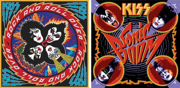
August 27, 2009 on 1:29 pm | By Michael | In Gigs, News, Wayback Machine | 3 CommentsToday I did my very first live radio interview with Stone and Double T at WXRX radio out of Rockford Illinois, home of the landmark Coronado Theater. I chatted with them about my work on KISS’ album covers: both “Rock and Roll Over” and “Sonic Boom”.
The Return of . . . KISS (#2)
August 17, 2009 on 2:00 am | By Michael | In Gigs, News, Wayback Machine | 11 CommentsWhen Paul Stanley came by my studio to discuss how to proceed on the art for the cover of their upcoming CD/DVD package “Sonic Boom”, I had no idea what to expect. I hadn’t met with him since working on Rock and Roll Over, and had very little memory of what that had been like. Any anxiety I had melted away when we started talking. Paul is a “gentlemen’s gentleman” and I immediately felt at ease talking with him—as if all those years had not intervened since the last time we had spoken. After some small talk he explained what he was after with the new cover art. His vision for this album was to make it as vital and raw as it had been when they did RaRO. He felt that that had been some of the best work that they had ever done, and wanted the new album to recreate that energy both musically and visually. While he didn’t want me to reprise what I had done with my art for the earlier cover, he did want me to try to capture some of the same spirit, attitude, energy, and look that I had instilled in that piece. Also one of his stipulations was that unlike RaRO (where I had created abstract, graphic versions of the KISS personas) this time he wanted photographic representations of the four group members in full makeup.
When I did RaRO I had a 12″ canvas to work on. Now with CD covers and digital booklets that canvas had been reduced to less than 40% of its original size. Designing in a 4¾” space poses some very different problems from what I faced while working on covers for vinyl releases. In fact the older cover design would not have worked at that size, it’s many elements would have felt crowded into a small space. So the elements of Sonic Boom had to be bigger, bolder—and fewer. I made the decision to make the title the main focus of the graphics, moving the other elements (faces, KISS logo) into prominent—but subordinate—roles.
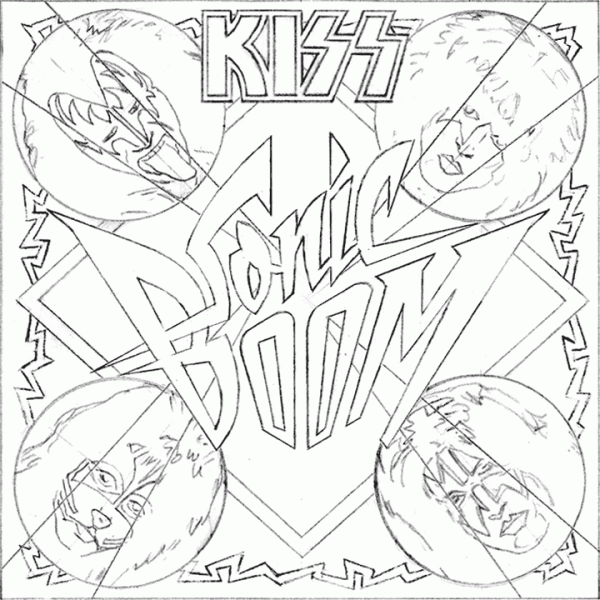
So I set about putting pencil to paper and trying to solve this the way I solve any other design problem. I did not want to get psyched-out by thinking too much about how the new design would compare with RaRO. That cover had taken on a life of its own and had become a pop culture icon. Creating an iconic cover could not have been one of my goals. All I was capable of doing was to try to create the most compelling graphics possible within the parameters and limitations that had been set out for me. So I started out at the core of this design by creating what I call a “word constellation” out of the title. I tried to make it communicate its meaning visually by not only making it angular and “explosive”, but also by creating a shape that was somewhat suggestive of flight—a “flying wing”, if you will. Bearing in mind the symmetrical, mandala-like layout of RaRO I started designing the new piece as a field growing out of the center of the square, with the four members faces moving outwards from the center, and capped with my version of the ubiquitous KISS logo.
It took about a week for me to develop my sketch to the point where I felt confident in what I had come up with. As I had done with RaRO, I felt so strongly about this cover design that I decided to not present any other options—I wanted this to be the ONE.
This is the rough pencil I first presented to Paul. I held my breath as he first took it in, and then was able to exhale when I saw a big smile appear on his face.
Next: A few changes and the final art.
Powered by WordPress and Nifty Cube with Recetas theme design by Pablo Carnaghi.
Entries and comments feeds.
Valid XHTML and CSS.


